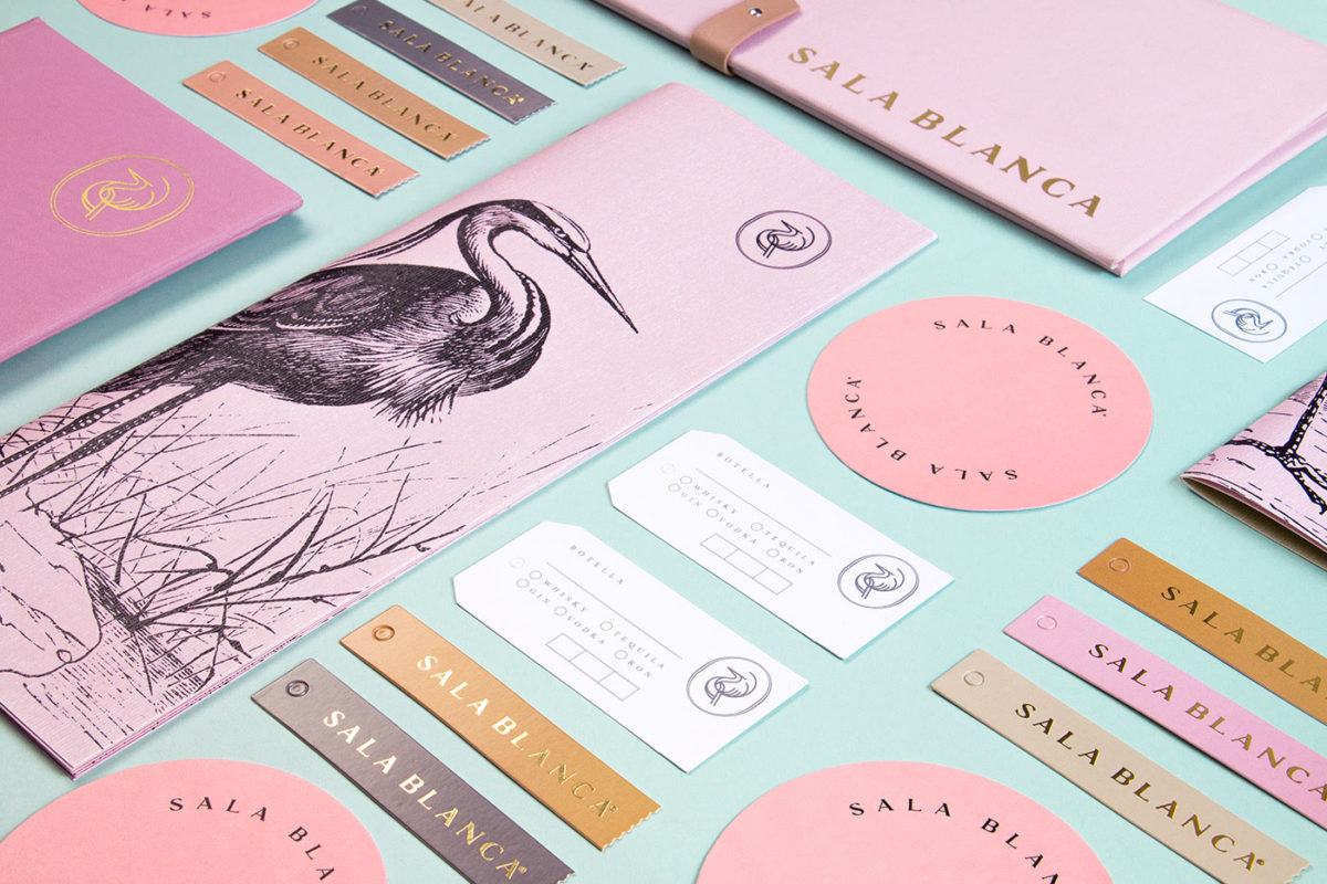
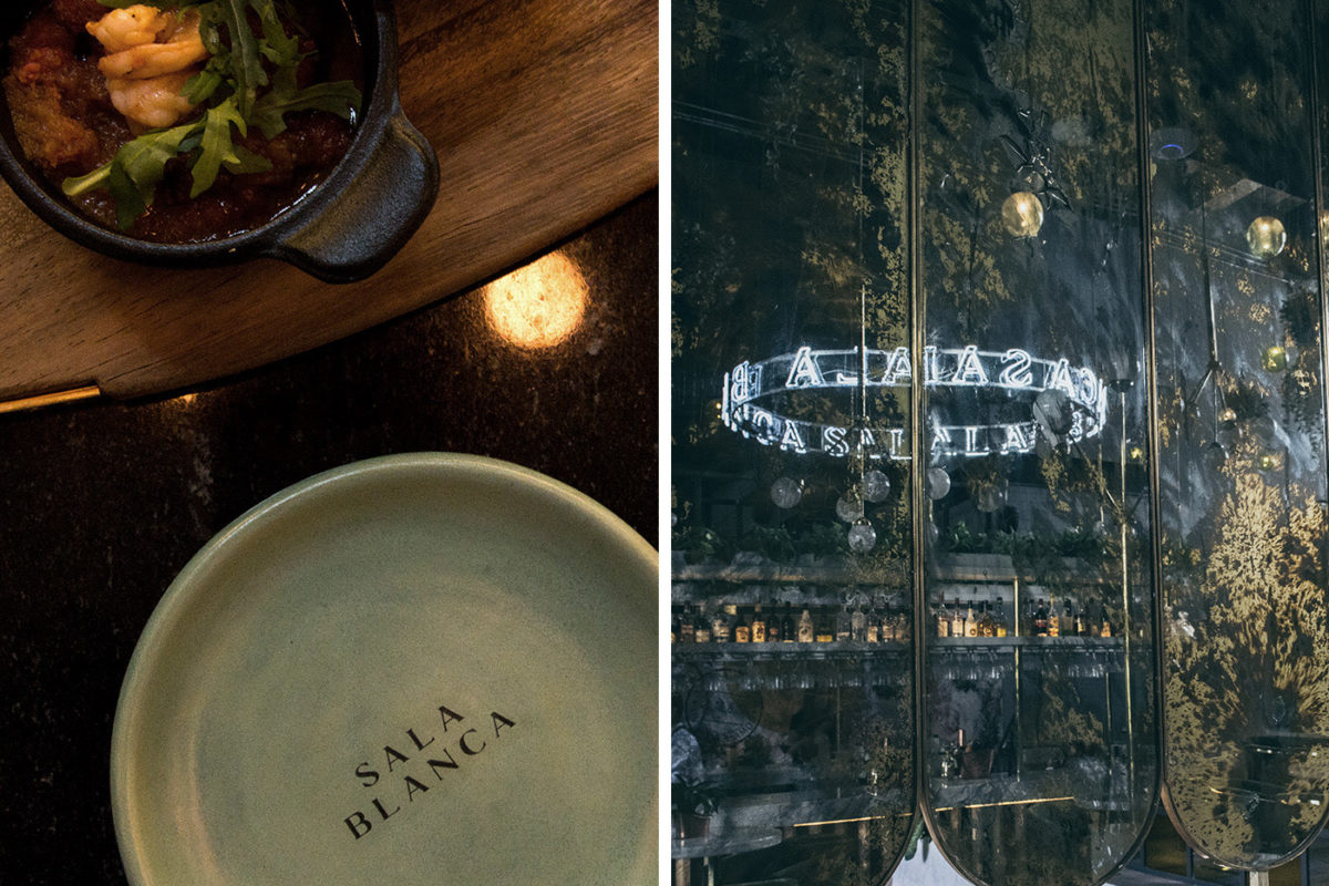
Today I’m struggling to find the words to describe the brand and visual identity developed for Sala Blanca. The soft, warm tones and tactile nature of the menus and plates makes this restaurant feel less like a restaurant and more like a lifestyle brand, as if you’ve dropped into your chicest friends’ vacation-home kitchen. And maybe that’s the point, to feel like an escape from the ordinary and instead find yourself, as a diner, somewhere exotic and welcoming. The typography used throughout the visual identity, especially that of the logotype, is delicate and ethereal, with sharp contrasting lines and the slightest of spur serifs. These delicate lines are mirrored in the restaurant’s chosen mascot; a heron, which can be seen printed in a linocut style illustration across the menus but also represented more abstractly in a seal element. I just can’t get over these colors though; the haziness of the pinks remind me of the feeling of heading home after a long day in the sun on the beach. It’s familiar yet not, that fuzzy, comforting, light-yet-heavy feeling of this menagerie of tones.
Sala Blanca Restaurant Branding by Estudio Albino.


