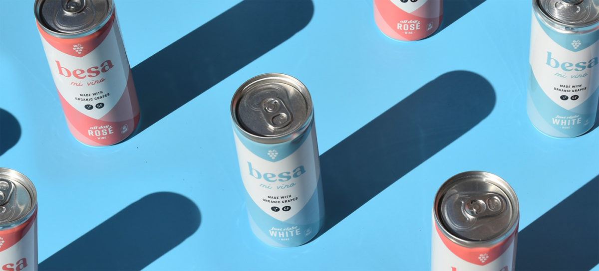
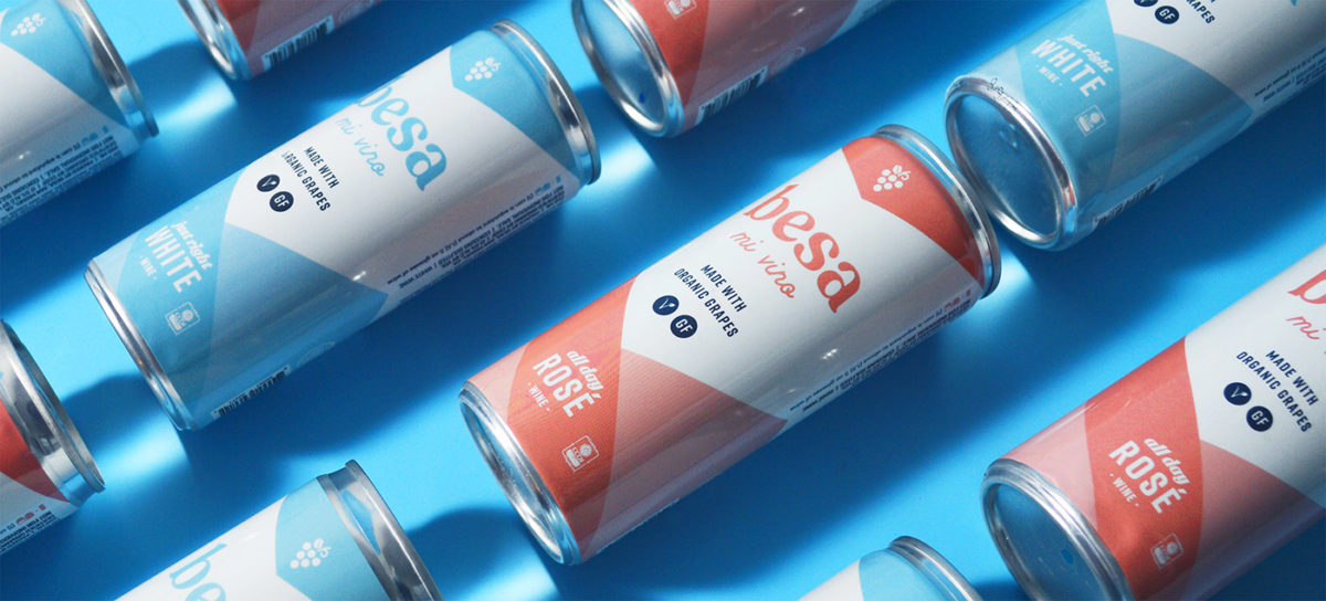
If you celebrate July Fourth or even went on vacation recently, you’ve probably crushed a couple of canned cocktails or wine. We’re crushing on this canned wine case study from Macaroni Creative. Besa is an organic canned wine from Southern California, available in rose wine and white wine. Designed to appeal to on-the-go, wanderlust-seeking millennials, the identity features a warm, pastel color palette and a friendly, retro-inspired slab serif. I love the little surprises hidden throughout this brand. The brand icon looks like a simple bunch of grapes at first, but looking closer you see that the leaf is actually a pair of lips, since ‘besa’ translates to kiss. The way color wraps around the cans form a downward-facing arrow, guiding the consumer’s eye. I also appreciate how consistent the visual language is across web, social, and other branded touchpoints.
Besa Mi Vino Canned Wine Branding & Packaging Design by Macaroni Creative.


