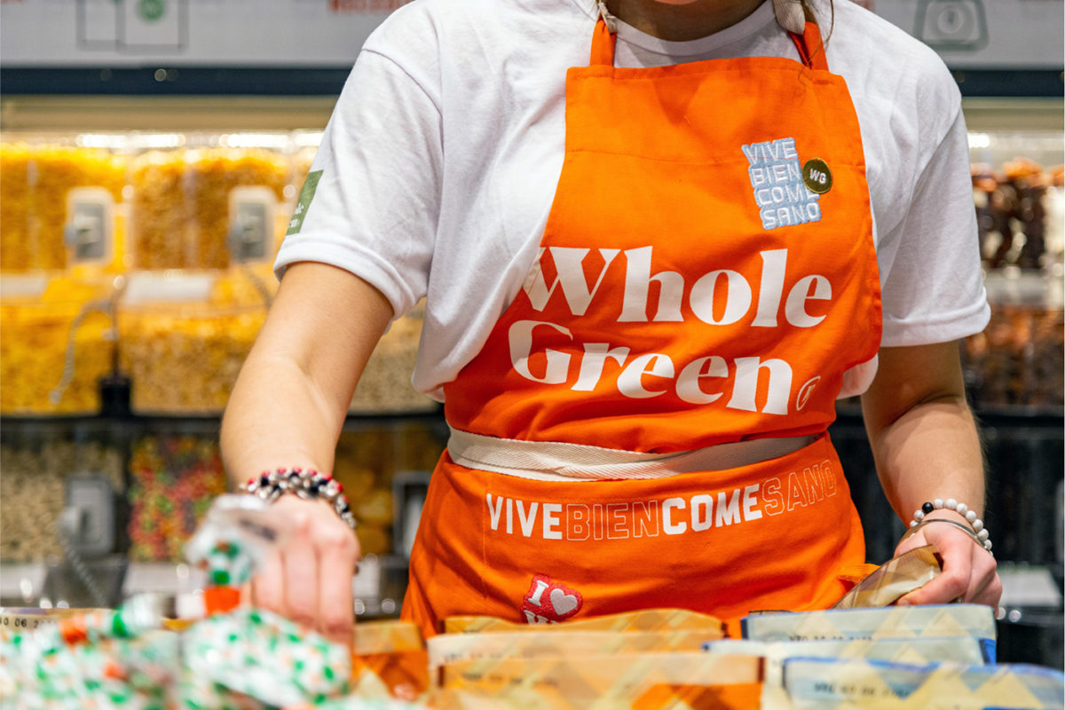
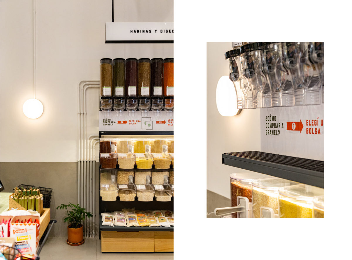
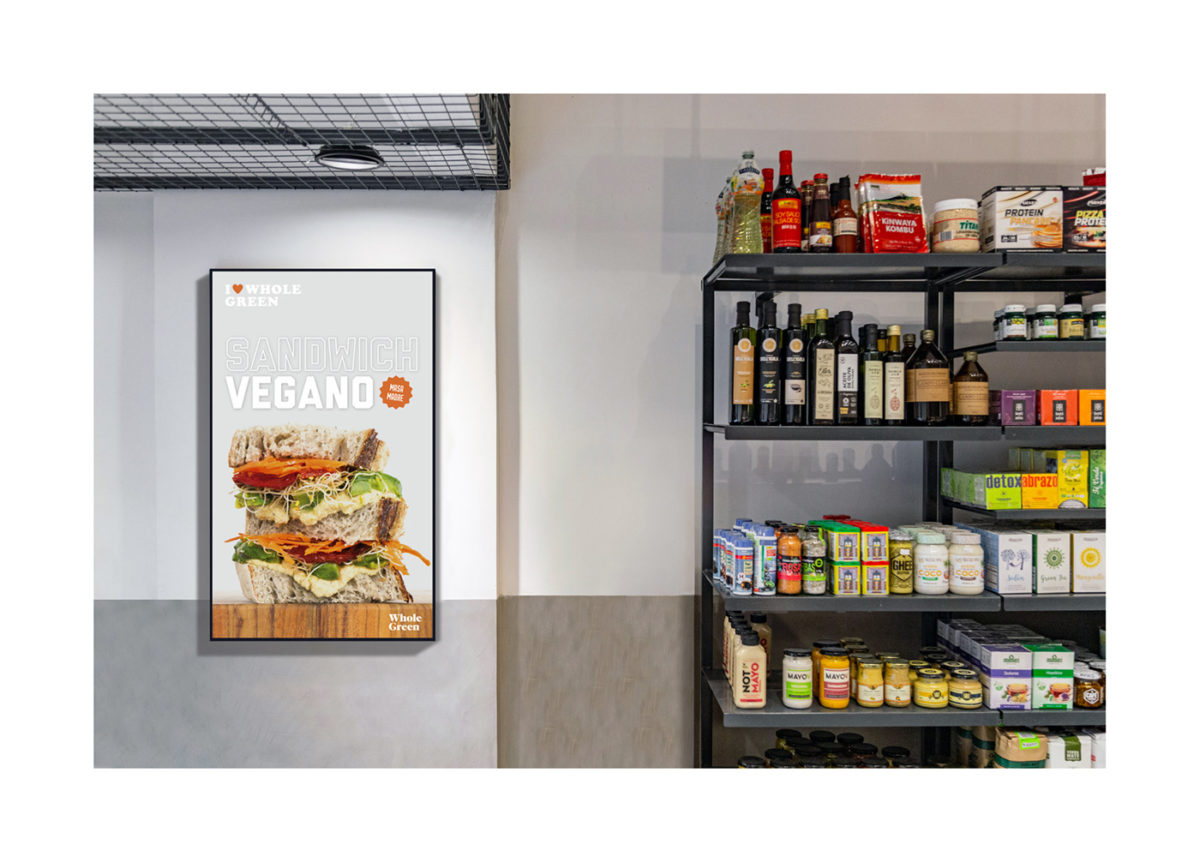
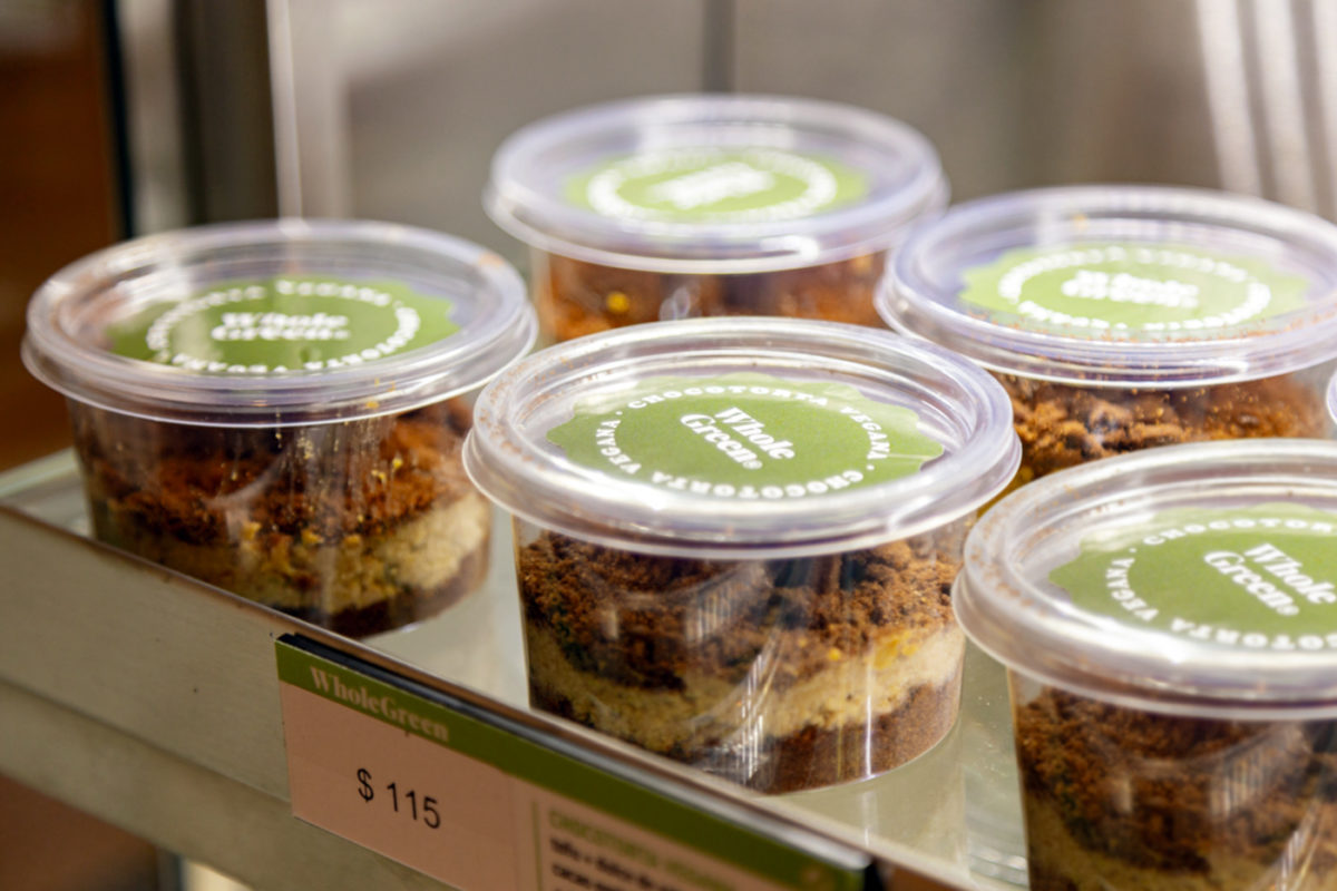
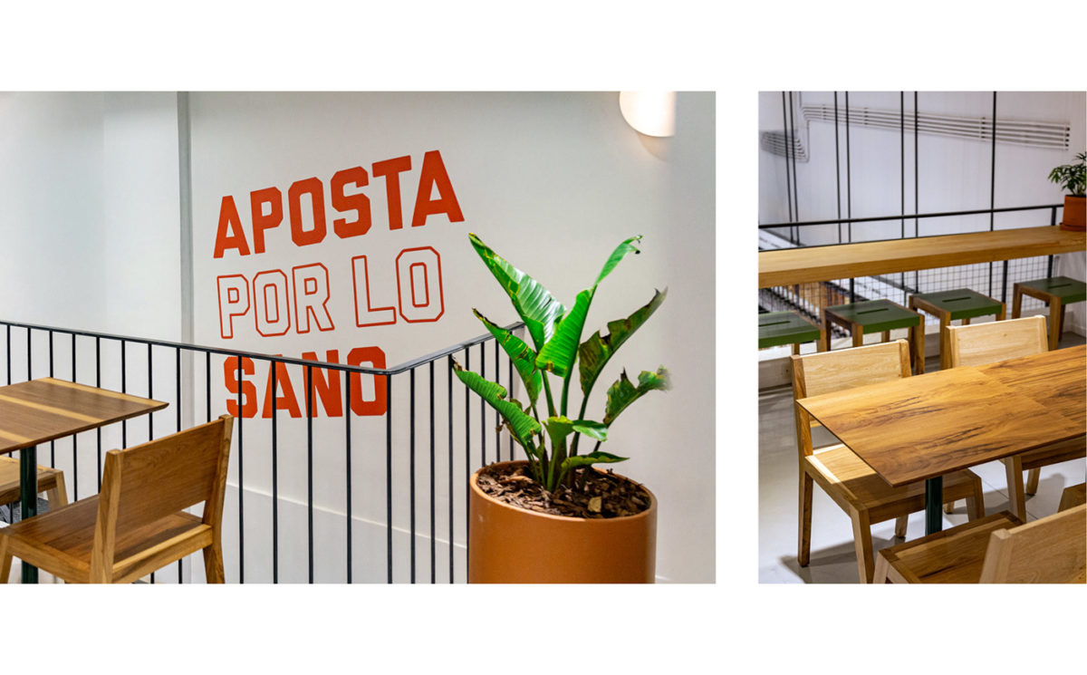
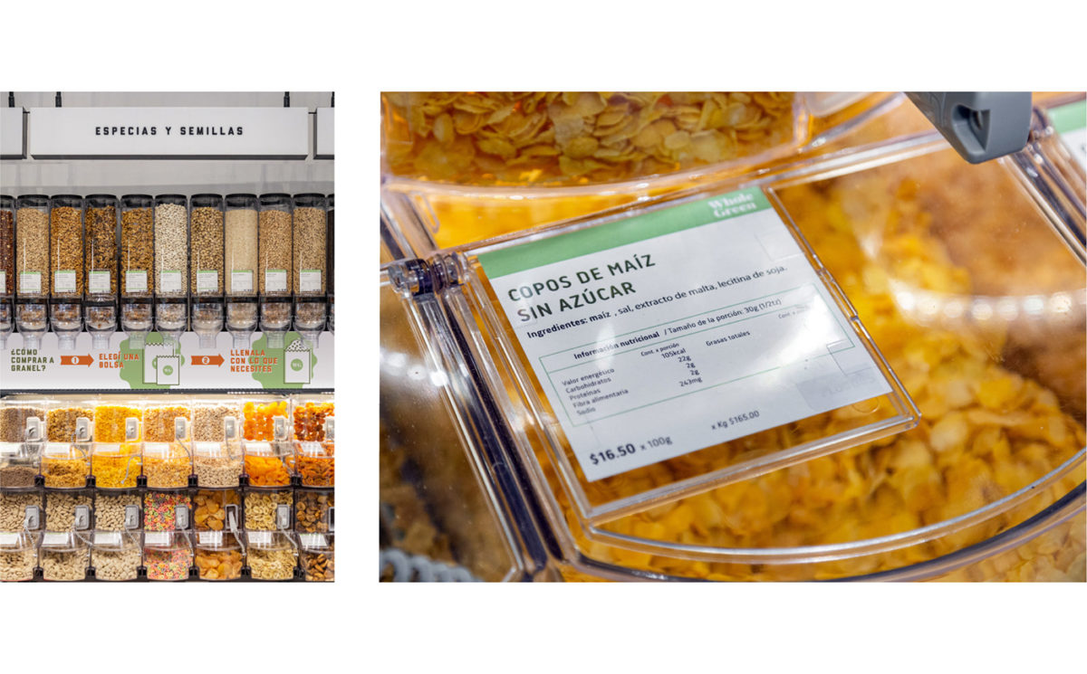
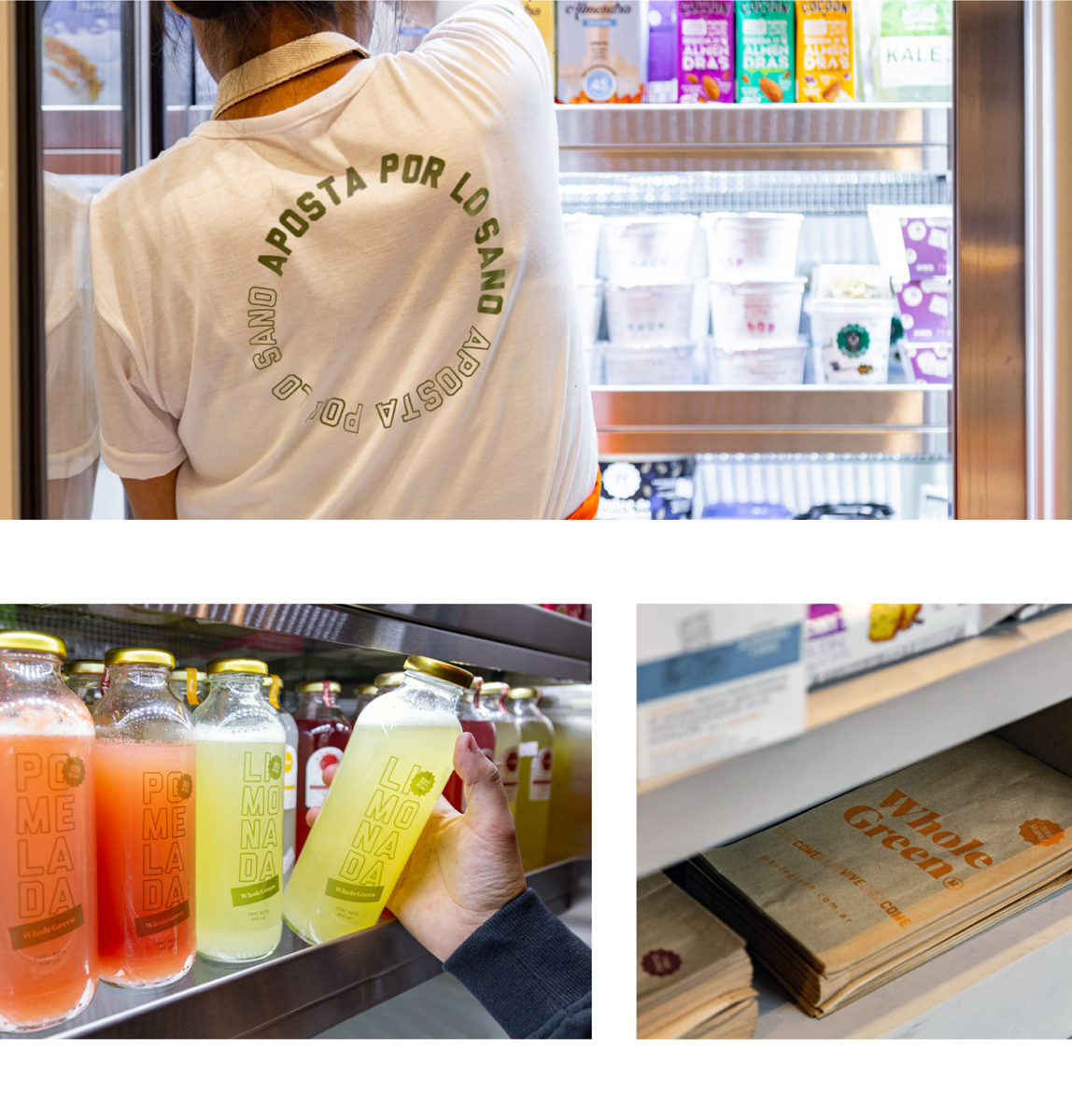
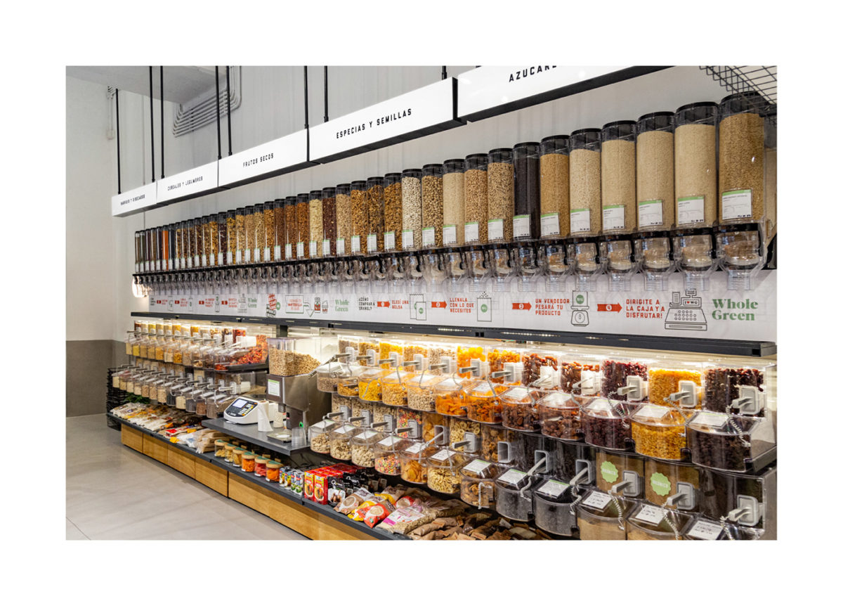
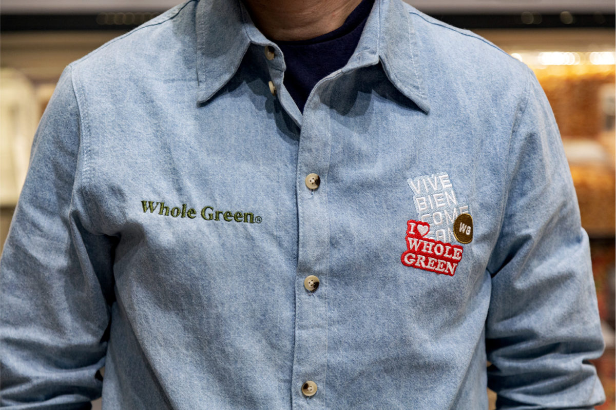
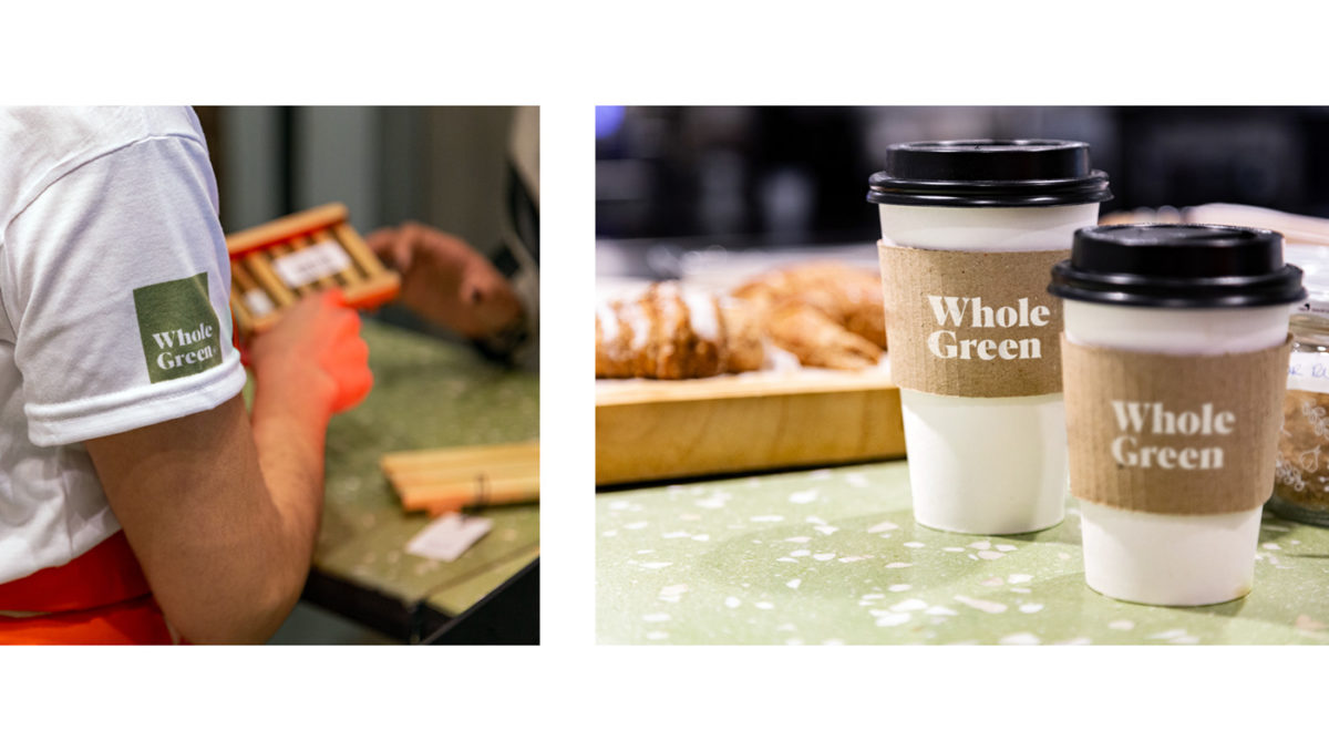
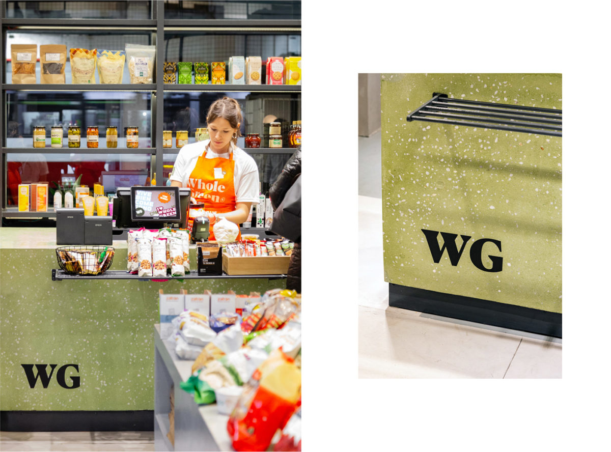
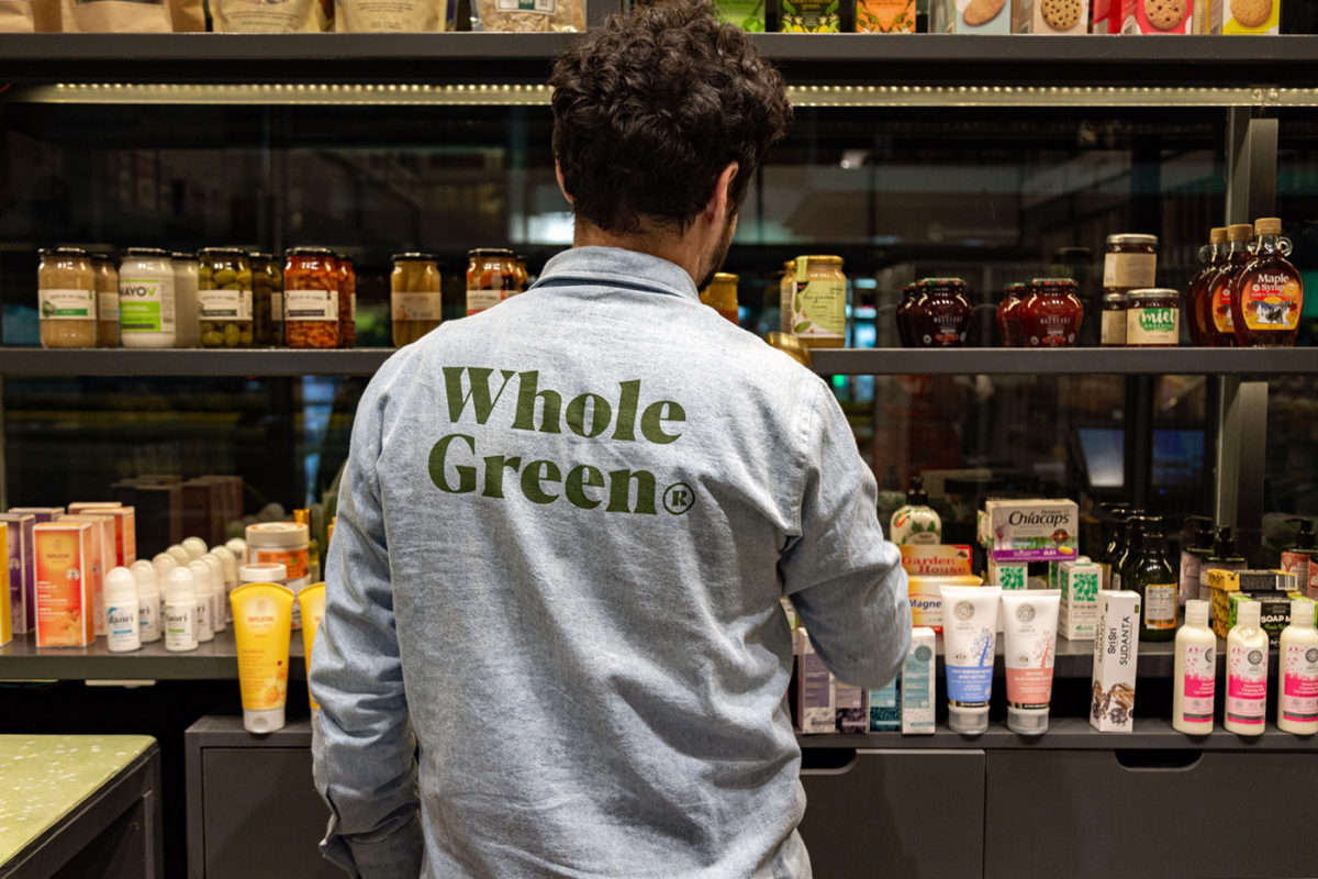
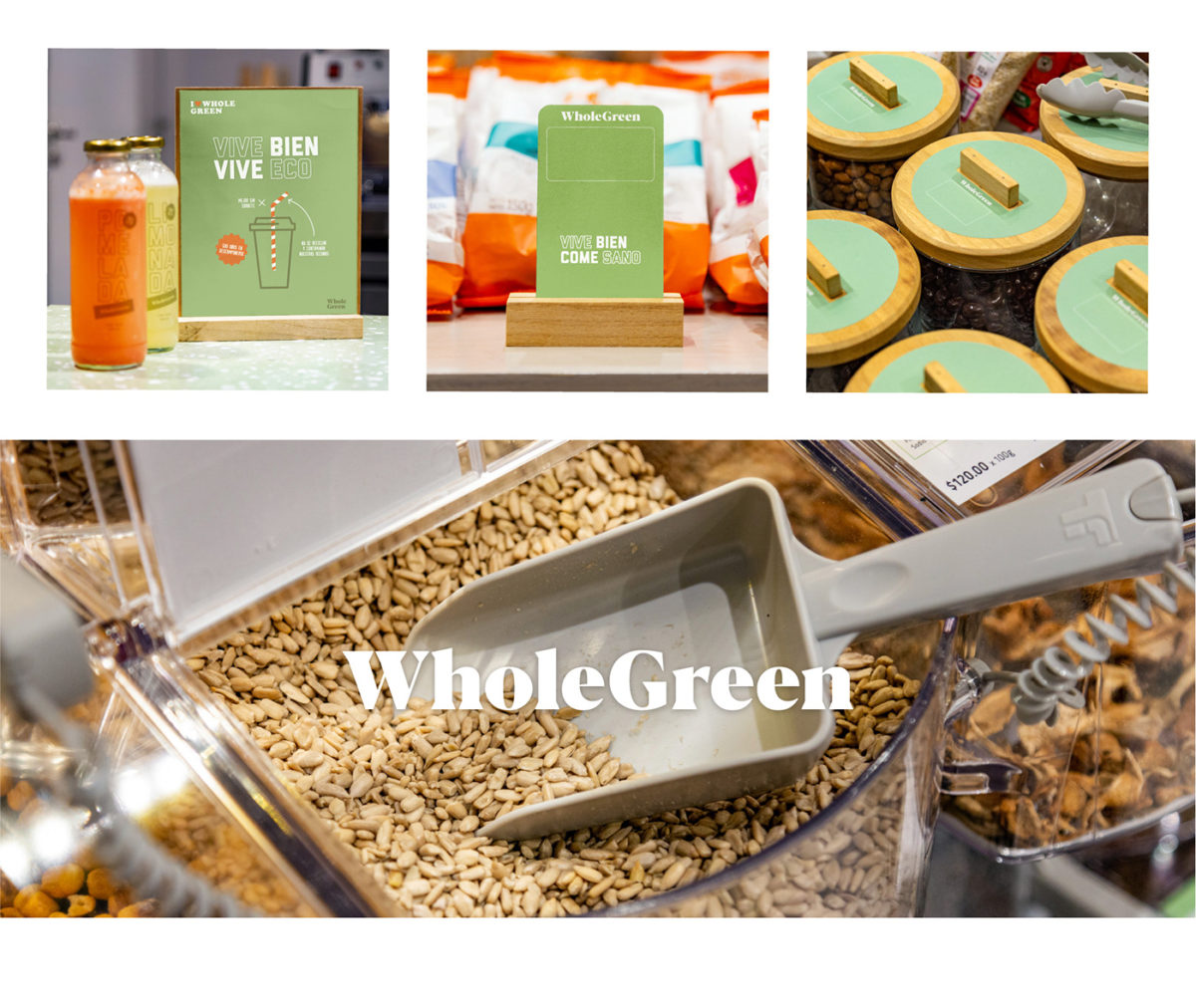
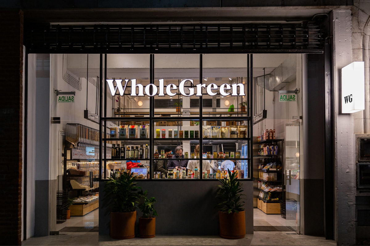
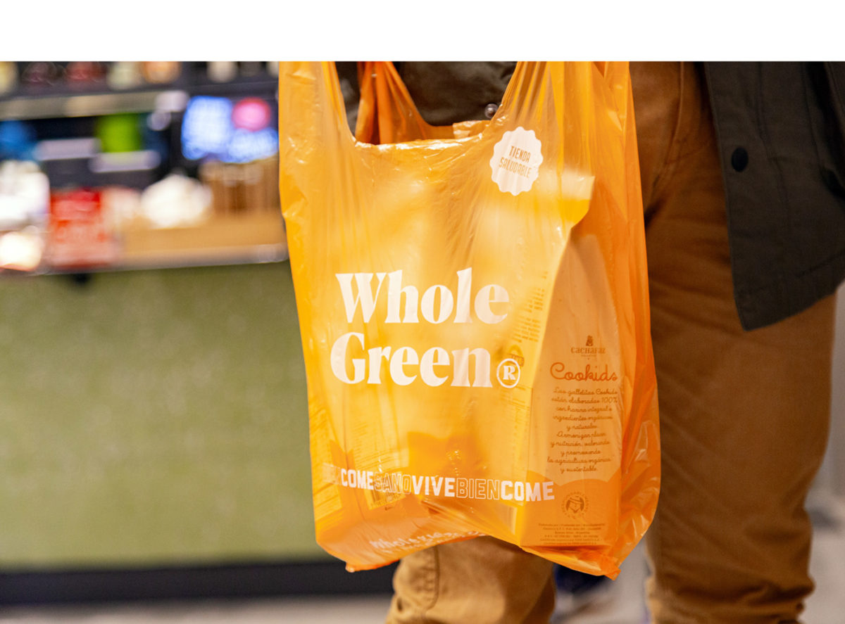
It’s not often you see a beautifully designed grocery store. At least, on a small scale anyway. Sure, the larger chains have the budget the design every aspect of the experience, but they tend to feel corporate and lacking in personality. Whole Green has made personality a focal point of their identity. Mismatched typography, bright orange aprons and energetic sticker-inspired graphics create an experience that feels personal and personable.
Whole Green Healthy Market Branding by Tricota Agency.
