Celli’s Branding by Project M+

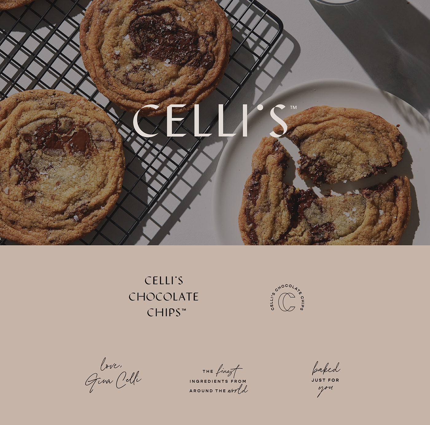
Less is more is a great rule of thumb most times, but when it comes to branding sometimes that is a hard thing to achieve. To create a simple and minimal brand that still feels wholesome is a challenge, Celli’s is such a successful case of how branding can be as simple as you need and still have all the elements to still be engaging, relevant, and refined. The most unique thing about this brand is the type of treatment from the logo, while at the same time combining it with two other typefaces that create the whole brand. A neutral color palette that reflects the simplicity and transparency of the brand, the ingredients, and the production process.

Celli’s Branding by Project M+

The Forktales Podcast™: Interviews with restaurant industry leaders and visionaries

Restaurant and advertising industry headlines and thinking

Reviews of restaurant experiences from around the globe 

Reviews of our favorite design, business, & restaurant books

Our favorite typography and fonts

Inspiration in your inbox

Get the latest inspiration in your inbox every Monday morning, for FREE!

"*" indicates required fields

This field is for validation purposes and should be left unchanged.

Delicious Bits in your Inbox!

Get the latest and greatest content delivered to your inbox for free!

"*" indicates required fields

This field is for validation purposes and should be left unchanged.