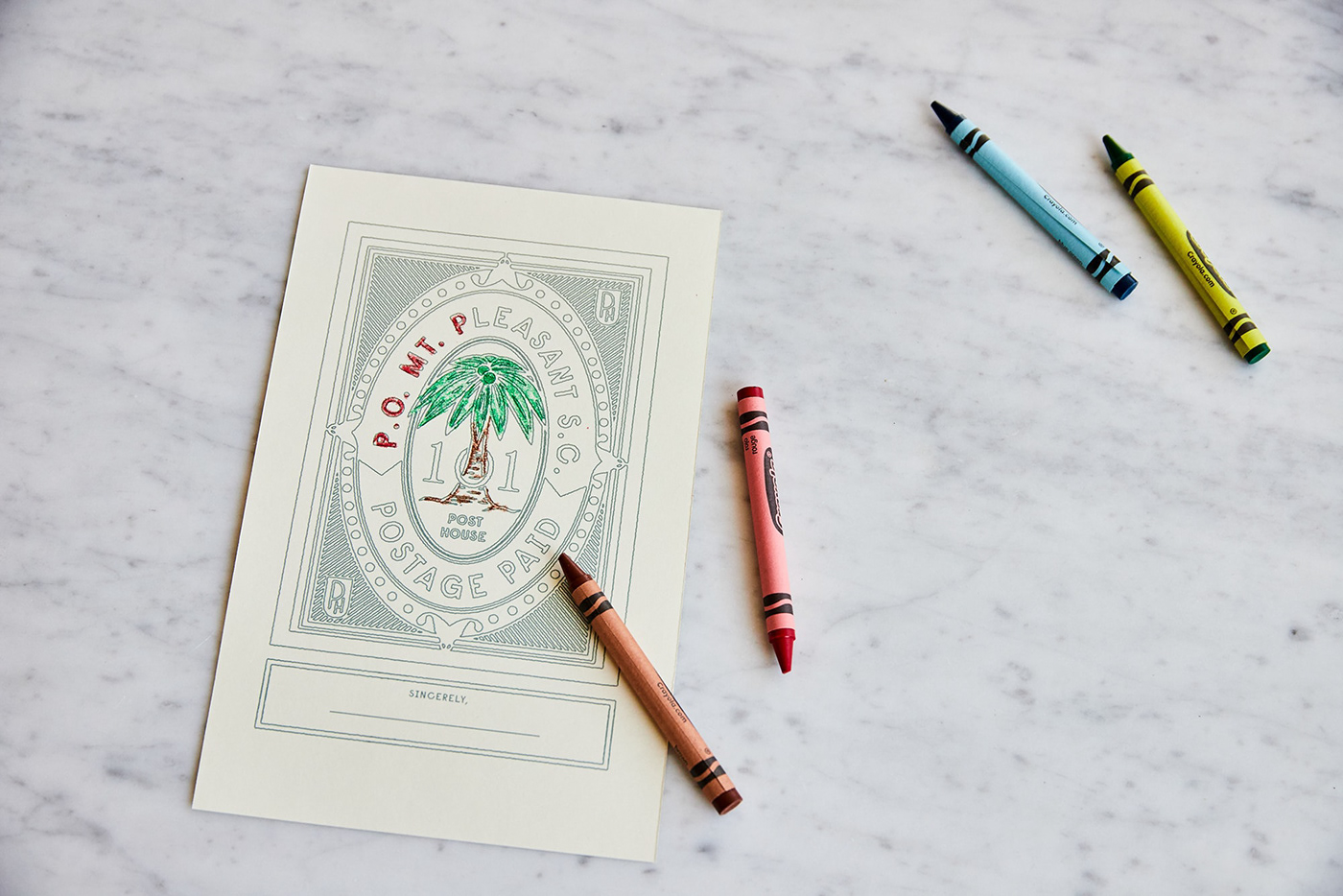
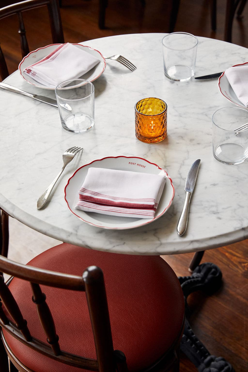
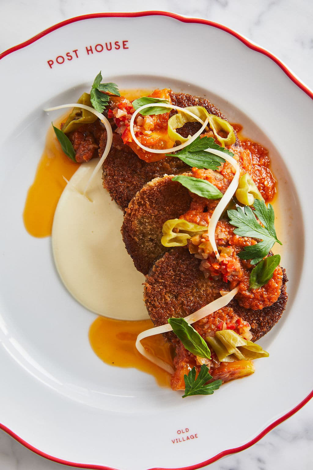
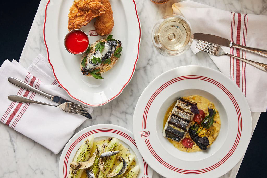
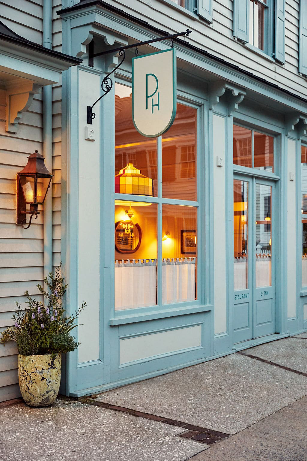
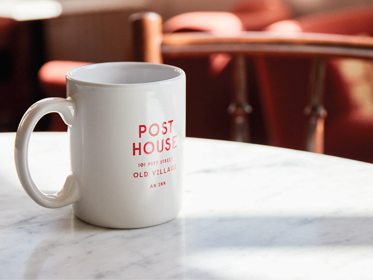
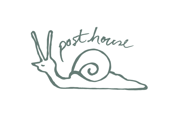
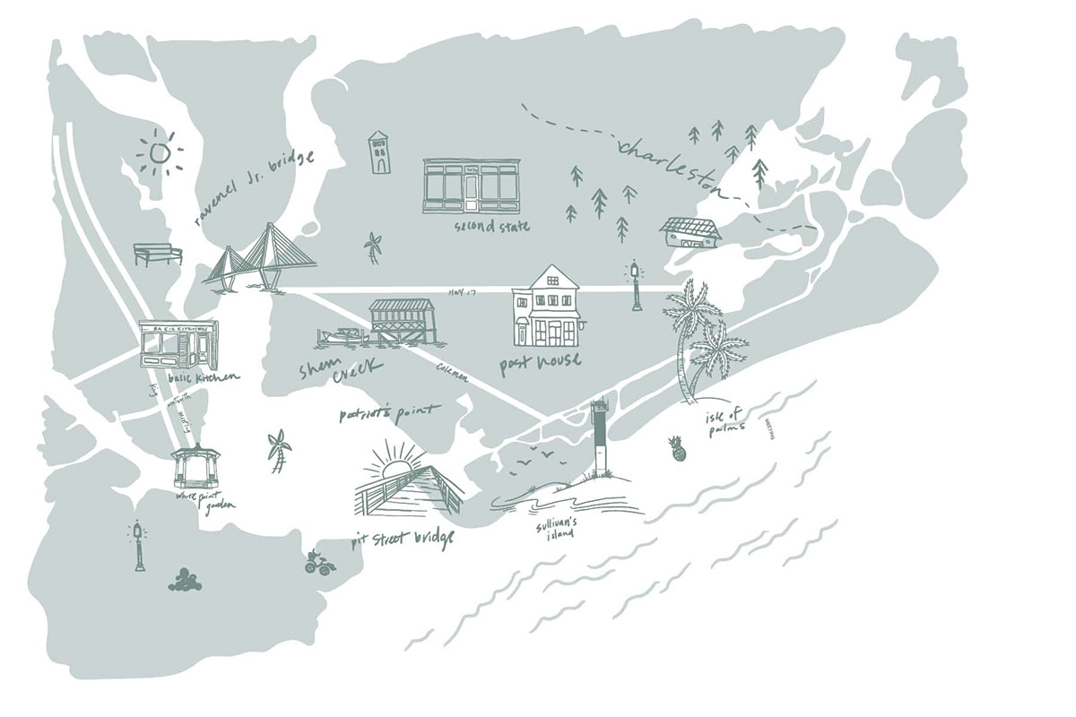
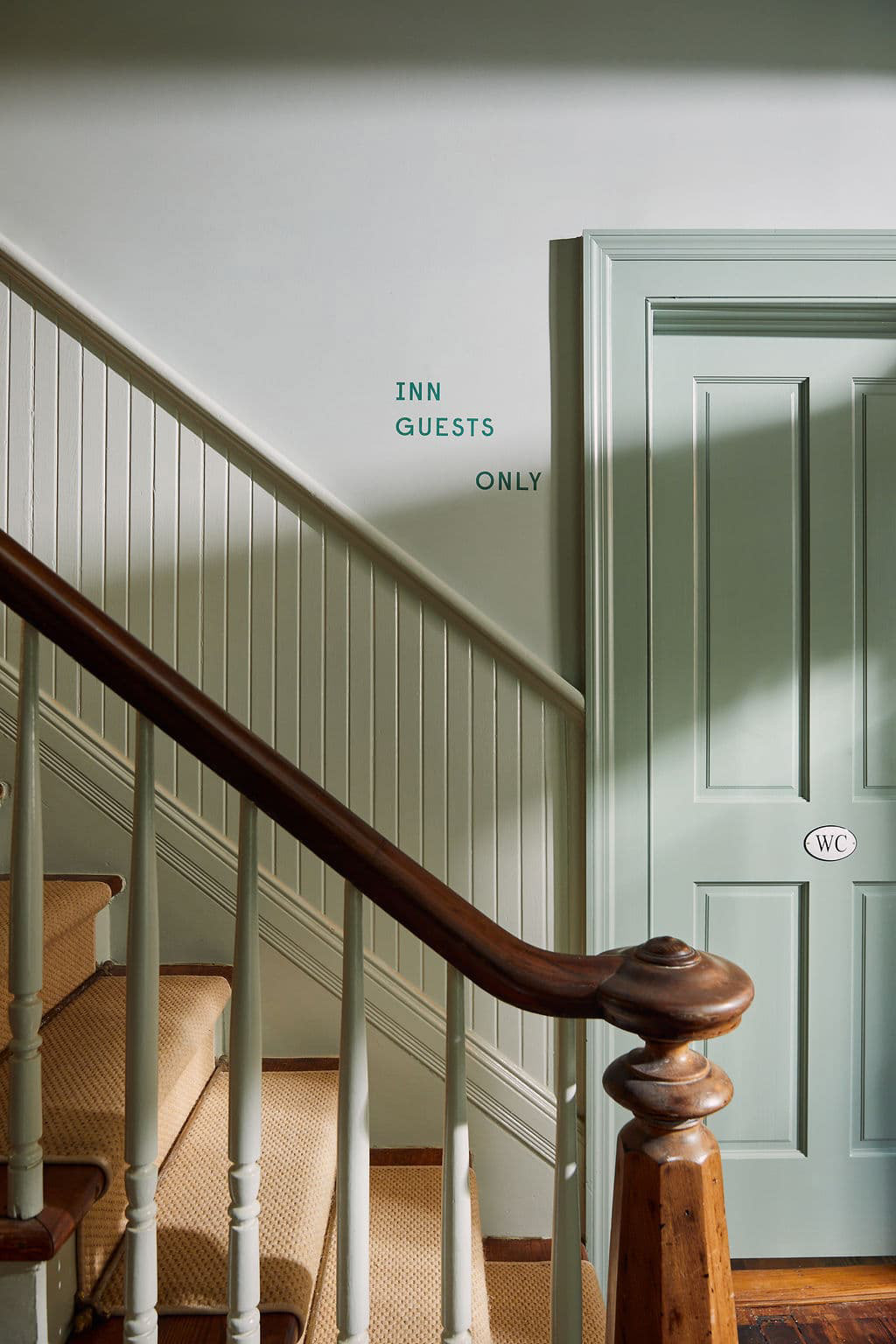
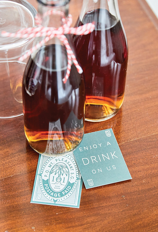
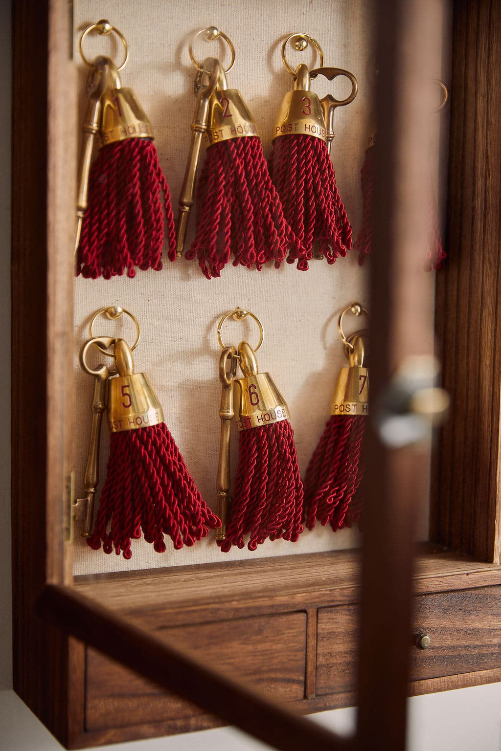
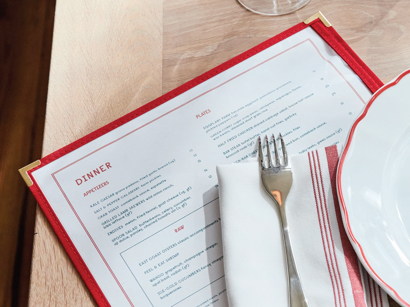
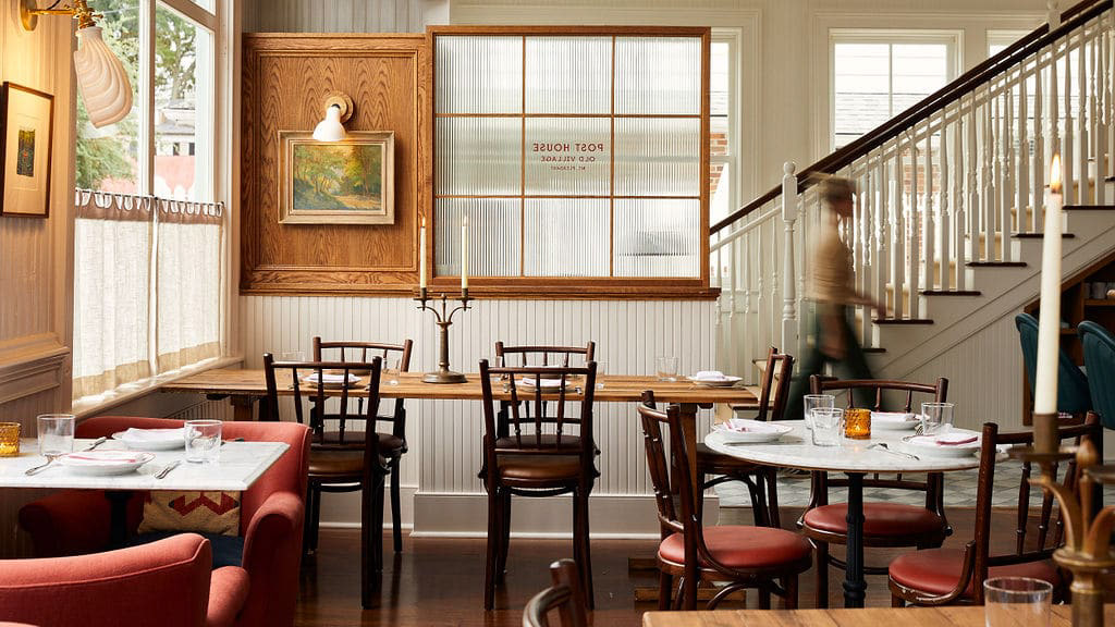
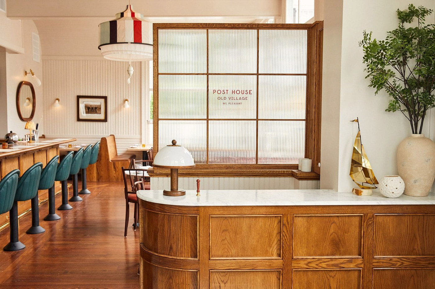
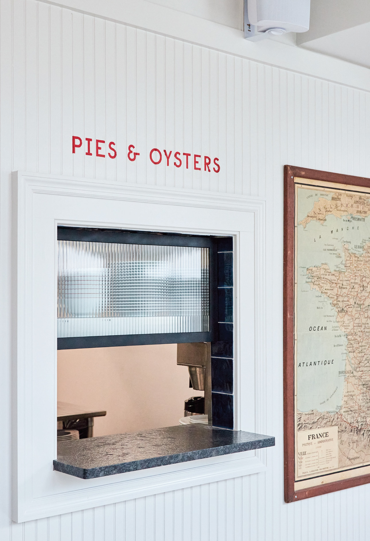
We adore when brands have a long and meaningful story behind them, but a good story doesn’t only come from the brand itself but sometimes of the place it inhabits, and the context which shapes it and gives it meaning. That is the case for Post House, an eatery and inn located in a circa 1896 building in Charleston, NC. Through the many years this building has been around it has been many things, and when Basic Projects decided to transform this establishment into a community/history-driven restaurant, a hospitable and traditional inn, and an eclectic bar; it made only sense that the overall branding would reflect the balance between the historic and modern, refinement and approachability, and a unique and dynamic visual identity that represented all the things this brand would stand for.
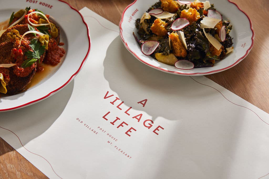
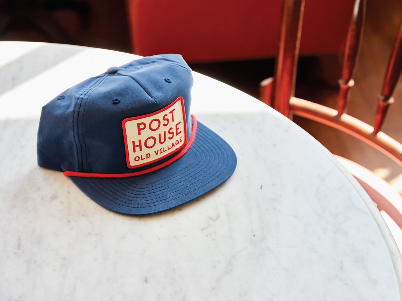
The overall identity is broad and diverse yet all of it evokes warmth, elegance, and ease. It feels private yet inviting and above all, it feels very intimate, like a place you’ve always belonged to even though it might be your first visit there. With this project, we get to witness the immense potential of branding and art direction, this place feels like a scene taken out of a Wes Anderson movie but at the same time, it has this nostalgic vibe that might take you on a visit to some part of your childhood as an adult.
Post House Branding by Stitch & Co.
