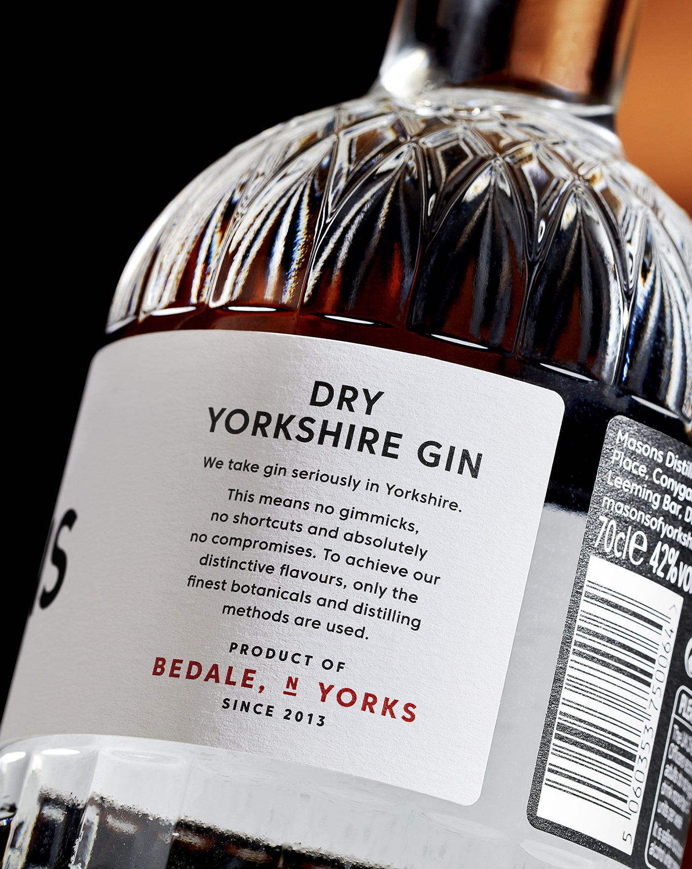
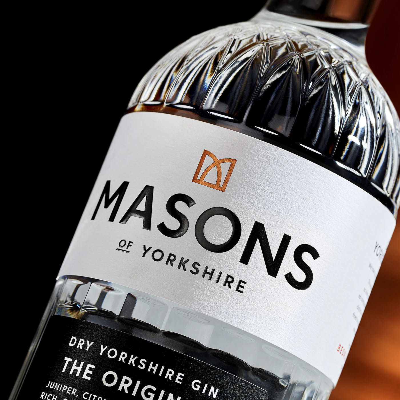
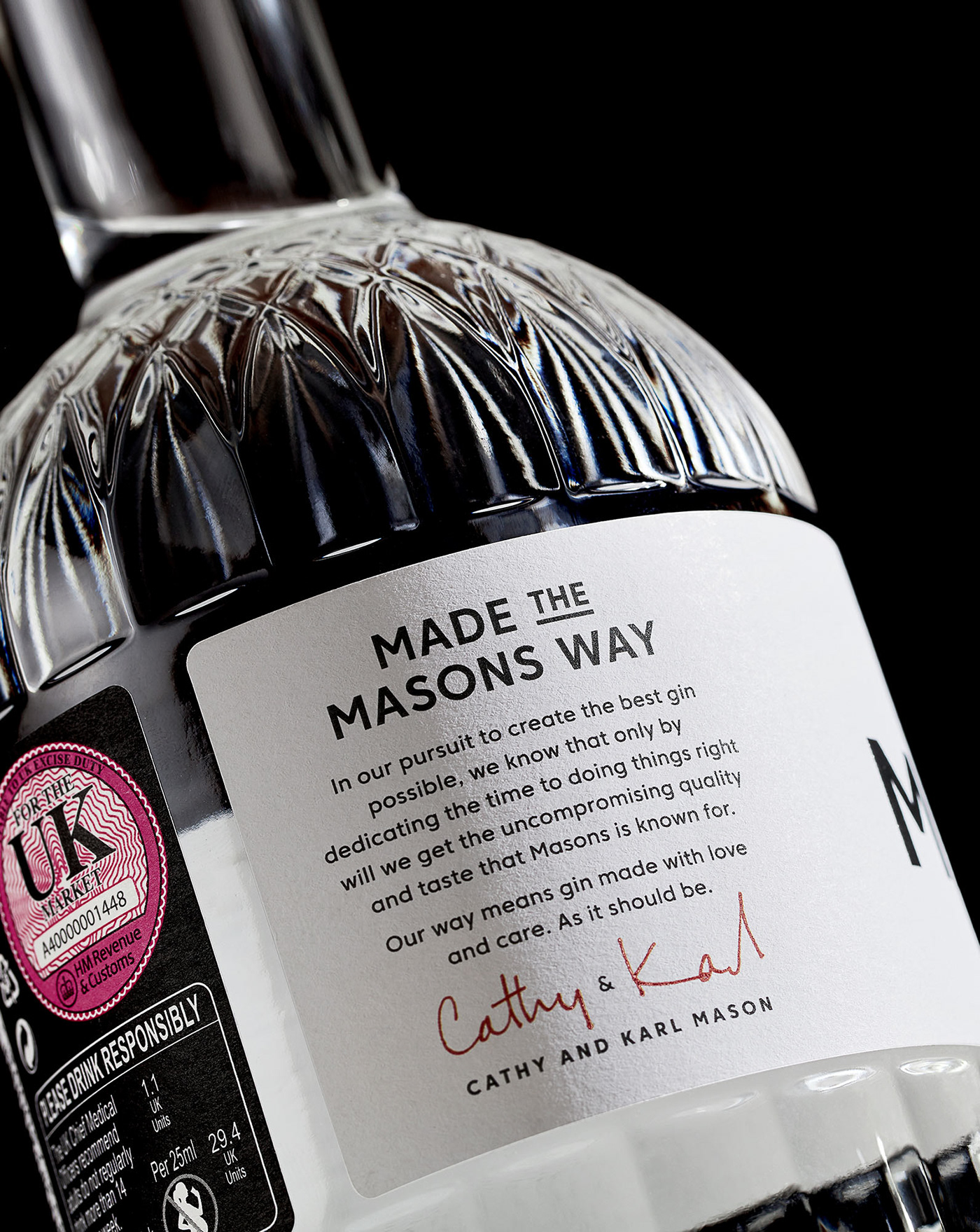
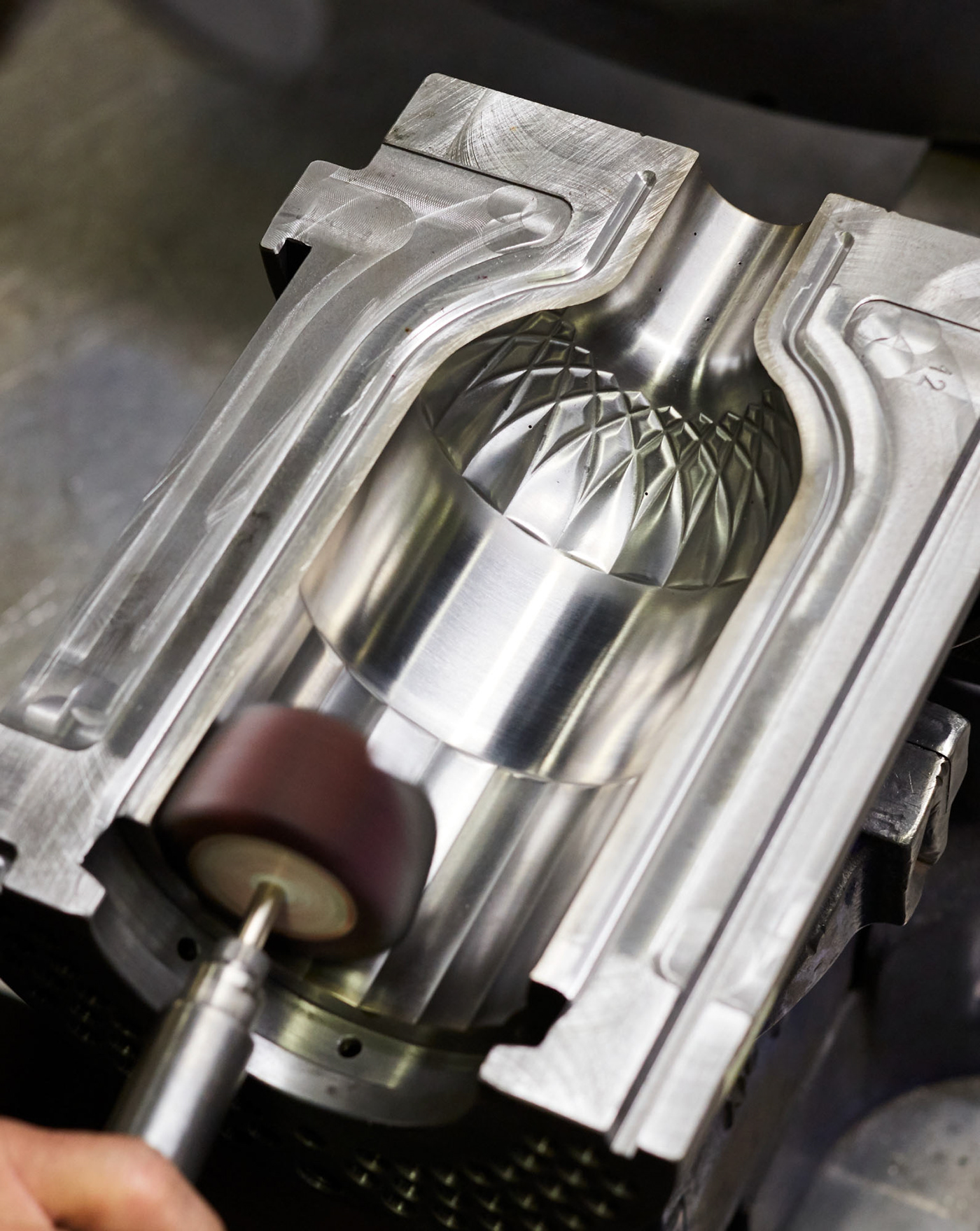
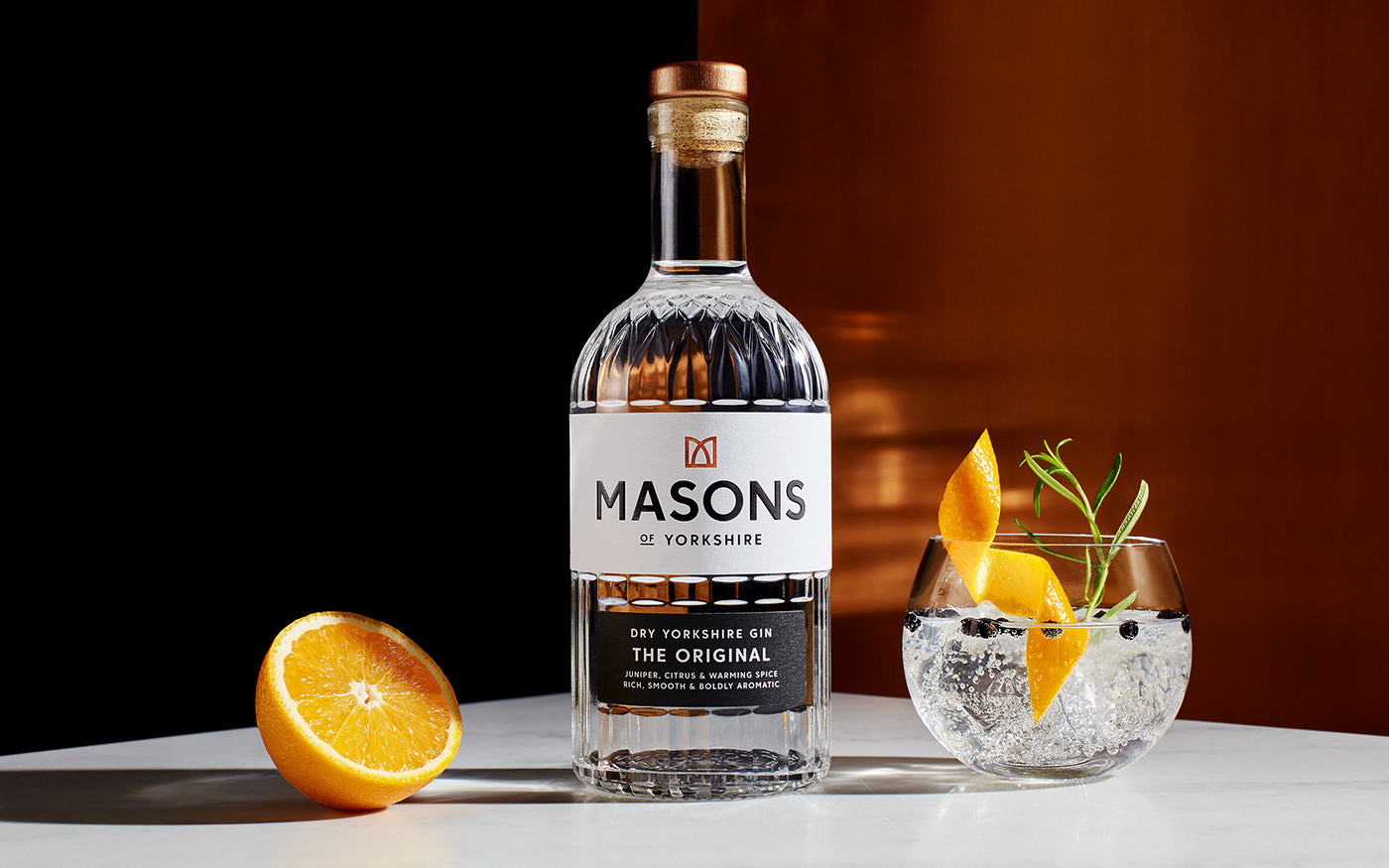
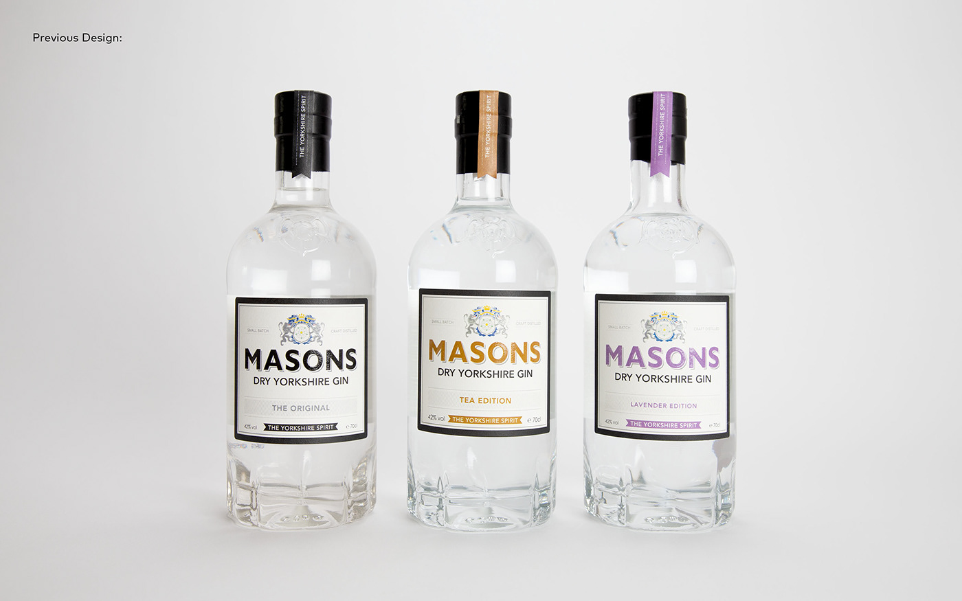
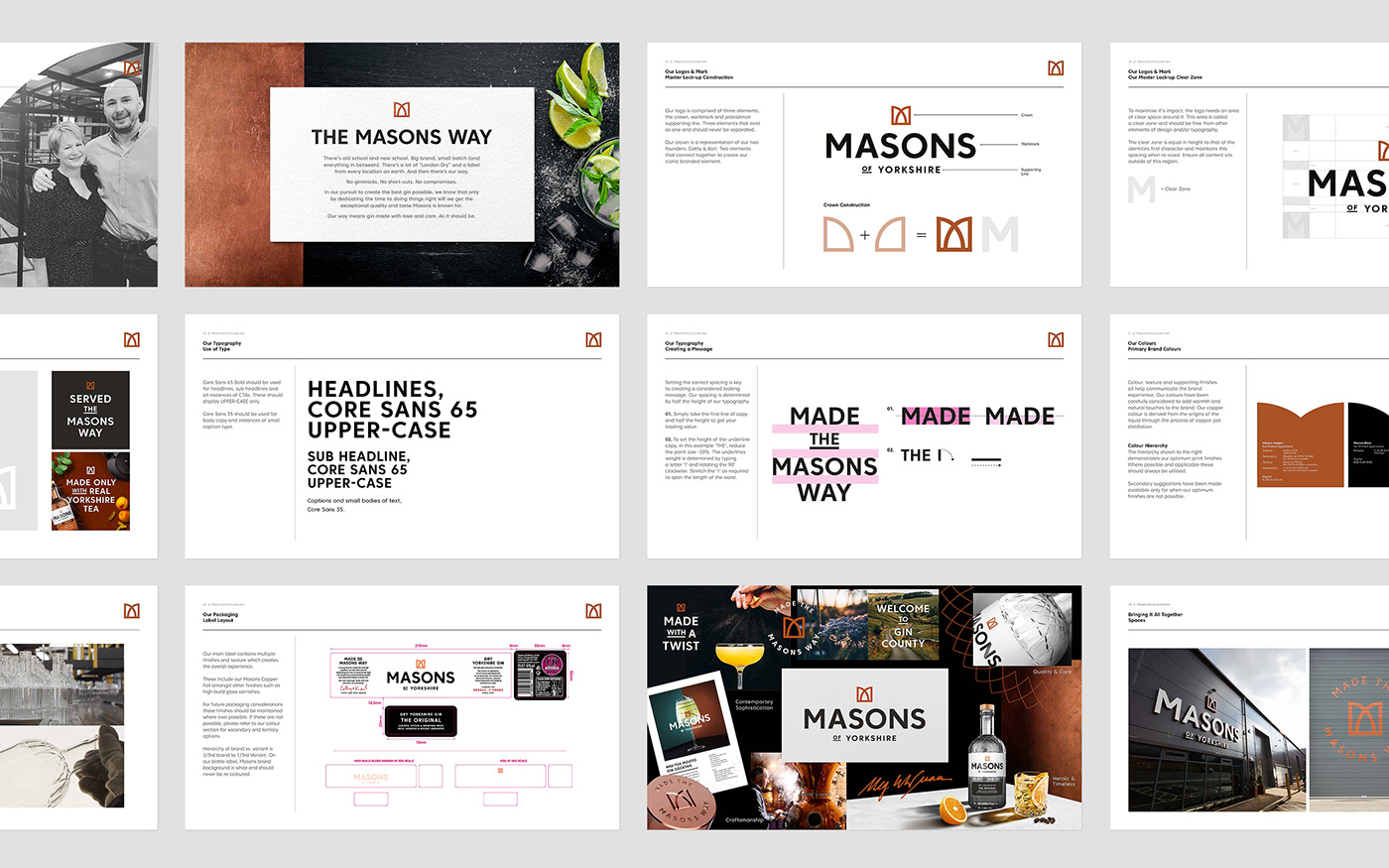
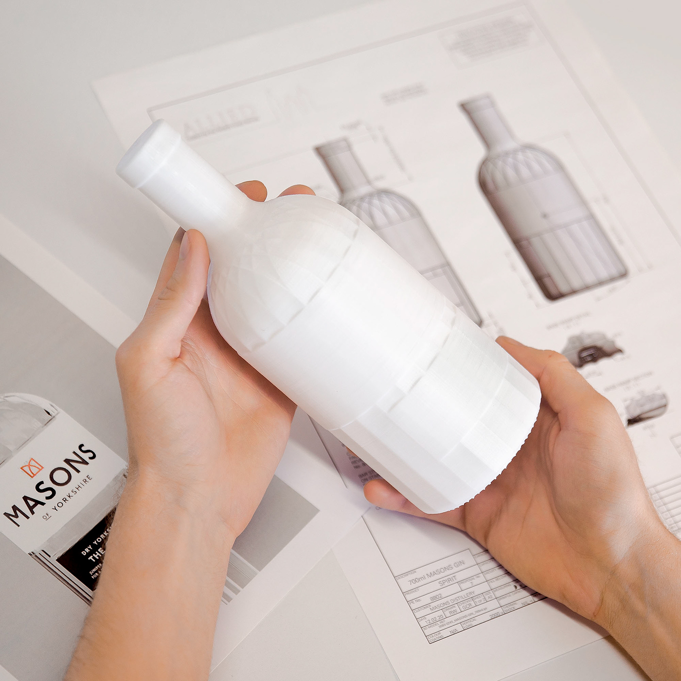
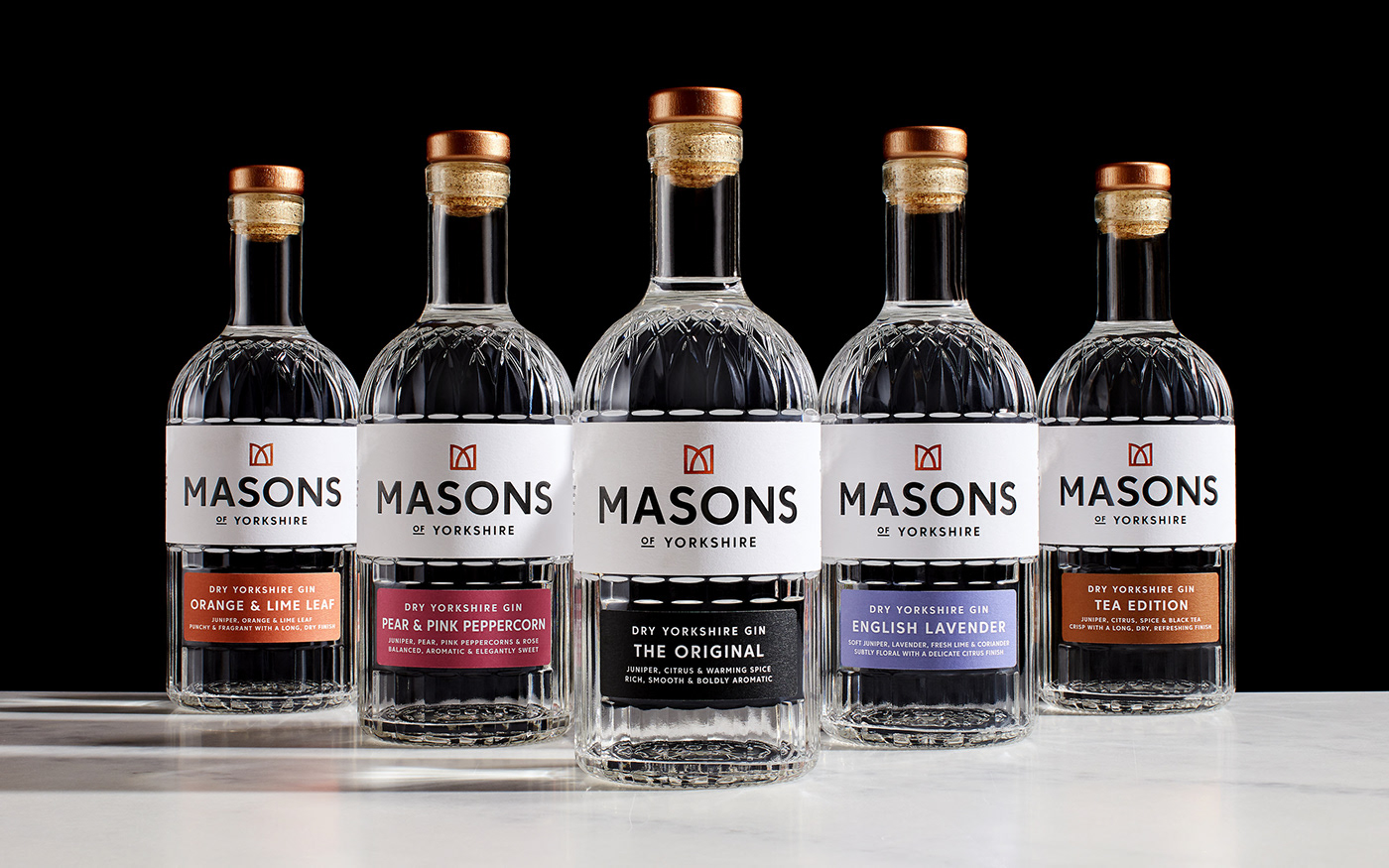
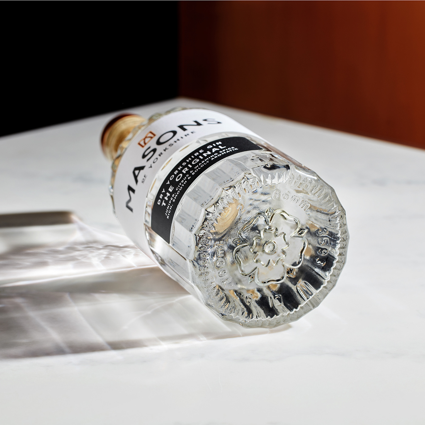
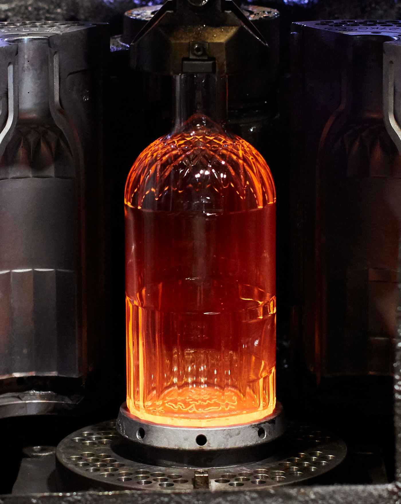
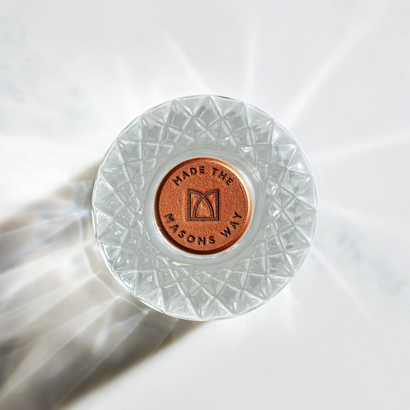
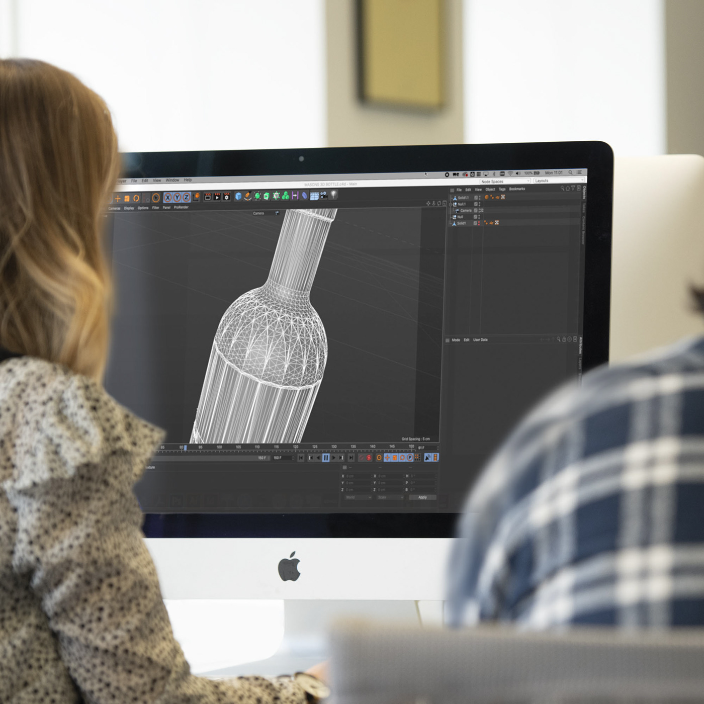
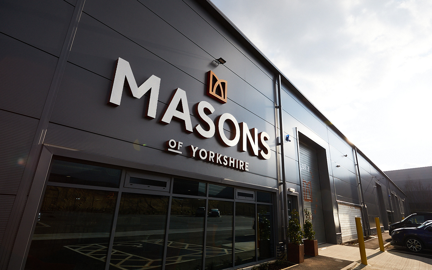
Masons of Yorkshire rebrand by Robot Food came about in less-than-ideal circumstances. Their distillery was destroyed by fire in 2019, but instead of despairing, they saw this as an opportunity to come back stronger. Robot Food sought to capture their tenacious ‘Yorkshire Spirit’ not only in the new visual identity, but in a whole new design for the bottle itself. Sophisticated and modern, this new look for Masons stands out on the shelf next to other hokey, ‘heritage’ gin brands. This new bottle was derived from the arches in the crown logo, harmoniously tying it together with the graphics on the label. It helps that this pattern is also reminiscent of cut crystal glassware, further connecting the gin as an item of quality and class.
Masons of Yorkshire Beverage Branding & Packaging Design by Robot Food.
