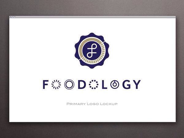
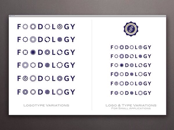
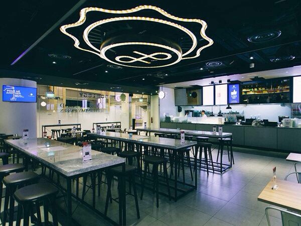
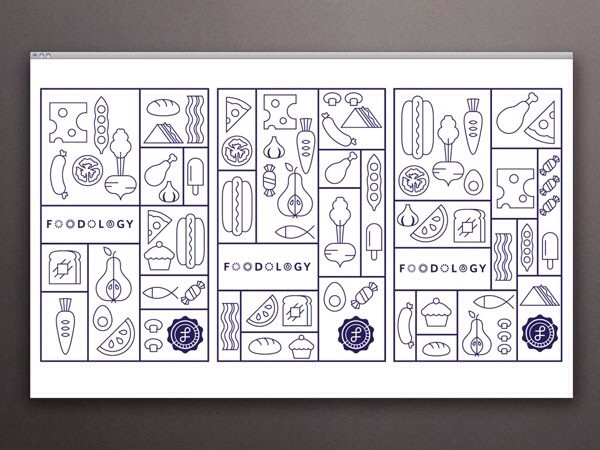
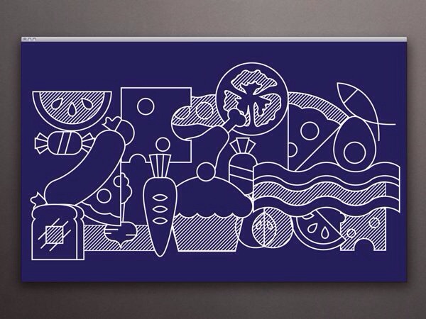
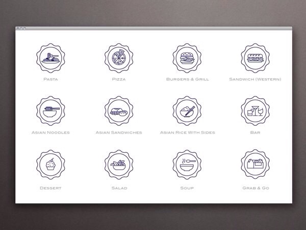
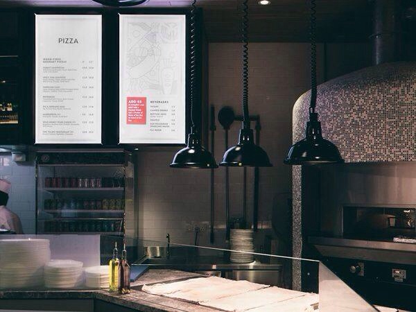
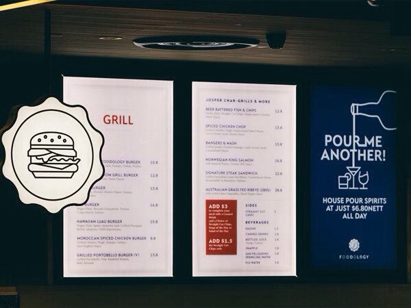
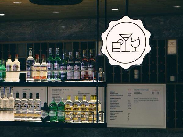
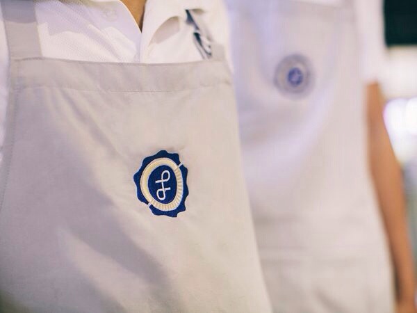
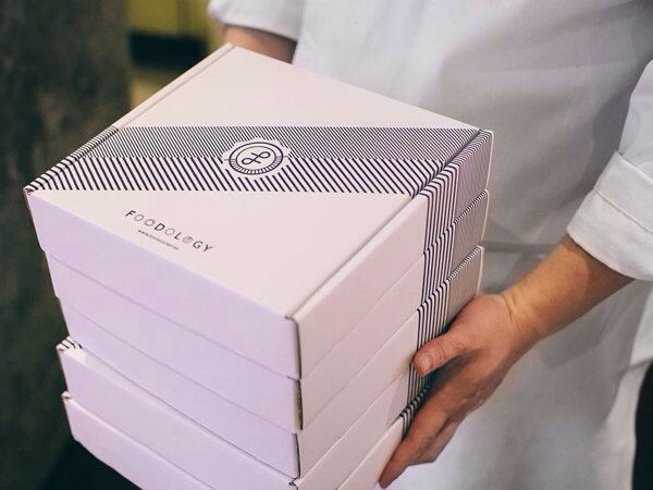
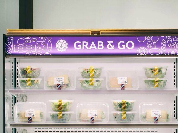
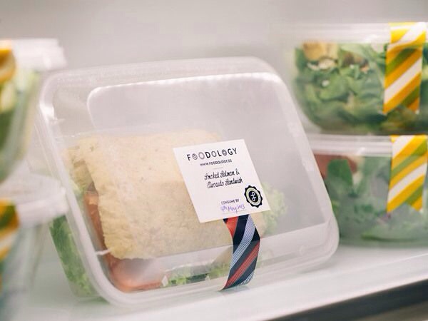
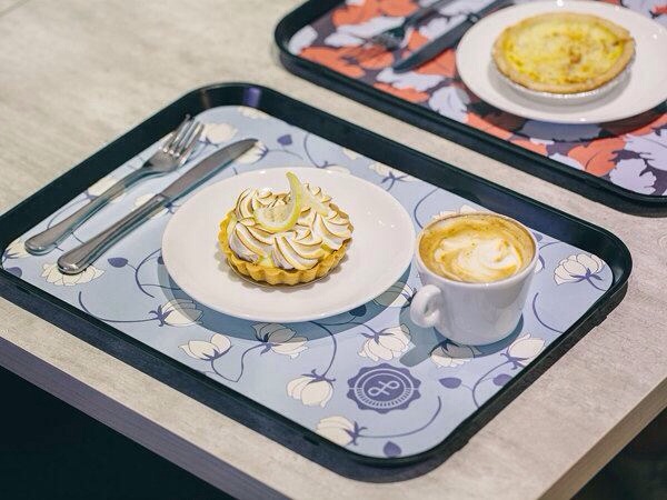
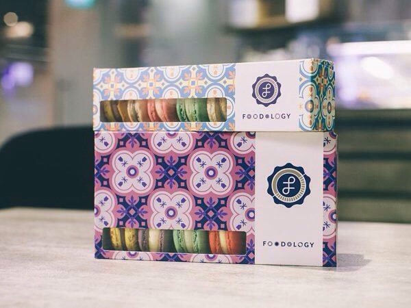
Let’s end the week with something truly inspired from the top down, inside and out. Foodology, based in Singapore, is a restaurant that offers “gourmet food at everyday prices.” The concept for the food isn’t unlike anything you’ve heard: it’s good food with quality ingredients but Foodology the restaurant concept serves quality and quantity. The location has nine separate dining stations, mapped out in the store with icons, which serves everything from pasta and pizza to soups, salads and sandwiches. It’s like a cafeteria, but everything is cooked on the spot and you can choose what you want. Foodology also aims to educate their customers about food at every opportunity and that mission inspires much of the brand identity that Somewhere Else created for Foodology. It begins with an icon-heavy palate with a bit of scholastic influences and moves into some really modern looks. It all comes together to look like the kind of cafeteria we’d all love to visit for lunch. It’s comfortable, smart and welcoming. The tray liners were inspired by the inside covers found in vintage books. It’s a smart reference and it ends up as something really attractive and they type of thing they could market, package and sell to customers in addition to being a part of the visual branding of the restaurant. The interiors are classy without being stuffy and make good use of lighting. The entire brand vibe represents the variations the restaurant offers, but manages to keep its roots deep in the intellect the brand projects.

