Queen Burger Restaurant Branding

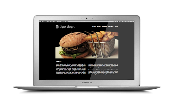
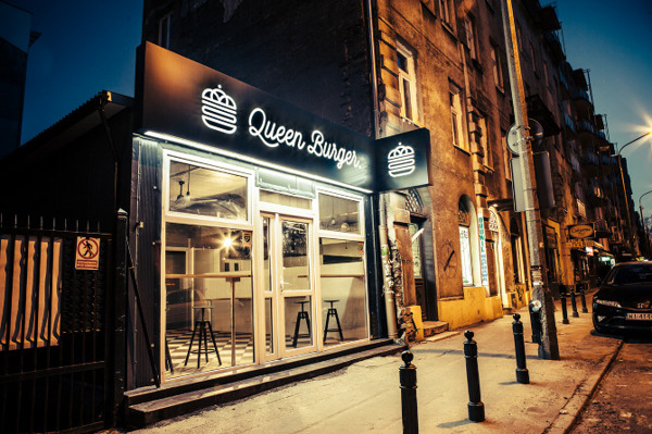
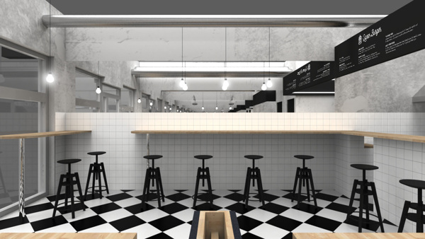
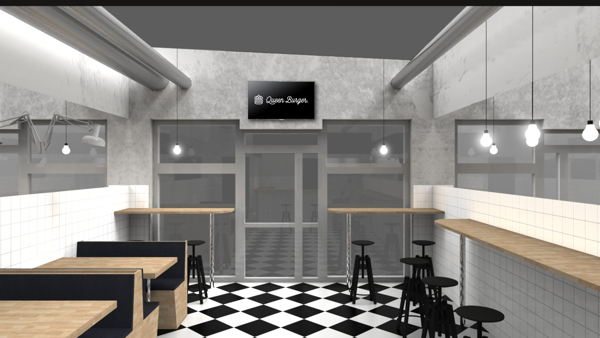
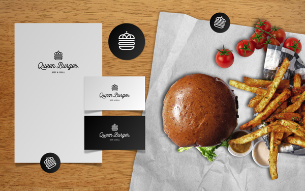
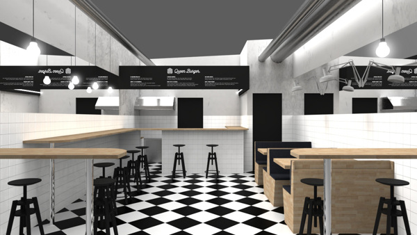
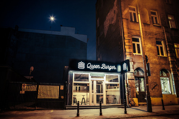
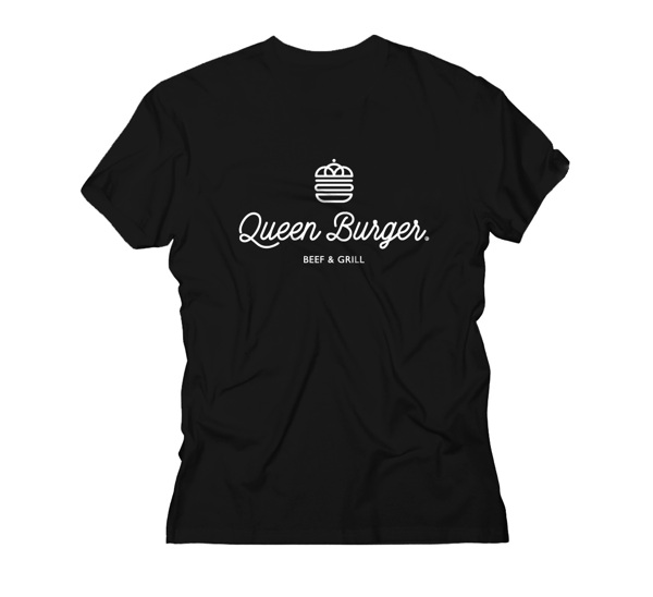
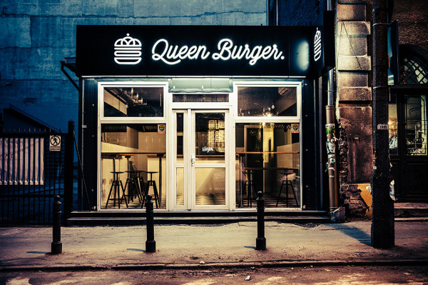
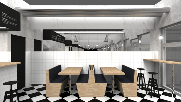
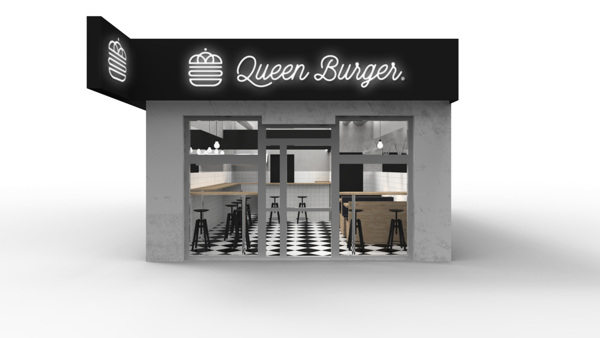
Queen Burger is black and white, and that’s not a bad thing at all. Using different textures and materials, the interiors are actually quite impressive. The use of intelligent lighting schemes also helps add drama to this burger joint’s interior. The logo is simple in its delivery. A burger is adorned neatly with a crown in place of the top bun making a subtle, yet poignant metaphor. Designed by Lange and Lange.
4fed1e6ae93b312dd9fb54c544c997f5

6dc2c40e2c1ace4044261a34931f89d5

438d908b96c26f4629fc4265288073df

6128d7c6d059e411ae703ae618d83dd6

70814daa763d435effa6f911636392ae

42853782c1b72590e47c7e195f1caa63

c0a5091700852e5ca1f5db0e1c2b8894

ceb29085403447081c6a76e7e9410437

d7027b7c1bffcda6da333c6f923675e7

d077726521d4c9a7475baeb88d1c62d2

e19dbc5da42dc283f6d2fbe7f0ad7235

f346d5b9d3f9f6f703e60c8128f7ea5f

f692295580147a7b1c36ac1592181015

Discuss this Project

Leave a Reply

This site uses Akismet to reduce spam. Learn how your comment data is processed.

The Forktales Podcast™: Interviews with restaurant industry leaders and visionaries

Restaurant and advertising industry headlines and thinking

Reviews of restaurant experiences from around the globe 

Reviews of our favorite design, business, & restaurant books

Our favorite typography and fonts

Inspiration in your inbox

Get the latest inspiration in your inbox every Monday morning, for FREE!

"*" indicates required fields

This field is for validation purposes and should be left unchanged.

Delicious Bits in your Inbox!

Get the latest and greatest content delivered to your inbox for free!

"*" indicates required fields

This field is for validation purposes and should be left unchanged.