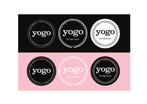
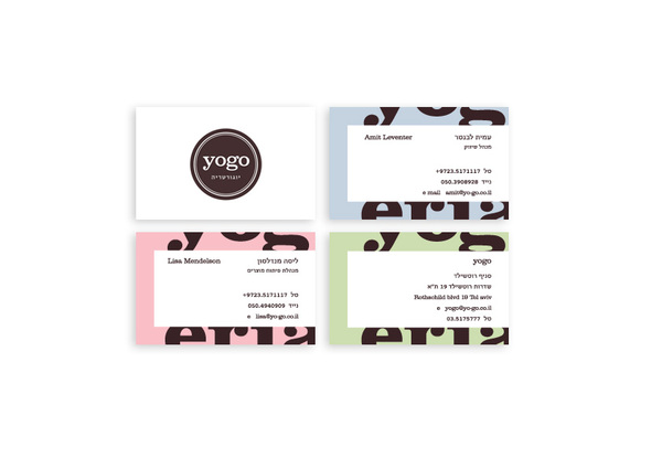
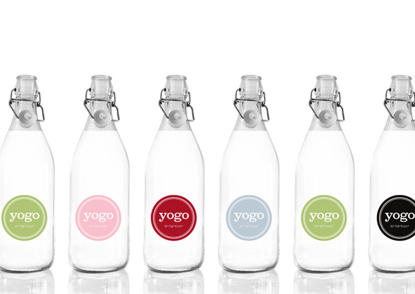
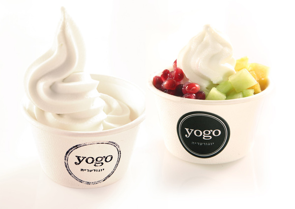
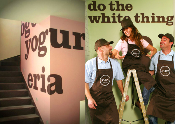
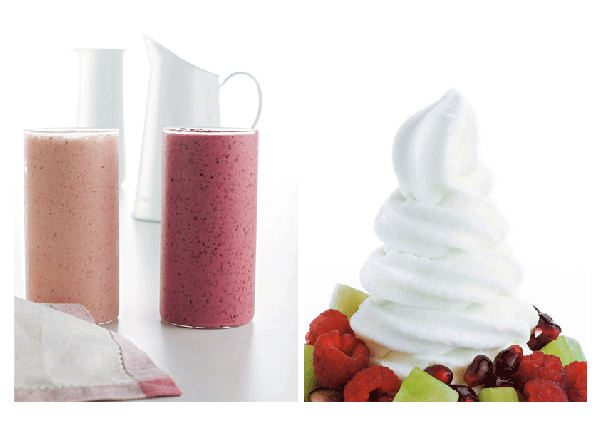
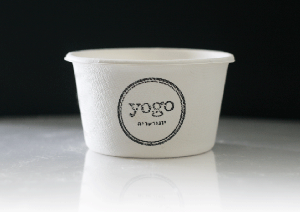
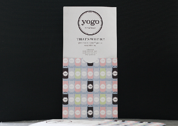
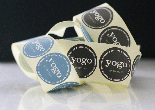
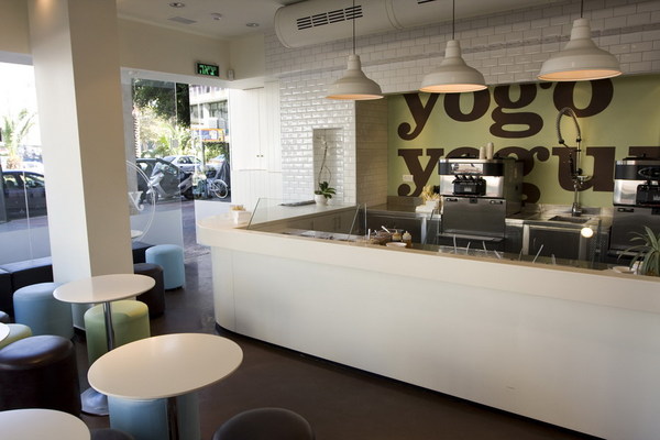
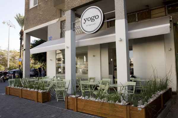
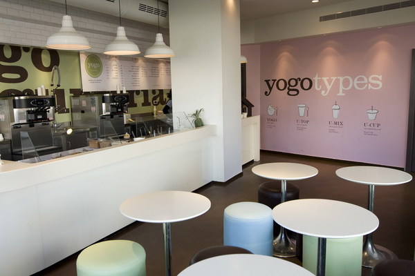
Frozen Yogurt shops took the nation by storm a few years back with boutique style storefronts and a self-serve, build-your-own format. Most of them looked like they had been cut from the same clothe: bright colors supported by plastic whites, tiled wall around the machines, and a fun name. YOGO starts to step away from these cliches a bit, but not completely. The name is fun, short and easy to remember. It evokes the thought of quickness, grab and go. The logo is simple and easy to spot when put in context of other yogurt shops.
Instead of fluorescent, bright colors, YOGO is using softer pastels which lighten the mood without being plastic and fake. They’re also using a serif typeface which keeps things rooted in the classic. Overall it seems like an upscale take on yogurt concept brand.
Designed by Koniak
