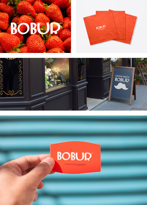
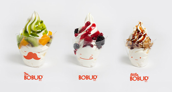
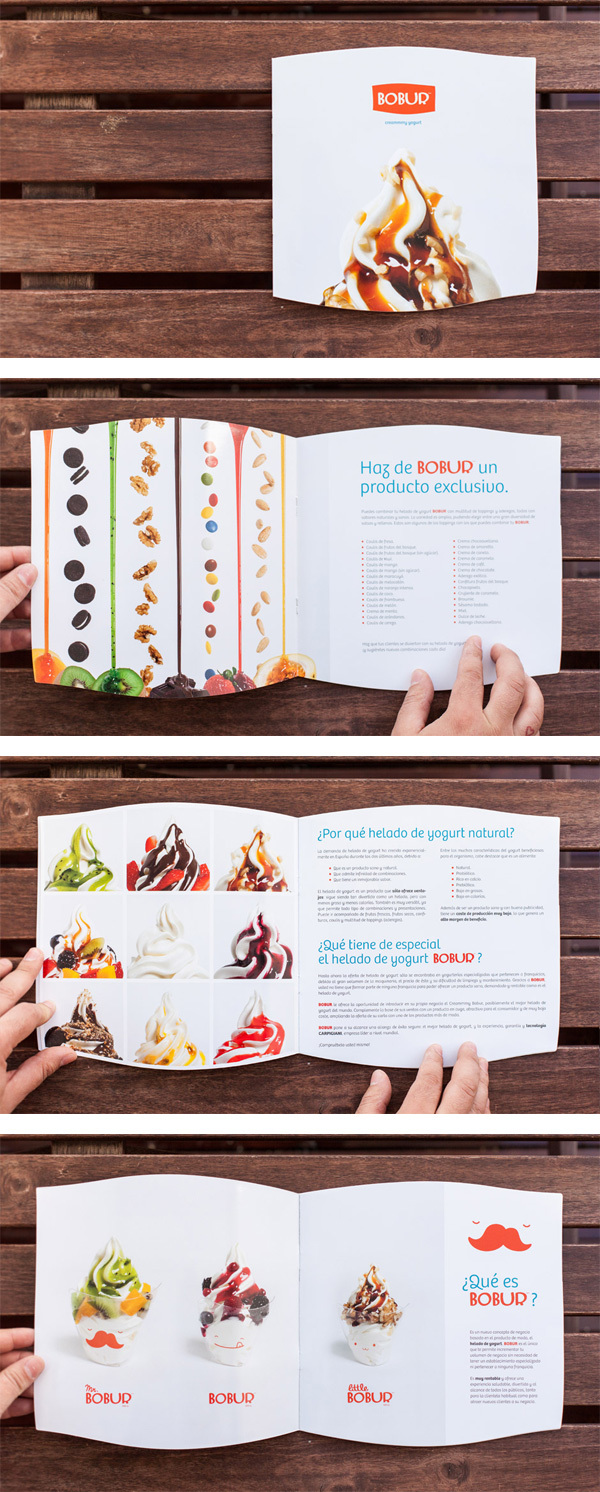
I thought we’d stick with the yogurt theme for the day. Maybe it’s because it’s so dang nice here in Atlanta that I’m fiending for some of this cultured goodness. No matter what the reason, here is an awesome brand development for a yogurt product called Bobur.

The color palette helps the basic logo and it’s unique logotype pop while beautiful photography gets the mouth watering. The business cards for the yogurt company take on the shape of the logo making it memorable while driving home the identity.

Designed by Pixelarte
2db263dfcdefdc2d32c48242d84cfc11

84ee2c54911c4f15d4d007c1a5a03cad

7016f9b6d0d2cc4f97f1da2d2ac6251f e11d7168796a04a2efef45d17d310e3d

Discuss this Project

Leave a Reply

This site uses Akismet to reduce spam. Learn how your comment data is processed.

The Forktales Podcast™: Interviews with restaurant industry leaders and visionaries

Restaurant and advertising industry headlines and thinking

Reviews of restaurant experiences from around the globe 

Reviews of our favorite design, business, & restaurant books

Our favorite typography and fonts

Inspiration in your inbox

Get the latest inspiration in your inbox every Monday morning, for FREE!

"*" indicates required fields

This field is for validation purposes and should be left unchanged.

Delicious Bits in your Inbox!

Get the latest and greatest content delivered to your inbox for free!

"*" indicates required fields

This field is for validation purposes and should be left unchanged.