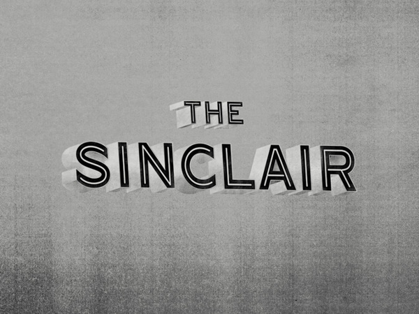
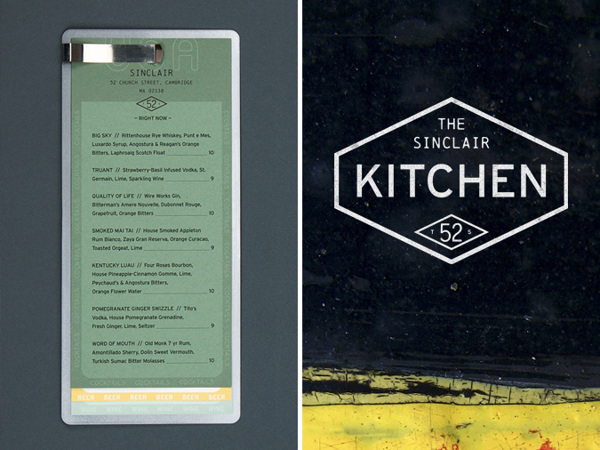
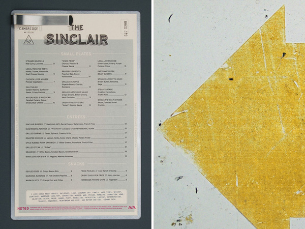
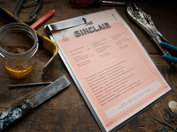
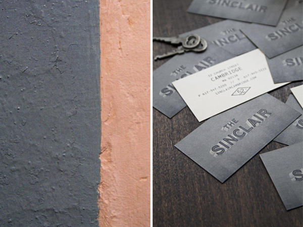
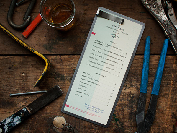
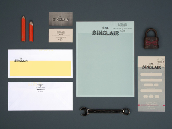
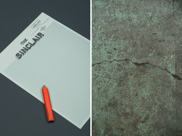
The Sinclair, a project by the design studio OAT, has a super unique look about it. It’s one part nostaglic cinema, one part retro design, and one part fresh take on restaurant branding. What strikes me as the most unique and stunning is the menu design. Maybe it’s the old school feel of the layout, like a 1920’s TPS report, or just it’s simplicity that allows accoutrements like rubber stamping to stand out as something special. Either way, enjoy this little masterpiece.
2fc962630ae439b4c1ec5eb73dc12cbc

3d6ad2cc0aba438f752777c43fb298fd

5e698ab7821cdb3d978ae0f05ba84604

34e6b96a61d23bbc21e3f10fcb59df31

039e5deec3e379be23b0bfd806b5dde4

5364c0be54cd11a5145d1095cf849d5b

da4042970cd89b58b42cc64e74307066

e9dd31f282a54fd561e4b12611a5c9ba

Discuss this Project

Leave a Reply

This site uses Akismet to reduce spam. Learn how your comment data is processed.

The Forktales Podcast™: Interviews with restaurant industry leaders and visionaries

Restaurant and advertising industry headlines and thinking

Reviews of restaurant experiences from around the globe 

Reviews of our favorite design, business, & restaurant books

Our favorite typography and fonts

Inspiration in your inbox

Get the latest inspiration in your inbox every Monday morning, for FREE!

"*" indicates required fields

This field is for validation purposes and should be left unchanged.

Delicious Bits in your Inbox!

Get the latest and greatest content delivered to your inbox for free!

"*" indicates required fields

This field is for validation purposes and should be left unchanged.