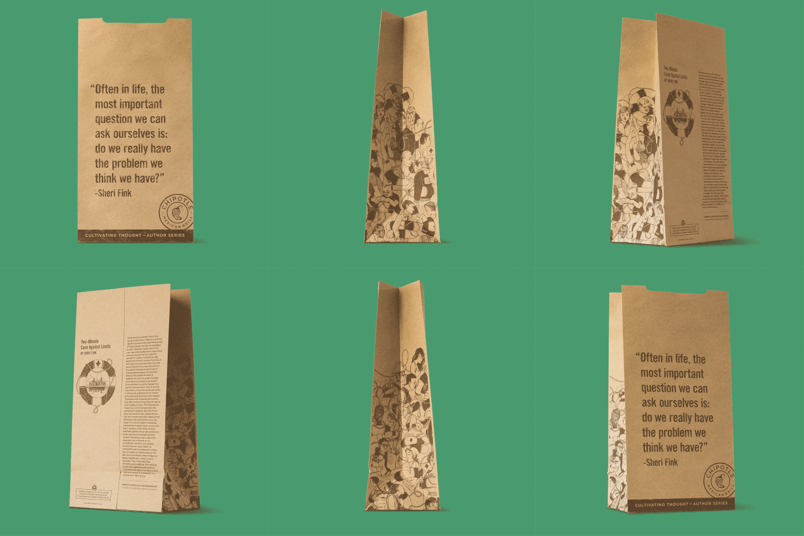
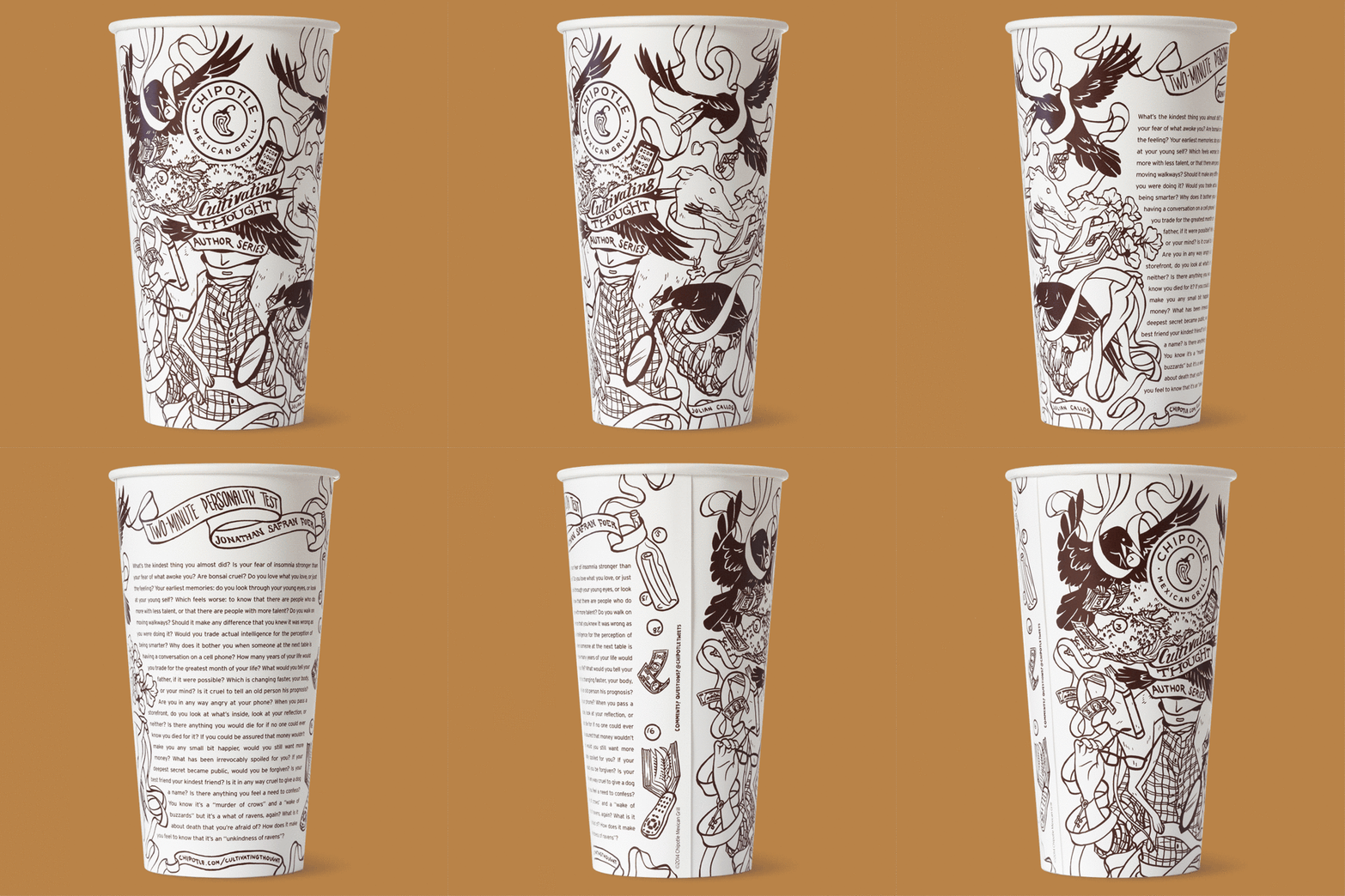
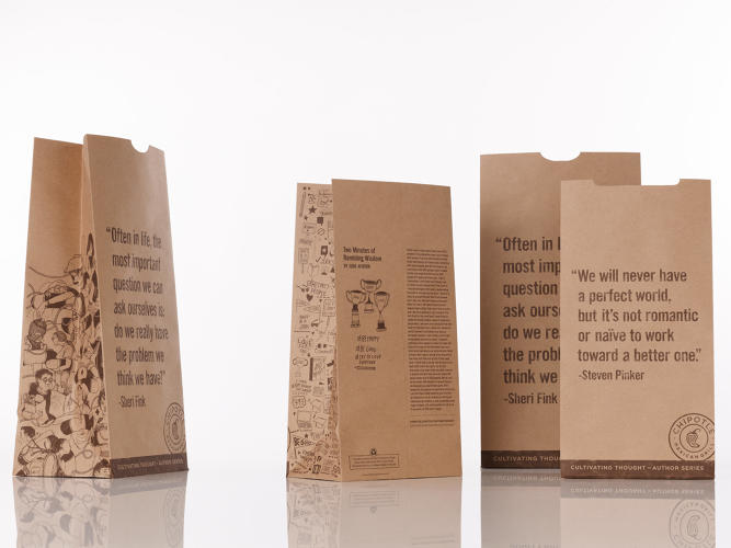
Starting today Chipotle launches a new packaging family. The design is highly aspirational with words of inspiration and illustrations that match a unique story written on each piece. This makes every element of the packaging family a different experience for the customer. They aren’t food focused, though.
There is a 2-minute personality test that asks questions like “Is it any way cruel to give a dog a name? Is your fear of insomnia stronger than your fear of what awoke you? Why does it bother you when someone at the next table is having a conversation on a cell phone?”
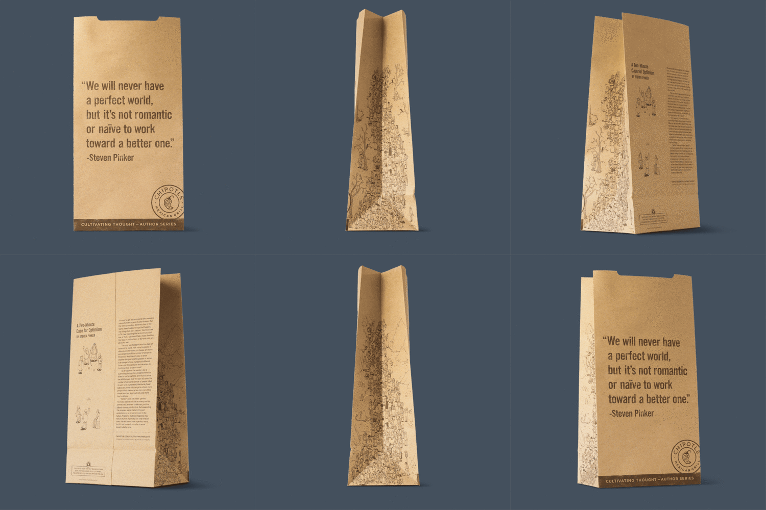
On another piece, Steven Pinker, the psychologist, writes about how the world is getting better–fewer wars, less violence, more democracy, more health–in a two-minute case for optimism. “We will never have a perfect world, but it’s not romantic or naive to work toward a better one,” he writes.
We’ve never used our packaging in the traditional sense that fast food uses them, to promote things like Coca-Cola. This takes people out of their daily routine a little bit, maybe gets them to think about their world in a different way.
– Mark Crumpacker, CMO of Chipotle
The project is the brainchild of author Jonathan Safran Foer, who was eating lunch at a Chipotle restaurant, and wished he had something to read while he sat by himself. Since he knew some folks at the company and decided to pitch his idea: What if Chipotle’s packaging was more like a book or a magazine?
The results are a user experience that further enforces the restaurant’s dedication to the consumer’s health. In this case, mental health, promoting optimism and some fun.
What are your thoughts on the restaurant’s new takeout packaging designs and angle?


