McDonald’s Paris Advertising Minimalism

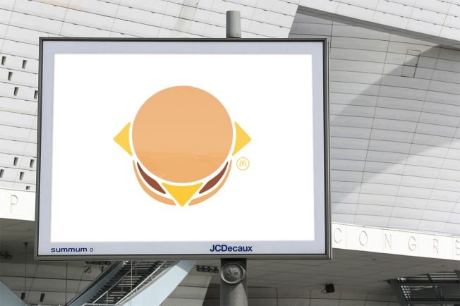
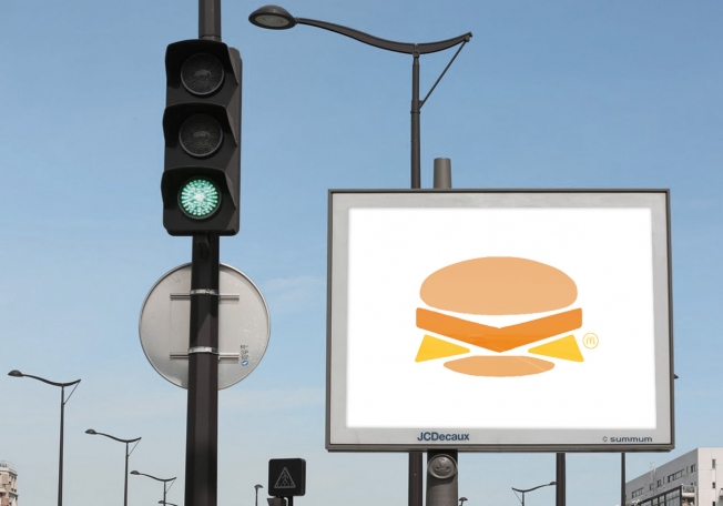
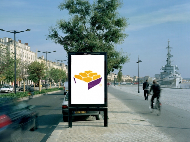
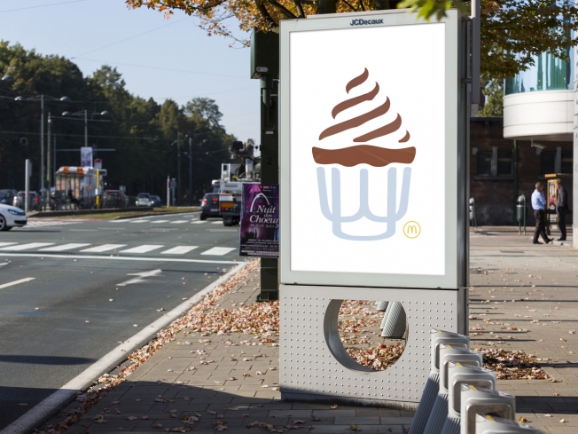
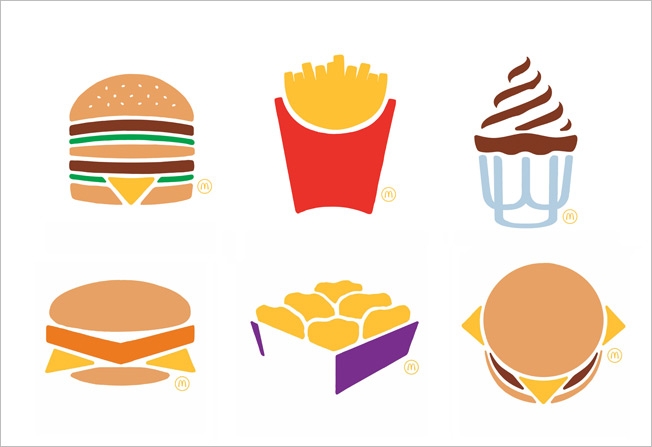
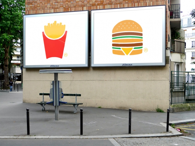
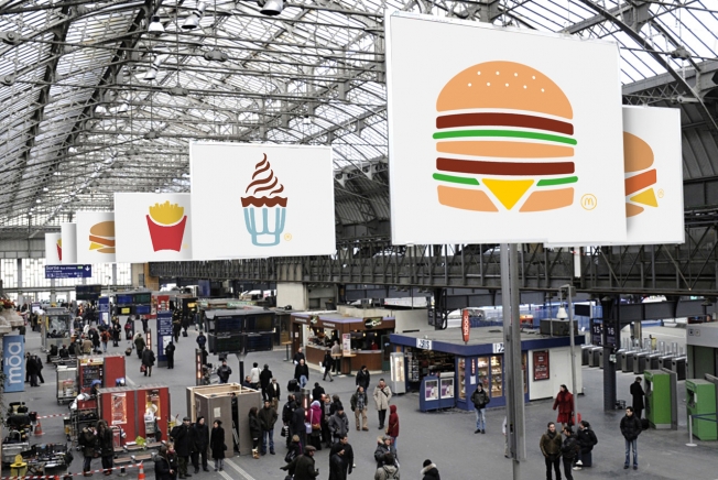
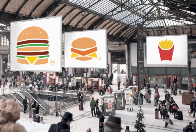
McDonald’s Paris shows off its amazing brand recognition by simplifying down “The Big 6.” First, this is awesome. The food items themselves are so iconic that they can stylize them to the bare minimum and have them still be recognizable as McDonalds. Their brand identity has extended into the actual food. Of course this only happens through consistency, frequency and reach. The fact that McDonald’s has controlled their process to the point of perfecting the presentation and look of its food is amazing. Especially across the world. Anyway, enough gushing, enjoy the work done by TBWA. Found on AdFreak
 

mcdonalds-art-1

mcdonalds-art-2

mcdonalds-art-3

mcdonalds-art-4

mcdonalds-art-5

mcdonalds-art-6

mcdonalds-art-7

mcdonalds-art-final-hed-2014


Discuss this Project

Leave a Reply

This site uses Akismet to reduce spam. Learn how your comment data is processed.

The Forktales Podcast™: Interviews with restaurant industry leaders and visionaries

Restaurant and advertising industry headlines and thinking

Reviews of restaurant experiences from around the globe 

Reviews of our favorite design, business, & restaurant books

Our favorite typography and fonts

Inspiration in your inbox

Get the latest inspiration in your inbox every Monday morning, for FREE!

"*" indicates required fields

This field is for validation purposes and should be left unchanged.

Delicious Bits in your Inbox!

Get the latest and greatest content delivered to your inbox for free!

"*" indicates required fields

This field is for validation purposes and should be left unchanged.