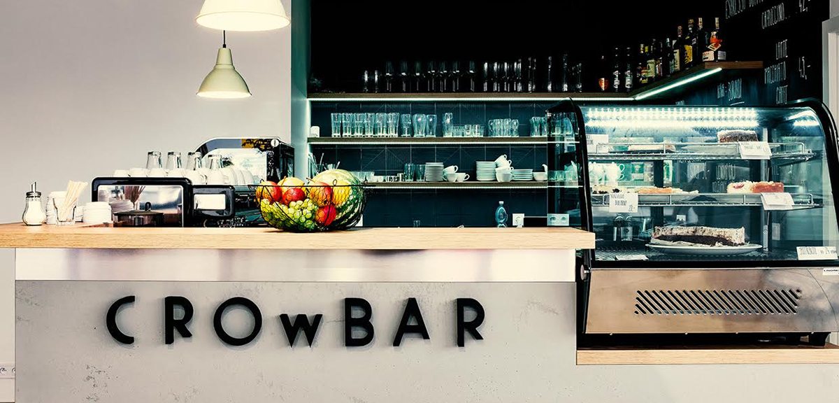
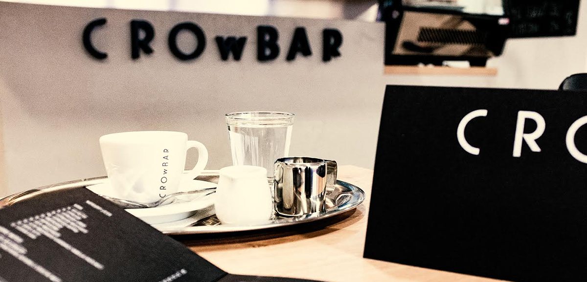
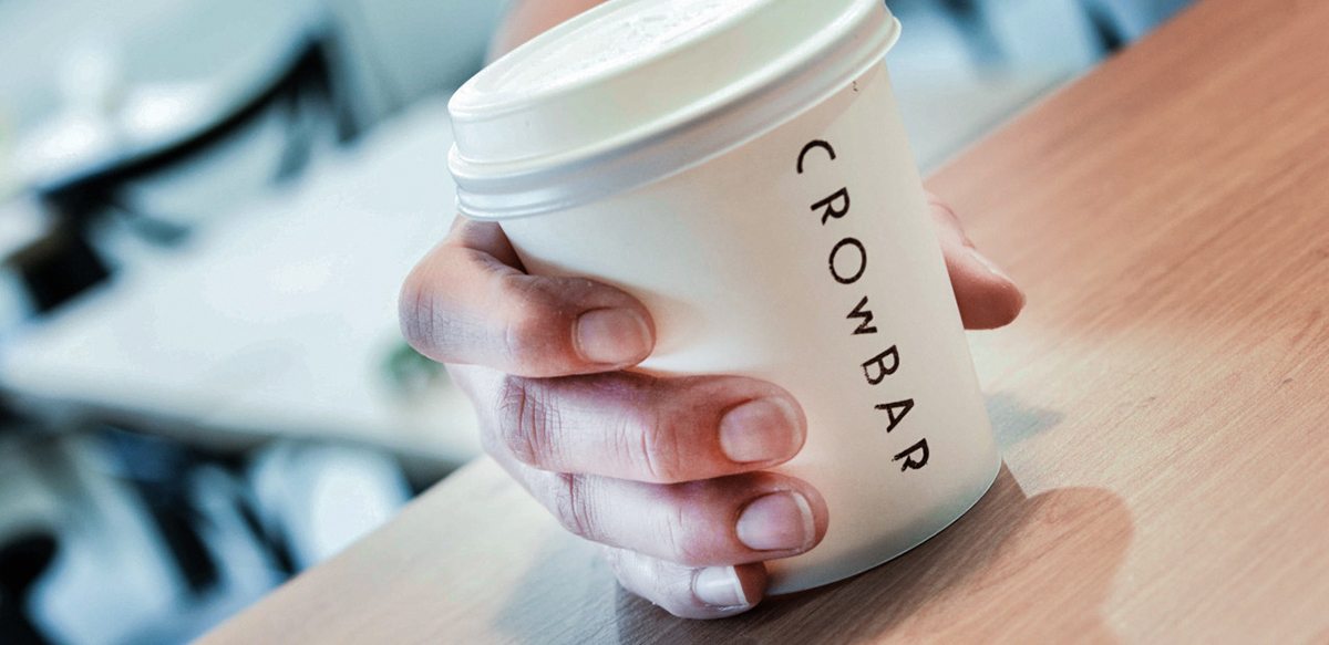
Cafe Crowbar is a small cafe in Brno, Czech Republic. It’s a simple brand, meant to be cost-effective, and easy to reproduce over several touchpoints. The wordmark itself is unique enough where it accomplishes a strong sense of brand recognition without having to relay on other colors or fancy finishes. I couldn’t find any context as to why the letters are cropped the way they are, so my guess is just to add visual interest and make the wordmark stand out.
Café Crowbar Visual Identity by Hany Zackova.


