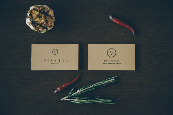
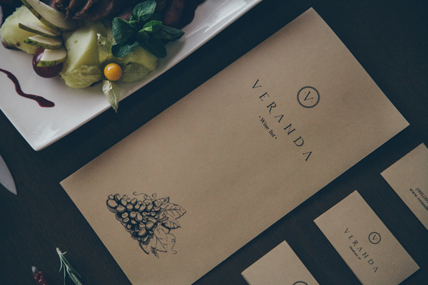
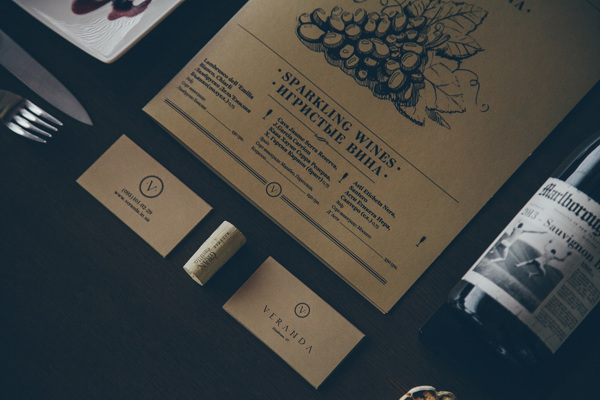
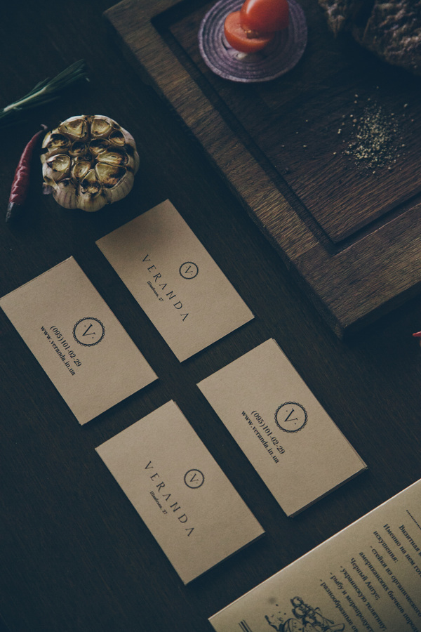
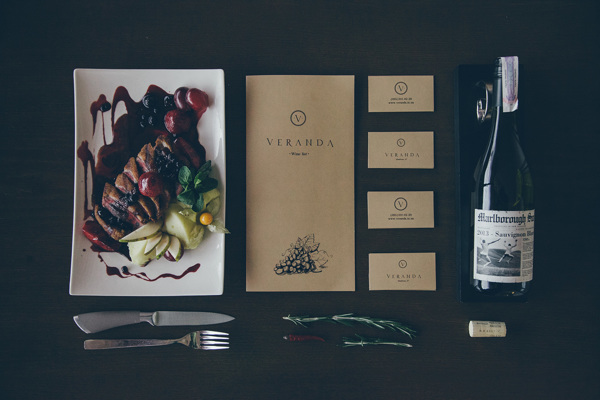
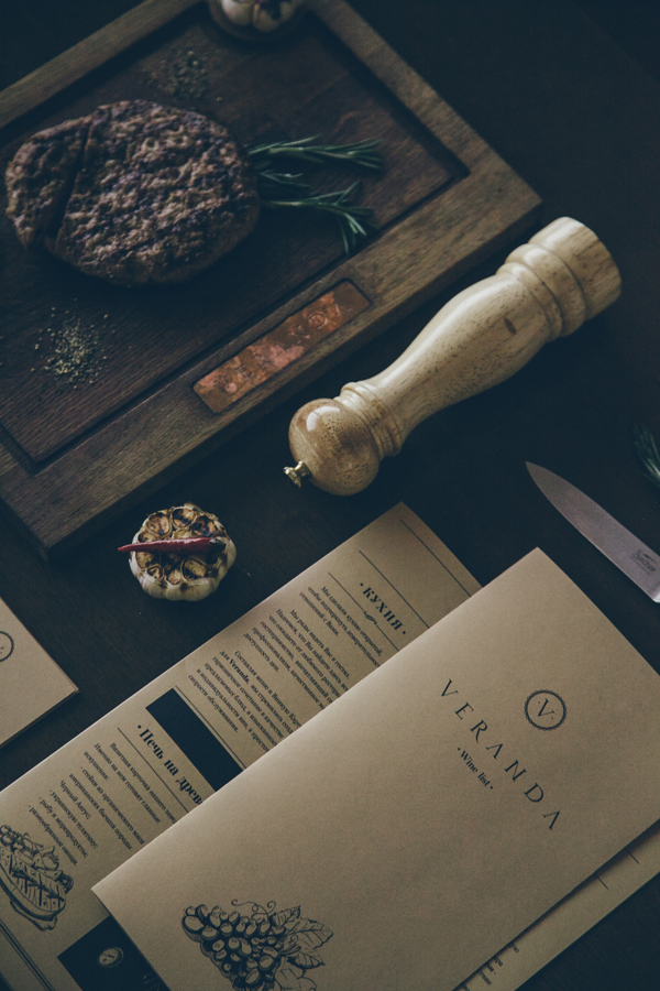
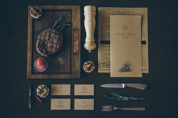
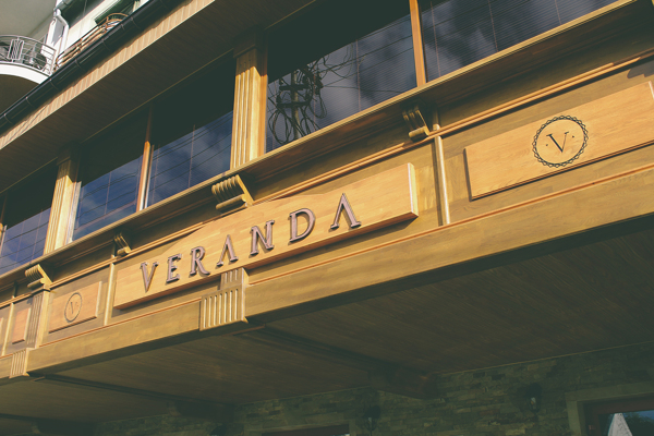
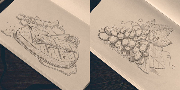
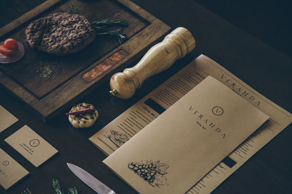
Simple, classy and confident are three words I’d use to describe the brand identity design for the restaurant Veranda. Designed by Forma Line Collective, the brand is rooted in natural textures and driven by a use of classic serif typography giving it an old world feel that’s comfortable and familiar. The pen and ink illustrations take this vibe and push it even further.


3 Responses
I’ve never been a big fan of pictures of food in menus (I get that it helps aid in boosting food sales of certain items), however, the hand drawn illustration is pretty unique approach. I’m not a huge fan of the “R” in the type though.
Yeah. A lot of designers don’t like it, but this is a commercial art and pictures sell. Done right, i think photography can be gorgeous on a menu. Not like Denny’s or Red Lobster. Haha.
No love for the “R”? Anything in particular. I know it disrupts the flow a little bit, but i think that’s a good thing. It’s not unnatural.
I really enjoy the balance created by the V and the inverse V creating an A (beginning and end). I think that is the appealing detail in the word mark.