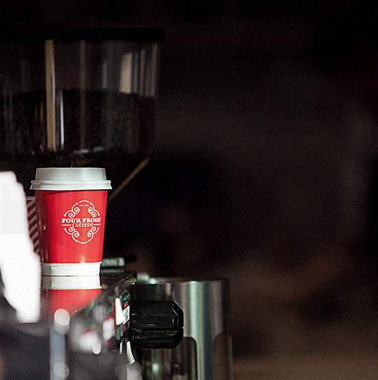
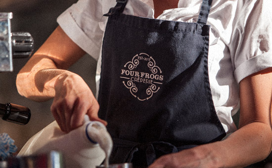
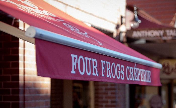
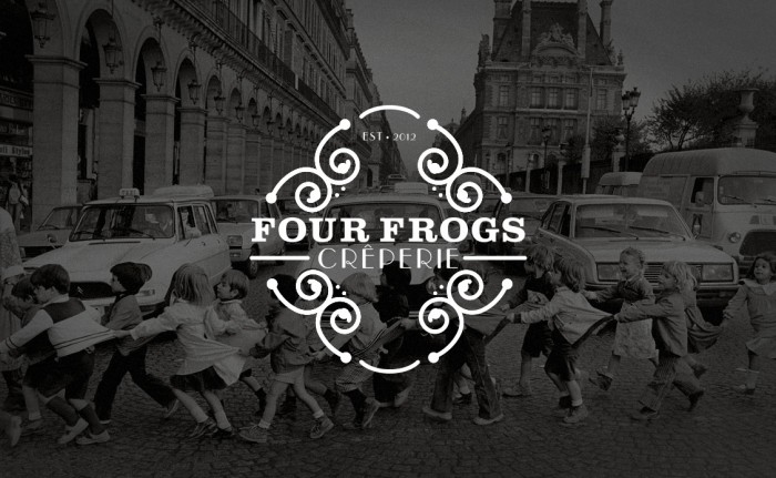
Although there isn’t much to show, the brand identity for Four Frogs Creperie is worth covering. The identity for this restaurant is spearheaded by a simple type treatment enclosed with geometric flourishes. The type is a combination of traditional serif supported by a notoriously sexy Art Deco typeface. The color palette is limited to black, white and creating a highly contrasted, confident tone. Designed by the National Grid.