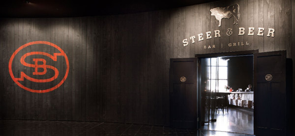
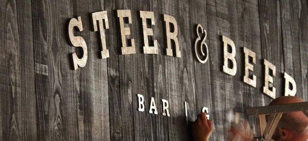
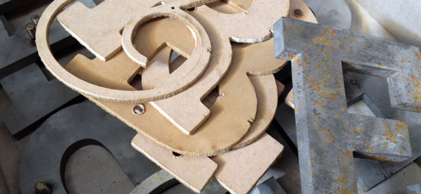
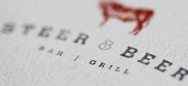
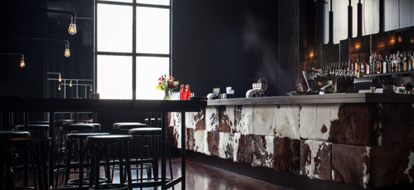
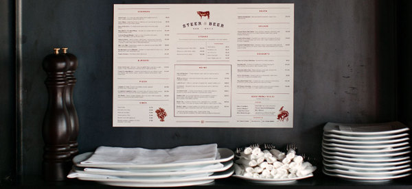
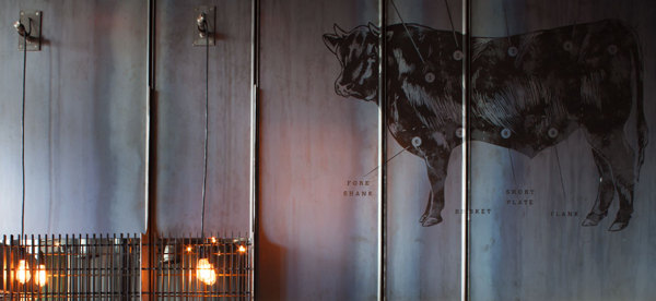
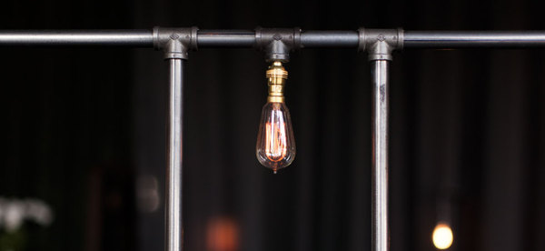
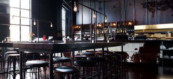
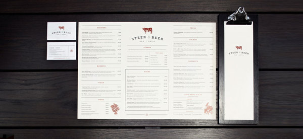
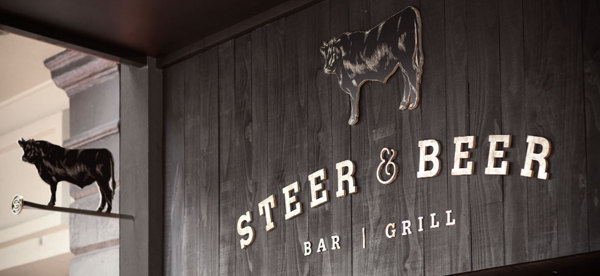
Love this ultra farmhouse inspired restaurant design. From the interiors, architecture, signage and through the brand identity this restaurant is on point. The textures of the distressed wood and clever use of cowhide create a fresh take on what could be an old cliche styled restaurant experience. The brand identity is simplified naturally into a graphic mark that’s easily recognizable and reminiscent of an old branding iron pattern. The menu is laid out simply with enough white space to keep things readable. Amazing design by Inject Design in New Zealand.
