Pizza Vinoteca restaurant branding

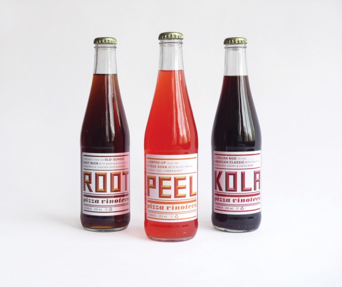
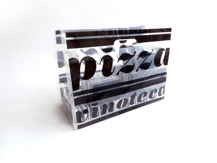
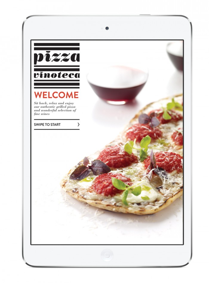
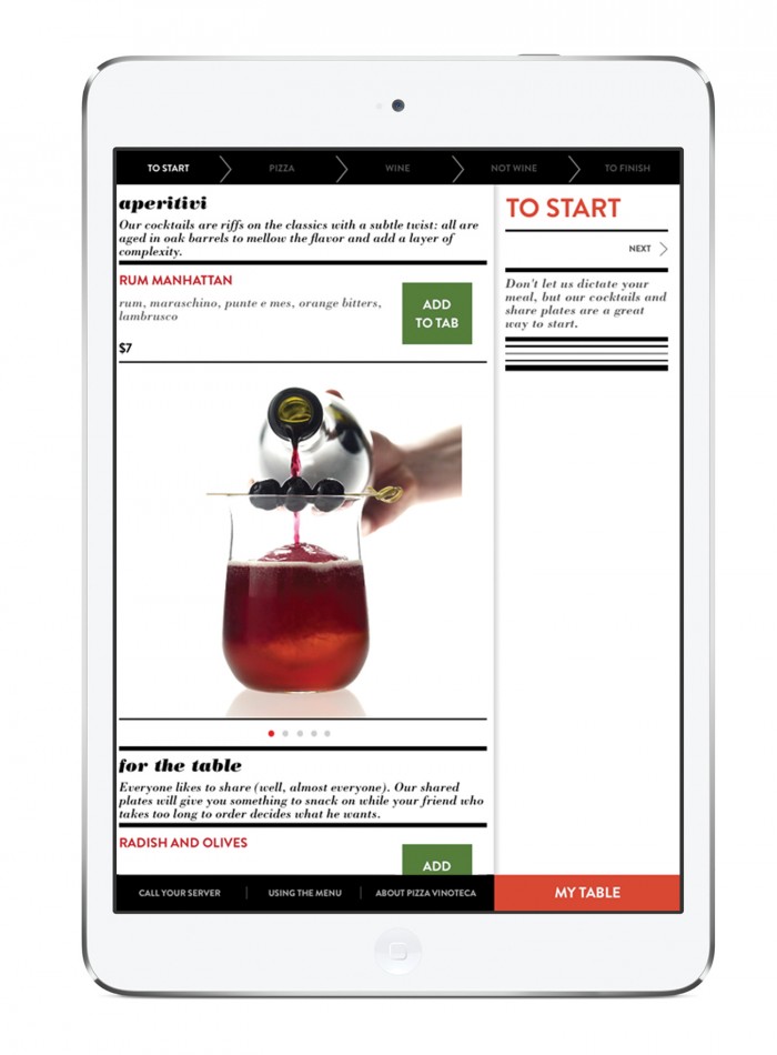
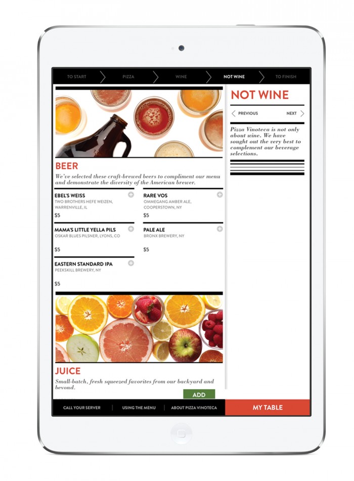
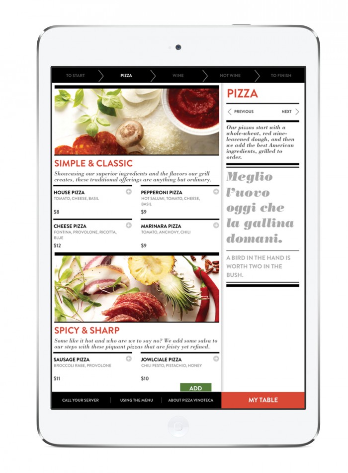
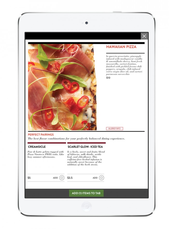
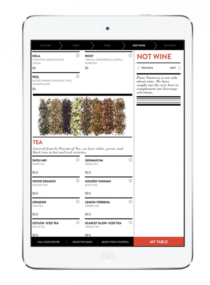
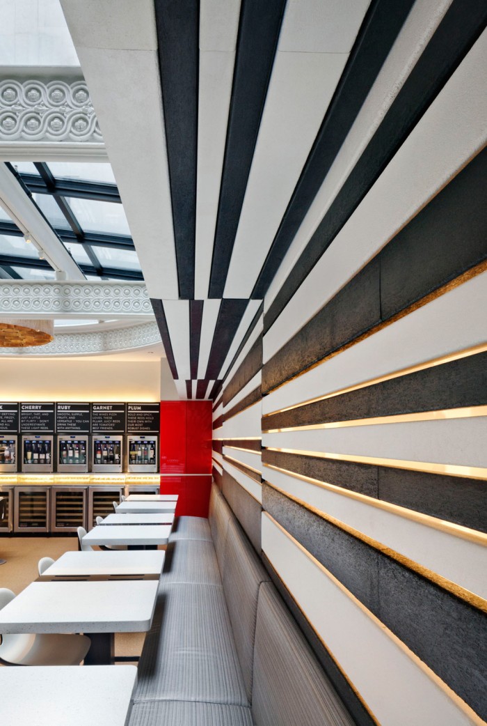
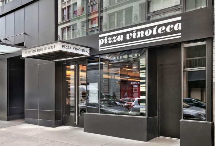
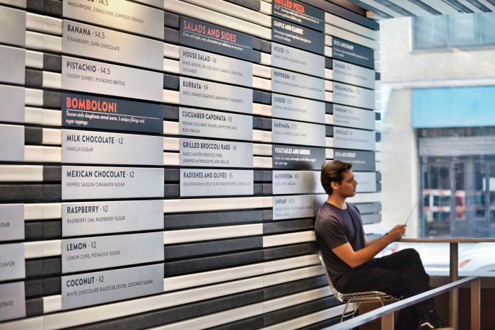
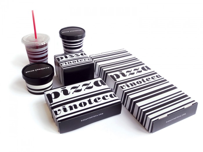
Gonna end the week with more Memo love. This project is for Pizza Vinoteca and is an exploration of high contrast, black and white shape versus typography. The quick description can be read at their website, but here’s a snippet:

The founder of Pizza Vinoteca had a vision to create a fast-casual restaurant and take-out destination that would redefine casual dining in New York City. The goal was to create a highly designed dining destination where the best of fine dining (high quality ingredients, 4-star preparations, and top notch service) was available at a great price in a technology-enhanced environment.

Architect: Biber Architects
Architectural Photography: Andrew Bordwin
IMG_1027

IMG_1046

IMG_1052

pvt_ipad_01_HI-RES

pvt_ipad_02_HI-RES

pvt_ipad_03_HI-RES

pvt_ipad_04_HI-RES

pvt_ipad_05_HI-RES

pvt_ipad_06_HI-RES

PVT-LOGO

Bordwin_PizzaVinoteca_5359C

Bordwin_PizzaVinoteca_5994C Bordwin_PizzaVinoteca_5432

Discuss this Project

2 Responses

Leave a Reply

This site uses Akismet to reduce spam. Learn how your comment data is processed.

The Forktales Podcast™: Interviews with restaurant industry leaders and visionaries

Restaurant and advertising industry headlines and thinking

Reviews of restaurant experiences from around the globe 

Reviews of our favorite design, business, & restaurant books

Our favorite typography and fonts

Inspiration in your inbox

Get the latest inspiration in your inbox every Monday morning, for FREE!

"*" indicates required fields

This field is for validation purposes and should be left unchanged.

Delicious Bits in your Inbox!

Get the latest and greatest content delivered to your inbox for free!

"*" indicates required fields

This field is for validation purposes and should be left unchanged.