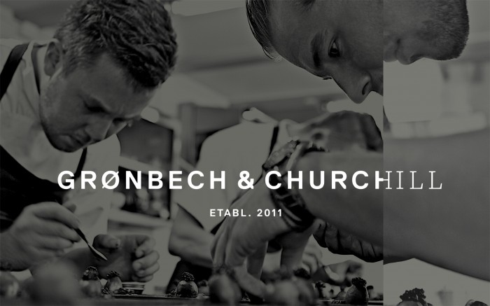
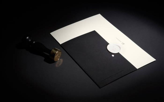
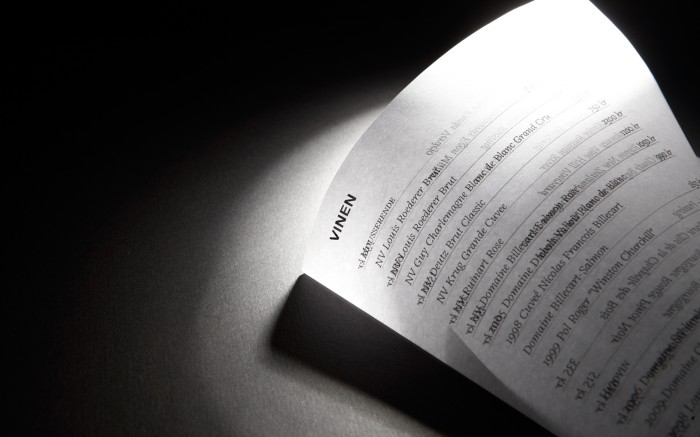
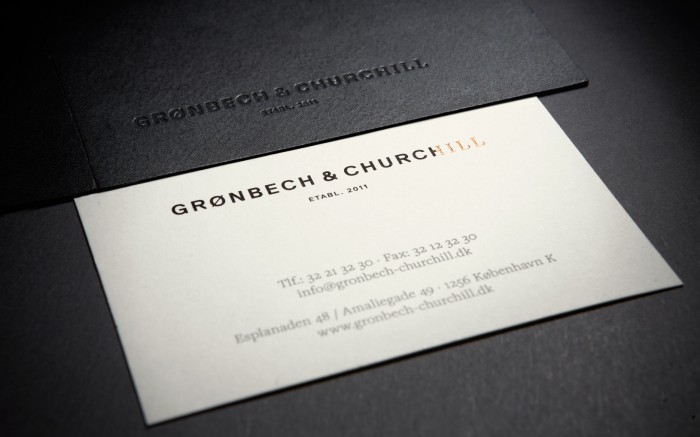
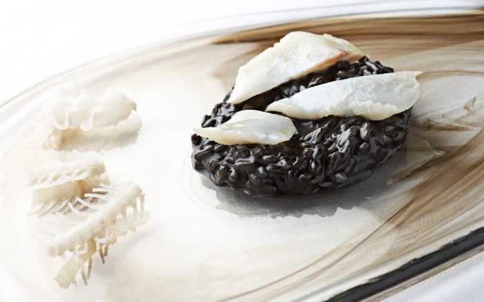
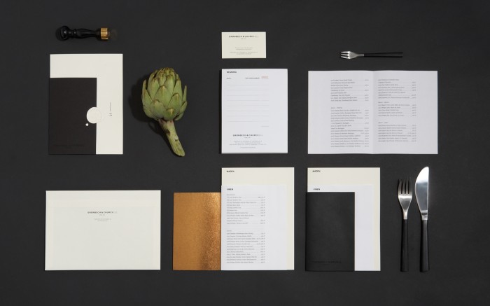
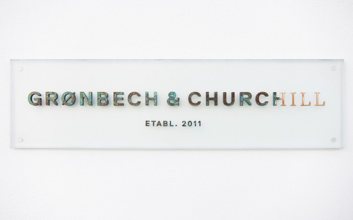
Sometimes a typeface is so excellent there is no need to embellish it with graphic treatments. Only a slight, unexpected alteration is enough to send home a highend, upscale feel. That’s what’s happening with the brand identity for Gronbech & Churchill. The logotype is a visual representation in portraying the act of refining produce from its raw form. How poignant! The supporting materials that comprise the identity all further bolster this refined attitude with extra accoutrements like wax seals, hand lettering and different paper textures.
Designed by Re-public.
