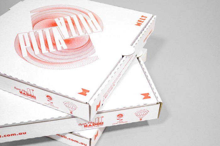
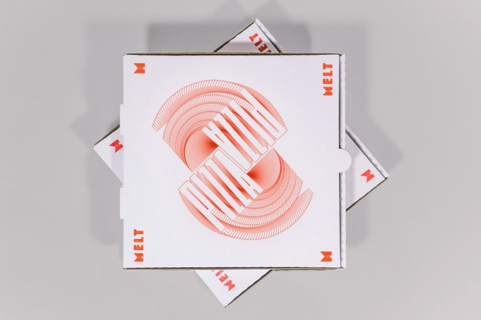
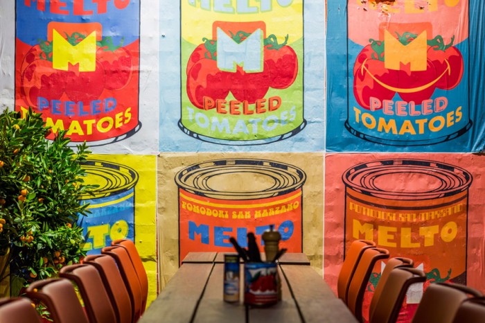
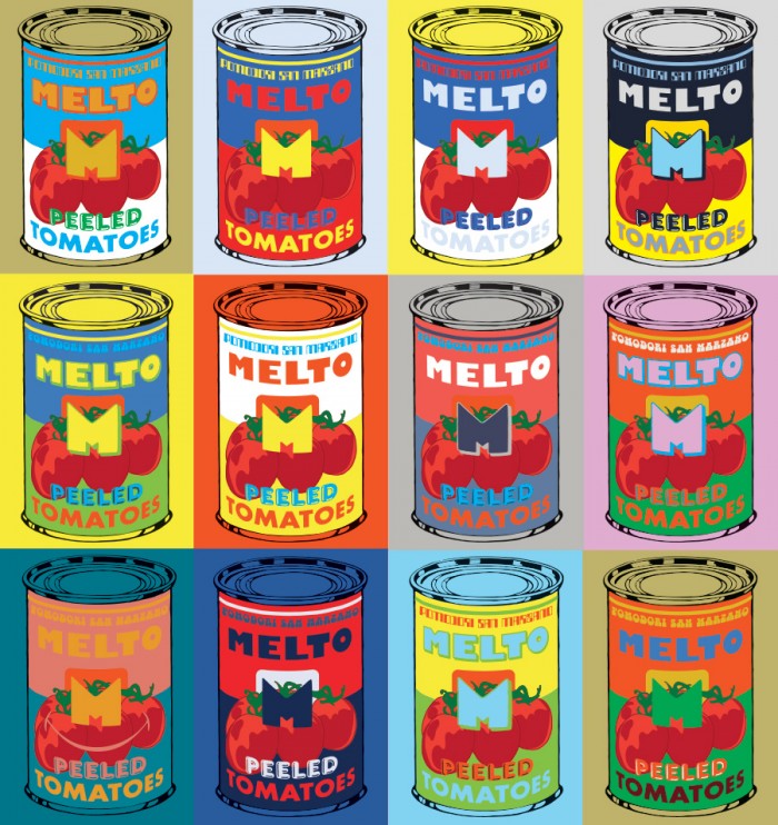
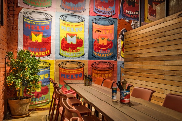
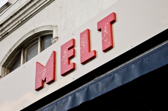
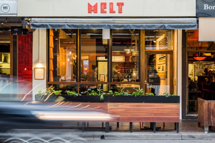
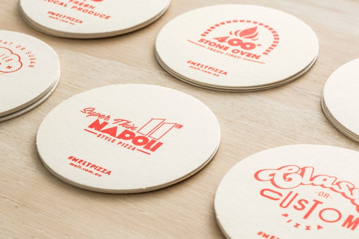
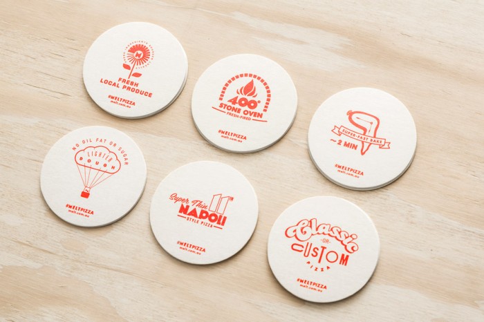
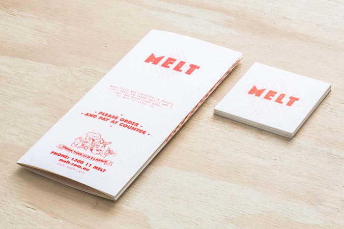
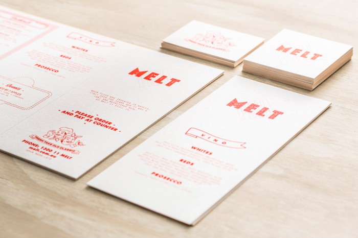
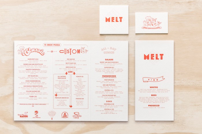
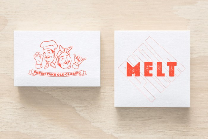
A lot of times the pizza world defaults to the expected red, green and white color palette with script typographical treatments. It’s safe. It’s a go-to. Melt bucks this trend completely. The team at Can I Play (Australia) created a fresher brand identity for their up and coming pizza client. Their take includes nods to Andy Warhol, thick and chunky typography, and a vibrant color palette that pops out from the standard issue pizza brand identities you see today. The logo type treatment was created from melted cheese cut into the letterforms needed to spell MELT. Absolutely brilliant.
Richard Baird has excellent opinions and commentary over at BP&O
