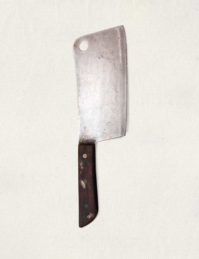
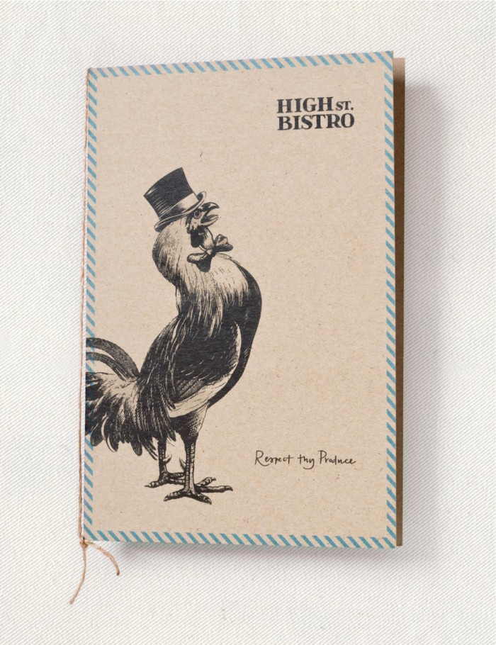
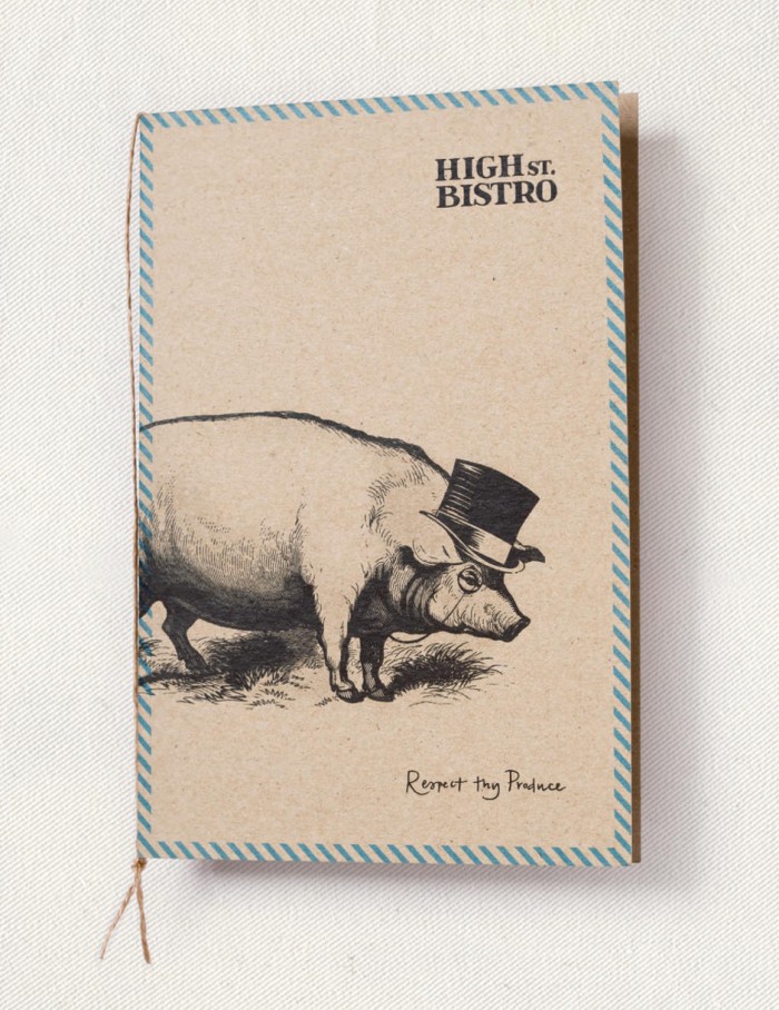
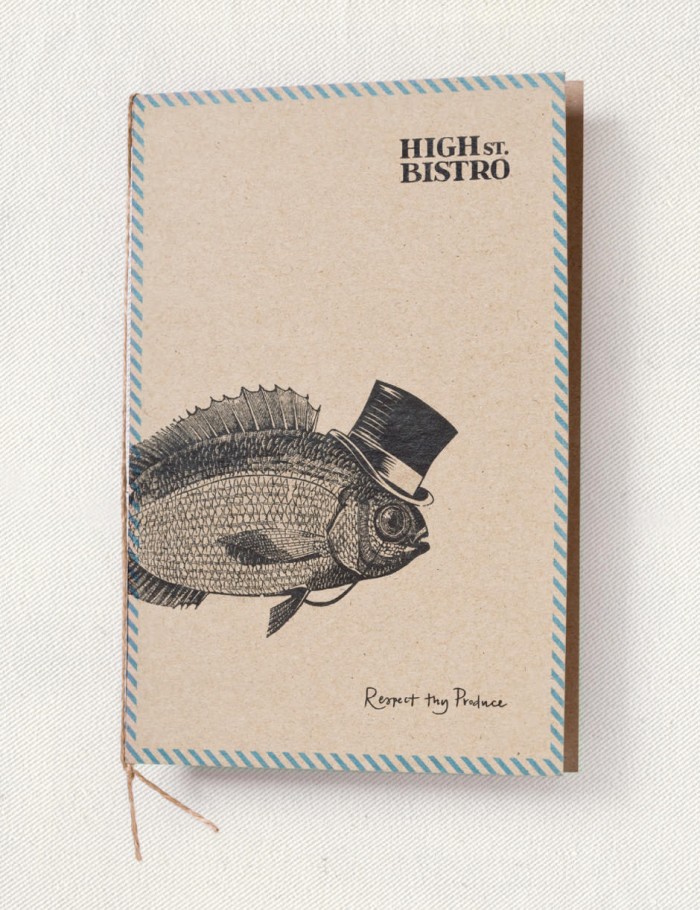
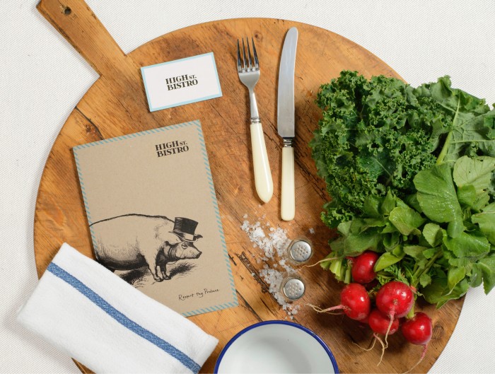
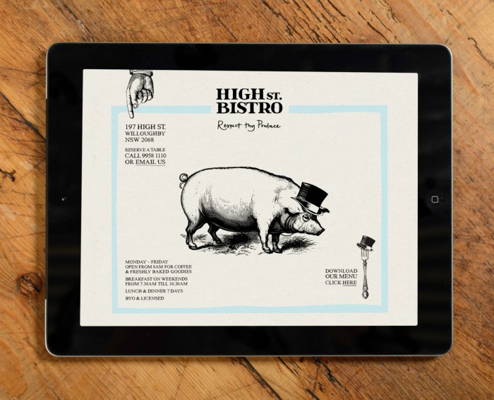
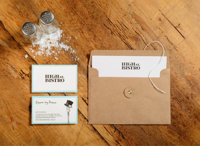
The brand identity design for High St. Bistro is a simple combination of pen and ink illustration and simple design. It’s a tough rope to walk as it can be easily over done, but the layout design for each piece lets the illustration take front and center with just enough supporting elements to make it unique. I really enjoy the slight anthropomorphism in the compositions with adding hats and monocles to the subjects. It makes for a unique touch that can be owned by the restaurant. Designed by SquadInk.
highst_7

highst_6

highst_5

highst_4

highst_3

highst_2

highst_1

Discuss this Project

Leave a Reply

This site uses Akismet to reduce spam. Learn how your comment data is processed.

The Forktales Podcast™: Interviews with restaurant industry leaders and visionaries

Restaurant and advertising industry headlines and thinking

Reviews of restaurant experiences from around the globe 

Reviews of our favorite design, business, & restaurant books

Our favorite typography and fonts

Inspiration in your inbox

Get the latest inspiration in your inbox every Monday morning, for FREE!

"*" indicates required fields

This field is for validation purposes and should be left unchanged.

Delicious Bits in your Inbox!

Get the latest and greatest content delivered to your inbox for free!

"*" indicates required fields

This field is for validation purposes and should be left unchanged.