For those that don’t know, OpenTable is the leader in online reservations for the restaurant world. They’ve been the go-to company for over 17 years seating more than 16 million diners per month via online bookings across more than 32,000 restaurants — a total of more than 760 million diners (As reported by Armin Vit of Brand New). That’s a lot of “butts in seats.” In the wake of a Priceline Group acquisition in 2014, the company has launched a new brand identity and direction.
Tomorrow Partners, out of California, manned the helm of the rebrand designing the new icon specifically. The inhouse team at Opentable/Priceline Group took the direction and ran with the rest of the identity.

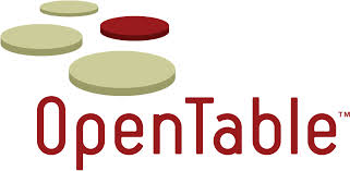
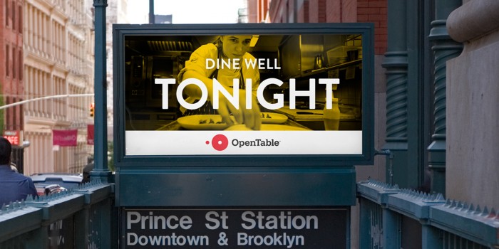
The old logo wasn’t necessarily bad or poorly designed. I wasn’t a big fan of how green hued the beige color was, and the deep red just seemed so stuffy. I also find 3D logos to be too forced and too restricting for an identity. You can leave 3D elements and design for any other touch point, but for a logo, simpler is better. That’s exactly where the design team landed with the new logo. It’s simple, poignant and excellent. The typography isn’t too thick, nor is it too thin. The mark is offset so nicely with the “O” in the brand type. Maximum meaning, minimal means.


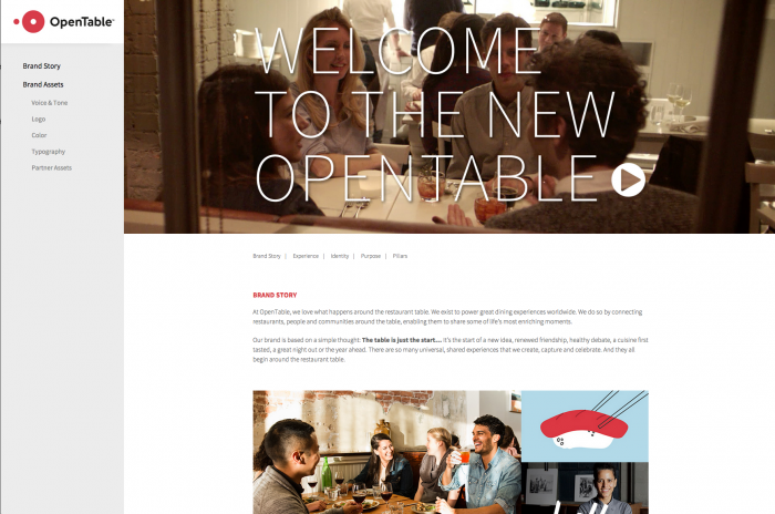
The brand has an excellent microsite for any to peruse the story, design elements and so on.


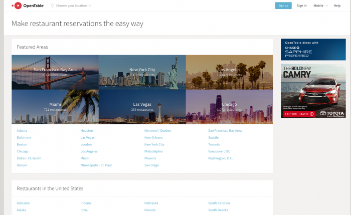
The website is a bit stark. I think a graphic language is begging to be built and designed. The website is simple and usable, so that’s a great start. I really hope they keep pushing the boundaries of where this brand can go. I think this is an excellent leap forward for Opentable. Like I say to my Uber drivers, Five Stars.


