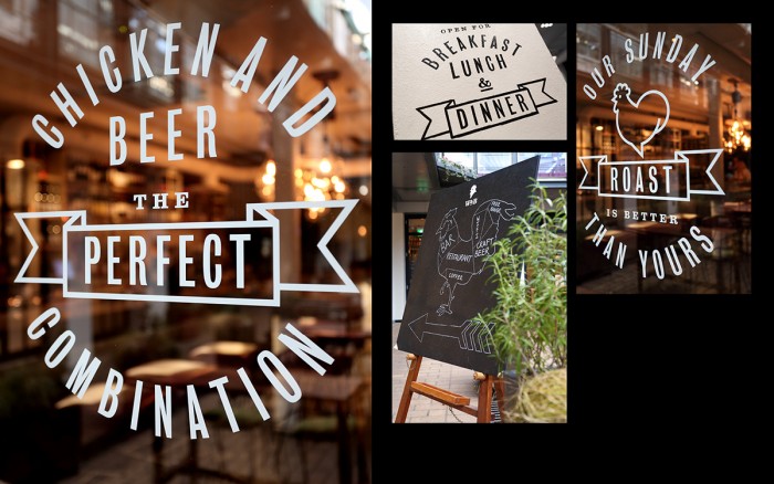
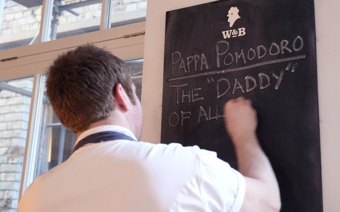
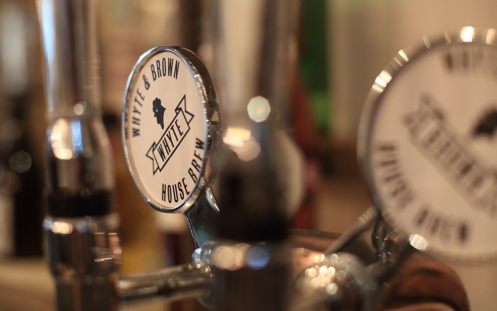
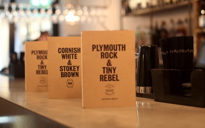
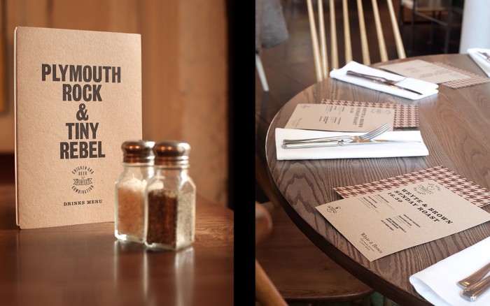
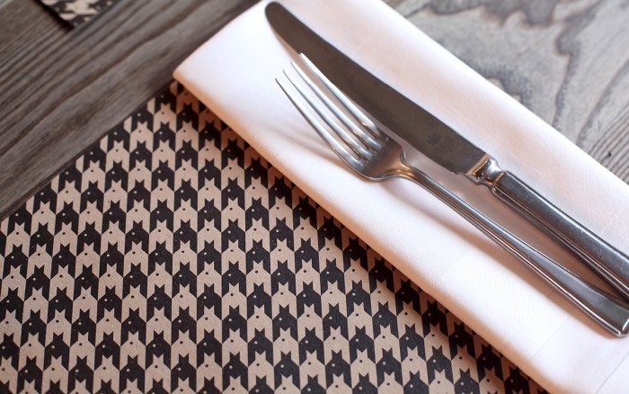
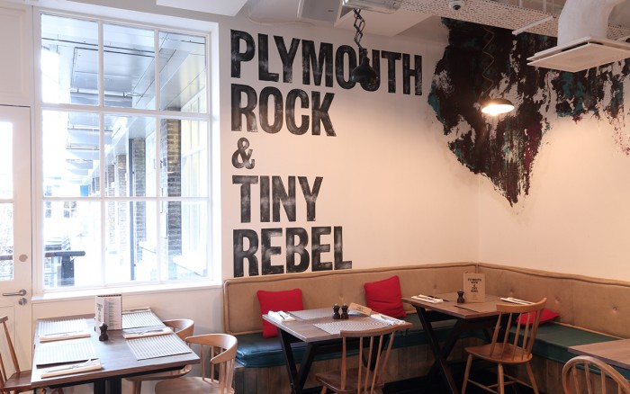
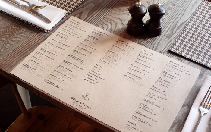
The brand identity for the restaurant Whyte & Brown, a restaurant located in London’s famous Carnaby Street, stands out with clean, modern design elements. What really jumps out at me is the chicken line-art brand mark (sort of reminds me of my own work for Seven Hens restaurant branding). It’s clean, simple and poignant. It’s simple lines meld well with the compressed sans-serif typography the design team selected for the brand’s main type family. This type-driven design style is carried throughout the restaurant’s interiors and other identity elements with excellence. Designed by October Associates
