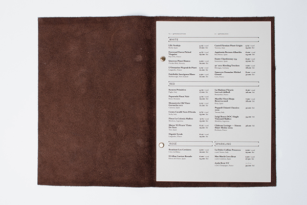
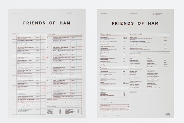
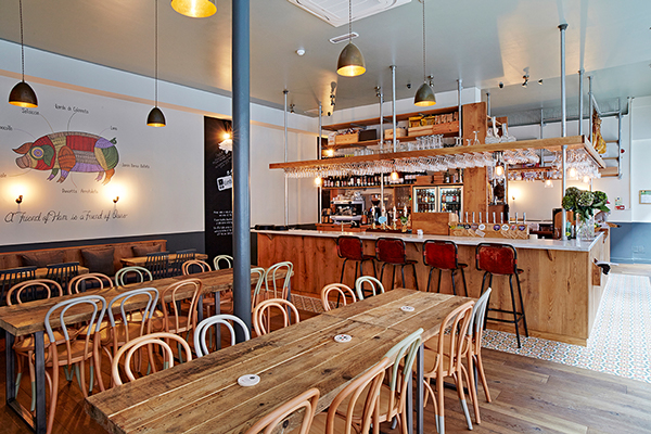
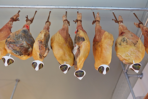
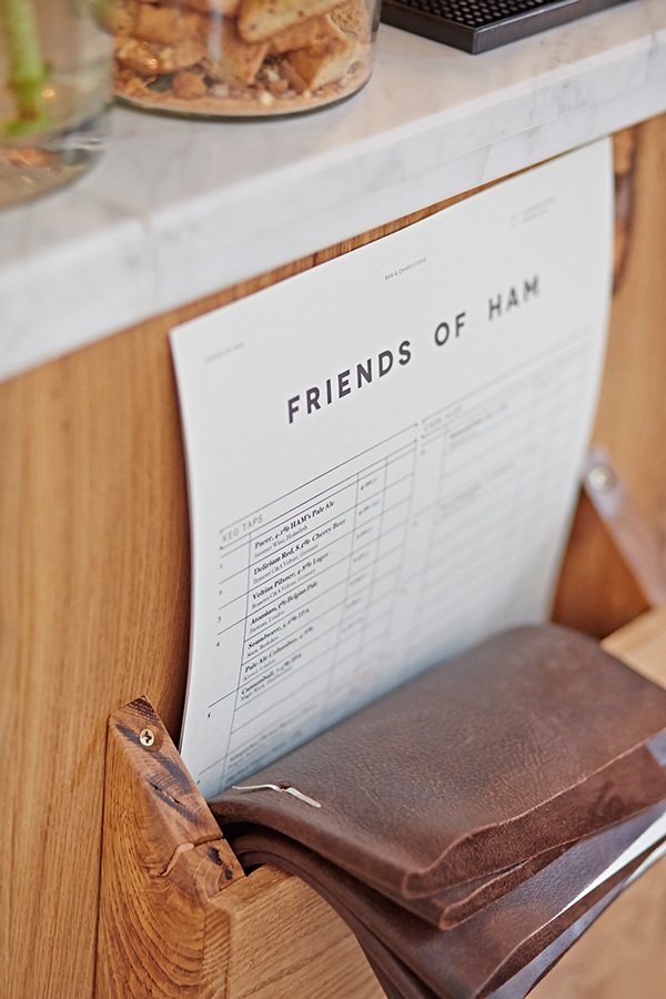
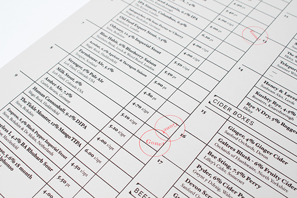
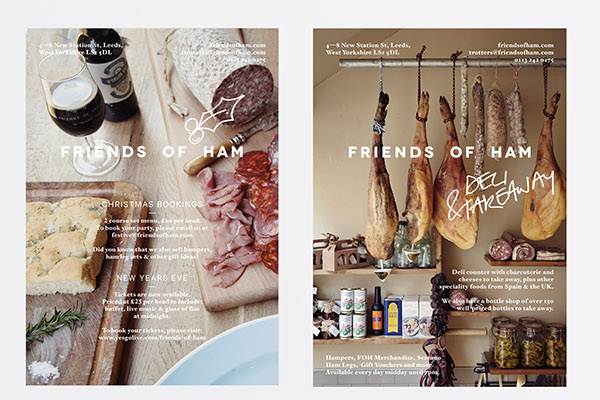
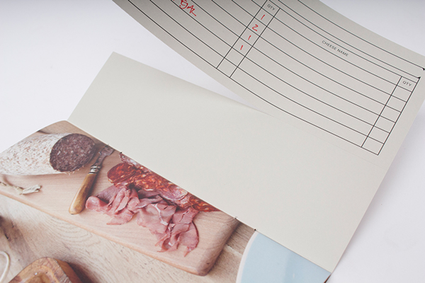
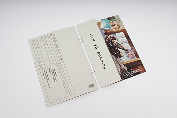
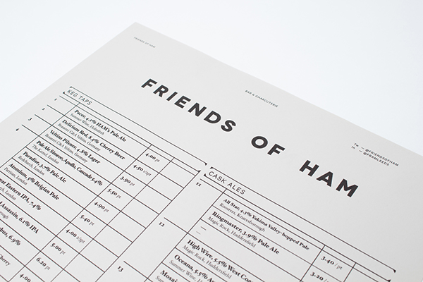
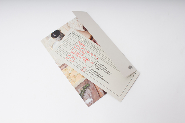
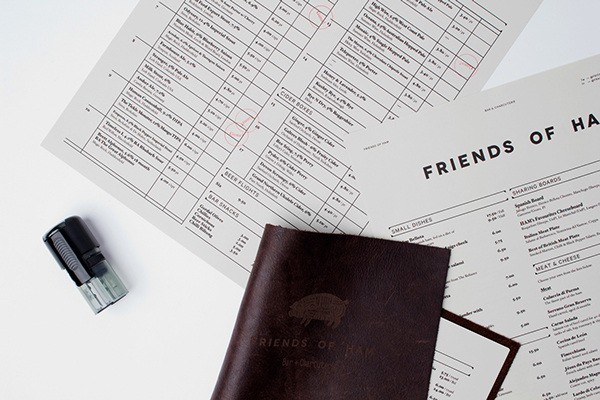
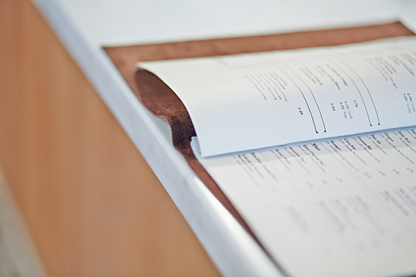
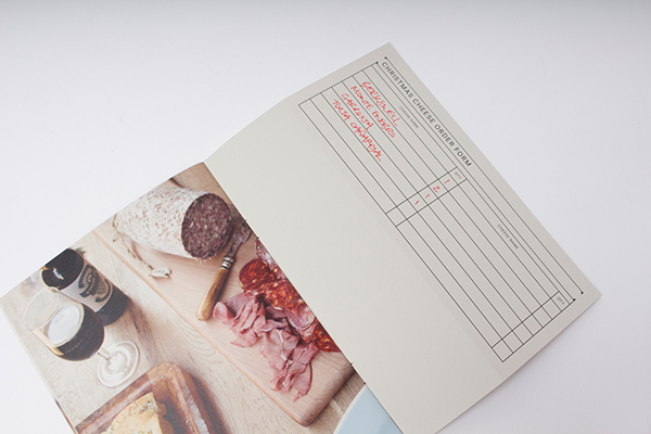
Something about simple grid structures and the rawness that gets me pumped about a restaurant identity design. For all of the tools and techniques we have as designers, there’s nothing like standard, strong design form. The identity for Friends of Ham (love that name, btw) uses this direct, elegant design to set the tone of a confident brand. Couple the layout with strong imagery/photography and you have a recipe for a great restaurant brand.
Designed by Passport Design
