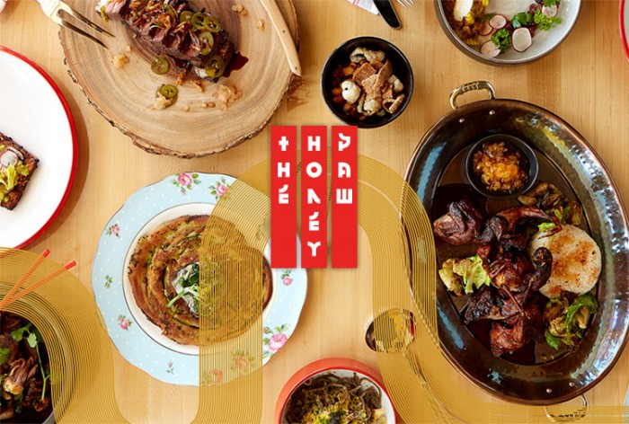
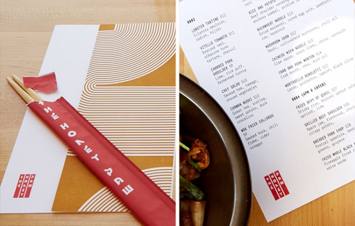
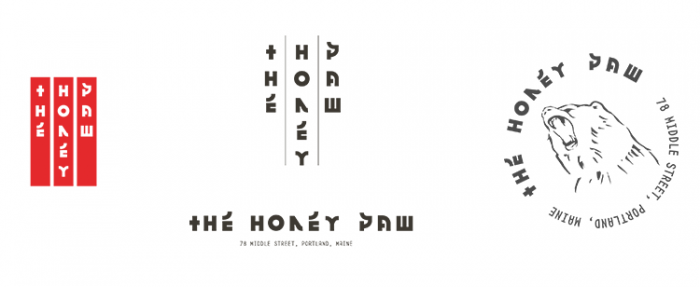
Might & Main’s work for The Honey Paw first caught my eye in HOW Design’s Logo Awards, and with good reason. The design for this “non-denominational noodle bar” is stellar. Taking design cues from Asian characters to drive a custom typeface, and leveraging traditional Asian graphic elements in new ways, the brand identity is a true representation of The Honey Paw experience. But wait… there’s more. The crew at Might & Main describe their deeper inspiration:
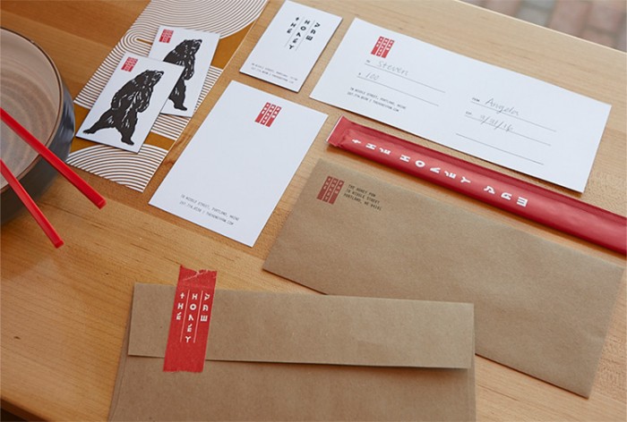
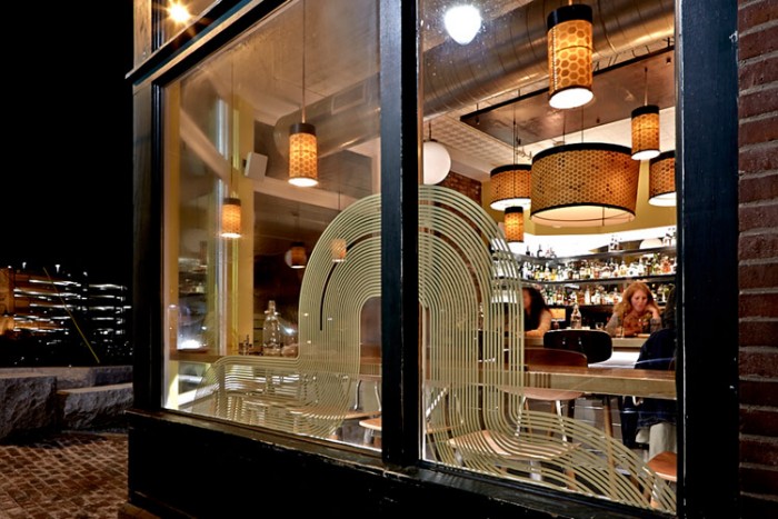
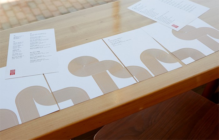
The brand identity takes its cues from the restaurant’s name (according to Chinese legend, a bear scoops honey with its left paw), and pan-cultural traditions, styles and trends. It was designed with careful consideration for materials, from the letterpress edge-painted business cards and custom-printed masking tape, to the large-scale abstract noodles that adorn the façade.
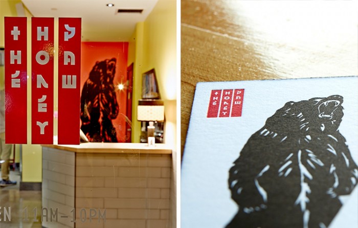
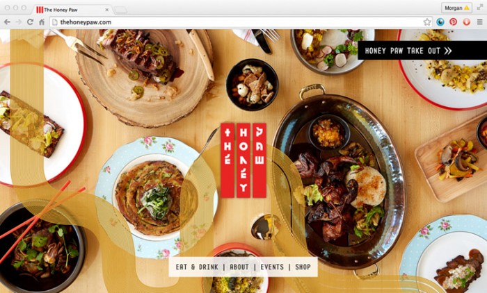
I enjoy the way the “noodle lines” move across large areas like on the windows and across letterhead. Very smart use of the graphic element. Finally, who could miss the large roaring bear? I question whether or not that’s an actual “honey bear,” but I’ll stop right there lest I start sounding like a client.
Designed by Might & Main
