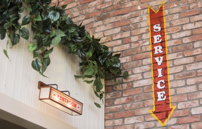
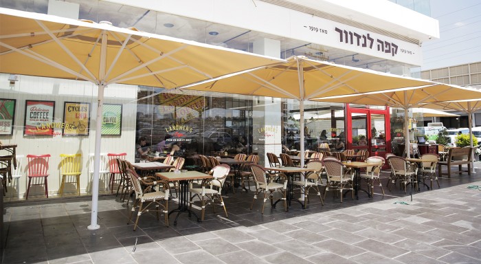
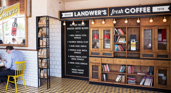
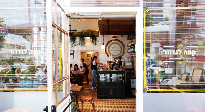
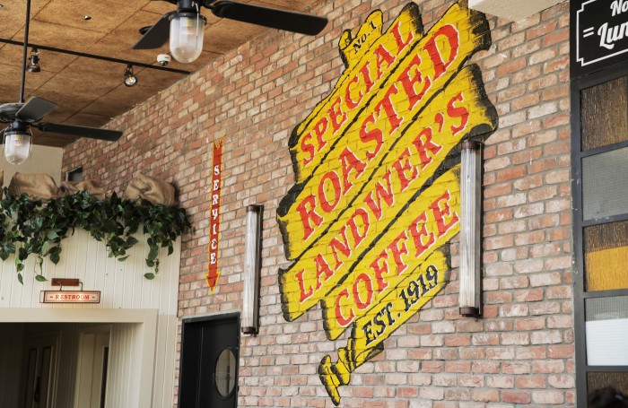
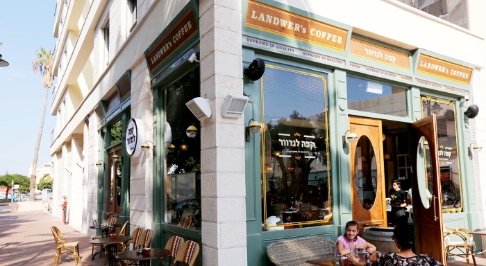
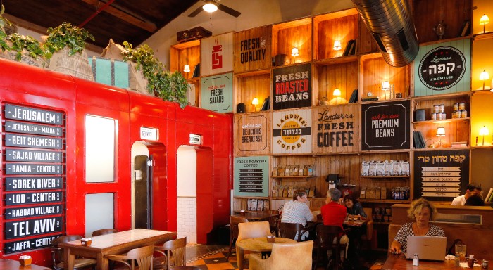
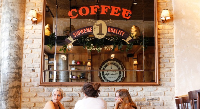
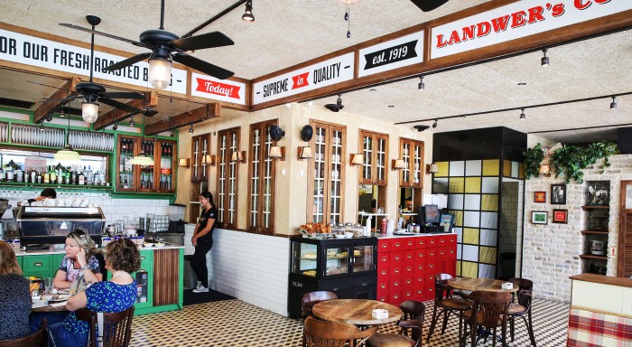
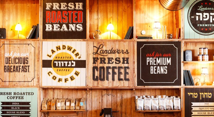
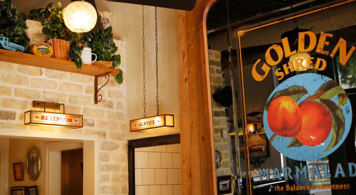
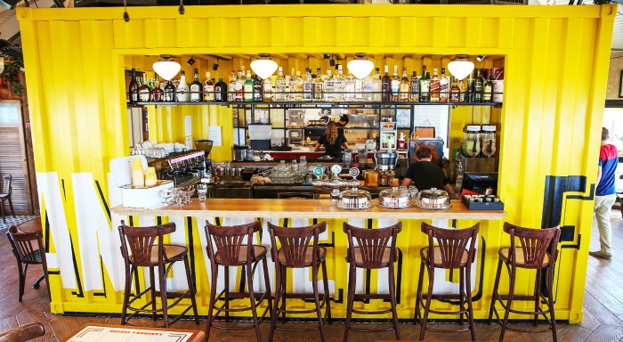
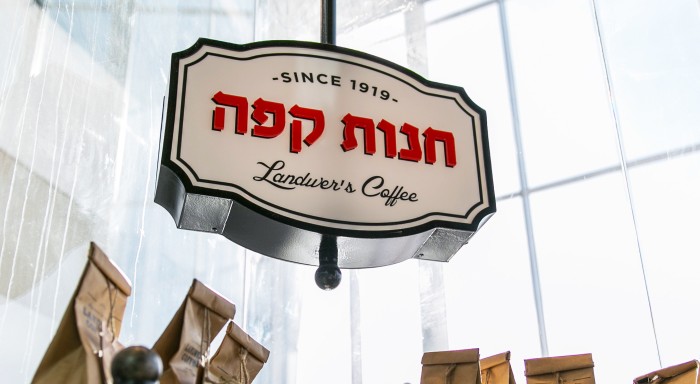
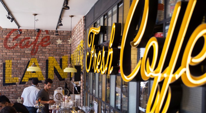
Kapsoola’s approach to the Landwer’s Cafe design is a melting pot of styles that take cues from classic diner elements. They describe it as “modern vintage.” With the use of many traditional forms of signage from hand painting to old-fashioned custom wall sconces, the brand has the feel of a vintage coffee shop that’s been updated over the decades. Here is how they describe the work:
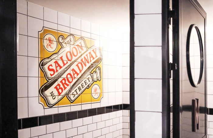
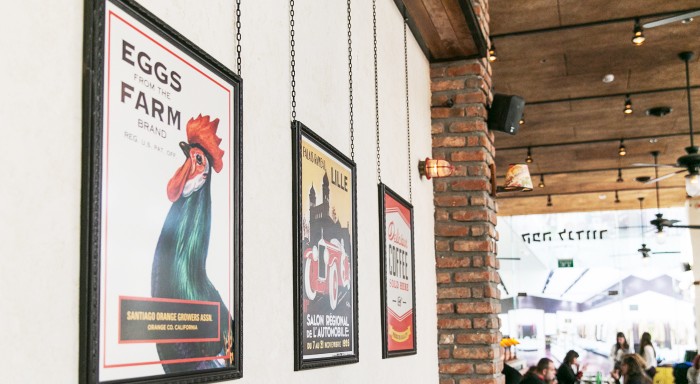
‘Landwer’s Coffee’ shops descended from a coffee roasting factory in Berlin est. in 1919 and made Aliyah to Israel. — With quality coffee, unique menu and an intimate atmosphere, the brand manages to maintain a personal environment inside the chain’s shops. The principle of the visual language portrays the idea of modern vintage – the new and the old, tradition and history with eclecticism, a warm personal environment with a modern twist. The brand’s graphic language naturally integrates with its interiors and emphasizes how interior design and branding work together and strengthen the brand’s personality and visual experience. — The store branding was spread over many varied formats : signage, tables, ceramics, mirrors, graphic printed walls, posters, lighting fixtures and much more
What jumps out at me is the wall “art” that carries a Normon Rockwell style and aura, yet markets the brand’s offering appropriately. The other design accoutrements found throughout communicate the vintage, hodgepodge feel perfectly.
Designed by Kapsoola
