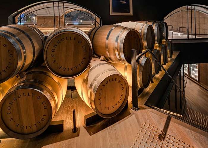
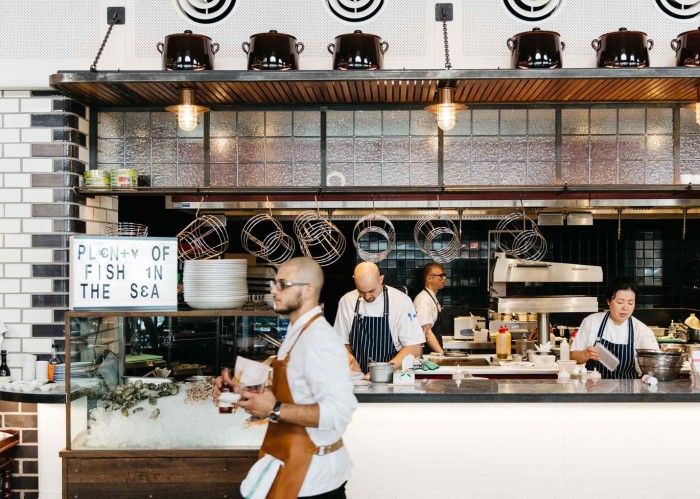
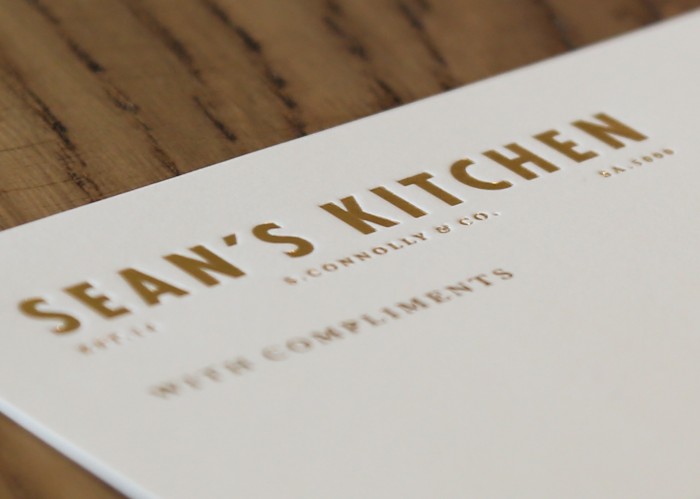
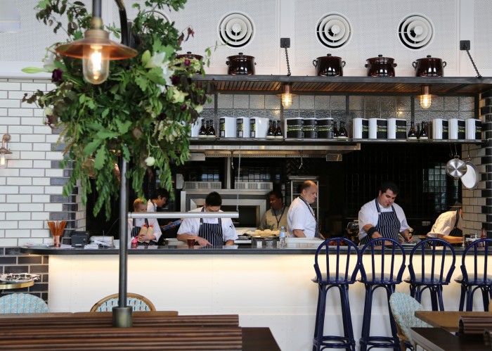
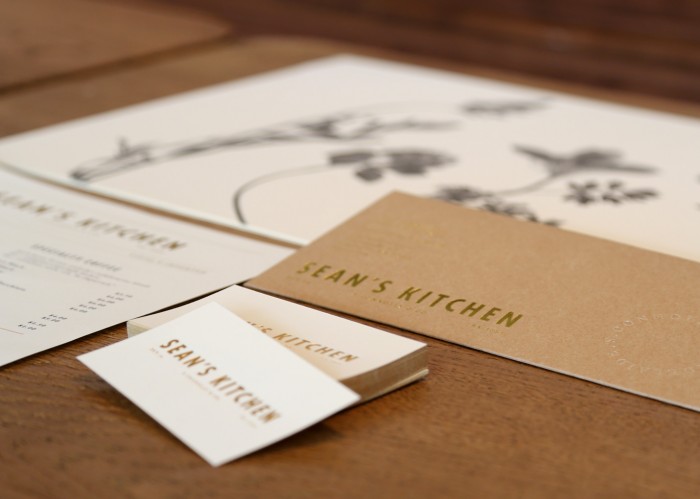
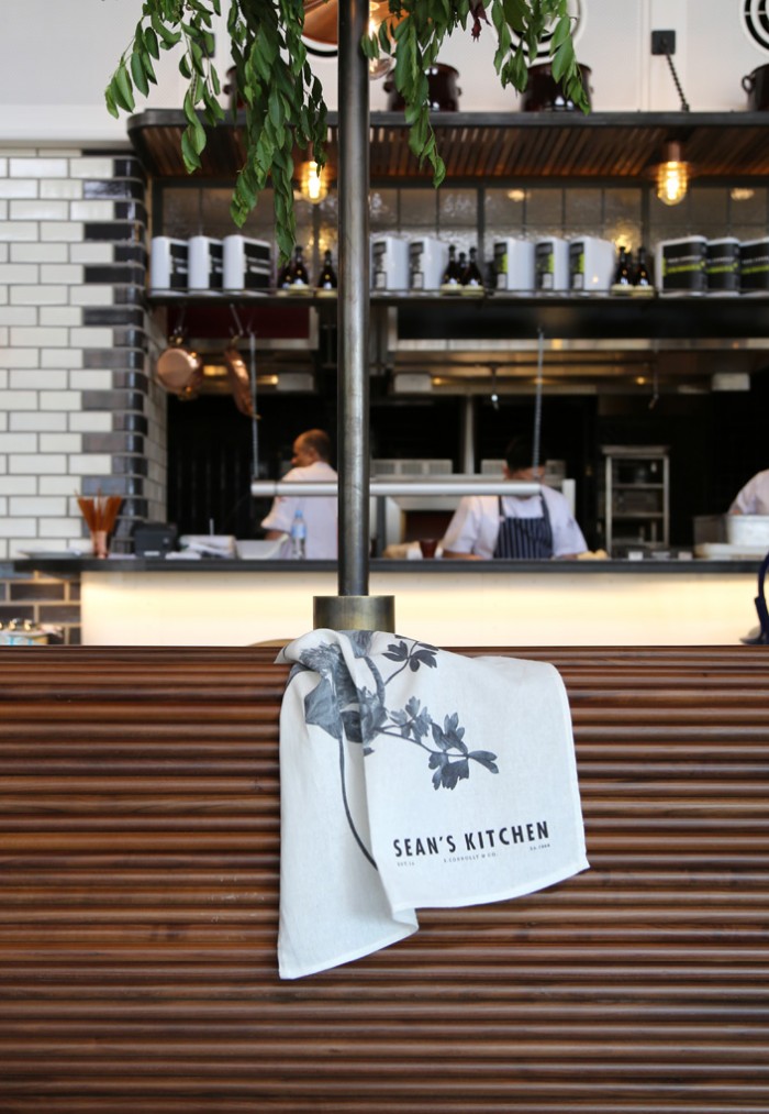
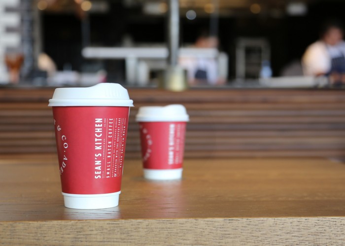
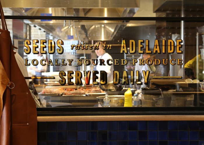
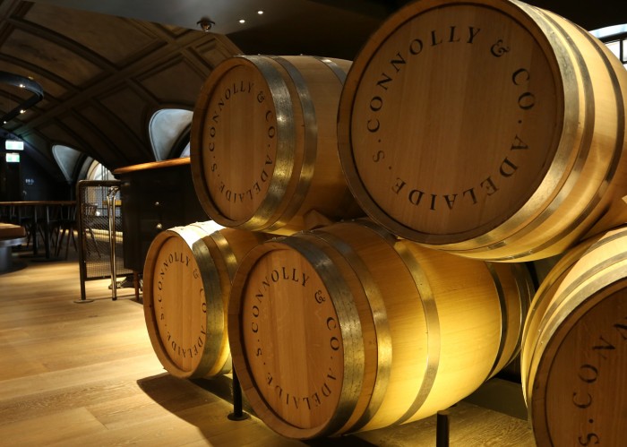
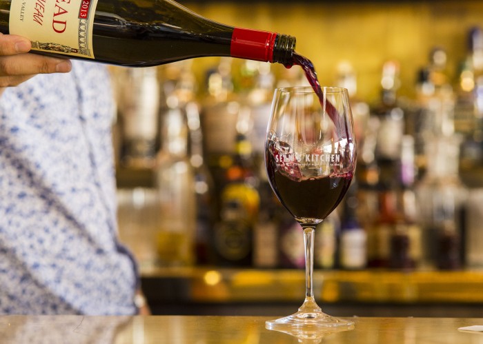
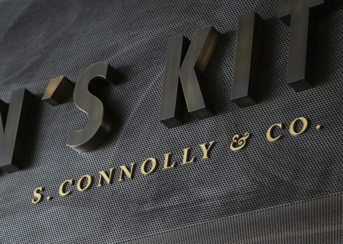
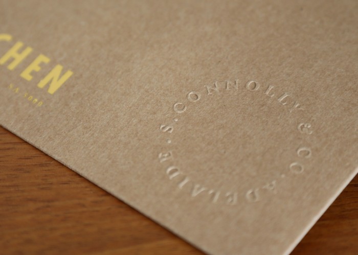
Sean Connolly is a familiar name in the culinary world in Australia. His latest endeavor is an exploration of local produce and ingredients inspired by New York’s rich food history. Sean’s Kitchen is located in the Adelaide Casino which demands a higher end experience. That’s exactly what this delivers. Designed by Gemma Warriner, the brand identity for the restaurant is an exercise in craft and attention to classic design principles.
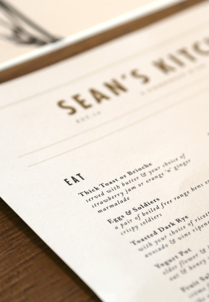
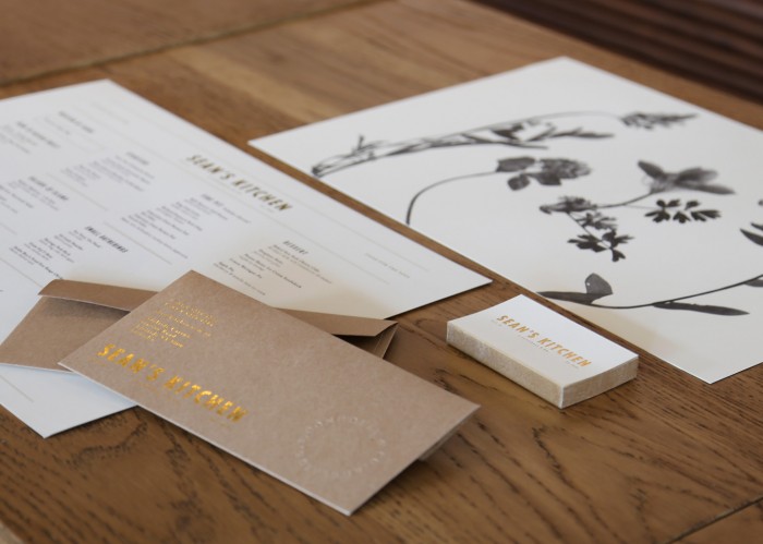
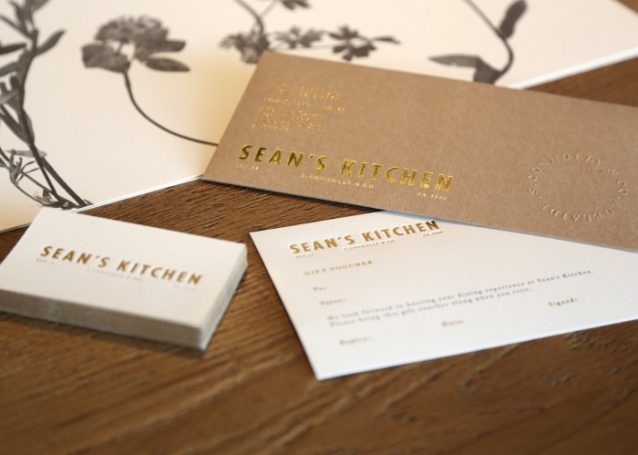
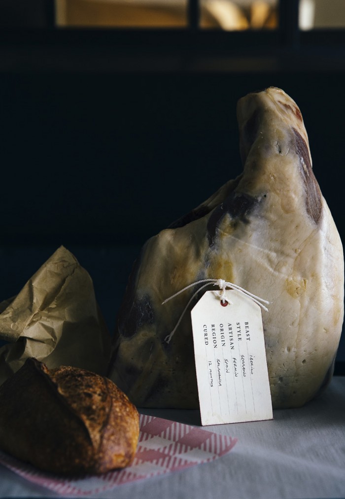
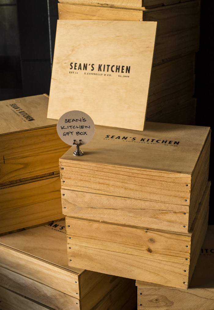
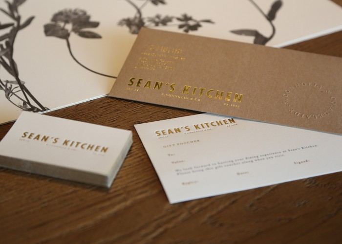
The identity reflects [his inspiration] through the contrast of classic new world and old wold typefaces whilst the brand collateral brings to life the elegance, origins and roots of food. Sean’s vision to create a truly unique experience is extended with items such as Sean’s branded retail products and Sean’s Kitchen seed packets which as the consumer to become part of this food journey.
The marriage of compressed grotesk typography and classic serif letterforms is executed perfectly across the brand’s touch points. The gold flake accoutrements elevates the identity without losing the calm, confident approachability. It’s an excellent interpretation of Sean’s food and interior experience.
Designed by Gemma Warriner
