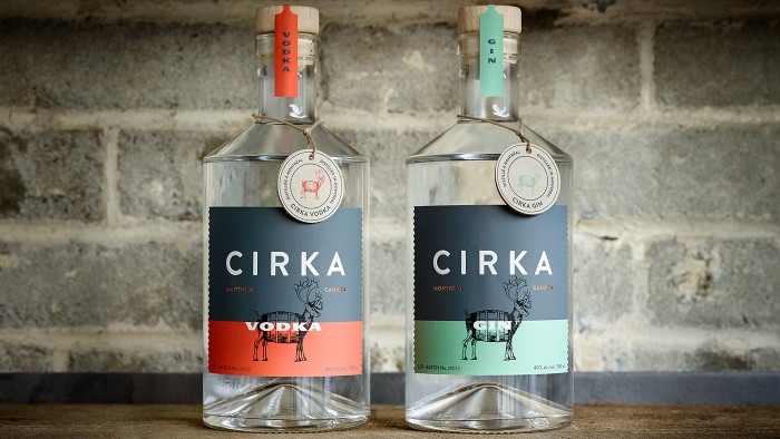
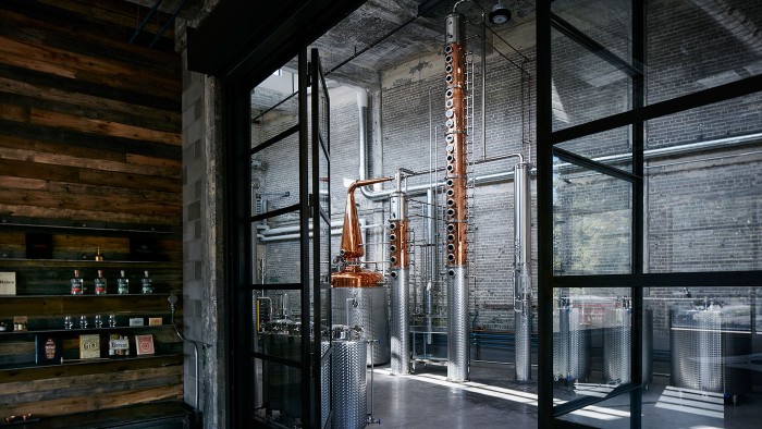
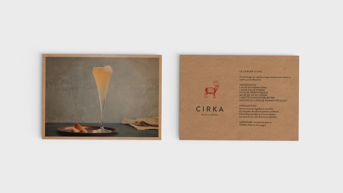
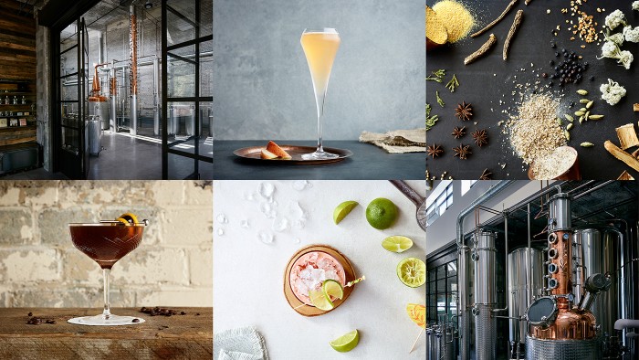
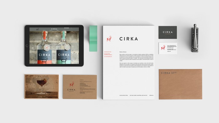
Found this today and had to share immediately. The package design and brand identity for Cirka Distilleries is on another level. Distilleries always want to communicate their craft. So much goes into making spirits, it’s obvious why that’s that case. However, there are many ways to approach communicating artisanship. The design for Cirka is one such way.
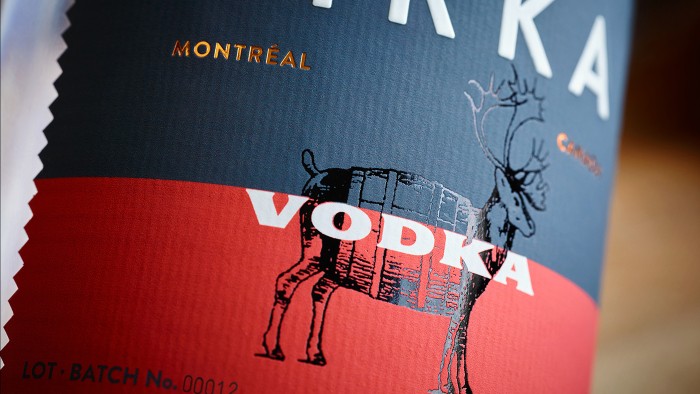
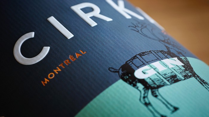
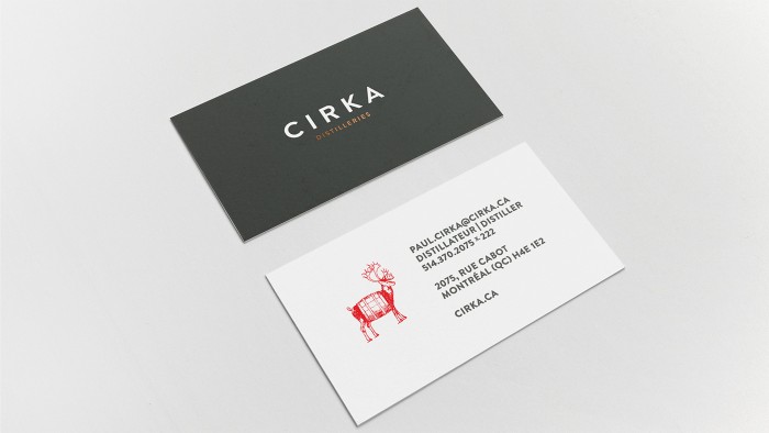
This is a mix of modern design and classic illustration style that’s excellently executed. From the caribou/barrel mark through the restraint used in the design of the bottle presentation, the details have been considered poignantly. I especially enjoy the tactility of the labels with the embossing and laid paper selection. The color palette is smart and fresh, standing out in the mix of other beverage brand packaged designs. This is a truly transitional design aesthetic.
Agency: Company Et Cie / Compagnie & Cie
Strategic Development: Mario Mercier, André Paradis
Production: Sophie Simonnet
Illustration (caribou): Alain Pilon
Photography: Mathieu Lévesque – Consulat
Culinary Styling: Stéphan Boucher
Mixologist: Romain Cavelier
Production: Éliane Sauvé – Consulat
Web Development: Yann Beauregard, Jean-Maxime Couillard – Lima Charlie
