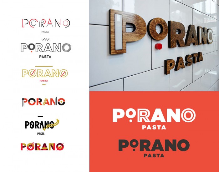
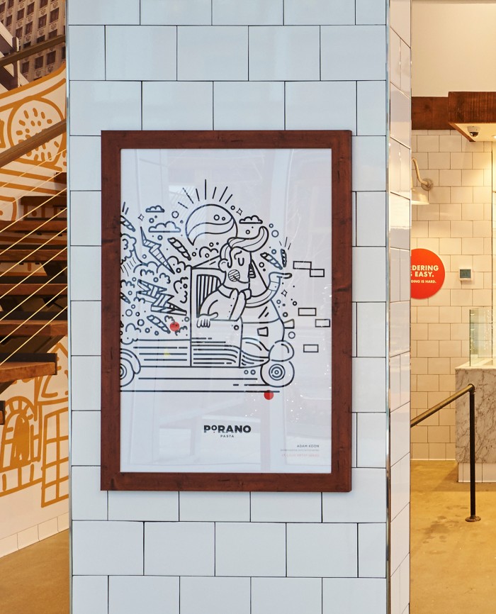
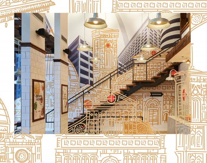
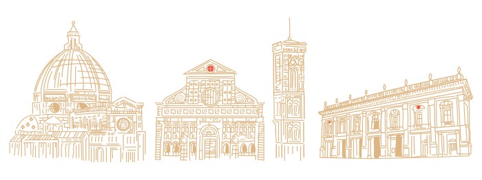
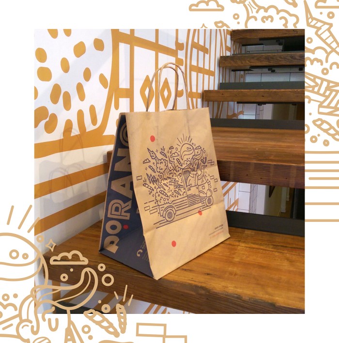
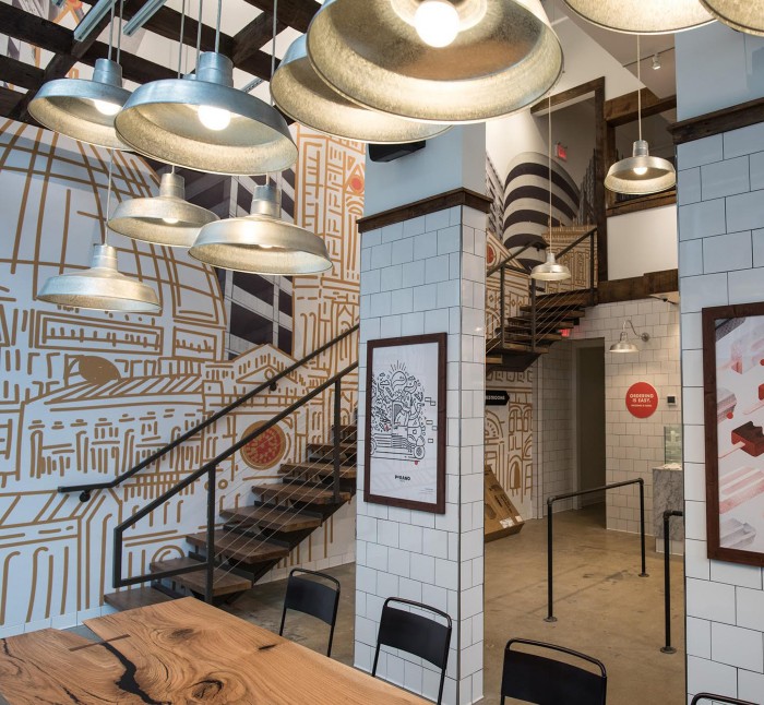
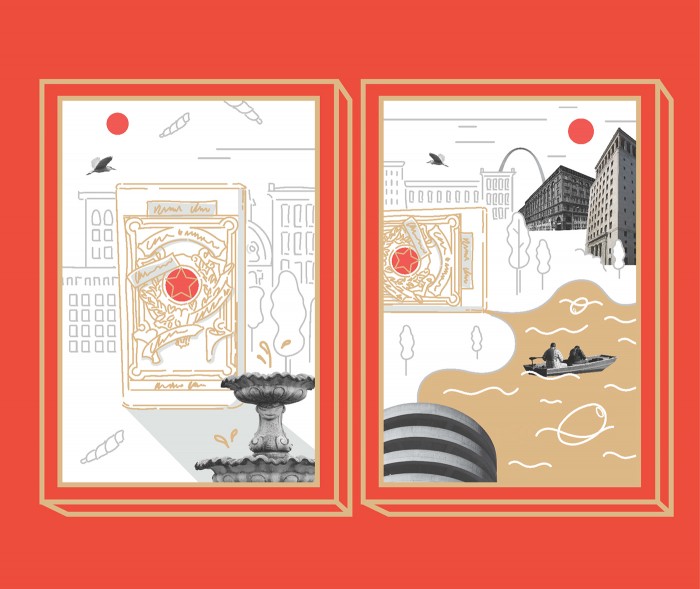
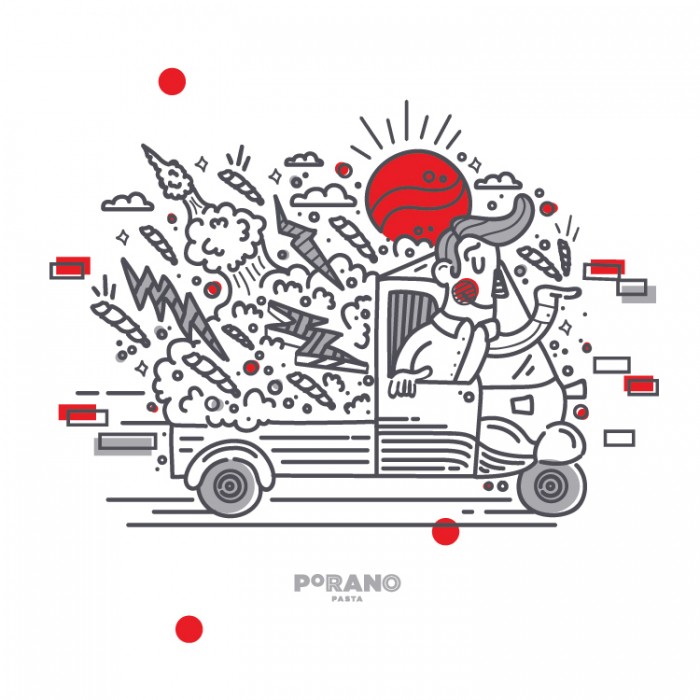
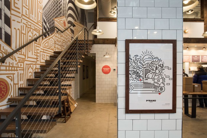
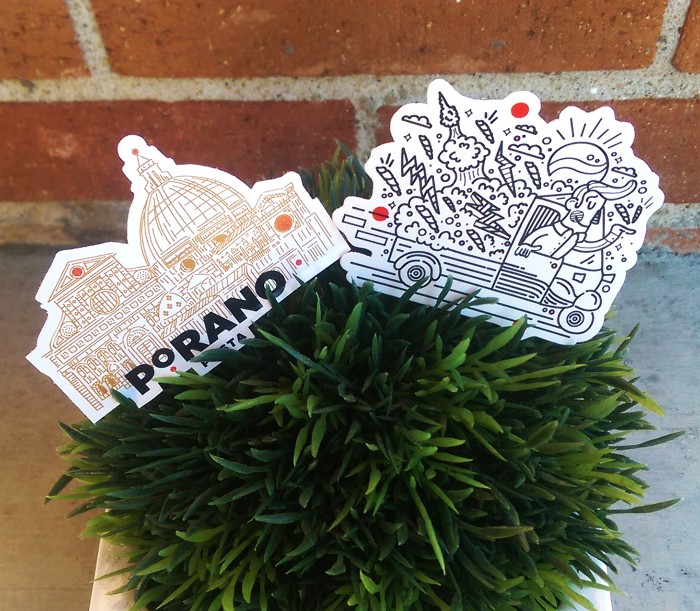
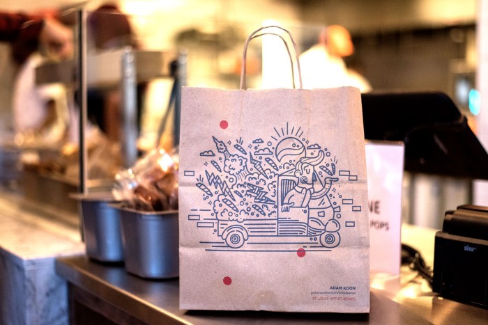
This project has been making the rounds on the interwebs for very good reason. The brand identity work for Porano is an excellent exercise in typography and illustration. The color palette is saucy and warm with splashes of golden pasta colors to create a direct correlation to the product. Atomic Dust pushes the brand forward with noodle-like illustrations that create a unique, ownable look. They describe their focus on their site:
Every step of the way, we sought to capture Gerard’s inspiration: a family trip to the small town of Porano, Italy. There he discovered a sense of warmth and community built around sharing delicious, simple food – and he longed to bring this feeling back to St. Louis…The logo and in-store signage carries similar influences. Its letter styles vary throughout the space, yet at the same time bring a sense of clarity and consistency to branding and wayfinding.
Designed by Atomic Dust
