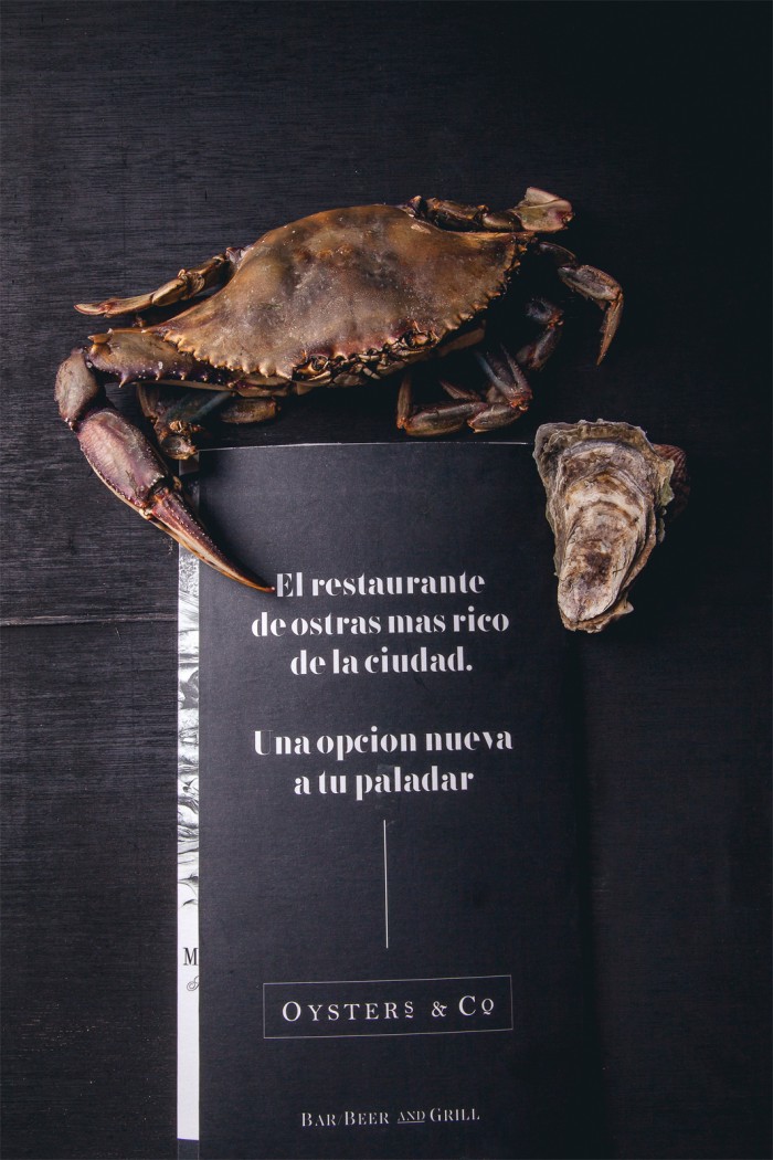
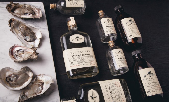
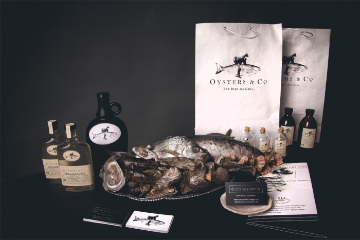
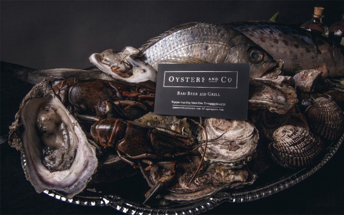
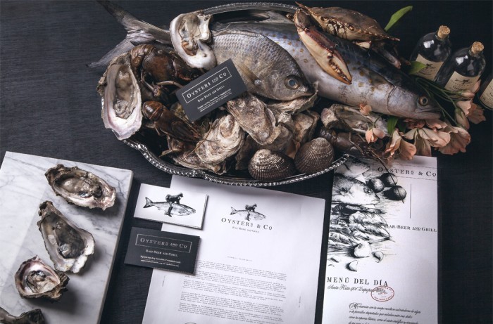
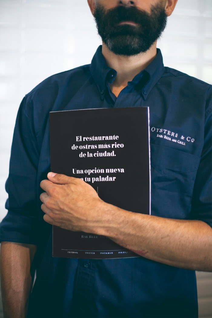
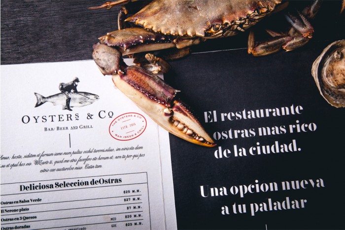
Black and white colors are a simple palette, but so powerful. They create a dramatic, confident look and that’s exactly what’s happening with the brand identity design for Oysters & Co.
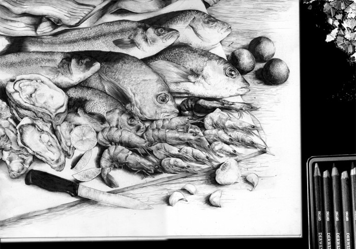
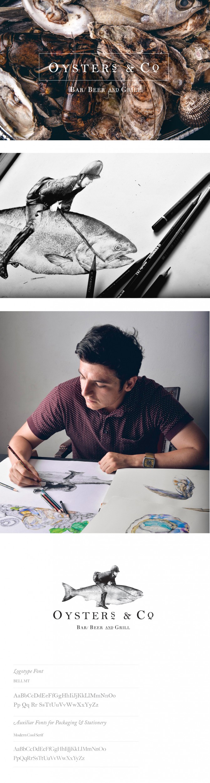
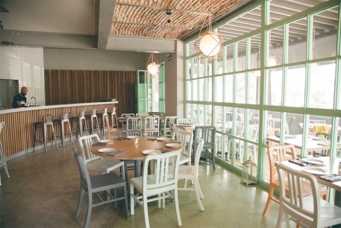
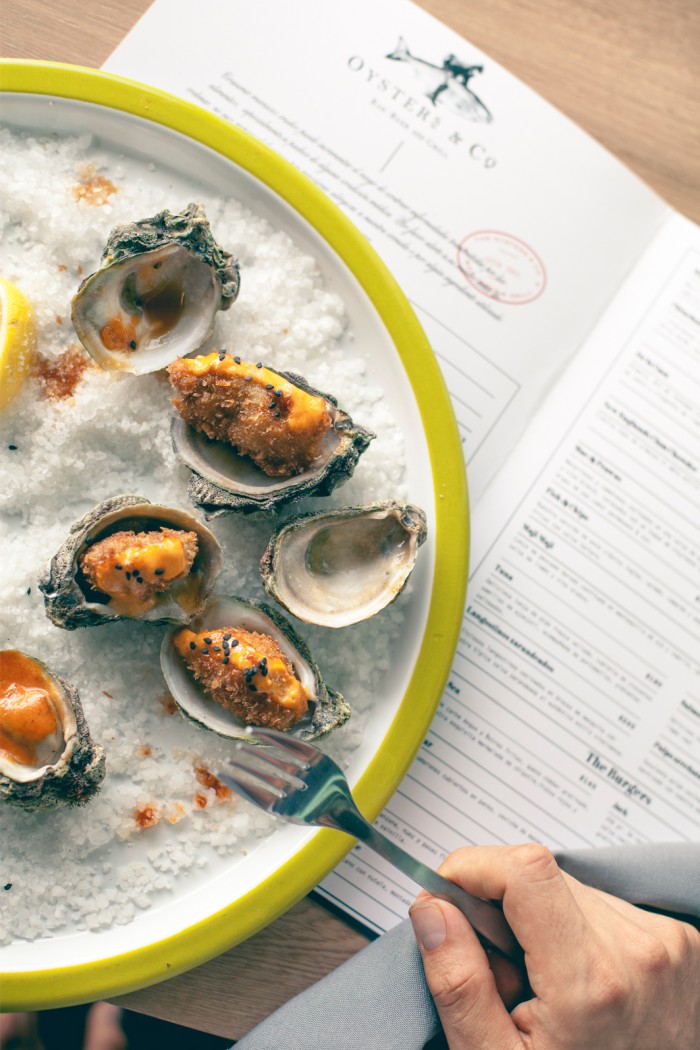
Oysters & Co is a beer bar and grill in Mexico. The brand leverages detailed realistic illustrations of product throughout the many touch points. It’s spearheaded by a watercolor illustration of a jockey riding a fish – a surrealistic take that conveys a vibe and context to the restaurant itself. The typography is simple and strong classic serif type that’s used in simple layouts that adhere to a grid. This creates a disciplined, upscale look and feel that complements the illustrations perfectly.
Designed by Daniel Barba of Monotypo