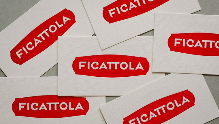
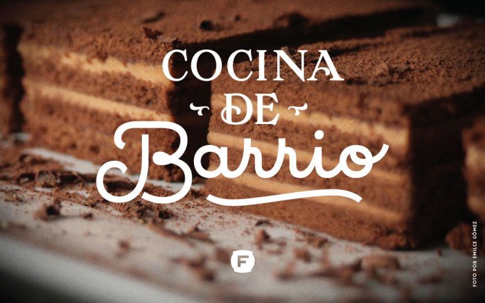
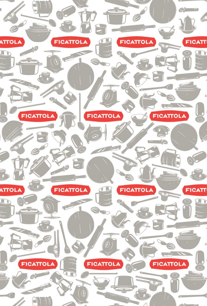
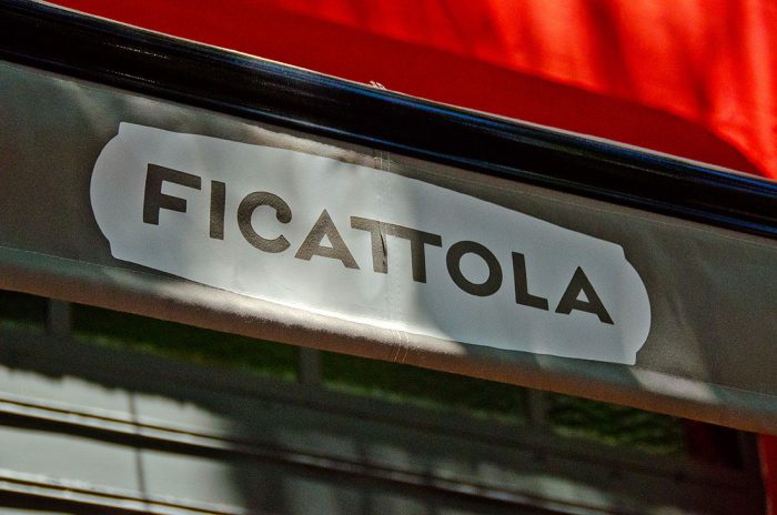
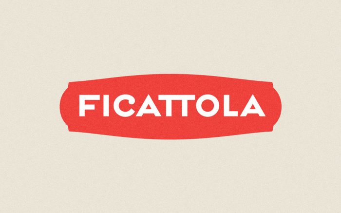
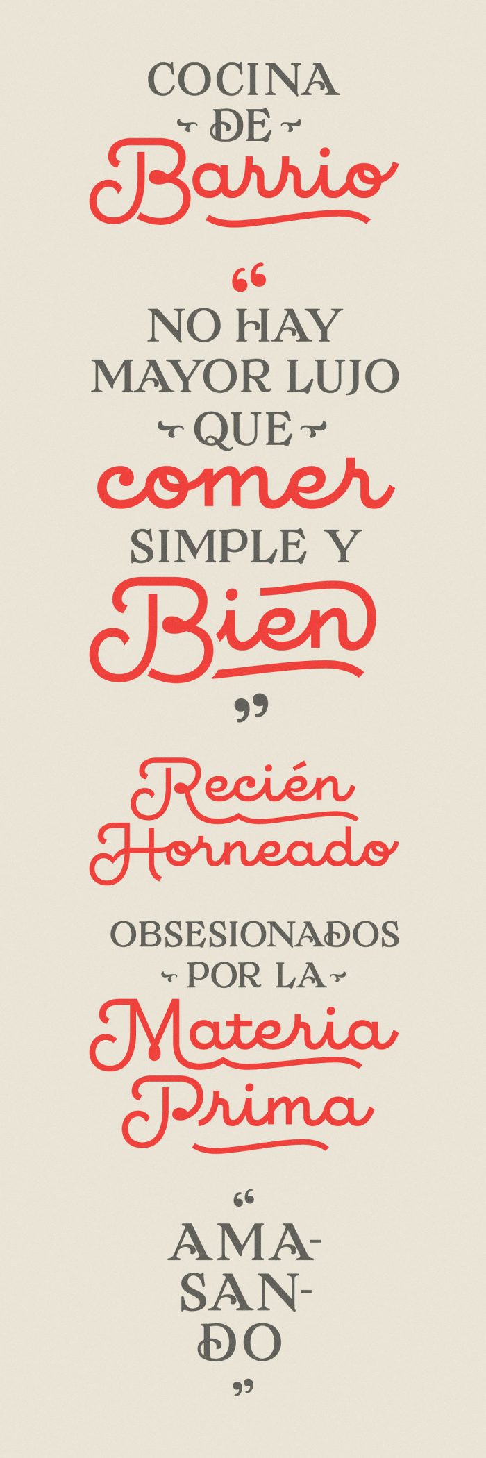
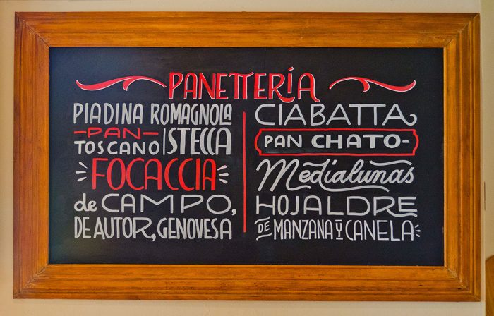
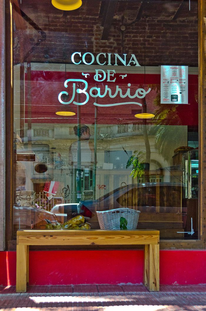
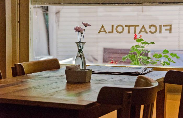
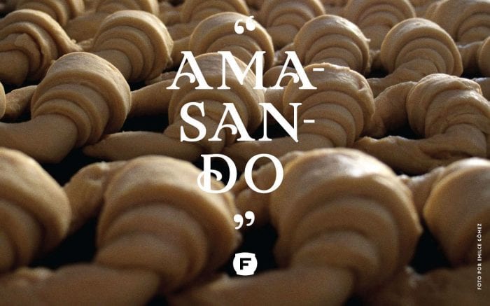
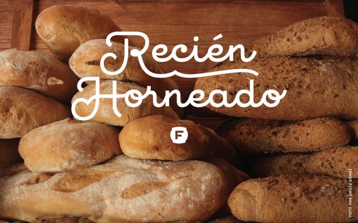
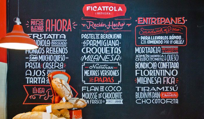
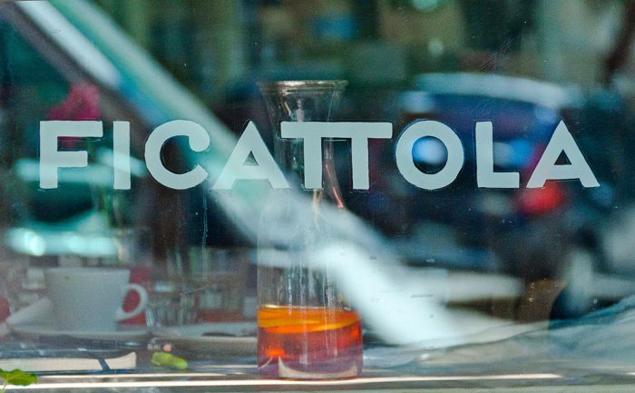
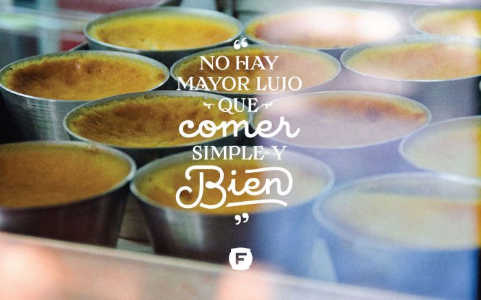
The identity design for Ficattola, an italian restaurant and “rosticcería” located in the neighbourhood of Belgrano, captures the craft and pride of home cooking. Located in Buenos Aires, Argentina, the restaurant puts the focus on traditional techniques for creating Italian food staples. The identity communicates this dedication with iconography of classic kitchen utensils spearheaded by a confident logo design. The logo’s red shape creates a memorable, identifiable correlation to Ficattola, while the custom typography melds Art Deco with slightly whimsical forms. It’s especially beautiful in the numeral characters.

Designed by Yani & Guille

0fddaf26470021.56355a99766ea

1a597c26470021.56355a993be62

2f2d4126470021.56355a9955432

6ac52126470021.56355a9981200

6bc70c26470021.56355a9996597

6ce3ab26470021.56355a9943b1a

8bfc1926470021.56355a9949f86

08c5cd26470021.56355a998c98c

17a61426470021.56355a99ceb44

175b8426470021.56355a9999303

289bdb26470021.56355a99da846

0831b626470021.56355a9970822

0877dd26470021.56355a995ebdb

89248e26470021.56355a9951ef4

19781926470021.56355a9963046

bbcdf026470021.56355a99b455a d dc66fe26470021.56355a9968235

The Forktales Podcast™: Interviews with restaurant industry leaders and visionaries

Restaurant and advertising industry headlines and thinking

Reviews of restaurant experiences from around the globe 

Reviews of our favorite design, business, & restaurant books

Our favorite typography and fonts

Inspiration in your inbox

Get the latest inspiration in your inbox every Monday morning, for FREE!

"*" indicates required fields

This field is for validation purposes and should be left unchanged.

Delicious Bits in your Inbox!

Get the latest and greatest content delivered to your inbox for free!

"*" indicates required fields

This field is for validation purposes and should be left unchanged.