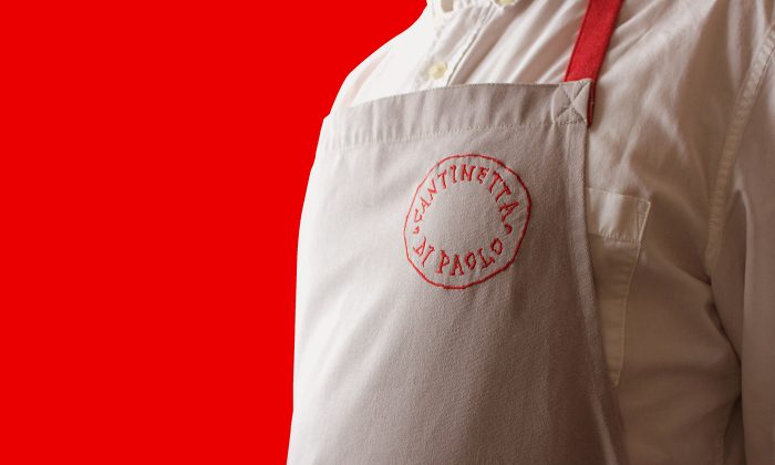
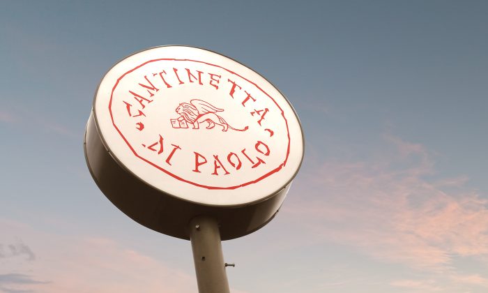
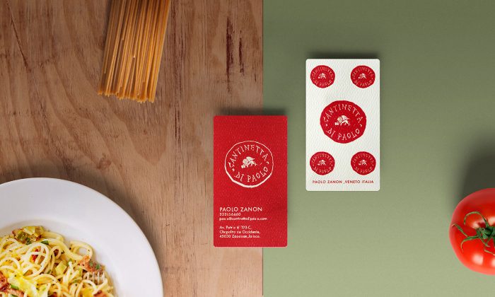
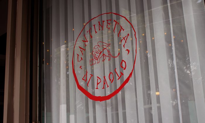
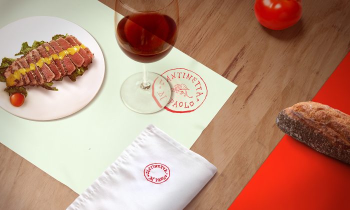
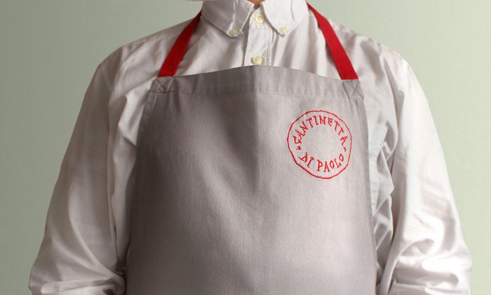
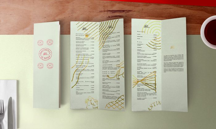
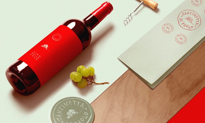
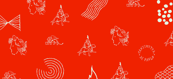
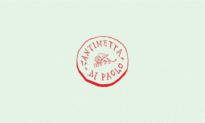
Designed by Toro Pinto, the brand identity and touch points for Cantinetta di Paolo are a mix of hand-scratched typography and illustrations with a carved look. Vibrant reds offset muted mint greens and warm grays, to create some drama across the brand. The backstory of the brand is as follows:
Cantinetta di Paolo iss a restaurant and wine cellar based in Guadalajara México and run by Paolo Zanon, our friend and client who was born in Veneto, Italia. We decided to make a branding that would connect to Paolo´s origins, so we went for a simulated carved lettering as if it was a die casted coin in an ancient Rome. The symbol is the San Marco´s Lyon, italian symbol of Veneto.
There’s a lot of great thoughts happening in this brand system. The subtlety of the wing ring graphic element is perfectly executed and works quite well with the typography. Wine is used as a medium to create more illustrations that bring the brand to life with different moments of meaning. Overall it’s a memorable look and a breath of fresh air for a wine bar/restaurant.
Designed by Toro Pinto
