As some of you know, I’m currently running around Europe on my honeymoon. During our travels I’ve snuck some photos of restaurant brands that I think are doing a stellar job. Recently we were in Barcelona, staying in the Gothic Quarter specifically. Around that area are some beautiful restaurant brands from interiors through graphic design that are cohesive experiences throughout.
Below, in no particular order, are some snapshots with some info on each of the ones I thought stood out. By no means are these the only restaurants with great design in the city of Barcelona. These are just the ones I saw while strolling the streets. Please share some of your personal favorites in the comments below.
Also, if you know the designers (Interior, architecture, branding, etc) please post in the comments as well.
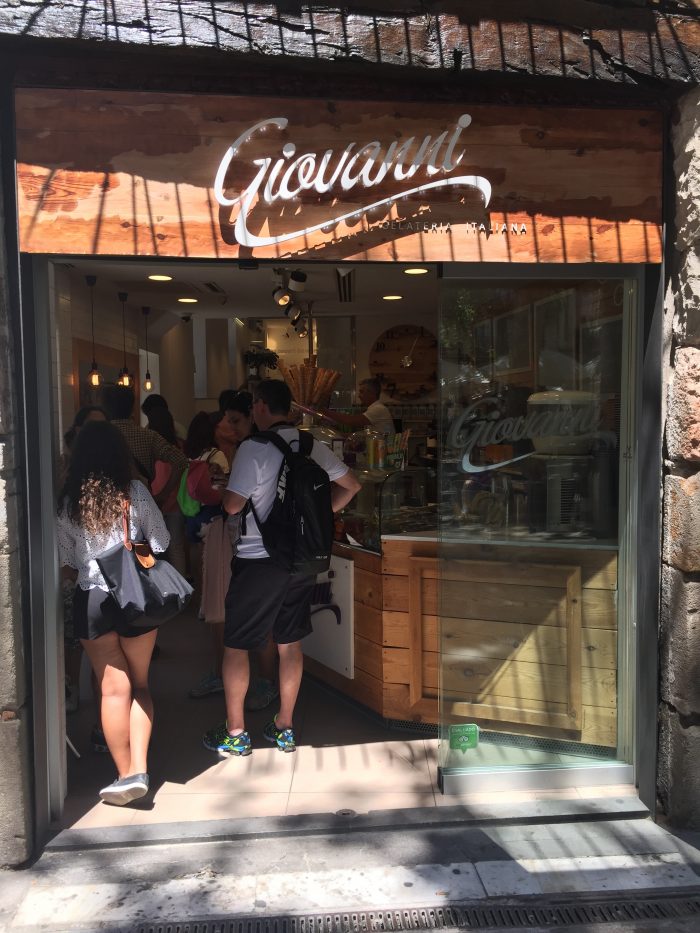
Giovanni Gelateria Italiana
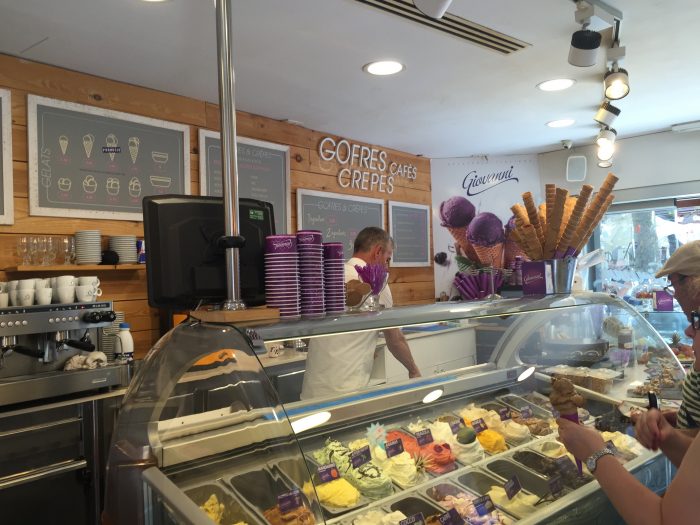
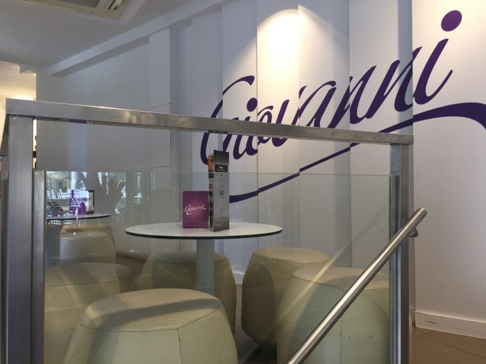
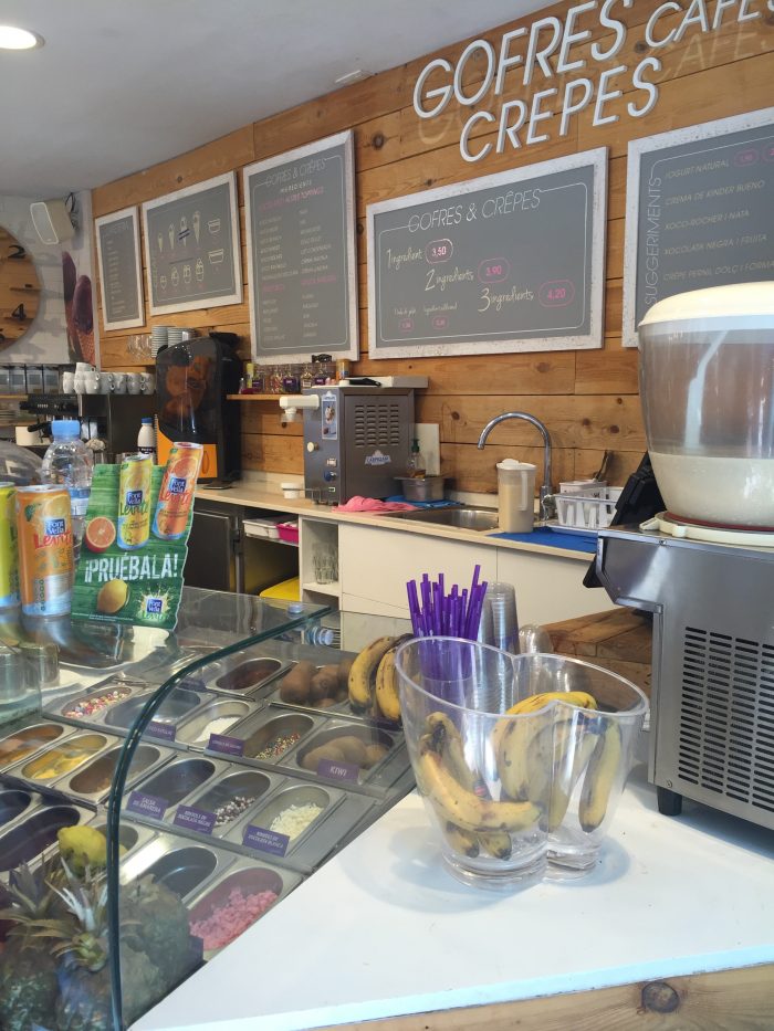
This beautiful gelateria is one of a few in a multi-unit brand. Although I can’t seem to find a website, this particular location grabbed me immediately. Maybe it was because I really like gelato, but more likely that it’s design was so well orchestrated. The pops of purple across pure white and beautiful wood grains create a chic experience.
Pans & Company
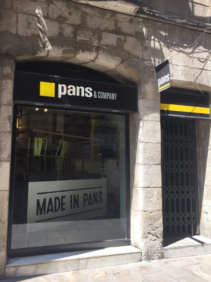
Pans is a larger chain and it shows in its design work. All the locations were in line with the bigger brand look and feel, but each had their own nuances and personality.
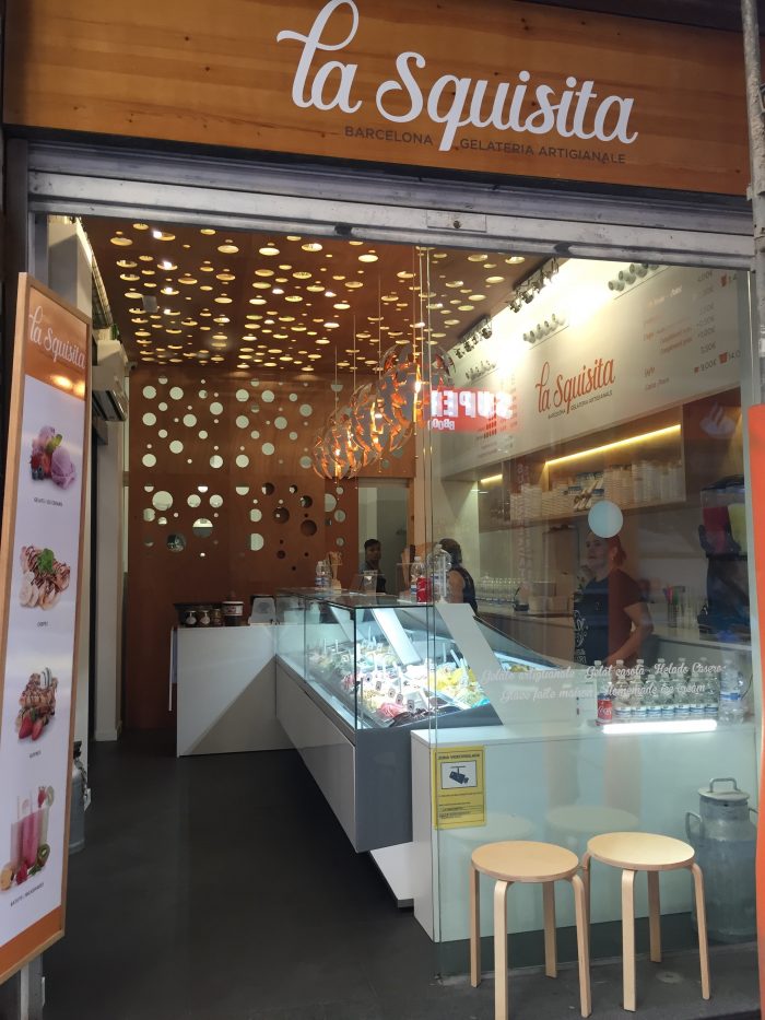
La Squisita
The interiors of this brand were completely eye-grabbing and unforgettable. The hero piece that spans the small shop gets your attention and sets this brand experience apart form other gelaterias in the area.
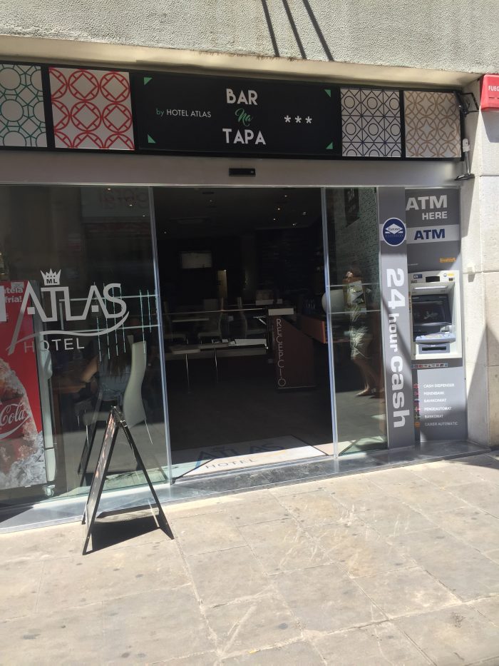
Bar Na Tapa
Modern, chic and beautiful, this full service restaurant jumped out with its use of patterns set against clean lines and stark white planes.
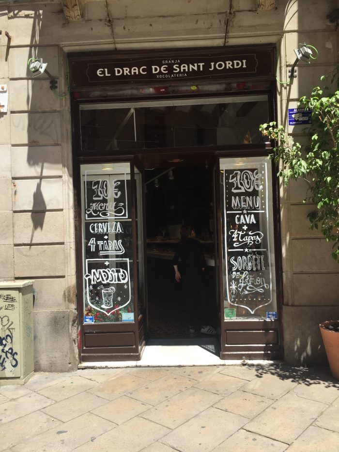
El Drac De San Jordi
Admittedly, I didn’t enter this, but the signage and handdrawn window designs were eye grabbing enough for me to snap this quick shot while walking. Beautiful work.
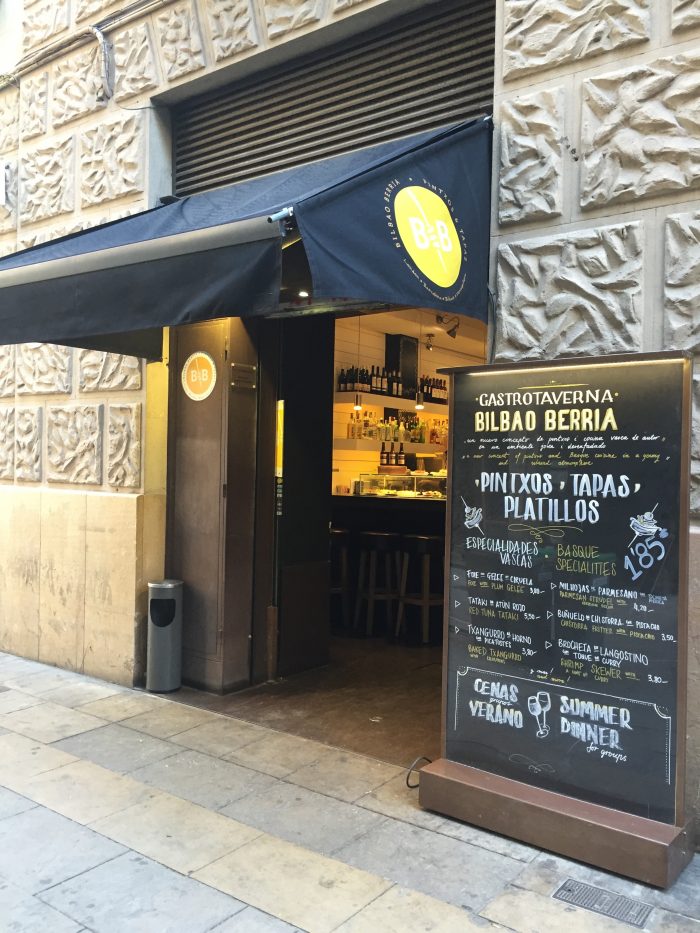
Bilbao Berria
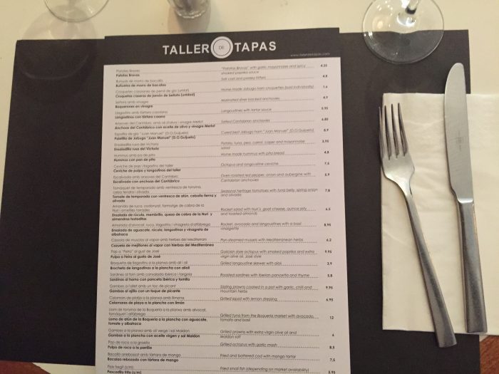
Taller De Tapas
Taller de Tapas had a simple brand, but the interiors were antique and a step into the history of Barcelona. Set against each other it was a beautiful collision of new and old.
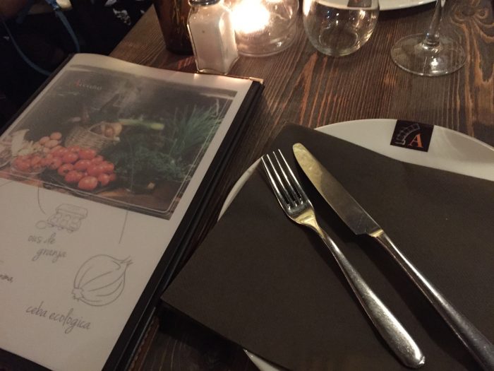
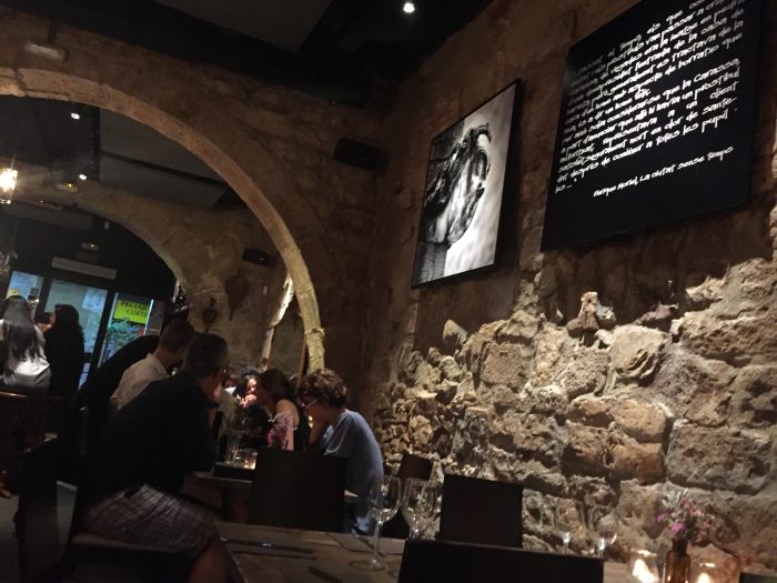
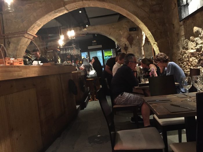
Arcano
This restaurant we hit on our final night in Barcelona and it was worth the wait. It’s a full service experience with all their ducks in a row. The menus were brilliantly designed with a noticeable attention to detail. The plates were designed. Everything about this experience was given the right amount of attention. Even the interiors pulled a perfect design touch when the antiquity of the walls would’ve been good enough. Instead, Arcano’s designers added a flavor of the brand to create unity across the interiors and into the print touch points.
