Apologies, we’re going to go slightly off the food and beverage train this morning to chat about the NHL’s new hockey team name and identity. For those that don’t know, the NHL approved an expansion team in the City of Sin, Las Vegas a short time ago, and us hockey fans have been semi-patiently waiting to hear the name and see the goods. That moment came last night during a glitchy presentation held in Las Vegas and streamed live.
What we saw was absolutely disappointing. We knew there wouldn’t be any play on gambling due to the ownership and most likely the NHL wanting to steer clear of that aspect. However, what we were delivered was a ripoff brand name with an obvious, and poorly executed identity.

In the design explanation video, Jeff Eagles, the Adidas Design Director, explains, “We wanted a unique identity and Bill was very fond of West Point and the Black Knight…” Sorry Jeff, uniqueness went completely out the door no matter how many pictures of knights you put on the background wall of the video.
Vegas, not Las Vegas, Golden Knights, starts its existence by smacking the face of the spanish language from which the cities name was derived. We’ll let that one slide. The mascot/nickname? A blatant rip on a multitude of sports team names from peewee league to professional, soccer to hurling. It was actually the name of the Catholic Elementary/Middle School I attended as a child. Not a good start here.

The typography is interesting and decently executed. There are some vectors that need some smoothing, but I think it’s unique enough to stand on its own. Upon deeper review it looks like a broken typeface. Like someone just opened it in a program and bent some ascenders and added some pointy serifs.
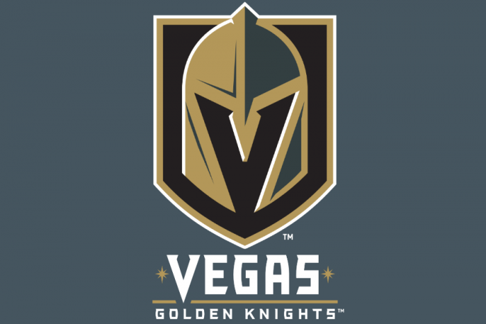
The mark is, well, a good friend of mine texted it perfectly this morning. “…looks like a high school kid was working on it but didn’t finish.” My buddy, Jeff Catlin, is a renowned insulation representative and has nothing to do with design (except tolerating me and my typography rants.) What’s so troublesome with the mark is the bouncing between forced three dimensional elements and flat design. Bevels conflict with flat design aesthetics to create something akin to a piece of literature that jumps voices from first to third person.
The knight helmet isn’t even a helmet found on a medieval knight. It reads more Spartan, and at the very least a foot soldier of that time. Beyond the historical inaccuracy there’s the question of, what the hell knights and medieval mnemonic devices have to do with a city built in the desert by The Mob to glorify and profit from vices?
One redeeming quality was they forced a “V” into the negative space of the helmet. So, there’s a glimmer of clever in there.
But wait, there’s more….

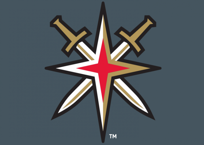
I have no clue where to even start with this one. It embodies everything I said about the primary mark, but goes even further into a well of poor design. The crossing swords fight for aesthetic direction, while the four pointed red star symbolizes, well, i don’t know. Maybe it’s a nod to the six pointed start on the Las Vegas sign? I have nothing more to say on this except at the office, we thought this was a joke.
The secondary mark introduces a bright red as a new color into a muted, dark palette.
What could have been a badass name, badass identity, for a badass town and supremely awesome sport has obviously been “by committeed” into just … ass. And now, we patiently wait to see the uniform kits yet to be unveiled.
The good news? You can buy a crapload of apparel with this terrible logo on it here. And their official website is here.
What are your thoughts on the Vegas Golden Knights logo, name, and direction? Comment below!


