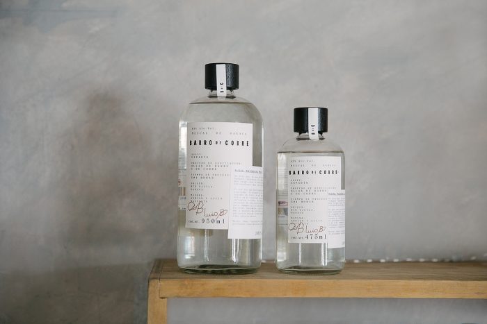
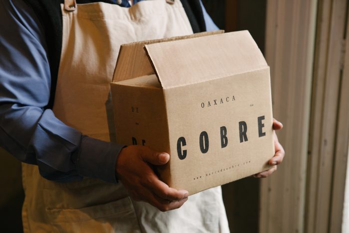
Sometimes the simple palettes and layouts make the biggest impact. This is absolutely true for Savvy Studio’s packaging design for Barro de Cobre, a new mezcal from Oaxaca. (Side note, how fun is Oaxaca to say? Wah-ha-ka! I could say it over and over again.) Back to the critique….
Savvy describes the product on their site: “Barro de Cobre is a mezcal that believes in taking its time, doing things the proper way. This is why it is distilled twice – once, using a clay pot and the second time round, in a copper pot. BdeC were proud to be the first to conceive this unique blend of different distillation processes, which is where we drew its name from. Strong yet smooth, clear yet earthy.”
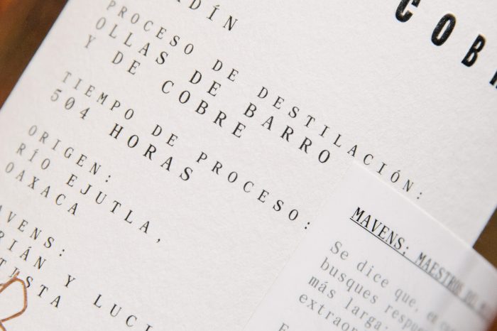
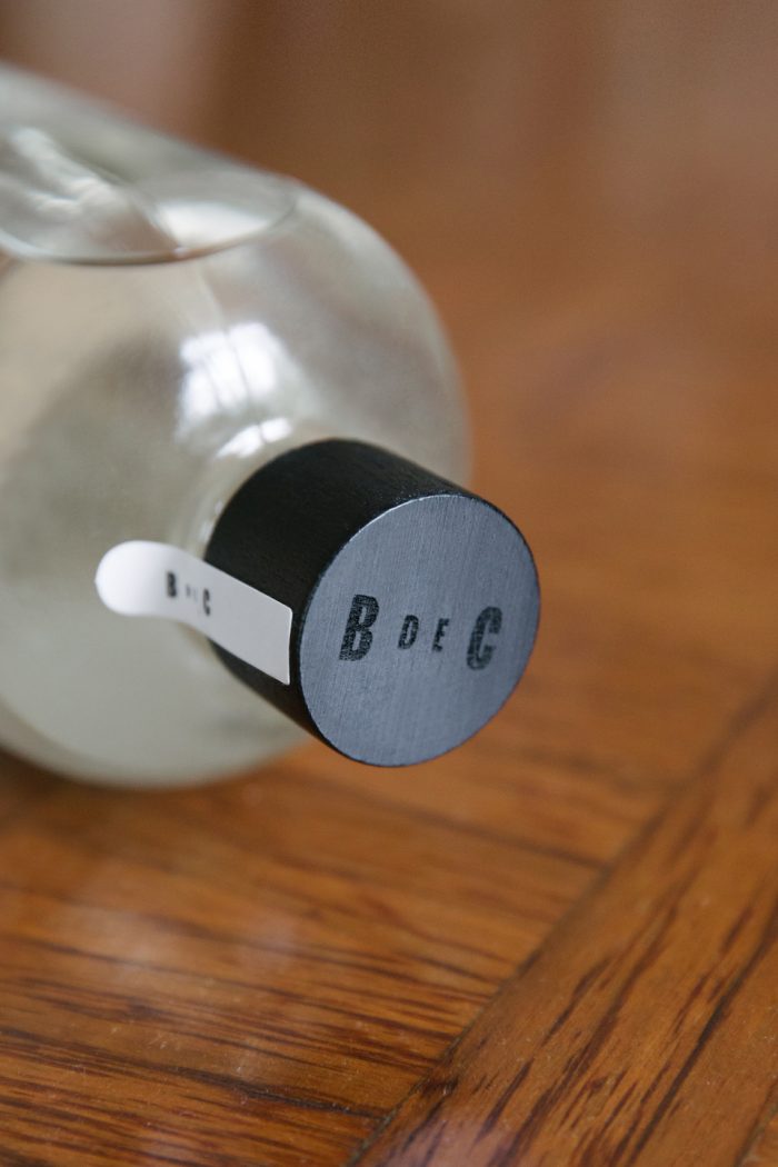
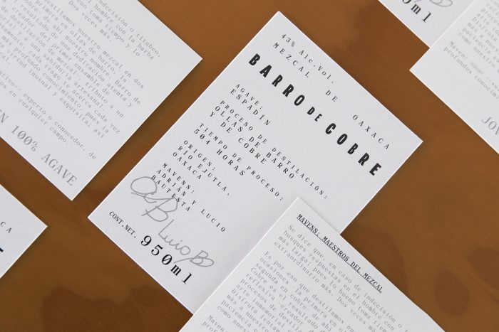
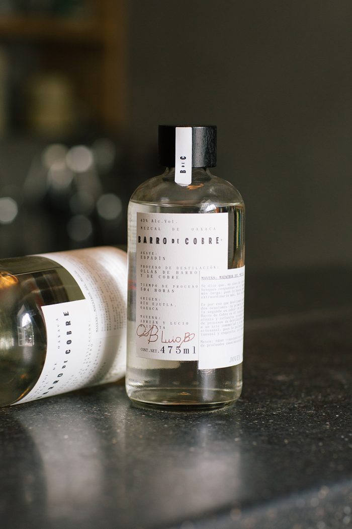
The “strong yet smooth” description of the product directly influenced the materials decision. Smooth crashes into rougher textures with the label stock. It’s pushed further with the typography selections. Using a compressed modern grotesque with soft corners, supported by a straightforward serif type family, the studio was able to create a direct, no-nonsense feel. The body type feels monospace with aggressively open kerning that allows for a lot of space to exist within the copy areas. This treatment effectively puts the focus on the clarity of product and creates a confident identity and visual message.
Designed by Savvy Studio
