Online, first impressions are everything. Users want to find answers or take action quickly. In as little as 50 milliseconds, a user judges your website and decides if they are staying or going. With such a brief time limit available to spark interest, it’s more important than ever to keep your website simple, clear and authentic.
Here are some ideas on how:
Be bold in type
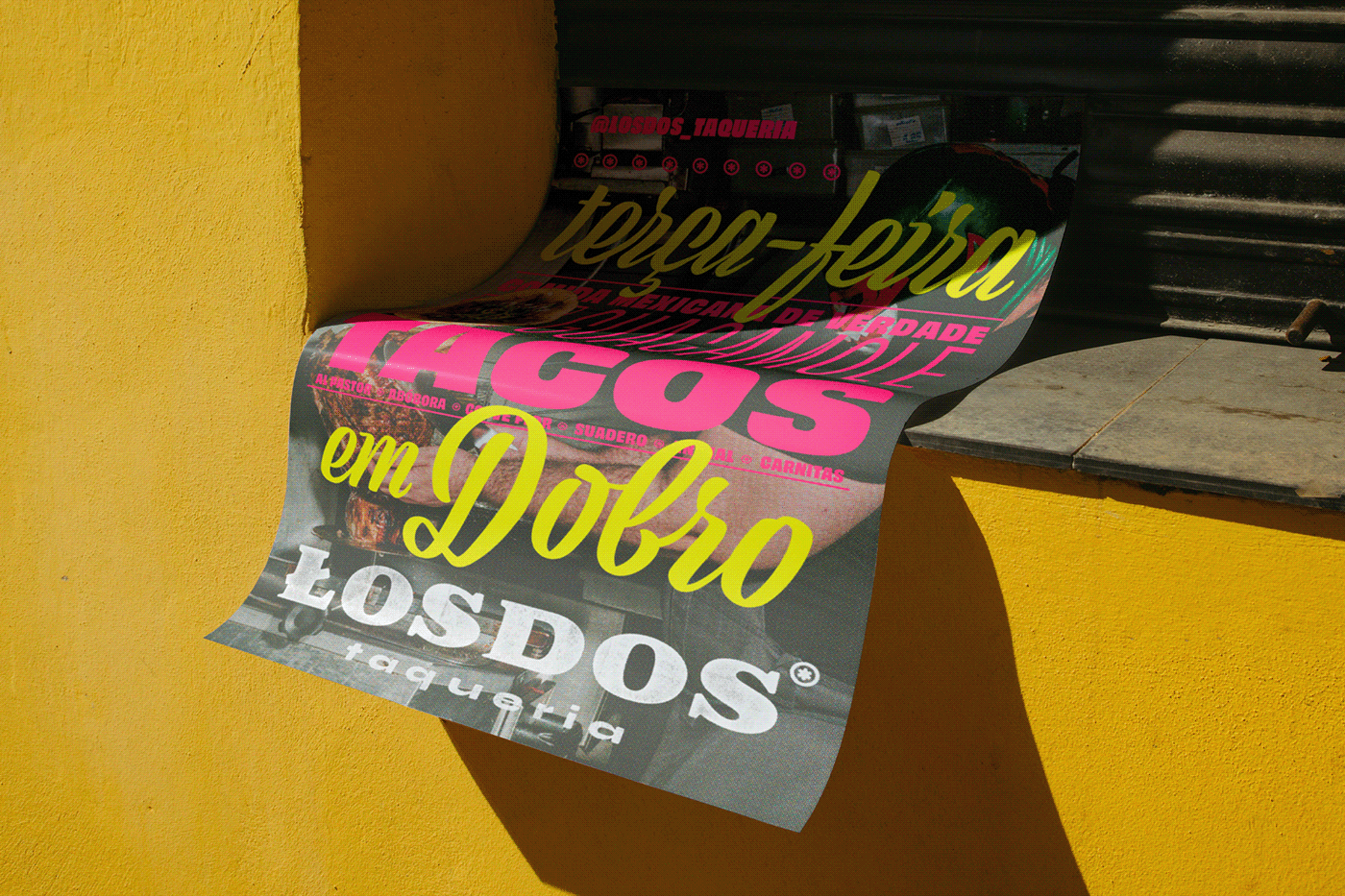
Bold typography is loud, and if you are working to make a first impression, loud can be a good thing. Emphasize what is important or what you immediately want to get across to visitors with large typography use. Words can be a more powerful tool than imagery.
Tell a story visually
Visual cues are universal, easy to digest, and especially useful when users want to find their answer or action quickly. So, instead of long chunks of copy, use visuals such as video, illustration or animation to quickly educate the user and get them heading down the correct user path.
Make an open path
Stop piling information on your site. Make sure the main customer paths are clear and easy to find. Less clicks to get to their goal will create a much more pleasant user experience.
De-clutter or build with simplicity
You know how finding an outfit in the morning is really tough when your closet is cluttered? Think of your website the same way. Don’t pack your website full of useless information. It leaves your visitors wondering if they can ever dig through the mess you created and find their answer. If you are starting from scratch, be sure to create site maps and wireframes first to avoid information overlap.
Think mobile first
When was the last time you were out of the house and thought, “I’ll wait until I get home to look up who the third James Bond was.” The age of smartphones has created immediate access to information, or in this case, your website. Design in mobile first – as most of your users will be visiting your site on the go.
Back up your claims
Anyone can say they are “international” or “award winning.” But saying you are international by being located in five continents, or that you’ve won 10 design awards in the past year is much more impactful. Numbers, not generic descriptors, speak volumes.
Downsize the menu
The minimalism trend continues. Having a long menu slows the user down. Looking at your site, what menu items can you condense or cut? Try to get it to 3 this year and place additional items in the sub navigation.
Clarity in navigation is key
Some users still don’t automatically associate those three little lines with ‘menu’, and limiting the user’s ability, especially on mobile, to find the primary navigation is a big problem. Solve any confusion by using the word “Menu” next to the hamburger – you now have a visual and text cue. Check out how Adobe does it.
Web performance and page load take precedence
Each year, visitors become less patient with load time. If your video, imagery and custom font use is killing your load time, it’s time to rethink your design. Optimize your media or get rid of it.
Keep it authentic and human
As a brand, making a connection with visitors, instead of just selling your services, is becoming more important. Be authentic in your imagery and voice. Stop the stock-y photos, talk to people like people in your writing. This is a general trend for all types of communication, but especially on the web as this may be the first interaction someone has with you.
What trends are you seeing employed by restaurant brands? What do you think is coming down the pike? What’s dying off? Comment below.

