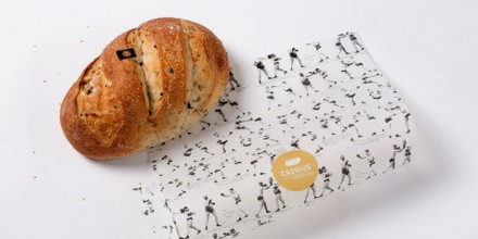
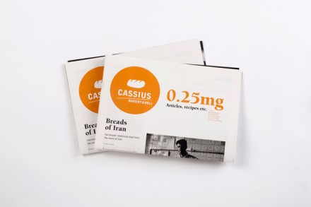
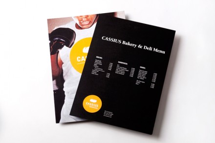
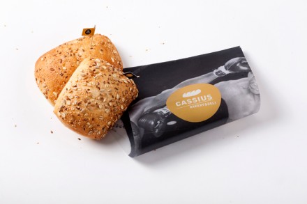
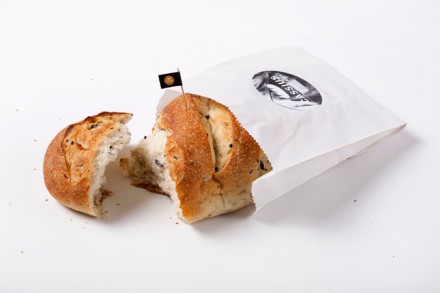
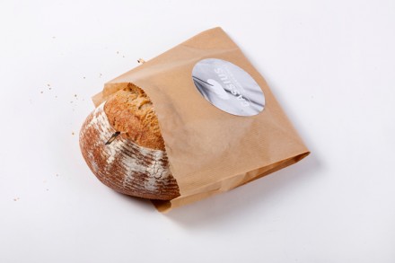
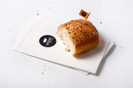
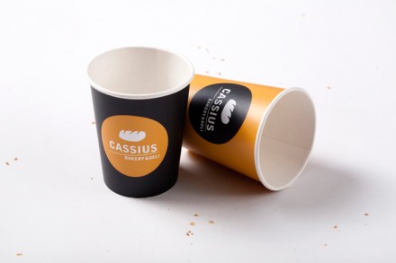
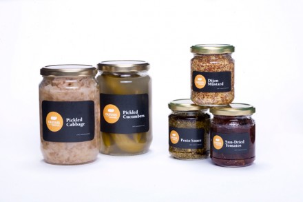
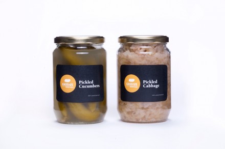
This bakery brand was designed by Avigail Bahat. Once again a strong black and white base color palate makes the yellow/gold accoutrement pop. This helps the logo stand out and jump while keeping the brand calm, subdued, but strong and confident. Everything has been designed from business papers to the packaging. The central theme for the brand is based on retro boxing probably derived from the name Cassius, as in Cassius Clay.
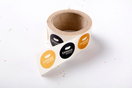
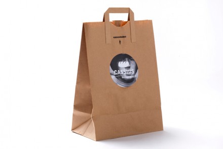
The branded elements are kept low cost by using stickers as tip ons to make the packaging “custom.” This is an inexpensive technique that requires only a little bit extra manual labor to execute, but it keeps the cost low and the effect is strong.
All these wonderful bakery brands make me really REALLY want to do one myself. Love the work.



One Response
thanks for the feedback!
a