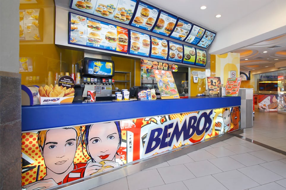
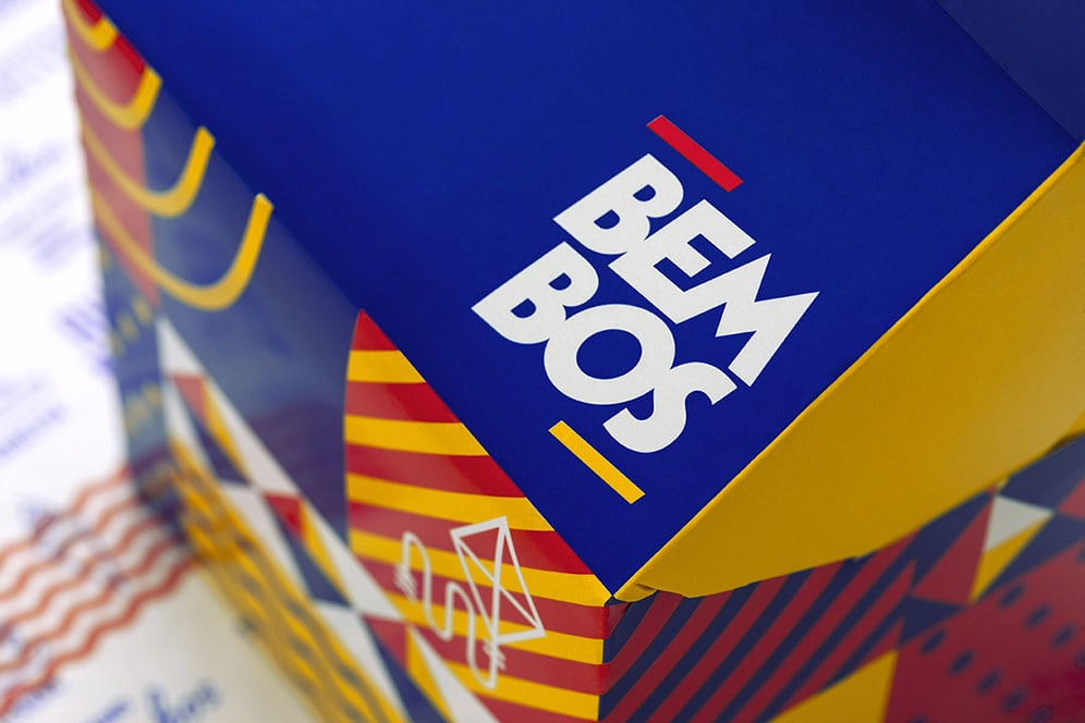
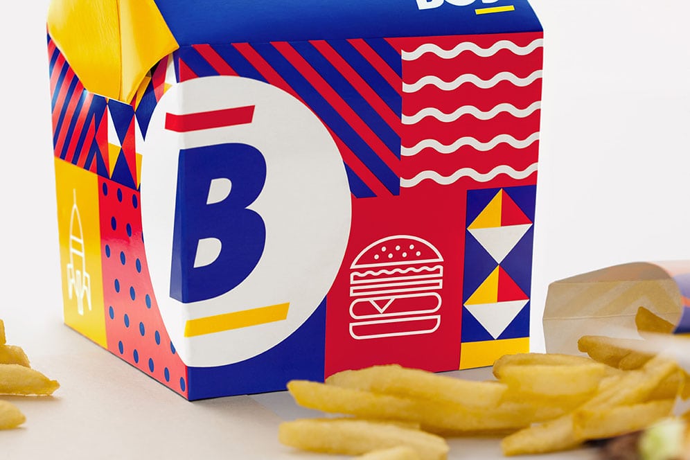
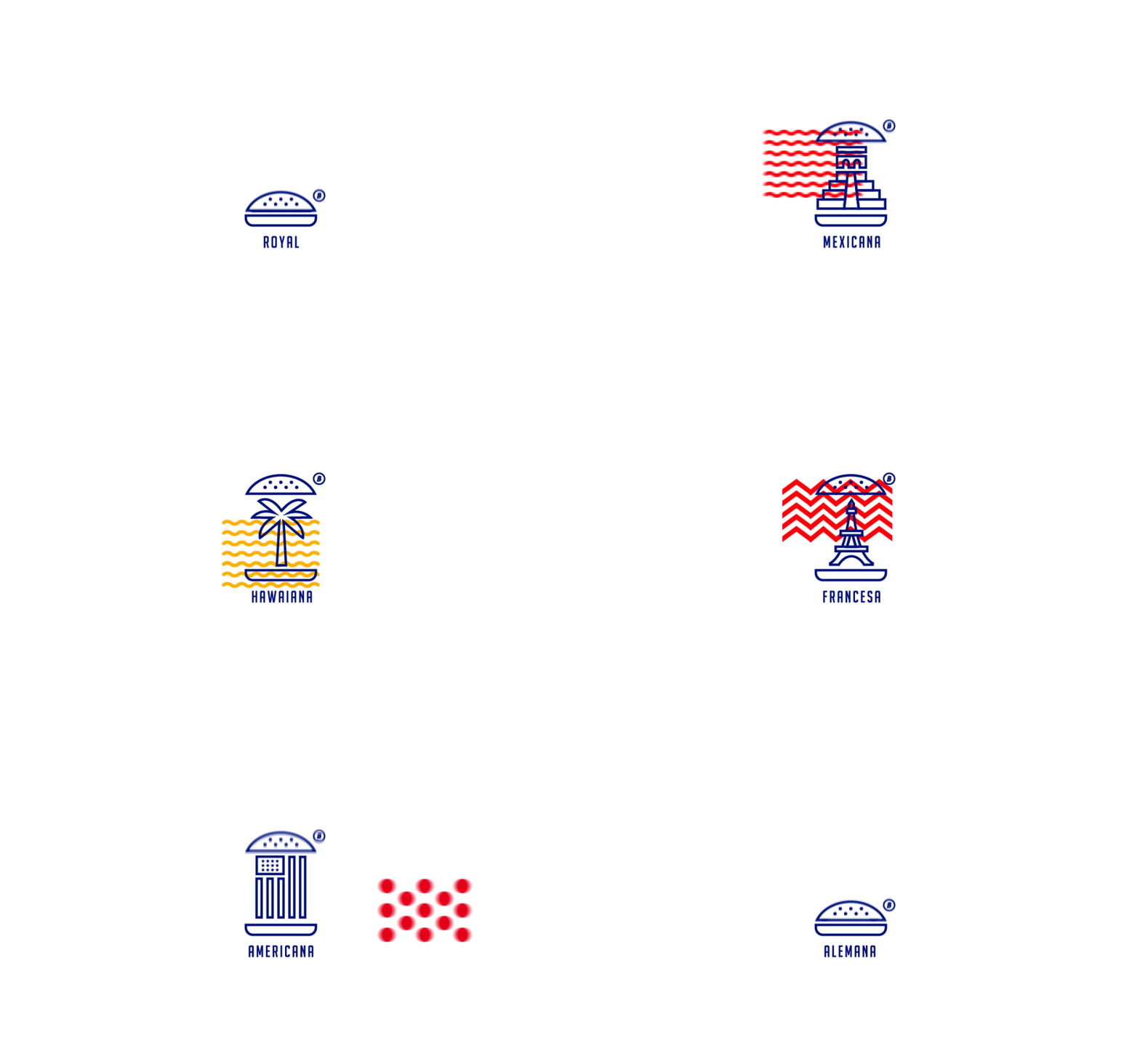
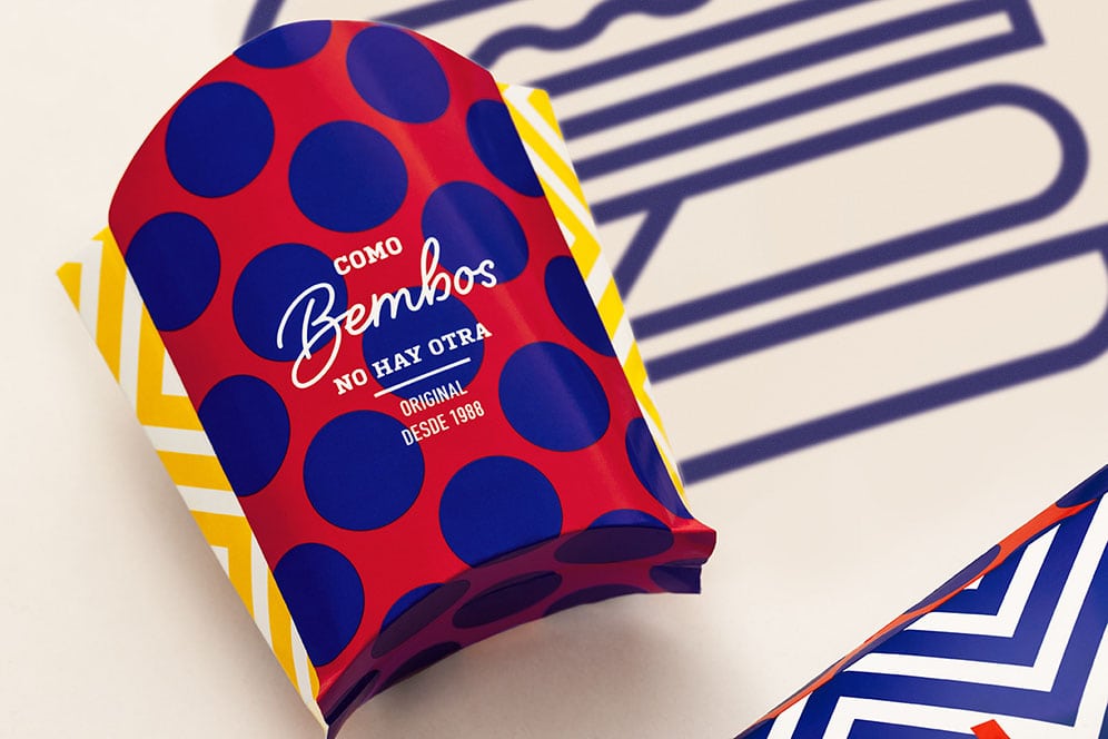
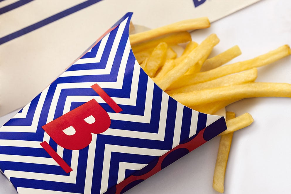
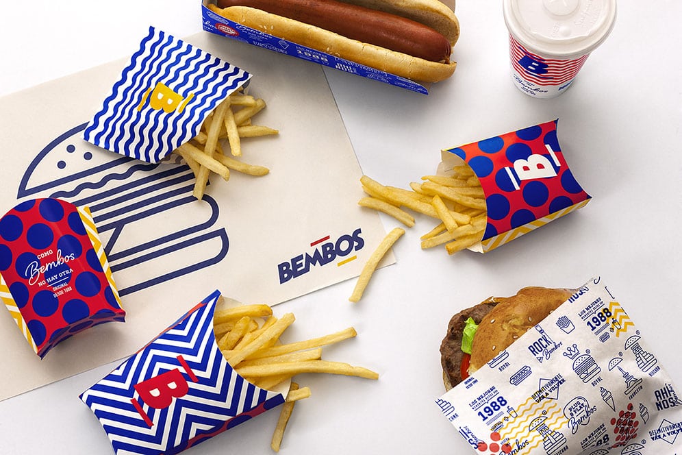
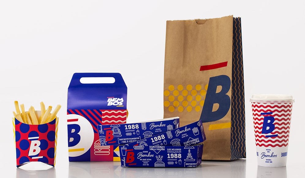
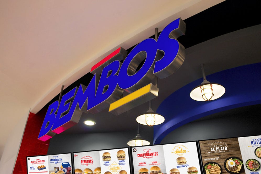
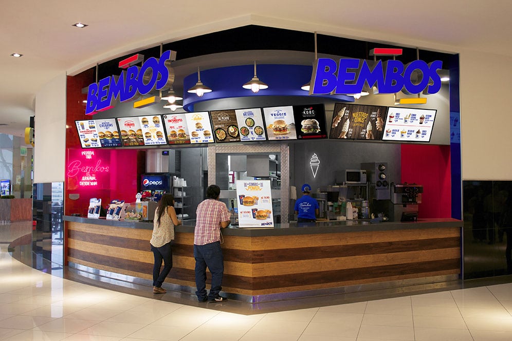
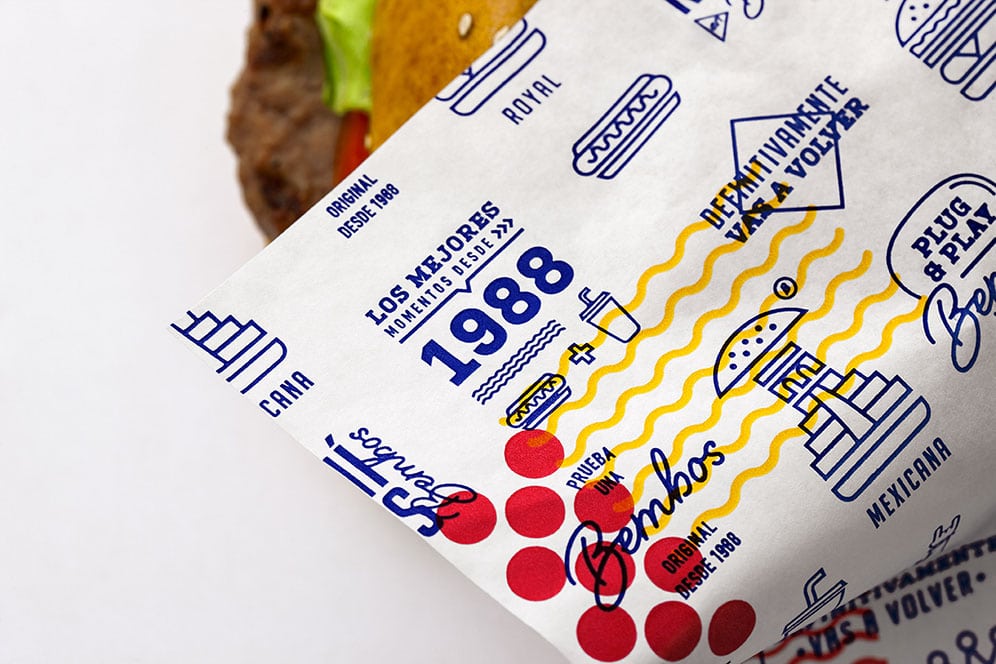
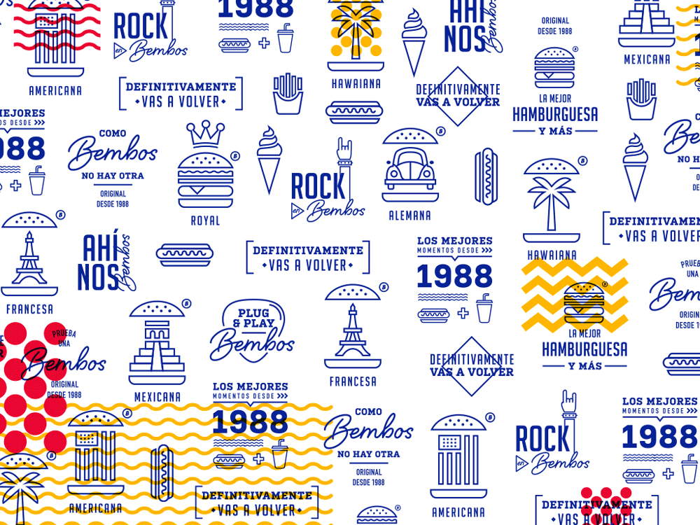
We’re a little late to this brand refresh party, but hey, with all the amazing design coming out of the food and bev industry every day it’s hard to keep up! Established in 1988 with a single location in Lima, Peru, Bembos is a fast food hamburger restaurant that now has 55 locations across the country. They treat their hamburgers like pizzas, each one named after a thematic flavor profile with the appropriate toppings (the Hawaiian, for example, has ham and pineapple, the Mexican with nachos and guac, you get the idea). Their brand, being targeted at young adults, is always doing what it can to look young, fresh, and exciting. The older brand, as you’ll see in the first picture below, has a visual basis in pop art and the energy that it encapsulates. This refresh is a modern evolution of their pop art look, bolder, brighter, and more dynamic than ever before. This is done by putting the pop art patterns front and center, making them bigger than ever before. Traditional pop art homages usually feature these quintessential patterns small, background elements but on this packaging suite, they are the entire focus. Another detail not to miss are the badges made for each of their hamburgers; a monoline illustration that encapsulates a country between two buns (again, using the two examples from before, a palm tree for the Hawaiian, a Mayan temple for the Mexican, etc.).
Bembos Brand Refresh by Infinito.
