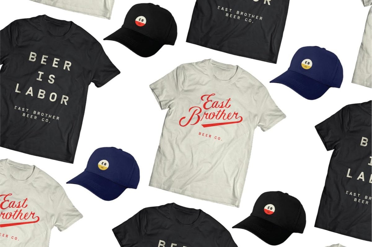
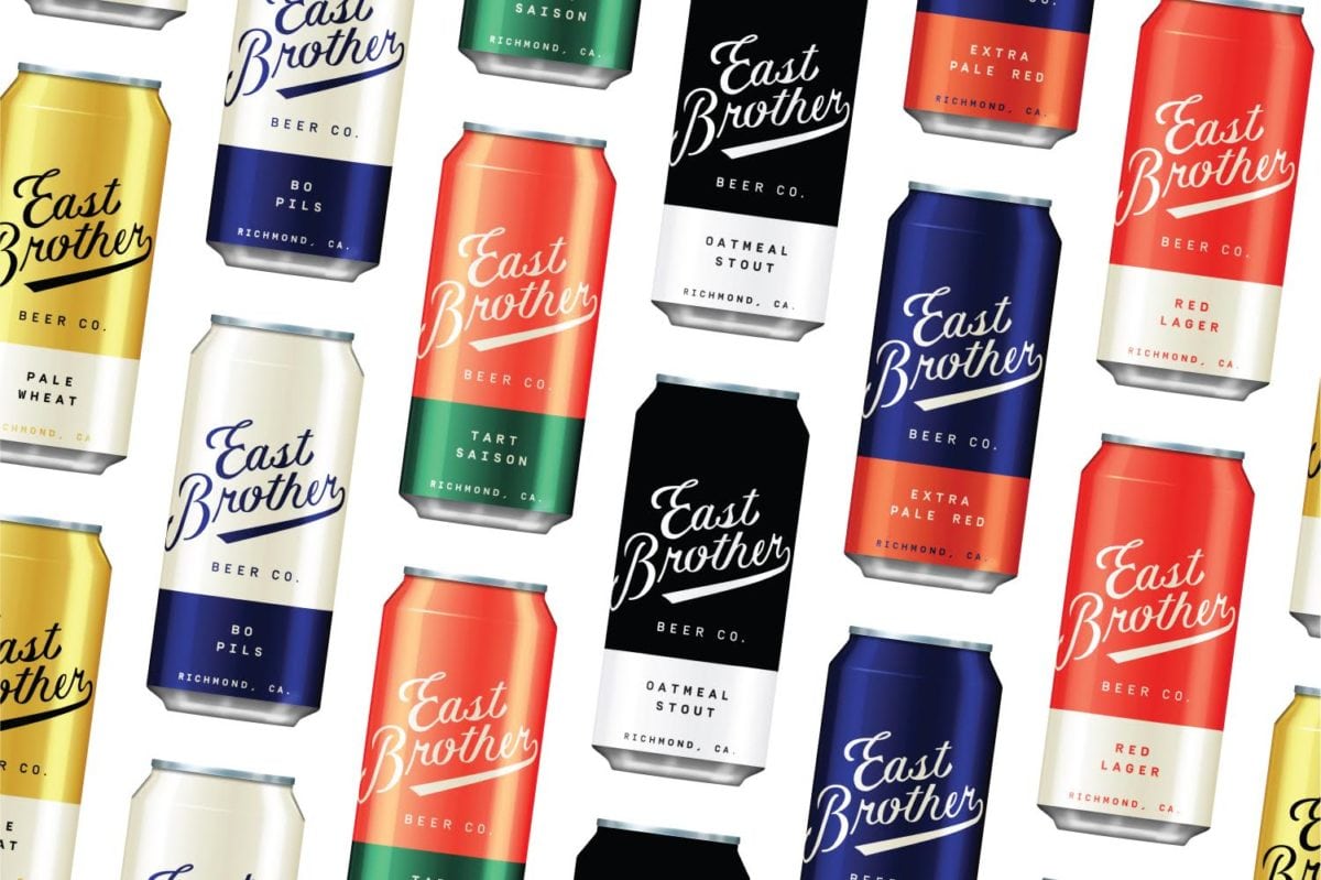
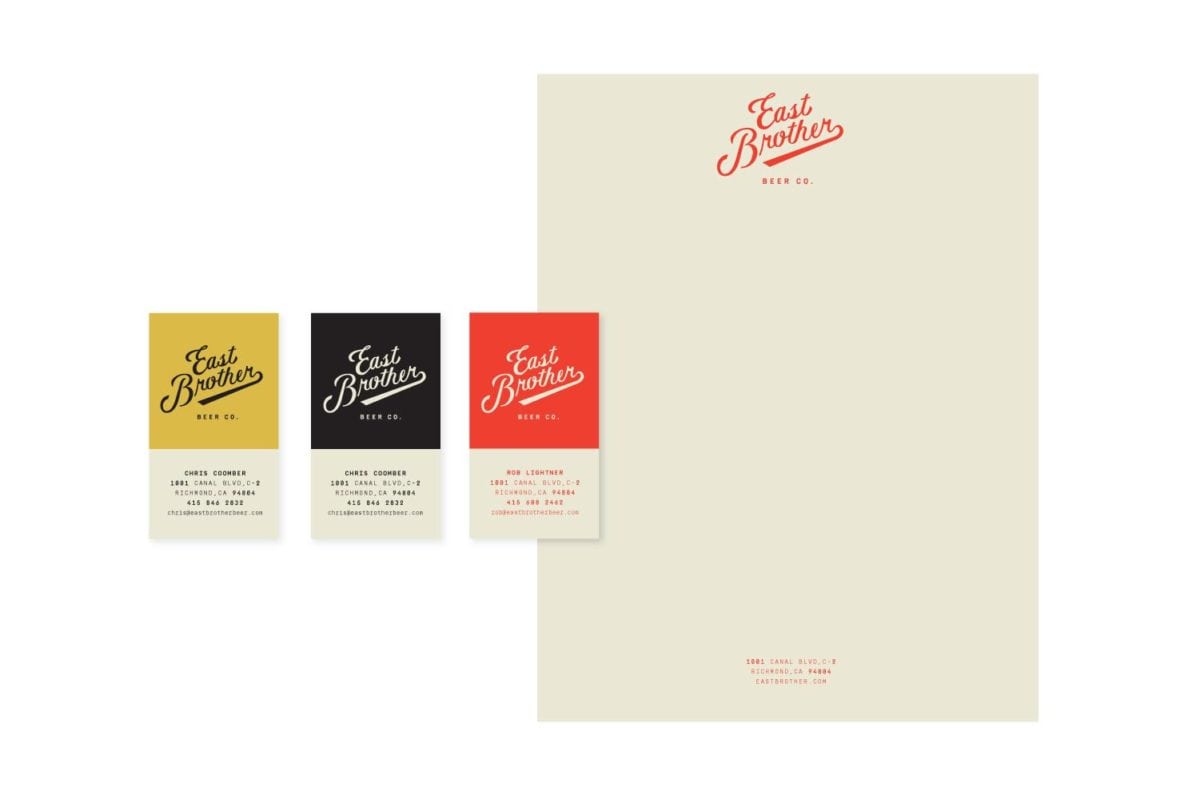
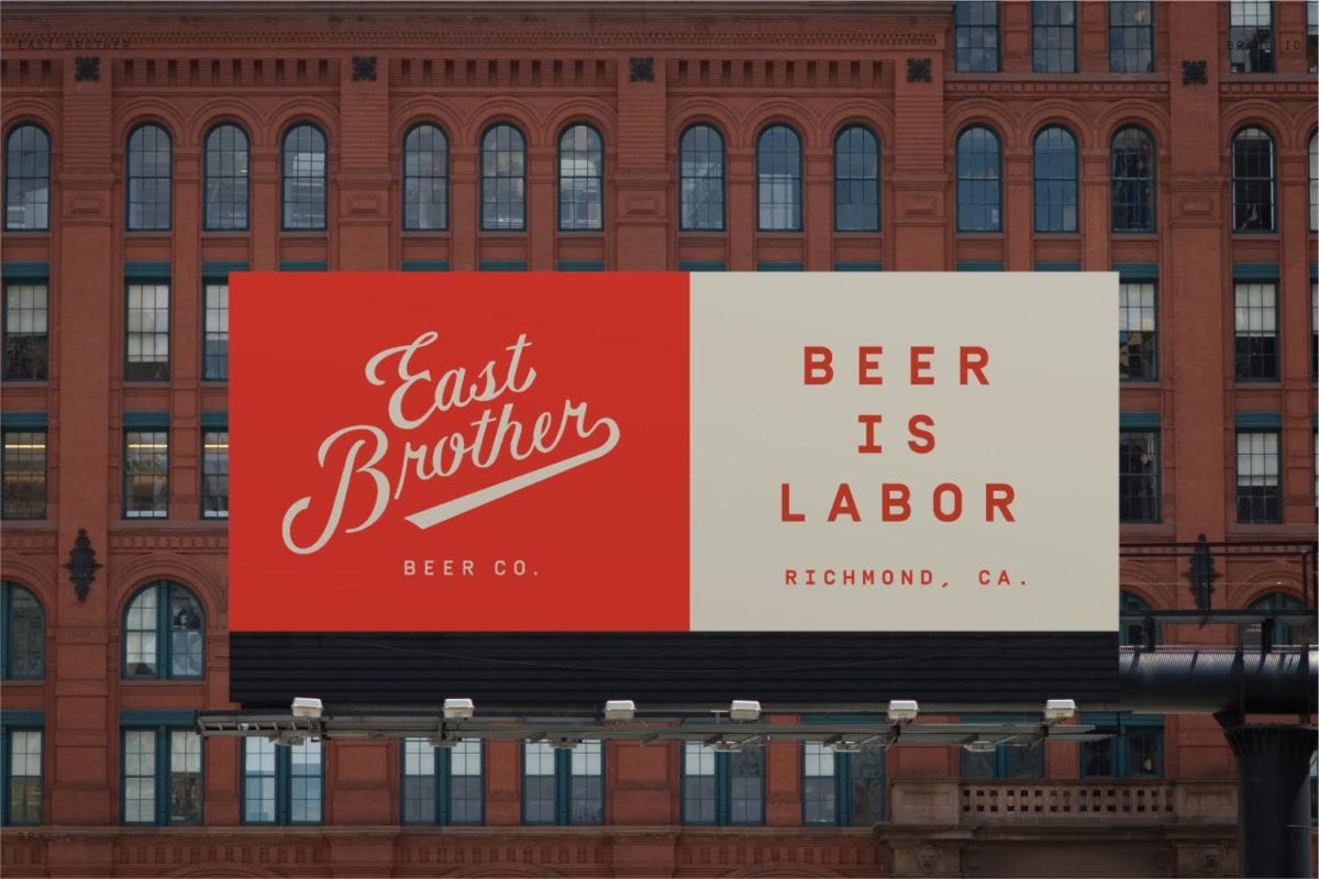
East Brother Beer Co. isn’t concerned with trends in craft beer, or keeping up with the competition and creating milkshake IPAs like everyone else seems to be doing now. They’re committed to timeless styles, and a commitment to making consistent beer, batch after batch. It’s always a challenge to connect a new contemporary brewery to the overall history of beer-making, but Good Beer Hunting accomplished this by connecting the East Brother Beer Co to its location amidst hard-working stockyards, train lines, and waterways, and relaying this simple, hardworking vibe into the brand touchpoints. To quote the designers:
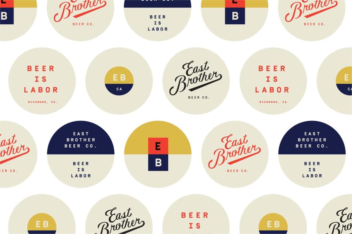
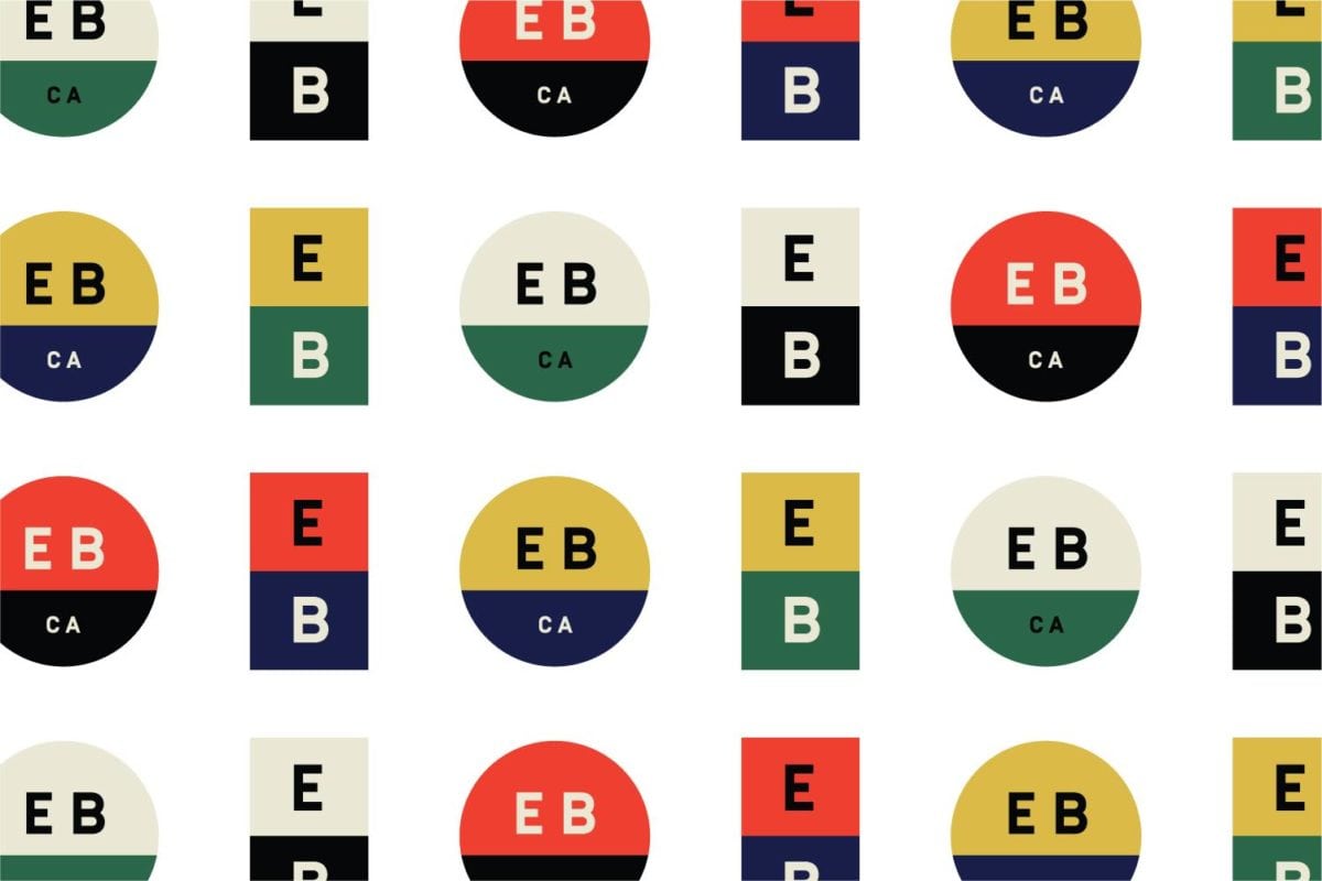
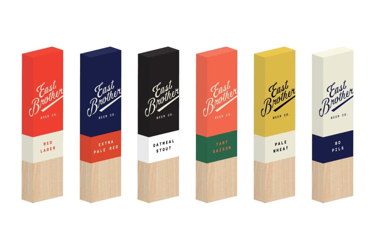
The bifurcated colorways reference the waterlines on those freighters, and the simple monotype font evokes the stenciled lettering of the ships names, or the numbers on a train engine. The simple hemisphere circle of the secondary mark is both navigational and an abstracted plimsoll line. The results are intended to feel classic and refined, industrial and logistical, both local and foreign, personal, but also massive in scale. Like seeing a boat or a train for the first time as a child — wide-eyed and curious, overwhelmed and obsessed.
East Brothers Beer Co Branding by Good Beer Hunting.
