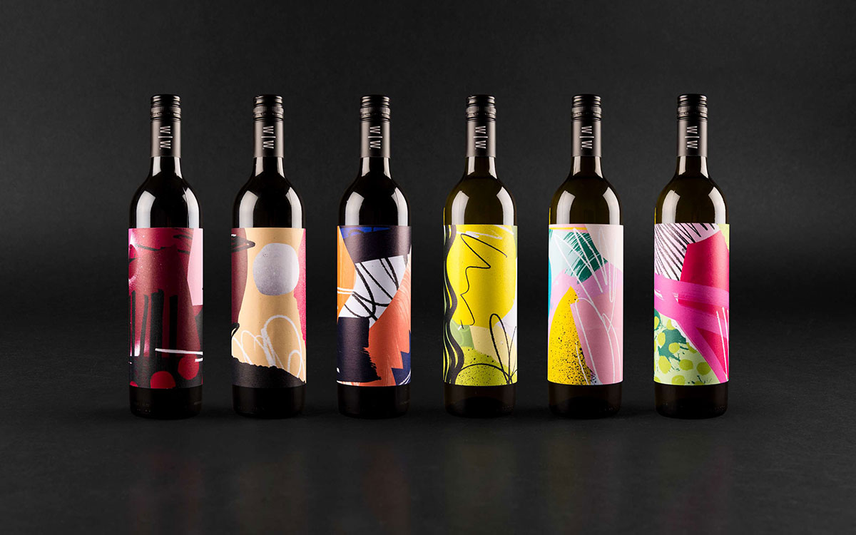
Intoducing another wine concept this week! This one takes all the fuss out of buying wine, theres no name, no dates, no grapes. Just a wonderfully, expressive illustrated label to suggest the flavor of what each wine will taste like. I think this design was meant meant for me and people who buy wine similarly. I’m the kind of person who judges a wine label by their bottle design and I’m always dissapointed when the label doesn’t quite match the flavor.
For those with a visual mind, the colors and textures describe the note of each flavor and help take the decision making out of the wine buying process. These illustrations were achived by scanning in all kinds of media including paper, wood, fruit, ink, paint, pencils, etc. – anything that could turned into a texture. This unique concept was designed by Robot Food in Leeds, England.


