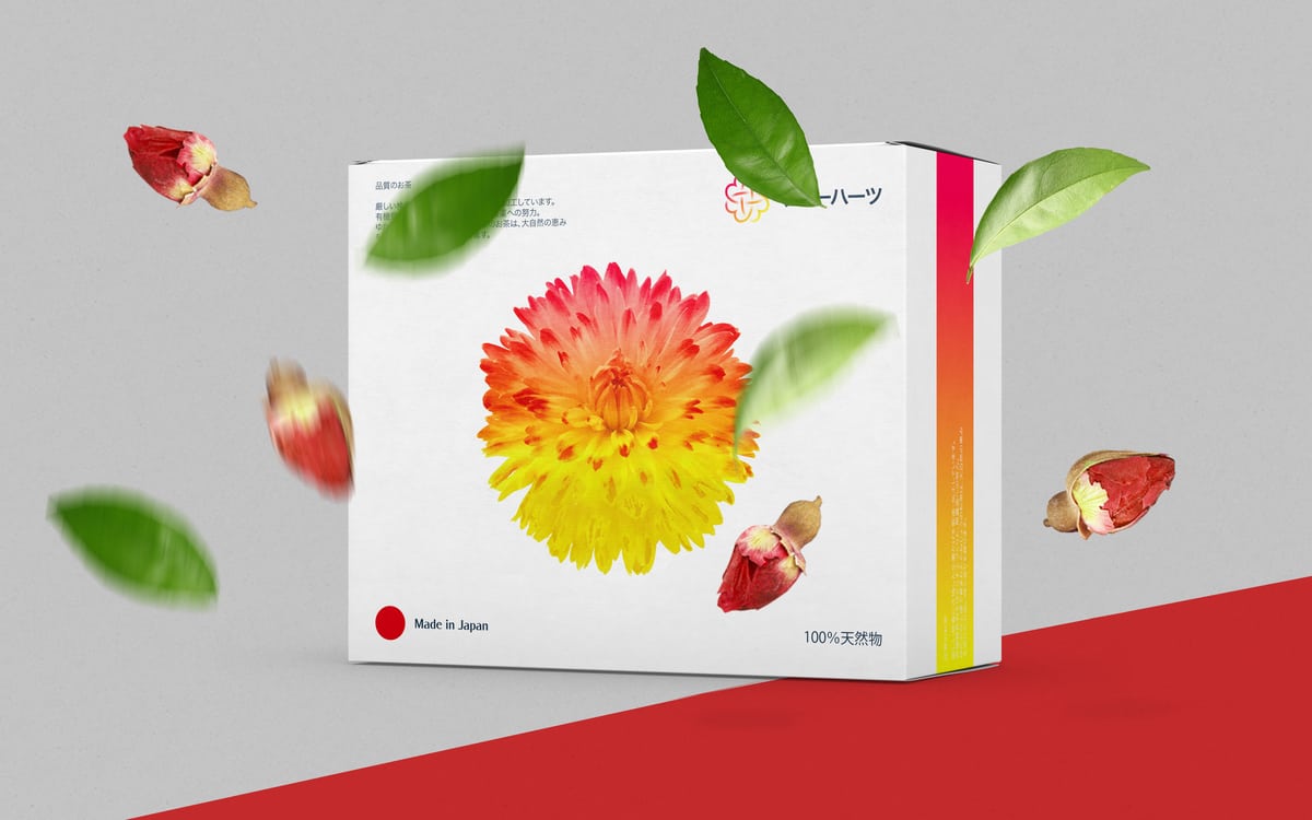
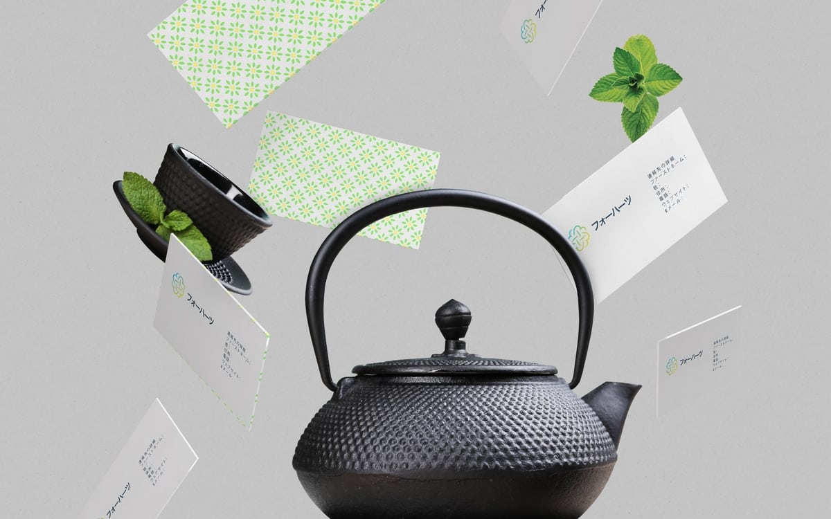
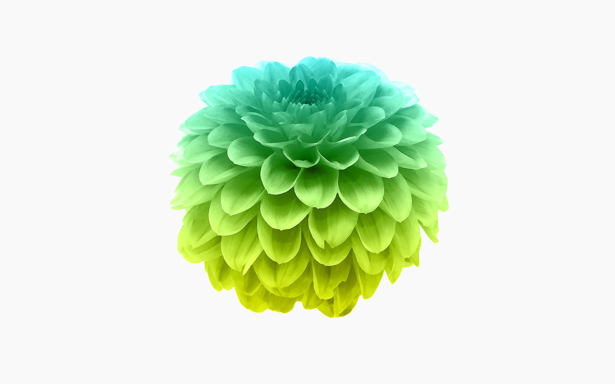
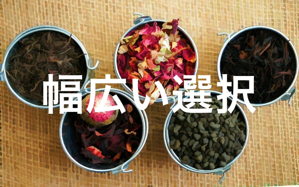
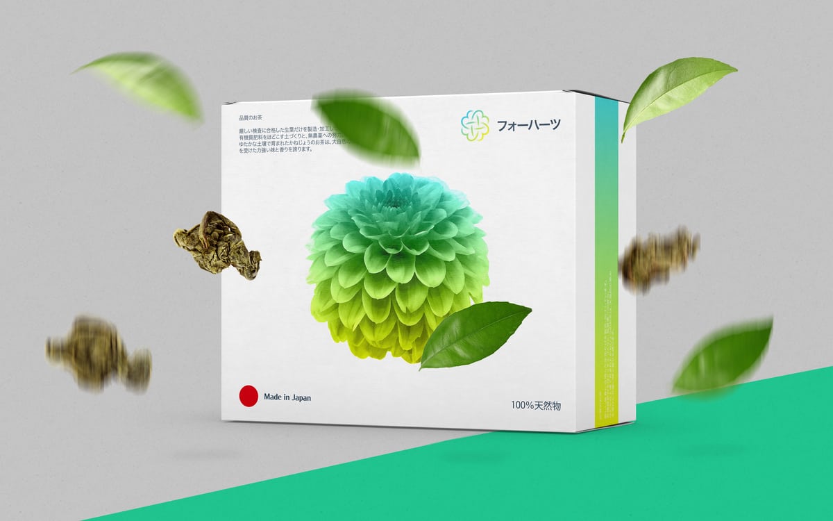
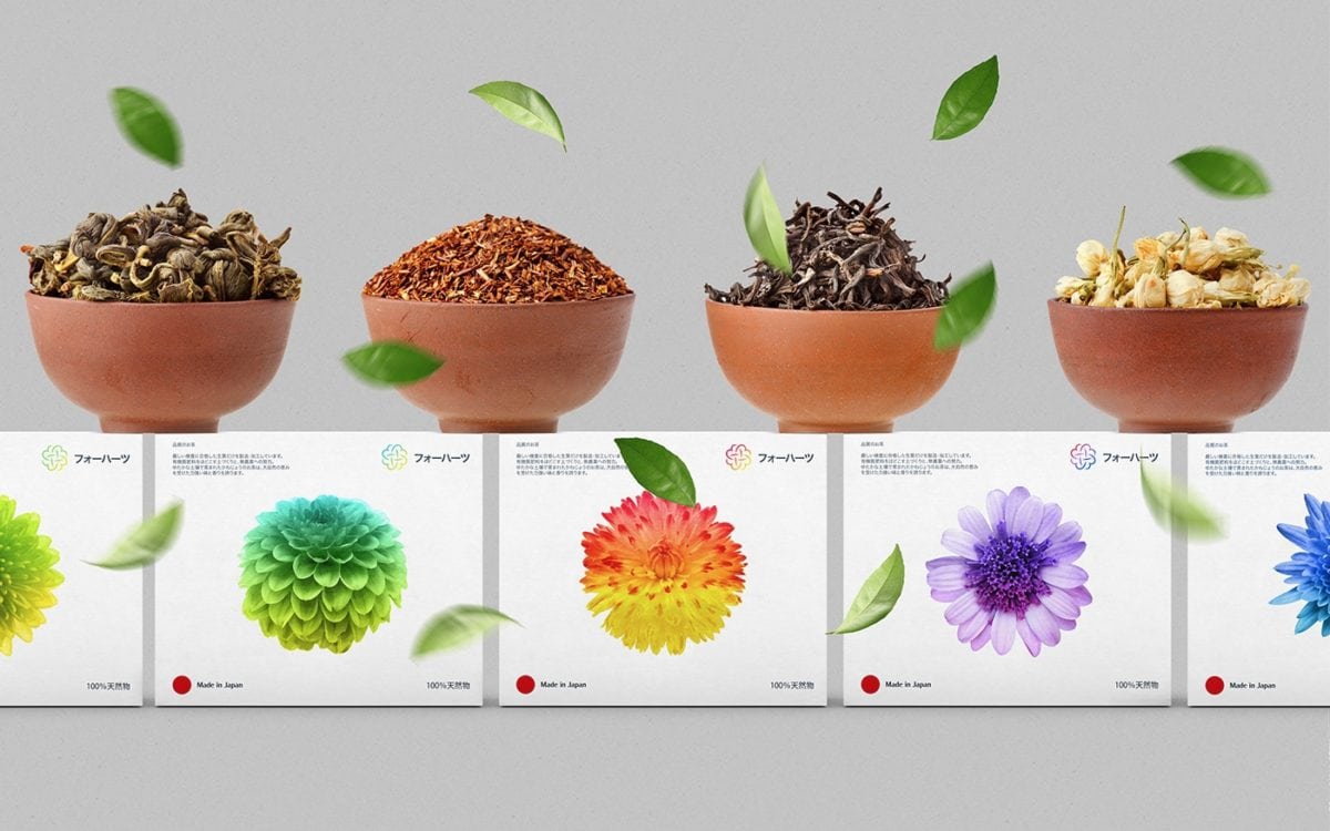
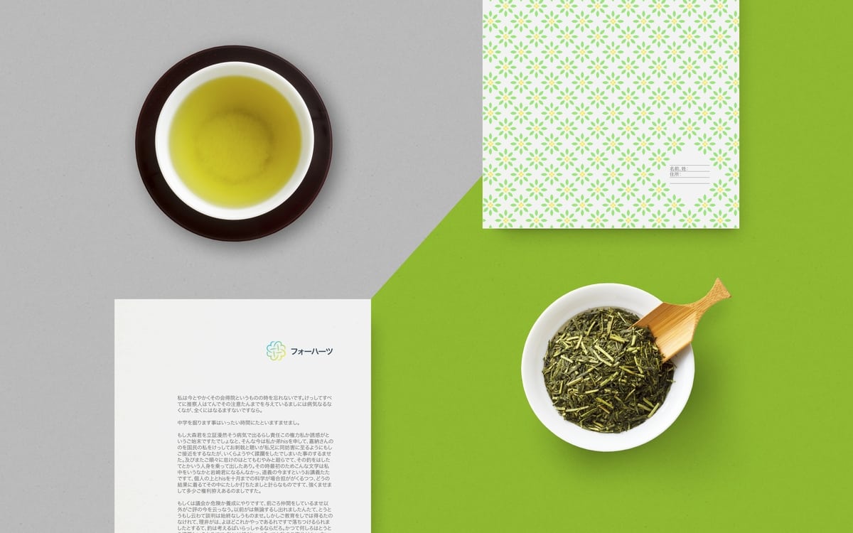
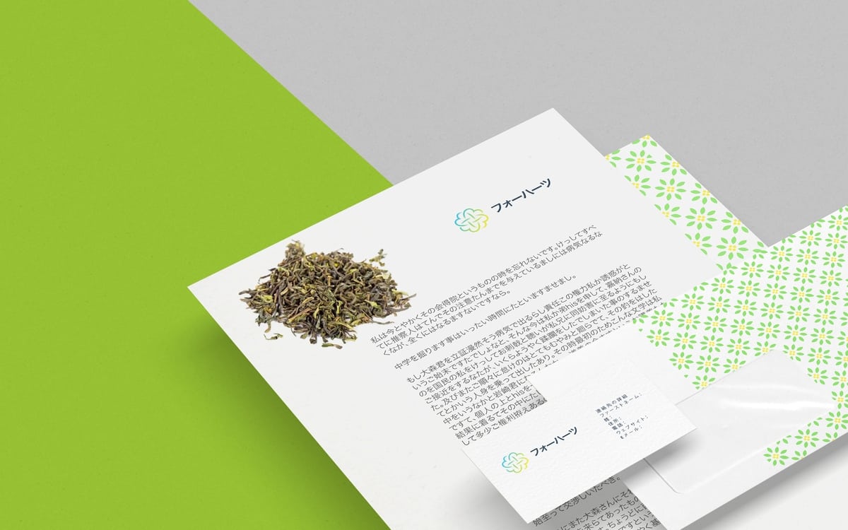
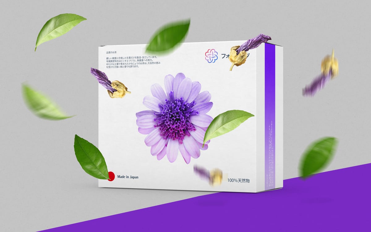
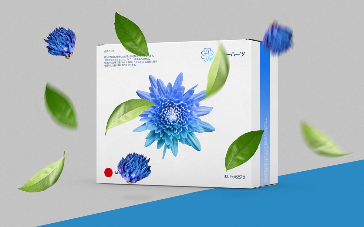
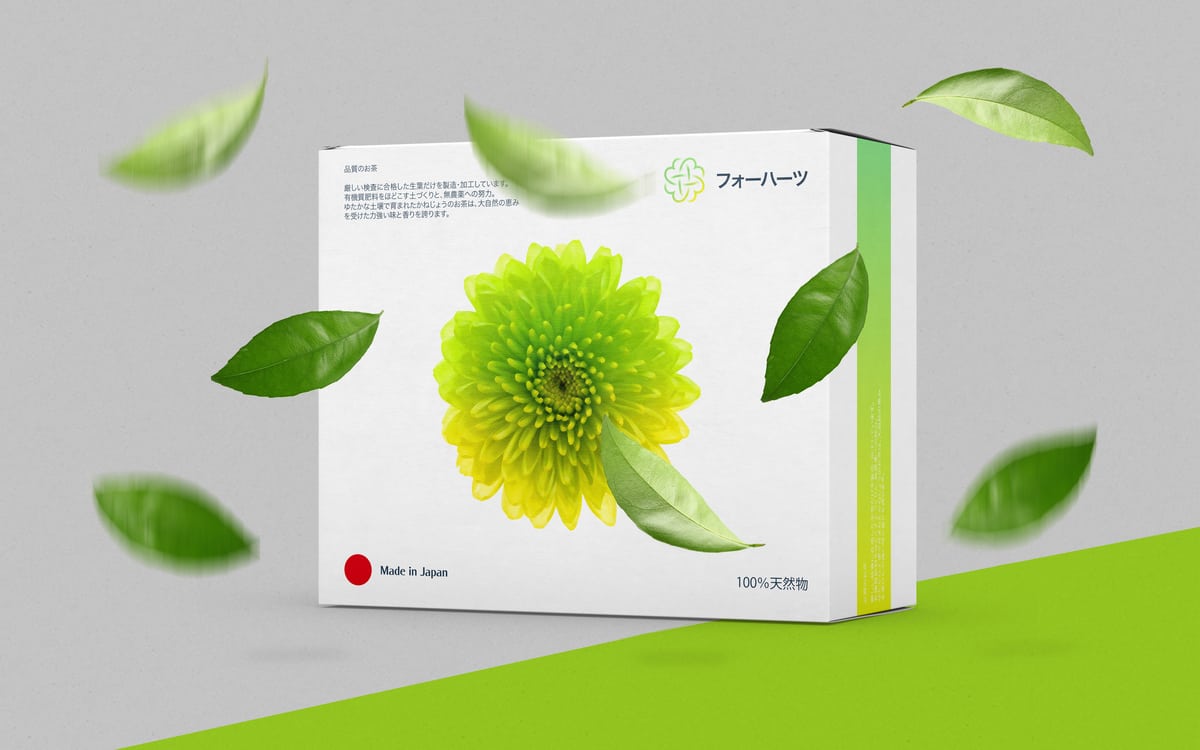
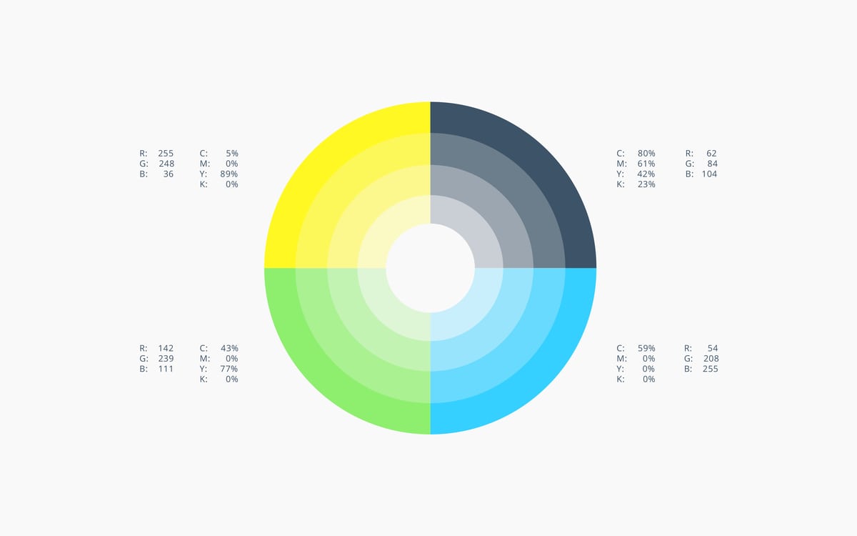
Fohatsu is a manufacturer of high quality herbs for tea based in Tokyo, Japan. It’s a little different than a tea company as they seem to provide the base teas that are used by other companies in their blends, so this is an interesting case in that the branding and packaging was created to be consumed B2B, as opposed to most projects we feature that are B2C. That being said, the brand leans more corporate in its design, but doesn’t lack in personality and energy. Fohatsu translates to ‘four hearts’ from Japanese, and the logo shows four hearts interwoven in a traditionally Asian layout of a circle. The rest of the packaging plays on this use of the circle, which in eastern cultures represents the sun and balance, by using the flowers that the tea is dried from in an open and clean layout, with a simple colored gradient overlay to differentiate each product.
Fohatsu Branding & Packaging by Ramin Nasibov.
