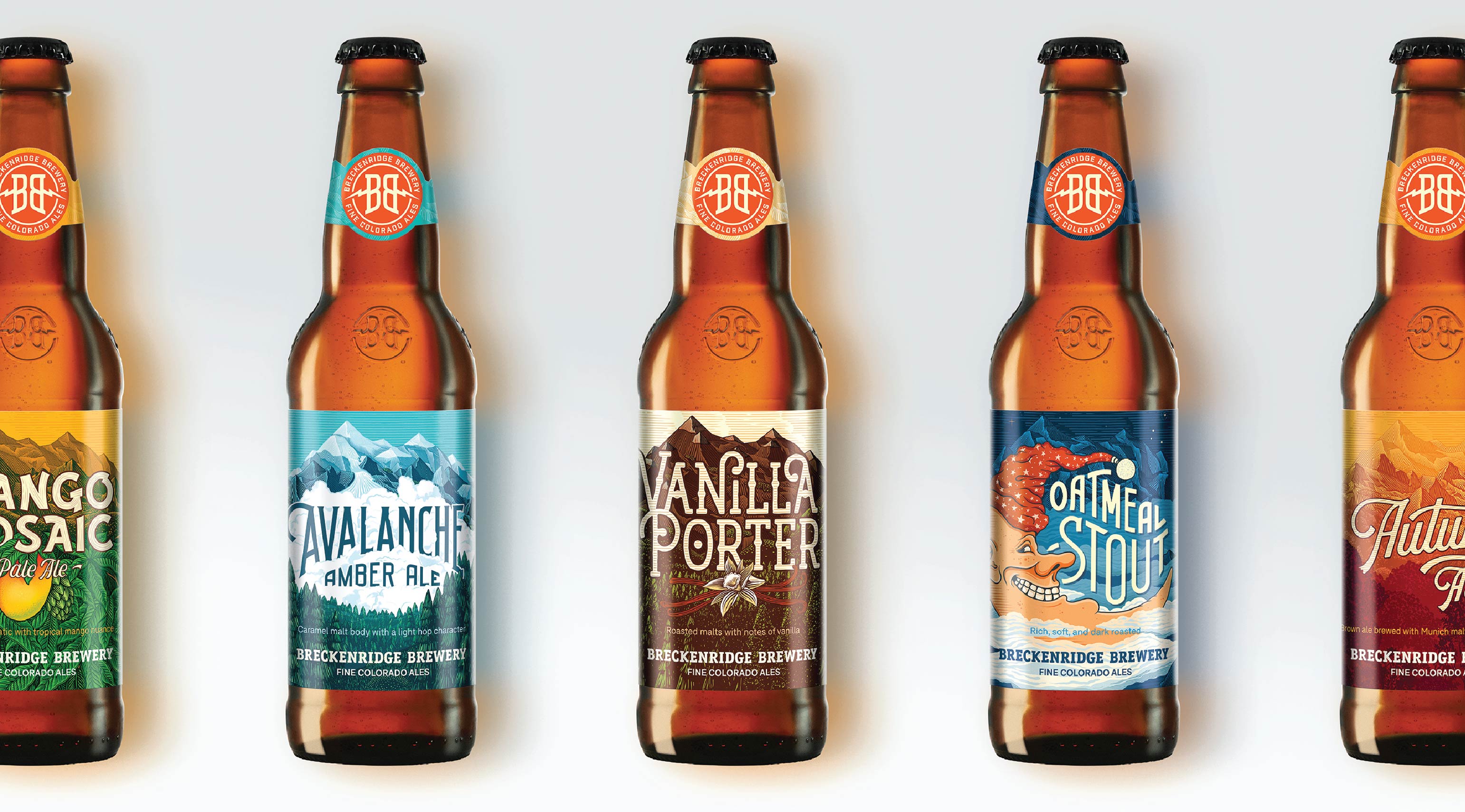
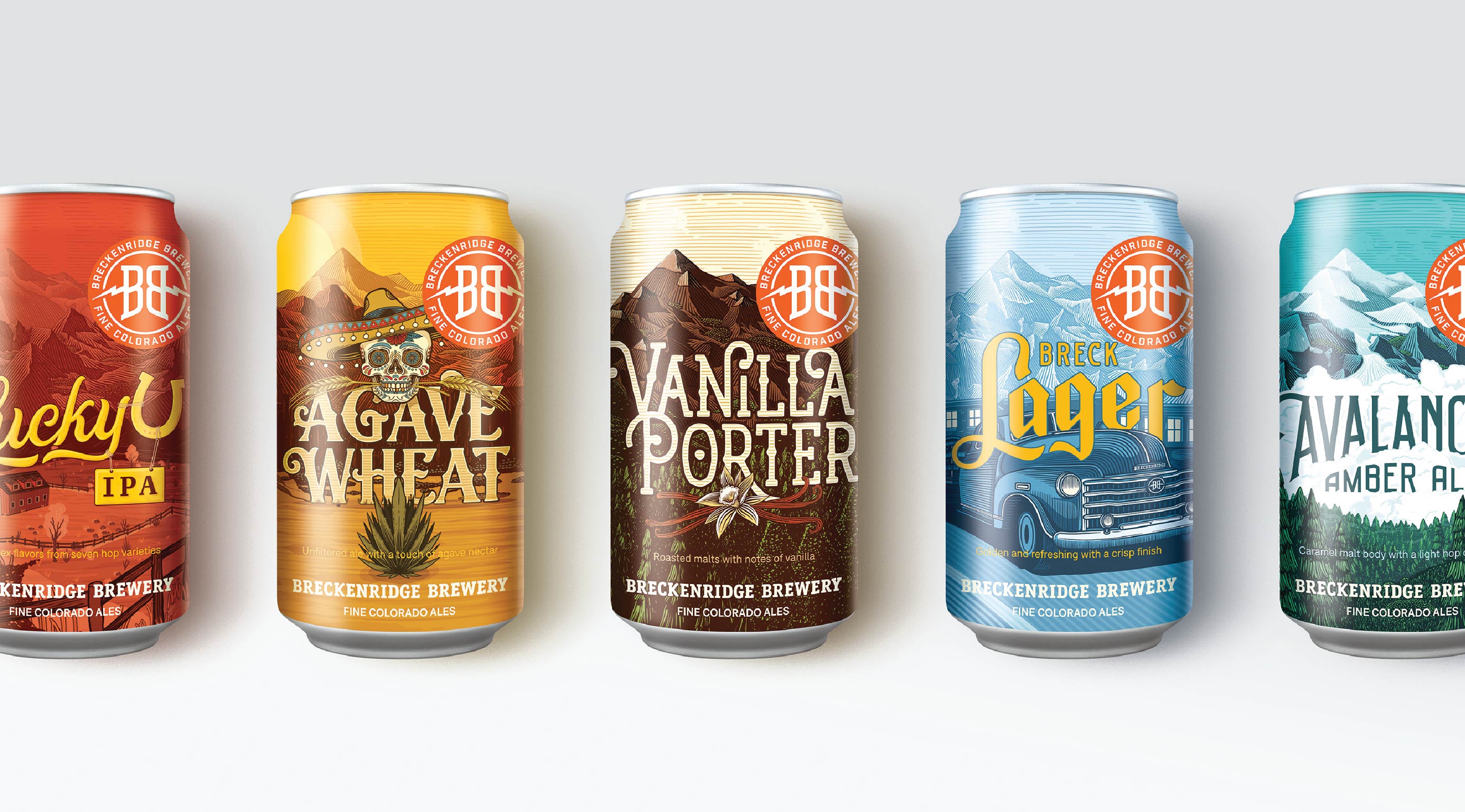
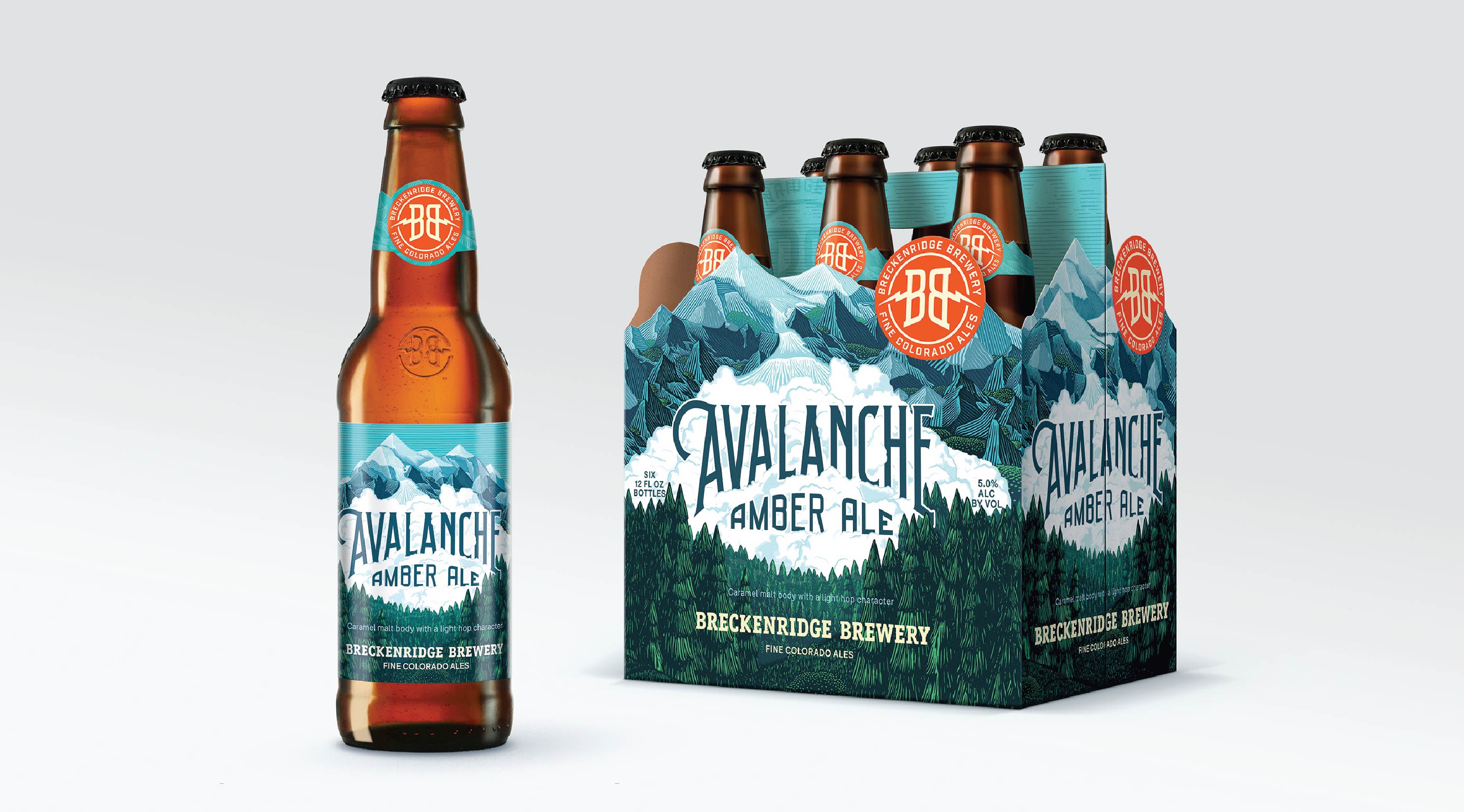
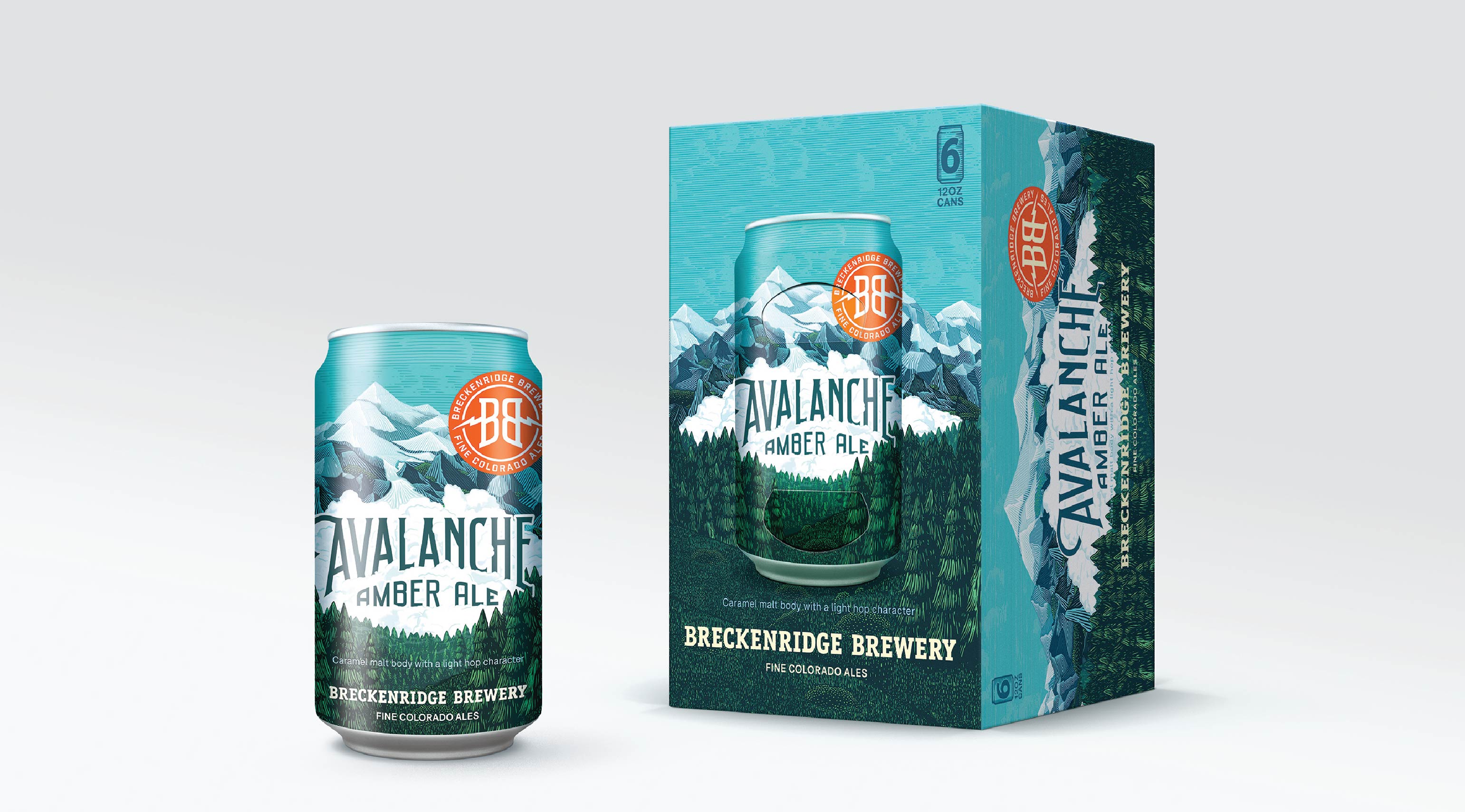
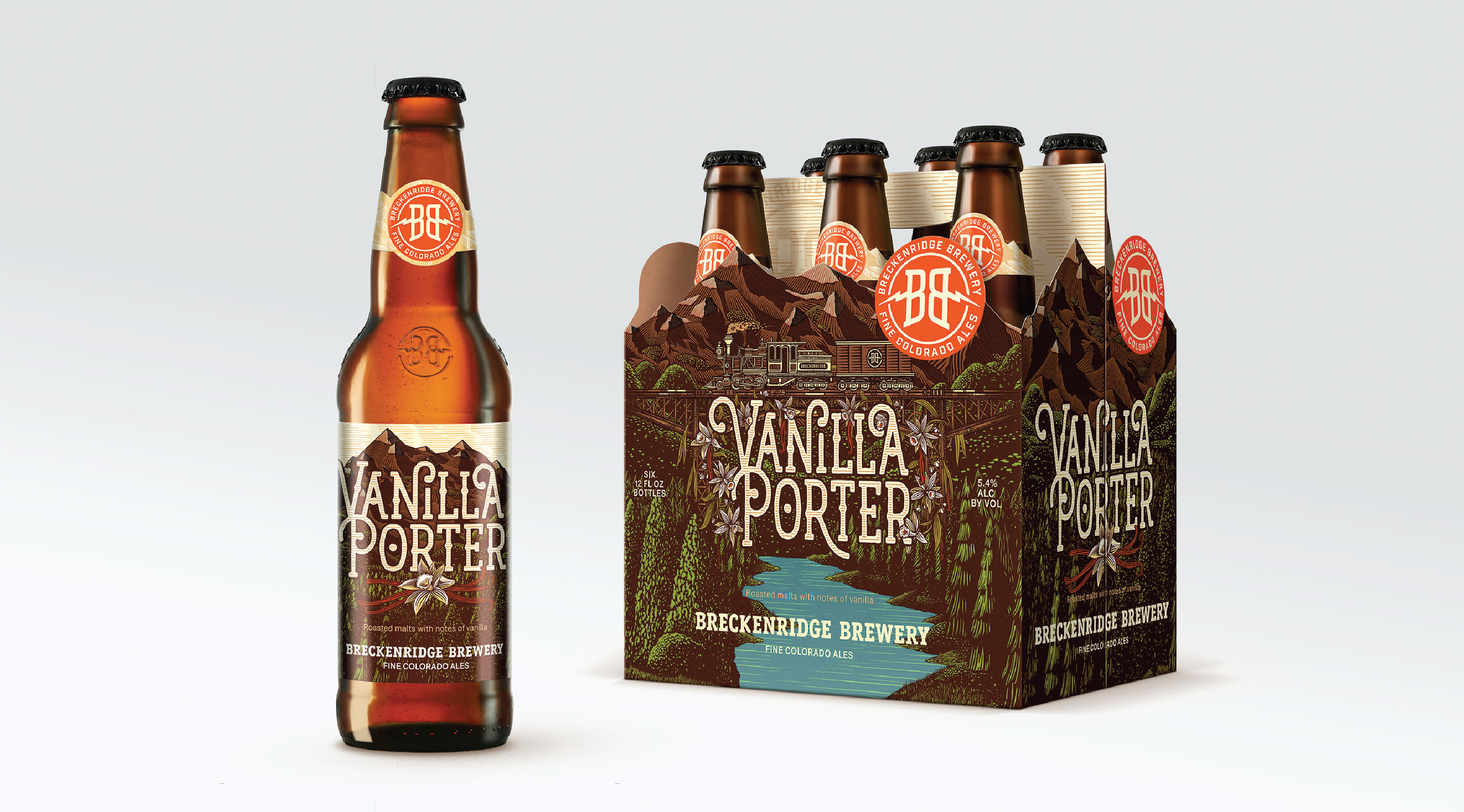
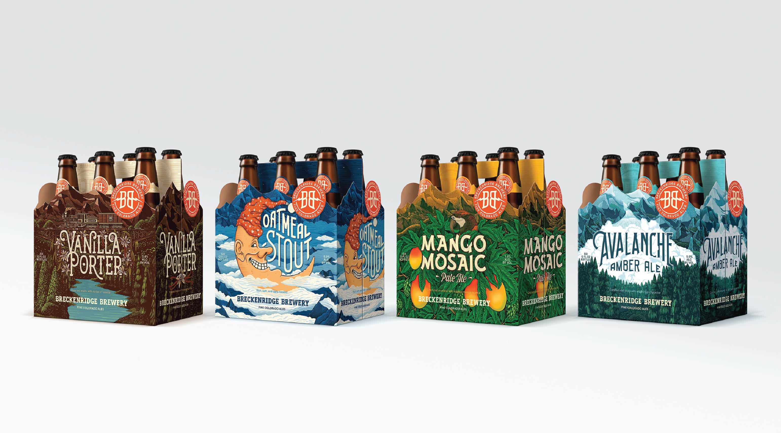
Breckenridge Brewery has rebranded! That means a new logo and new labels for their core and seasonal offerings. This change comes almost two years after they were acquired by AB InBev and is “the first manifestation of changes to come at Breckenridge.” Take that as you will.
You can see in the video below the progress of the brand and what the packaging looked like before. I, myself, was not familiar with Breckenridge before seeing these new designs, and while I don’t think it’s a revolutionary new look, it does create a newfound sense of consistency across the products and while still working with existing colors and key elements unique to each brew. Using the same illustrator (shoutout to Florian Schommer) for each reincarnation of the label also adds to that consistency.
Brand refresh and packaging design by VSA Partners. Illustrations by Florian Schommer.
Breckenridge Brewery Package Designs from VSA Partners on Vimeo.
