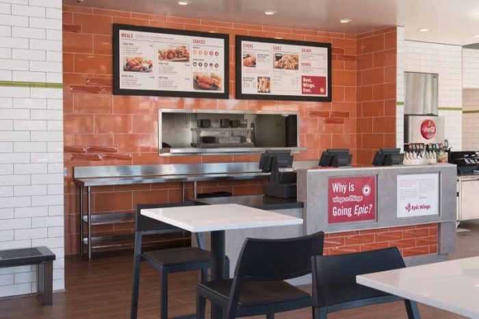
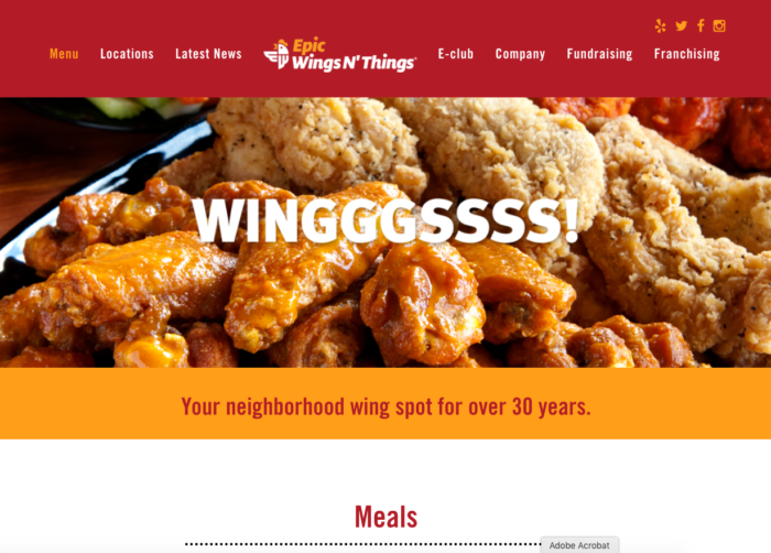
Thanks to NRN.com we got tipped off on the new name and brand identity for Epic Wings, formerly Wings N’ Things. Here is our first take on the new name and new look:
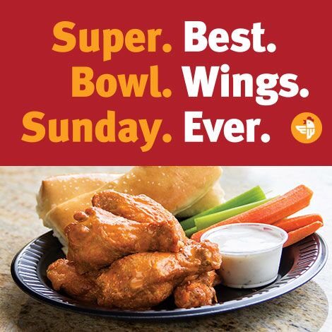
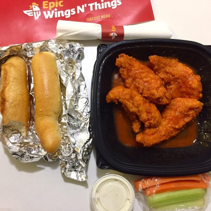
The brand is in full transition mode away from the former look into the new. They’re doing a great job of explaining the change and mitigating confusion. Big points here. For instance, the new brand uses the same color palette as previously established which is a smart way to maintain brand recognition during a shift as large as name and logo.
The name is interesting, but a bit lackluster. When compared to the original, Wings N’ Things, it’s definitely an improvement. Epic Wings doubles down on the “wings’ offering which can be a good thing, but not without side effects. They do have ancillary menu items and focusing on wings up front puts them on the back burner.
Former Brand Identity for Wings N’ Things
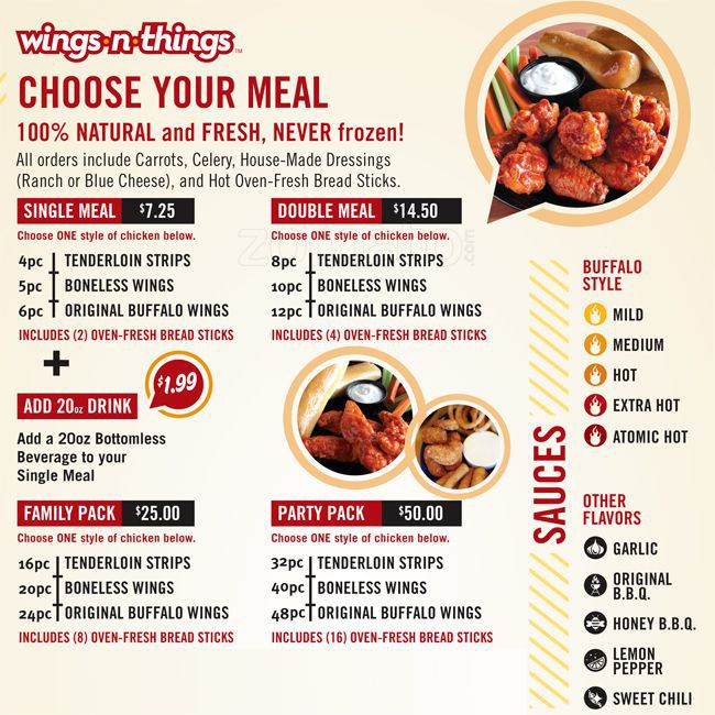
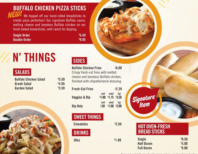
New Brand Identity for Wings N’ Things
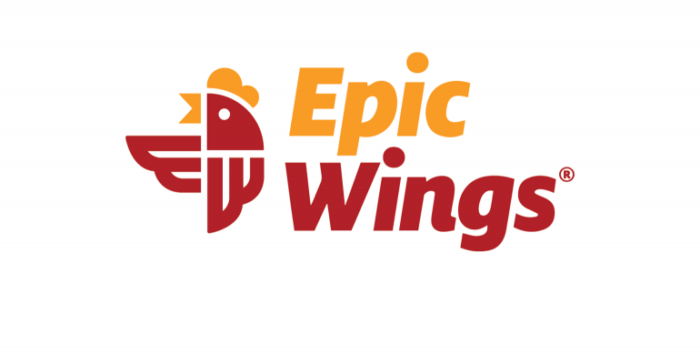
Epic Wings’ new logo mark is great in my opinion. The use of geometric shapes to form a flapping chicken is fun and distinctive. The wings create an upward directional device giving it a positive feeling. It’s easy to visually interpret which will make it quickly identifiable in cluttered areas like signage.
The brand does seem to fall short in creating a visual language that stems from the chicken mark. Besides color, the brand uses copy as it’s defining mechanism, but doesn’t establish a unique look. In short, if one removes the logo, the brand touch points could easily be for Popeyes, Bojangles, and any other brand that has yellow and red as their colors (that’s a wide range of restaurant brands in case you didn’t know.)
