I just posted some new work on my Behance profile for Maple Donuts. Although the project is purely hypothetical, it’s easy to see how my take on the brand could quickly rejuvenate its image and take it light years beyond where it is now. I’m going to try to give some explanation and theory for each element below. Enjoy and please feel free to comment.
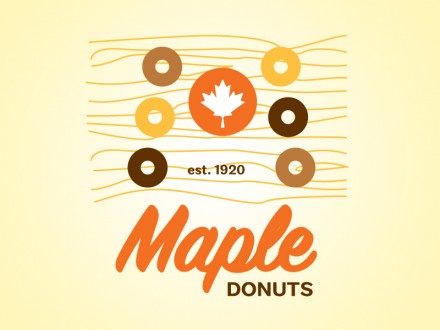
The logo itself uses a script typeface that’s fresher than the current one. Colors were maintained, but tweaked a bit and the overall palette was expanded to include supporting colors that reinforce the warm morning feeling. The mark itself is a combination of donuts that form an “M” shape. In its center is a maple leaf rendering tying the entire logo together. The addition of a wood grain adds a touch of nostalgia and is another connection to “maple” as a tree. When combined the logo is portraying a number of things that should tie the viewer directly to brand promises of warmth, breakfast, and tasty treats provided by Maple Donuts.
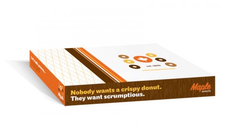
The box is probably one of the most used brand touch points of Maple Donuts. So, it only makes sense that it be designed to not just be a holder for a logo, but reinforce the brand. It should upsell it and add to it. Do to this, we’ve used the multiple sides as tiny ad spaces while extending the graphic treatments set by the brand logo. Introducing witty text and slogans starts to give Maple Donuts a personality.
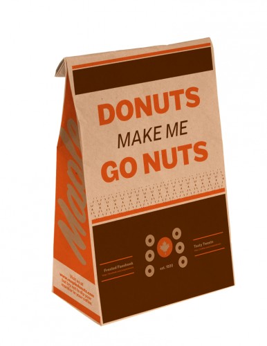
The bag of donuts is the second most widely used and seen brand touch points for Maple. Once again, we want to extend the brand visually, and add onto the vibe and tone started with the box. So, I featured a one liner that’ll be memorable and combined it with little “ads” for connecting with Maple Donuts online: Twitter, Facebook, Yelp, etc. The two color treatment on this piece should keep the bag relatively inexpensive.
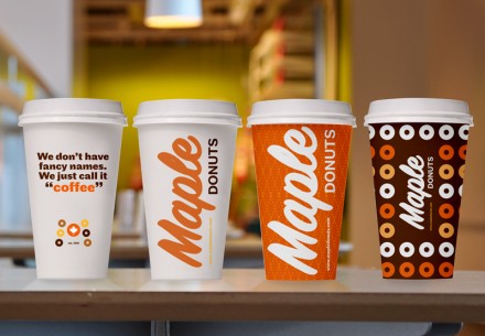
Coffee completes Maple Donuts’ core offerings. To date, they’ve used Styrofoam cups that easily broke and were chintzy at best. With this being the third most popular touch point, it only makes sense to actually spend some money on creating a personality and easy-to-recognize designs. People should glance past one of Maple Donuts’ cups and know subliminally that it is from Maple Donuts. Fun designs add some character and these are just four renderings of what could be done. Look out, we’re extending the personality here!
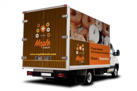
The delivery truck(s) is seen throughout the area. These are rolling/mobile billboards and not using the open space for advertising is a missed opportunity. It’s relatively inexpensive and gets high impact. By now, you can see how the brand is forming. Consistent, but new uses of graphic treatments and colors mixed with similar tone/voice in the copy writing.
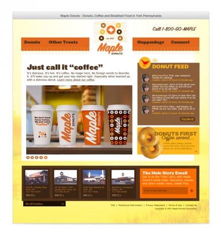
Finally, I tackled the landing page of the website. The website is often times one of the first in depth experiences one has with a restaurant brand. Therefore, it needs to be eye catching without using parlor tricks. No flash. Simply animation, strong design, good information architecture, and great content will go beyond what music and annoying animations will ever do. This site has a strong layout and everything is easily found from locations, to phone numbers and ways to connect more with the restaurant’s brand.
These are only main touch points for this particular brand. There is a slew of other elements that could be, dare I say, SHOULD BE, designed. Remember, “branding” isn’t about putting a logo on something. Sure, it gets the job done, but every time that is done an opportunity to EXTEND the brand is missed. That is the core of superb restaurant branding. Every piece is different, but works together in harmony.
What are your thoughts?

