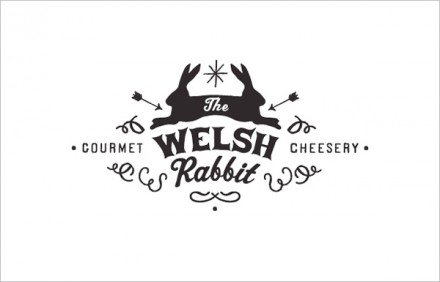
Two cheese places on this lovely Friday. Why not? The Welsh Rabbit Cheesery identity was designed by Sarah at Candy Coated Universe. It’s a simple branding package that touts hand drawn typography and illustration work. It’s simple, but fun. The color palette is muted keeping things earthy and hand made like the cheese itself.


2 Responses
Well done logo. But a little bit tired of all the symetric treatment in the construction of multiple identity, wich is now to ofen seen….
I agree. I think it’s well done, but there has been a huge insurgence towards retro style, symmetrical treatments. It’s easy to love though.