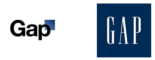
I guess we have to jump on the wagon here and proclaim our distaste for the gap logo. Along with everyone else that would call themselves a designer, we absolutely abhor the new look. But rather than rant about how design is dying all around us, we’d like to keep things factual, true to our own nature.

If it’s not broke….
The world has seen its fair share of blue squares in logos. However, with Gap’s permeation and frequency, it has become a strong owner of the imagery. Gap stores are everywhere and so are the blue squares.
Web 2.Blow
The whole “web 2.0” craze that hit website design and, unfortunately, brand design and identity was just horrible. All of a sudden there gradients, gel-like effects and everything became blase by design. It still affects a lot of new web start up companies because there were some brands that just happened to do it right. Gap is not web 2.0, it’s not the future. It’s slowly becoming a cheap rip-off of J. Crew.
Go to Hell-vetica
What a wonderful and horrible typeface all at the same time. Using Helvetica for an identity is about as creative and new as a talentless rapper interrupting award ceremony speeches. Seriously, we all love Helvetica for many reasons, but stay away from it. You’ll never own the look it gives your brand. You will not look unique. You will do the complete opposite of what branding and brand identity design is supposed to do for you.
Overall, the new logo has aligned perfectly with what Gap seems to promise: Far from unique, relatively safe statement. Nothing new here. Nothing to talk about except the same anger you get when they start selling their $75 sweater for $10 at the end of the season.
Back to the drawing board Gap.


2 Responses
Does this have to do with dinner? Guy next to us in the same shirt, yours being more moderately priced?
Hah if only… I think thats exactly what they want us to do lol.