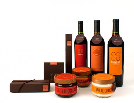
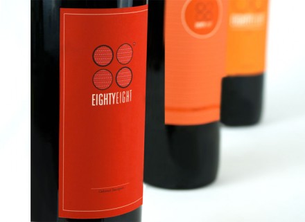
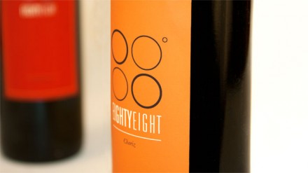
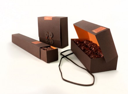
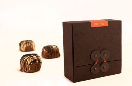
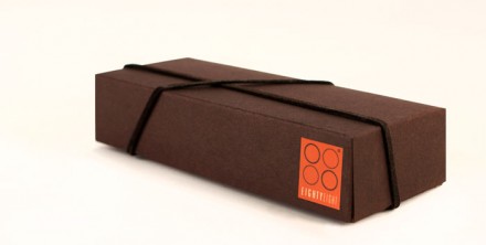
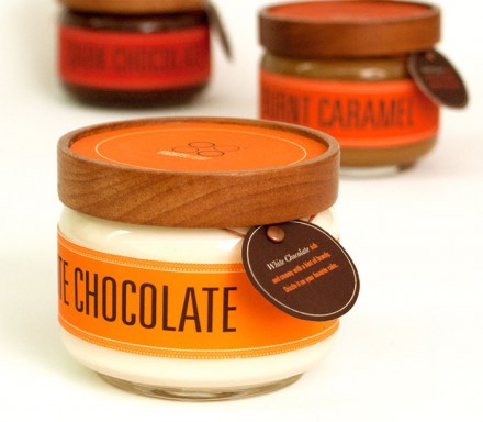
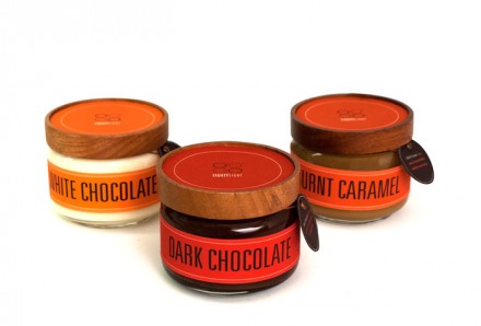
Simple. Elegant. Beautiful. All these describe the brand identity and package design for 88°. This very elegant brand packaging system is a perfect example of how many products collectively build a brand’s identity. Even though this isn’t directly correlated with a restaurant, it doesn’t take a genius to see how extending a restaurant’s core offerings into packaging can also build a restaurant’s brand awareness and develop a restaurant brand’s identity. Eg: Take out bags, cups, napkins and containers. Maybe it’s a special ingredient, sauce or seasoning that gets packaged as well. These all push the brand further and create an image that’s memorable.
Here’s what Natalia Padillo, the student designer, has to say about her inspiration:
[It’s]the perfect temperature to melt chocolate in order for it to be smooth and shiny. 88˚ is elegant and expensive with a modern twist. It was created for the sophisticated urban woman who enjoys a good glass of wine that pairs perfectly with her chocolate.

