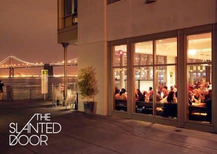
This identity has been making its way across the web this week with good reason. It’s an amazing example of simple, minimalist design with maximum impact. This comprehensive restaurant brand identity design covers all the bases using simple techniques that make an impact. It’s upscale and luxurious. It’s crisp. The typography is solid and poignant. The materials used throughout combined with the simplicity create a calming, elegant effect. It sets the expectations of the food and experience perfectly. Designed by Manual


