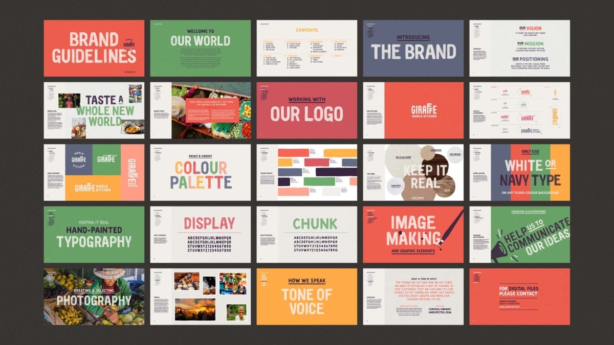
As a restaurant grows into a chain, more often than not, they loose sense of who they are and the whole reason why they got into the restaurant biz in the first place. And often times, a rebrand is not a completely new venture for a brand, but a return to its roots. That was the case for Giraffe when Ragged Edge rebranded them as Giraffe World Kitchen. The chain started out with the intention of bringing the world’s best dishes to their restaurants and had lost sight of that, limiting themselves to one kind of cuisine. In this case, a rebrand included not only an updated visual identity, but also a new operational approach, one that included an overhaul of product offerings.
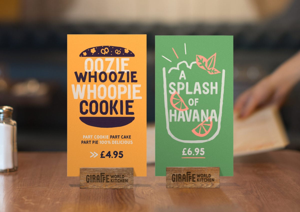
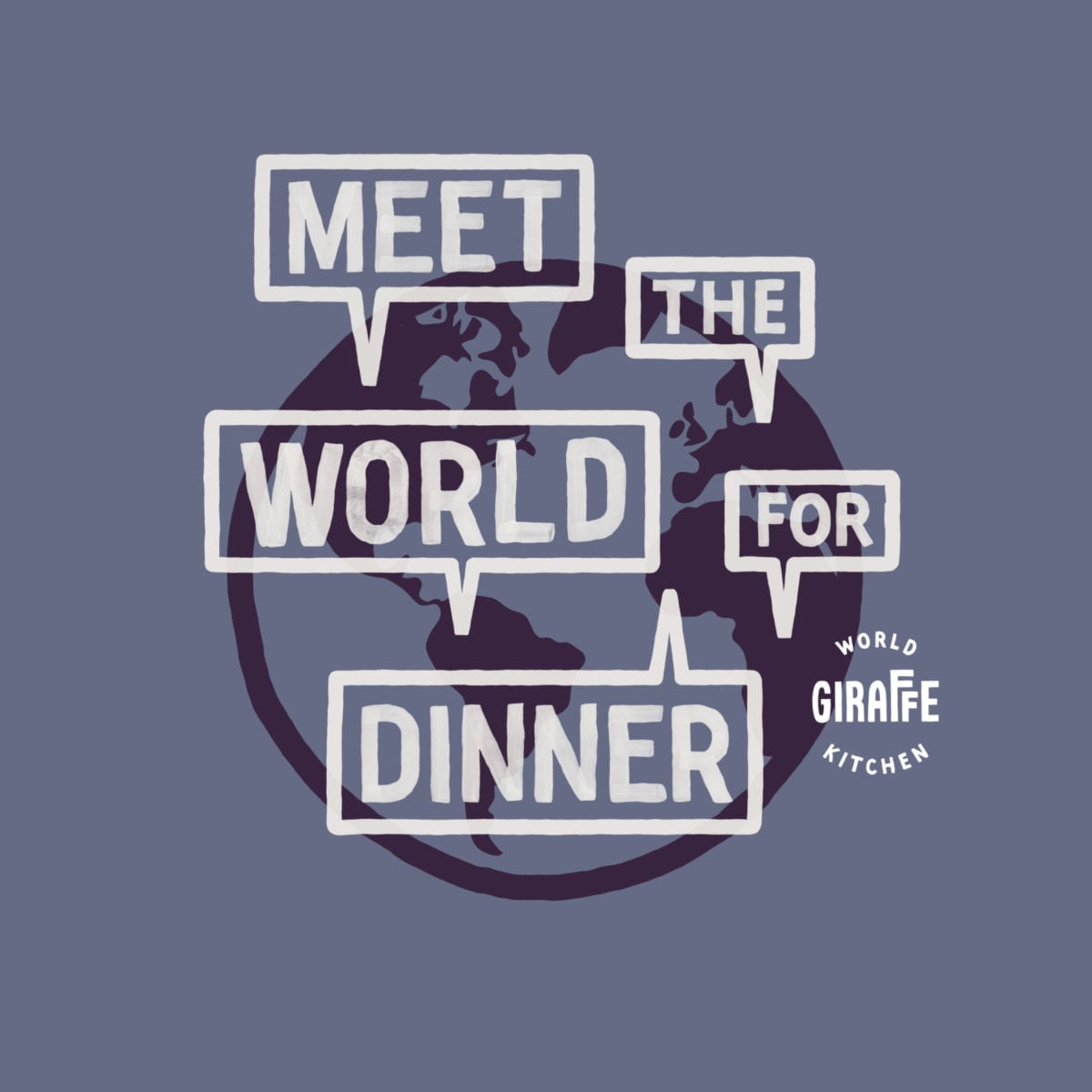
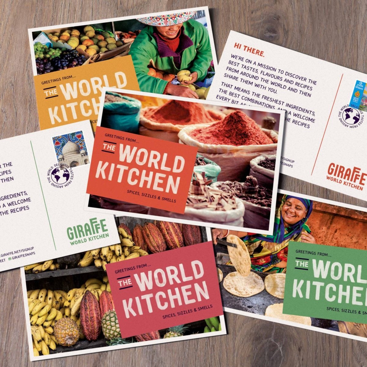
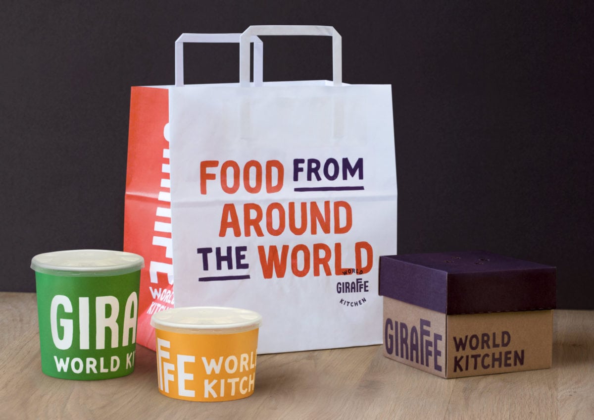
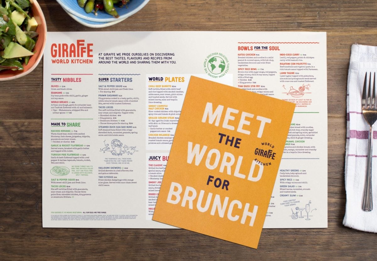
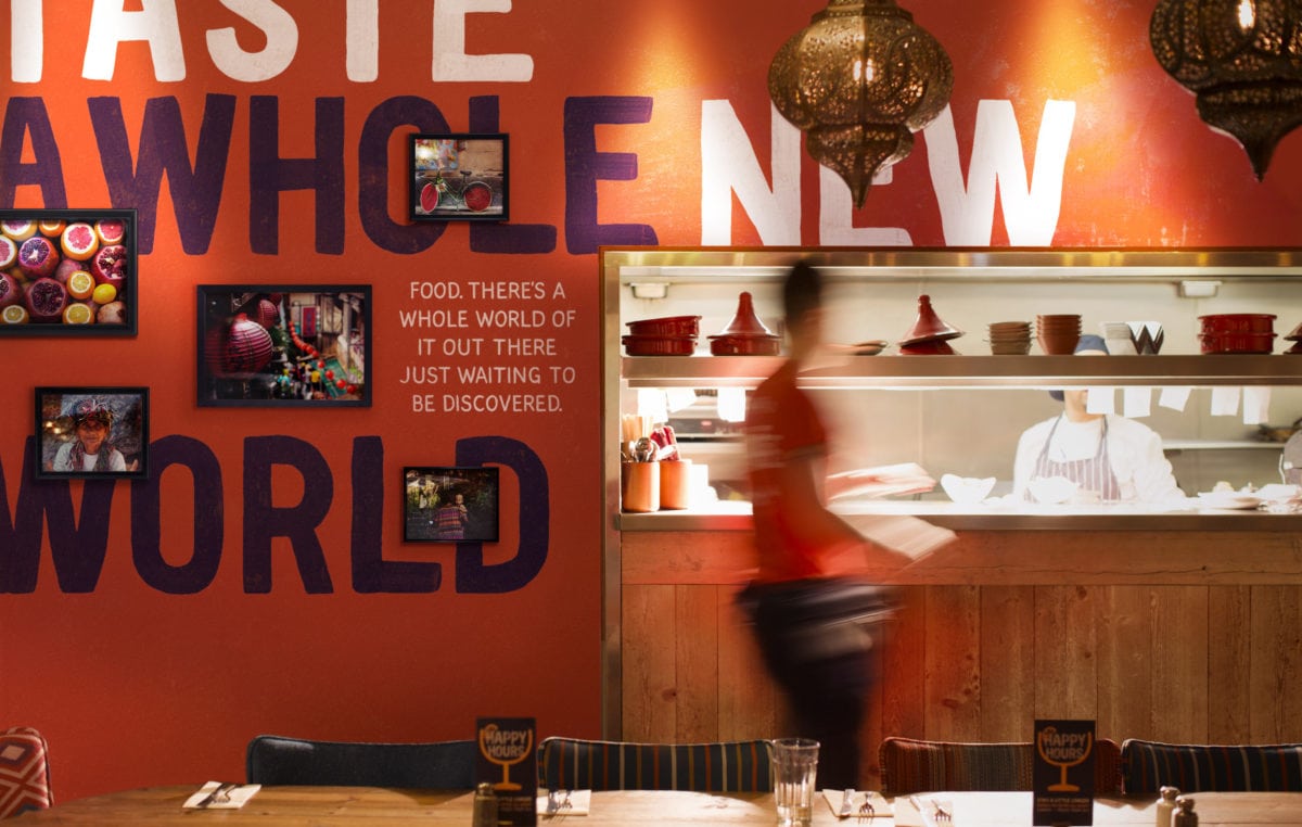
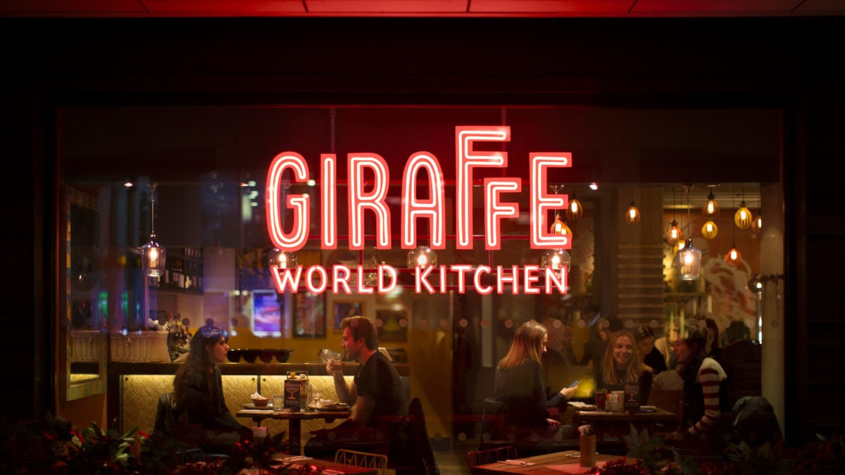
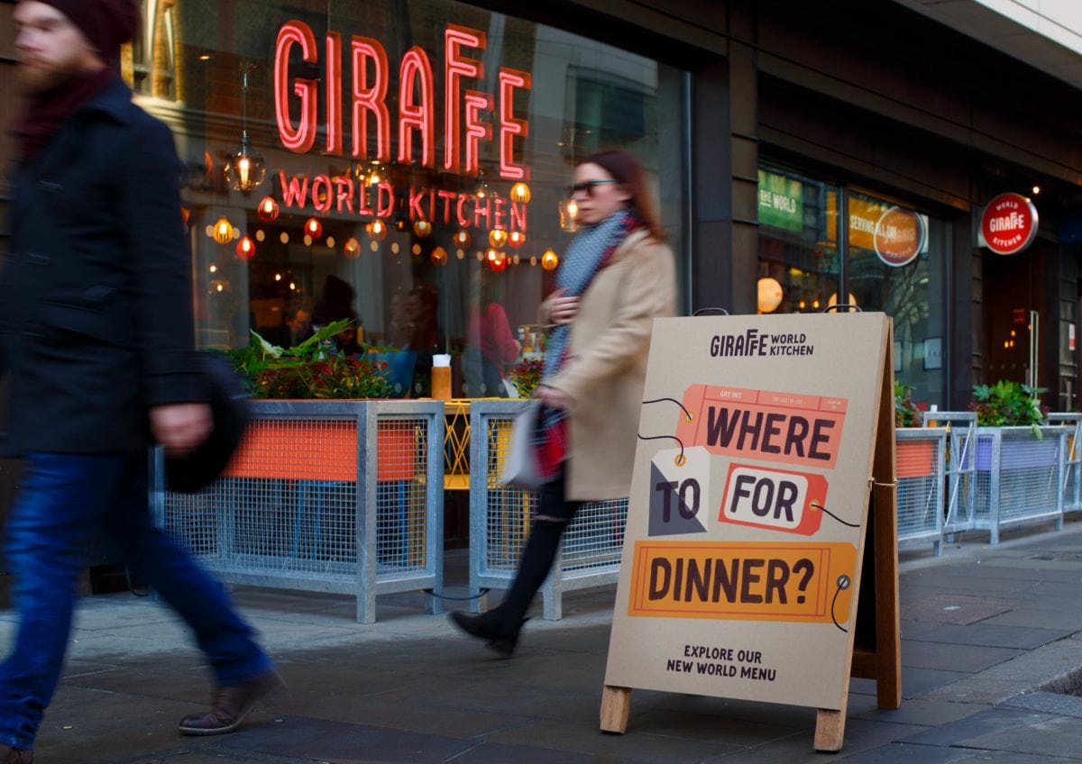
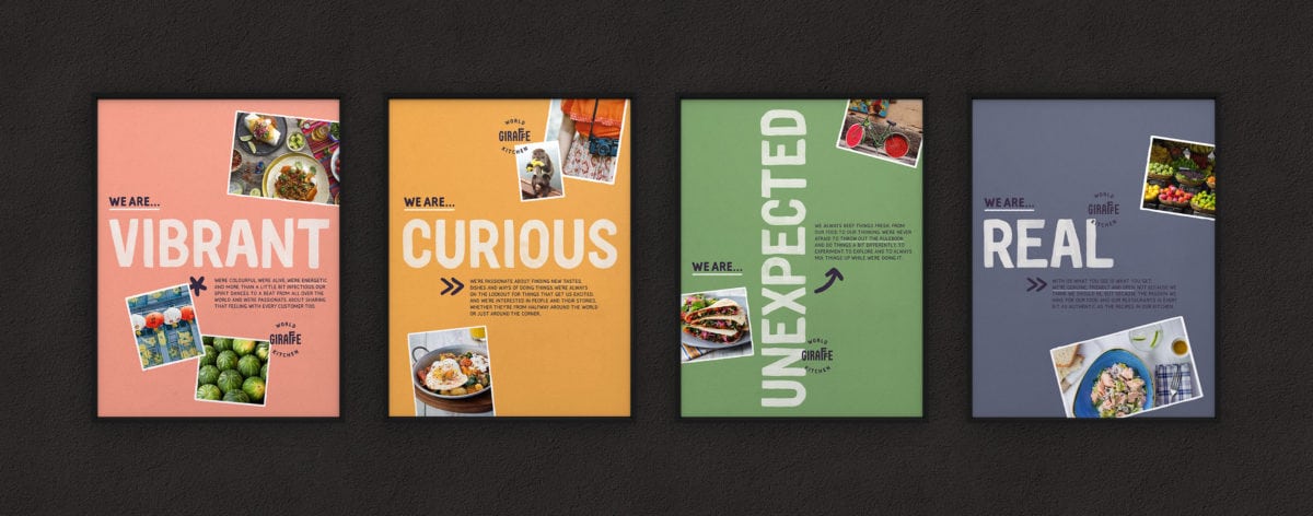
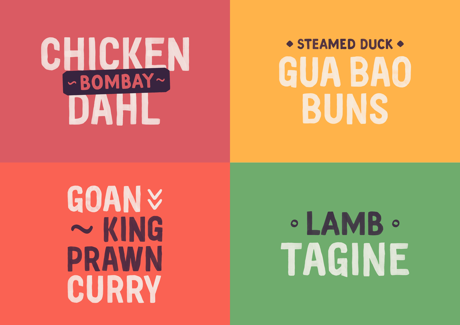
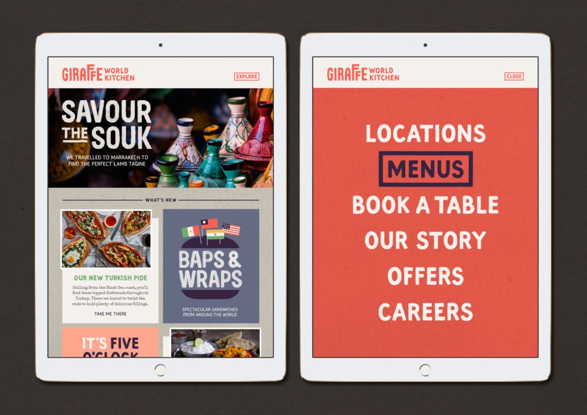
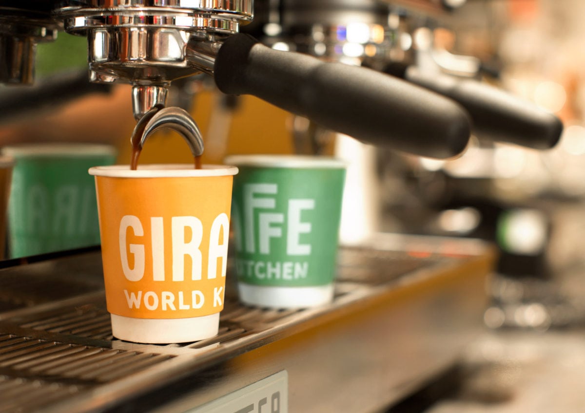
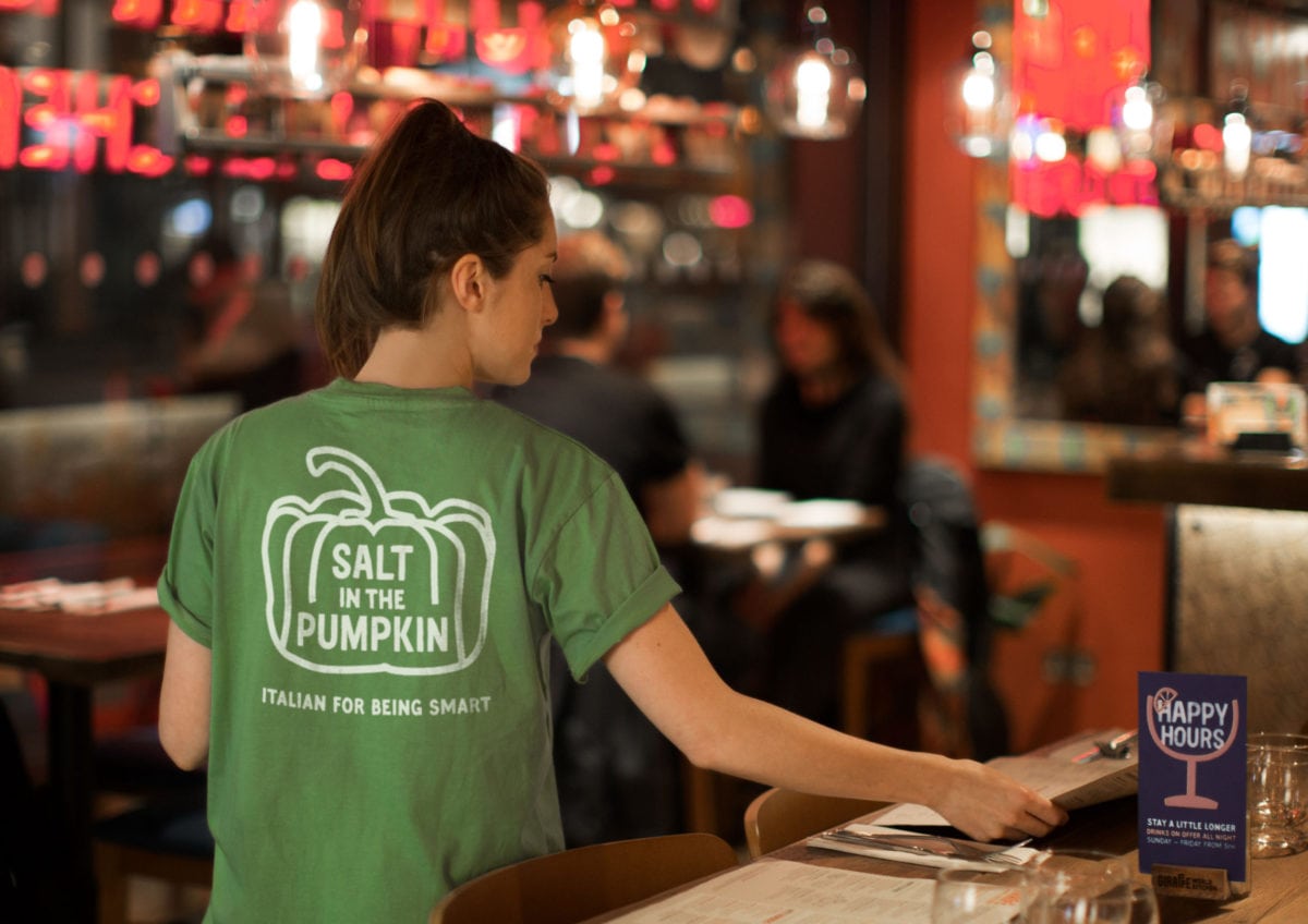
The new brand purpose, ‘Taste A Whole New World’, reinvigorated the chain for a new audience. The visual identity was inspired by sign-painting common to small restaurants across the world, while the imperfect quality of the letters relays a sense of warmth. Other visual touchpoints are clearly influenced by aspects of travel; posters advertising new dishes often look like travel posters, direct mailers look like a postcard you would send to a loved one while on vacation, etc. Overall, it’s a gorgeous look for them, one that stands out and oozes personality from each asset.
Giraffe World Kitchen Branding & Art Direction by Ragged Edge.
