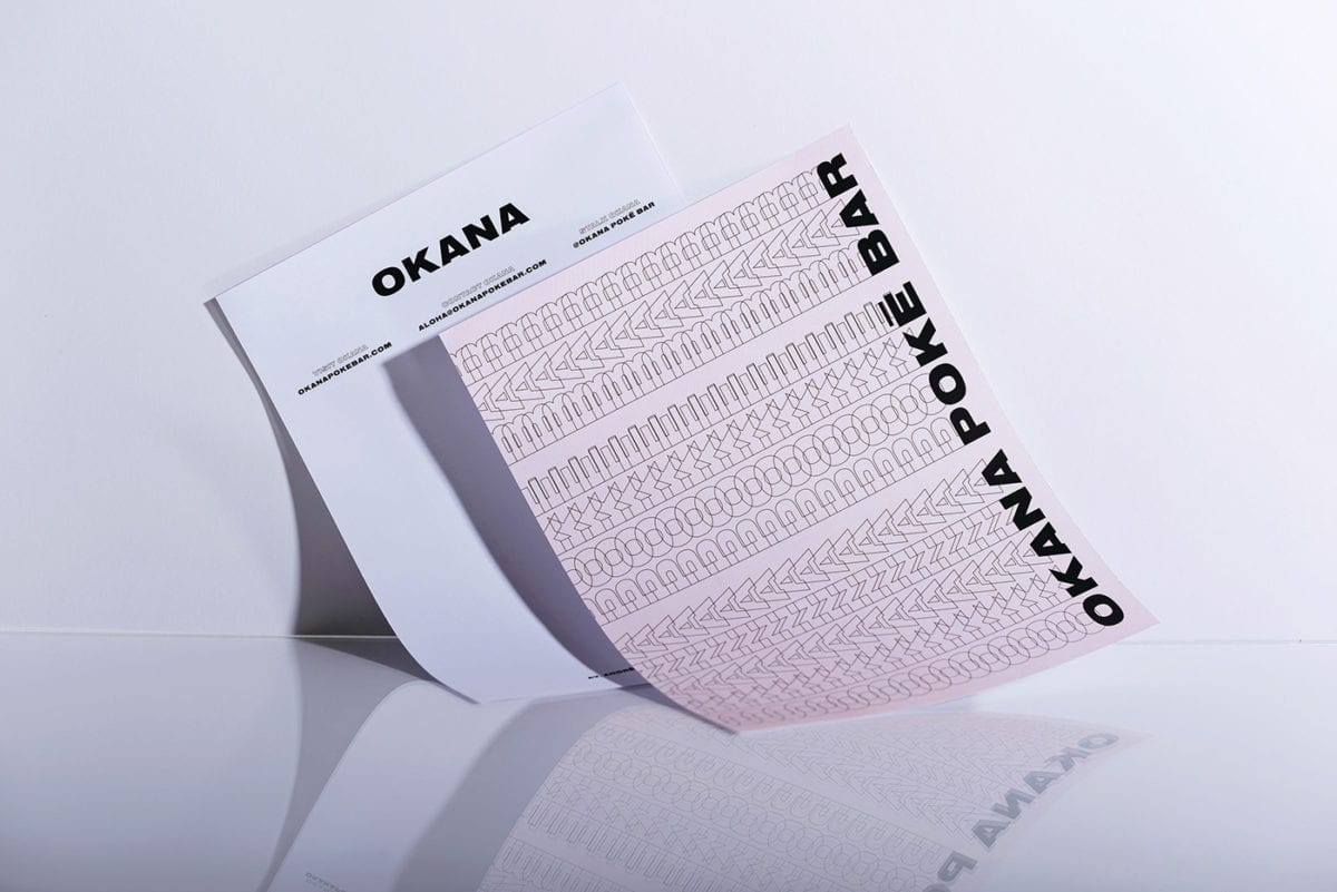
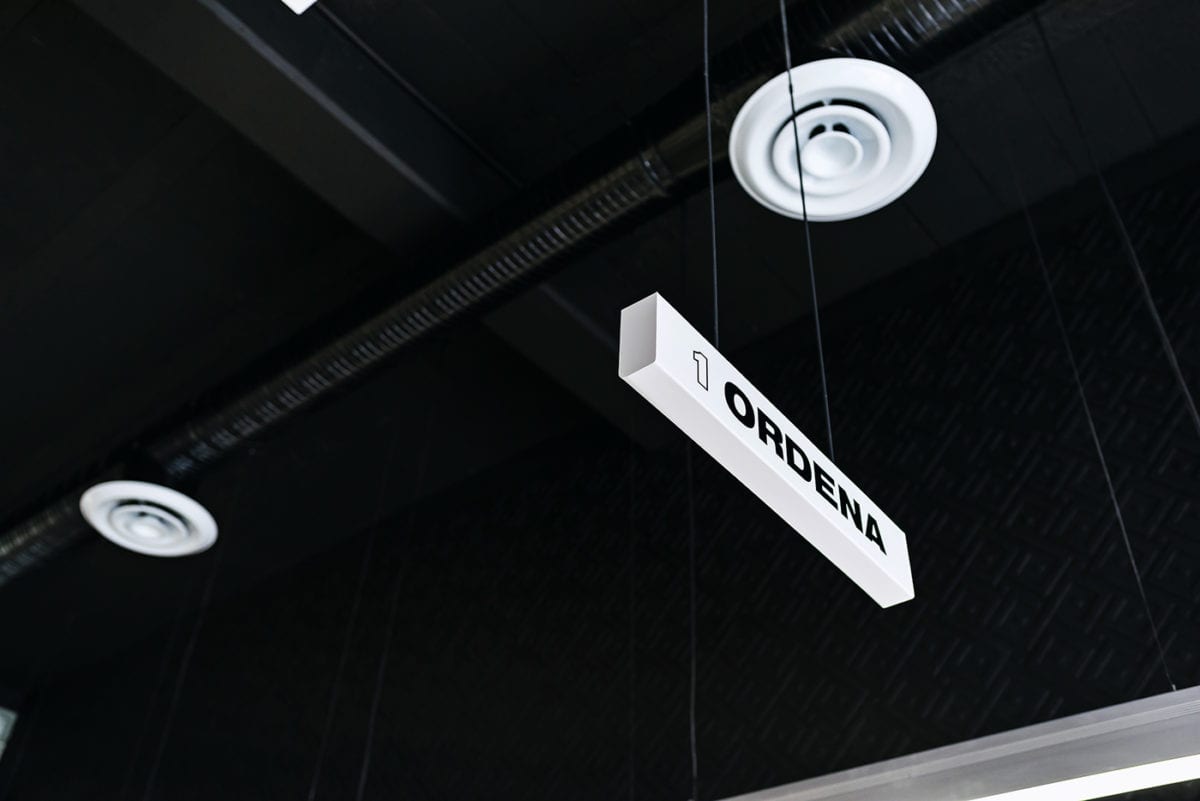
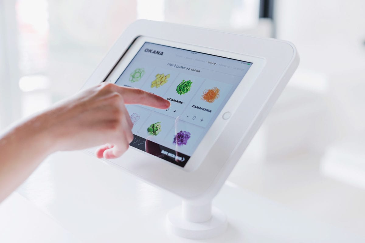
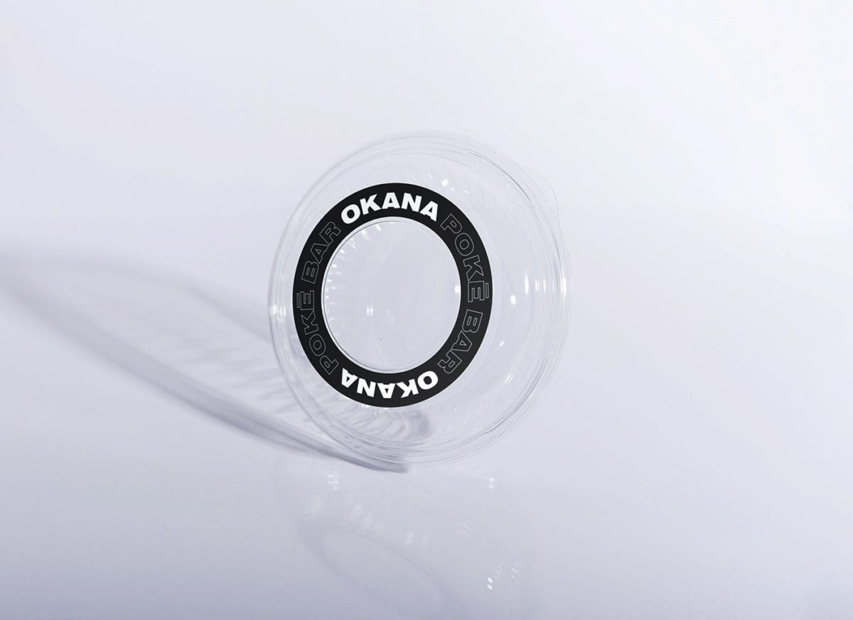
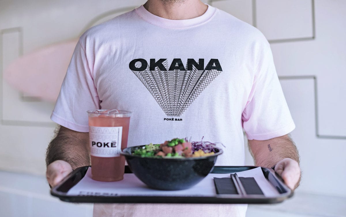
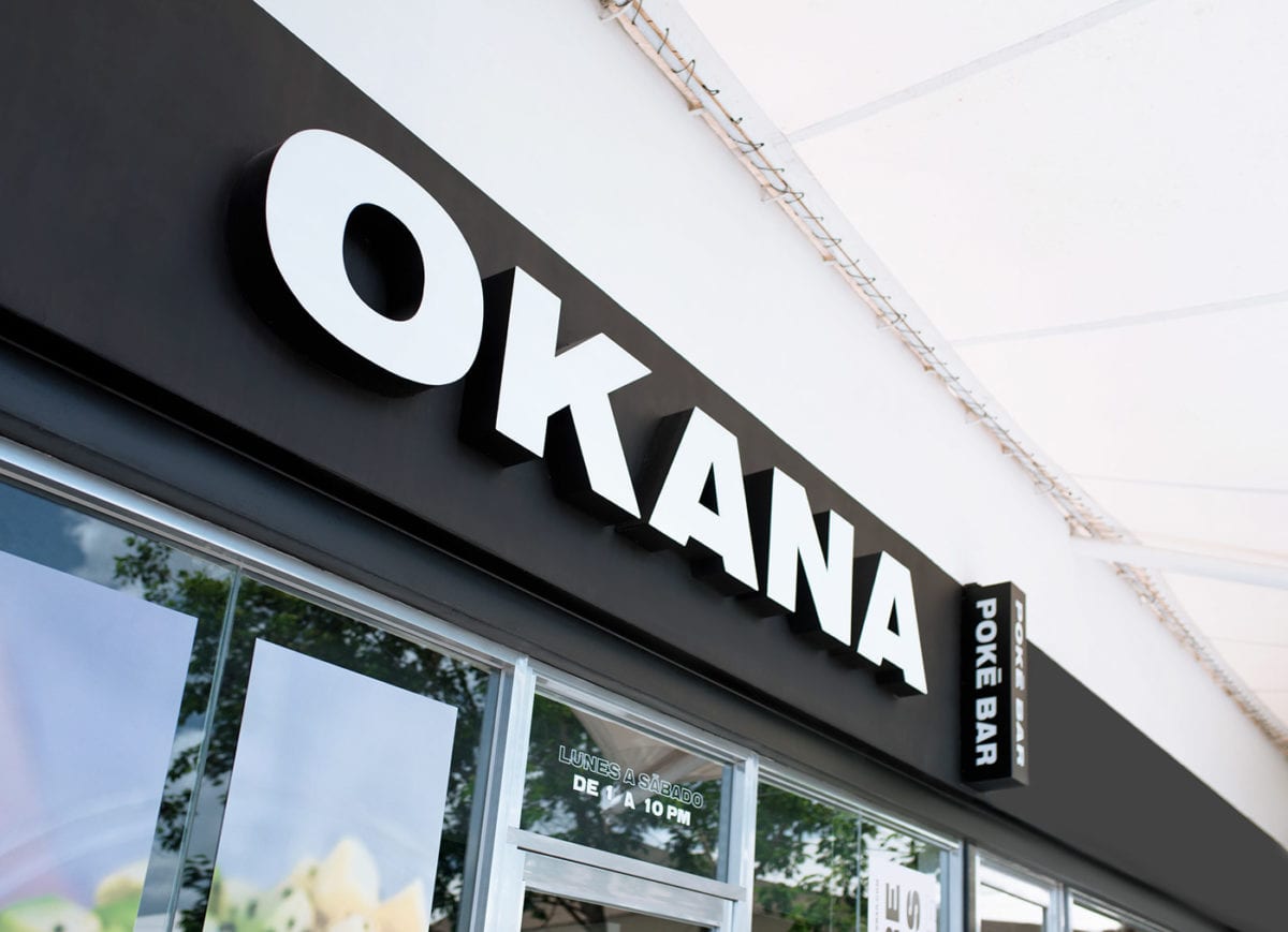
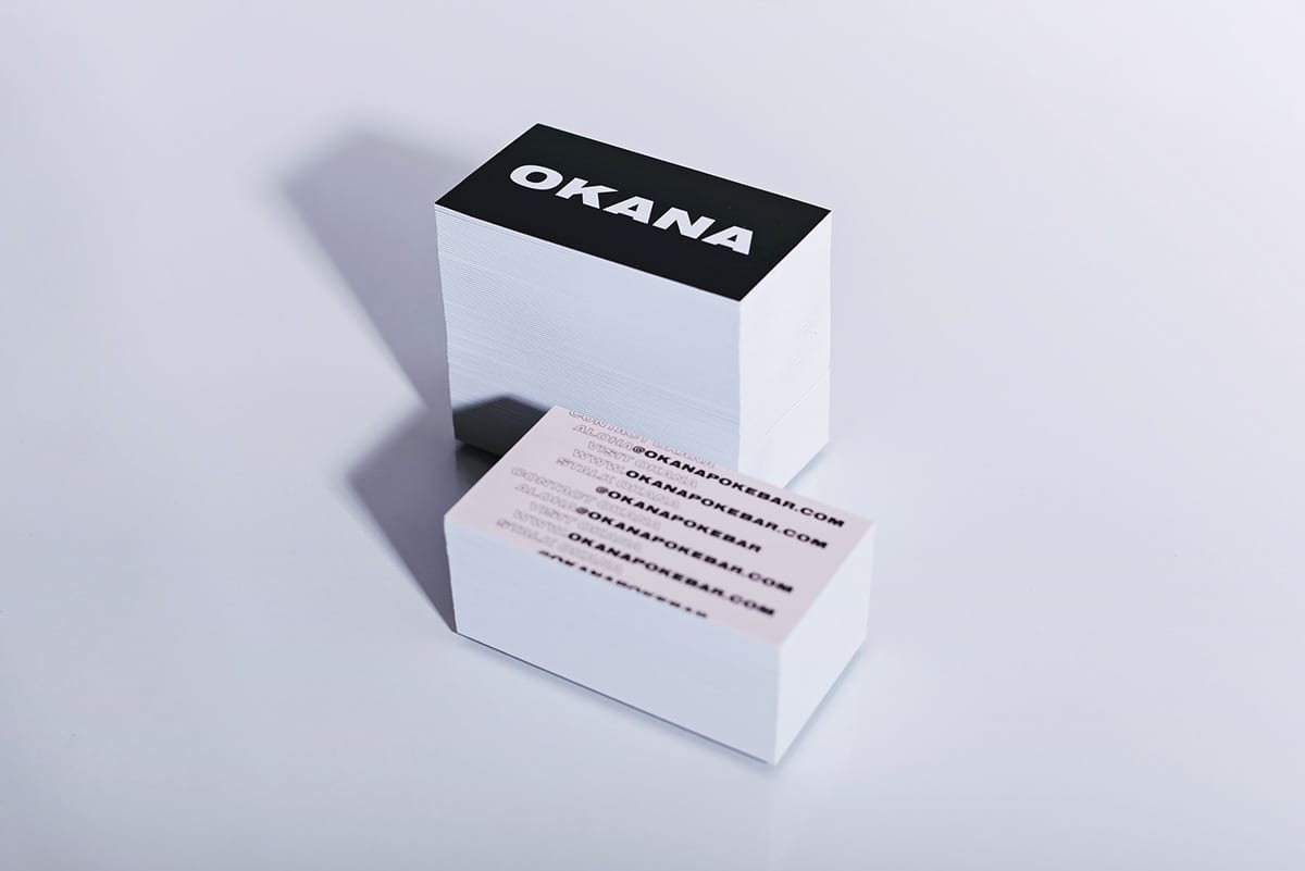
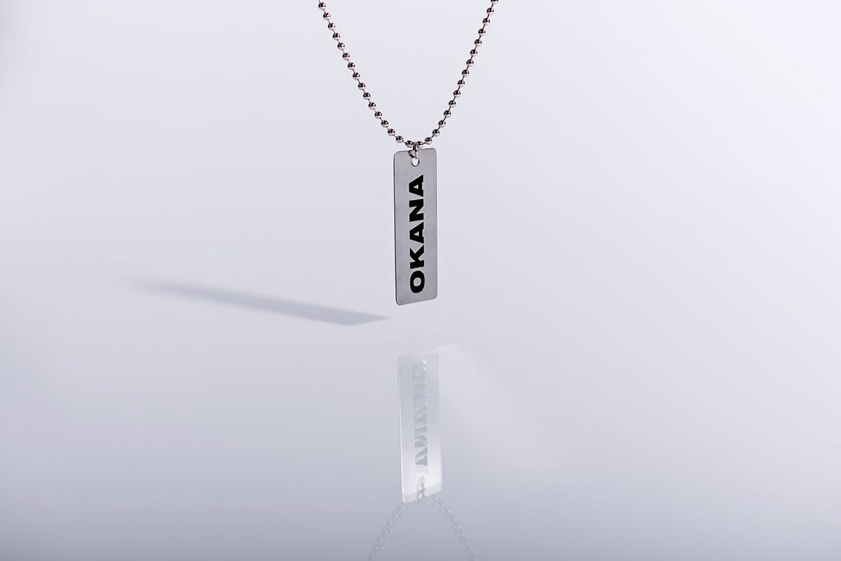
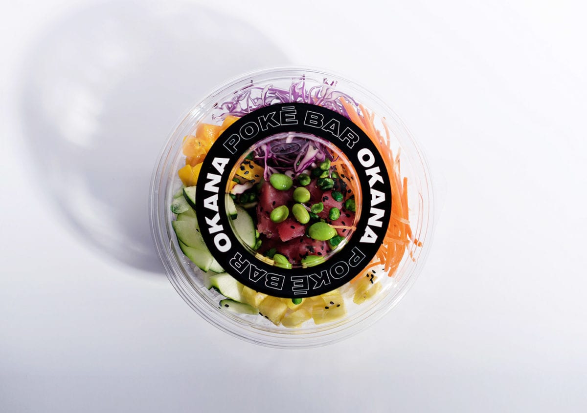
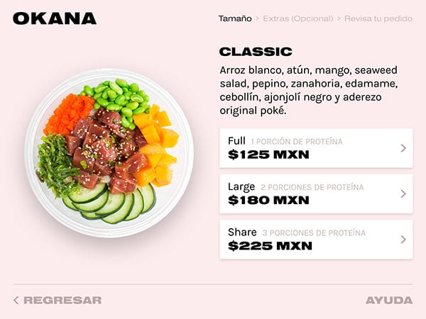
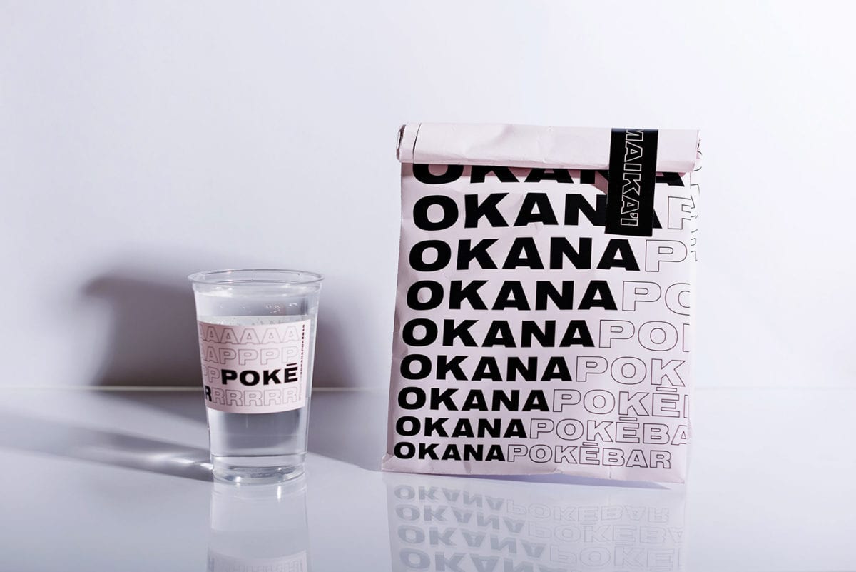
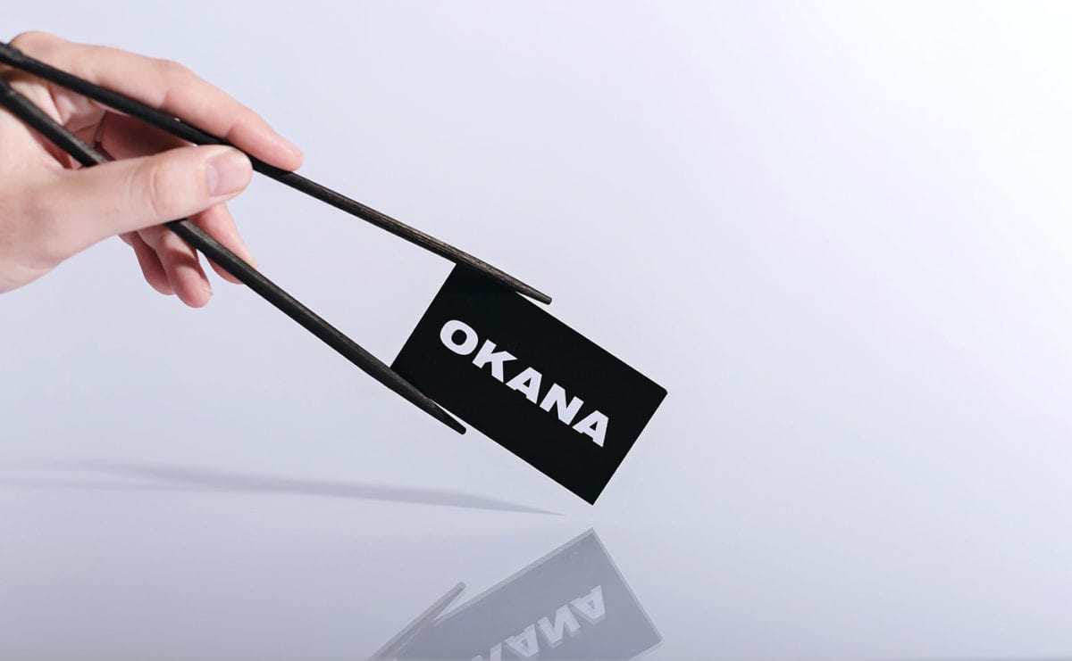
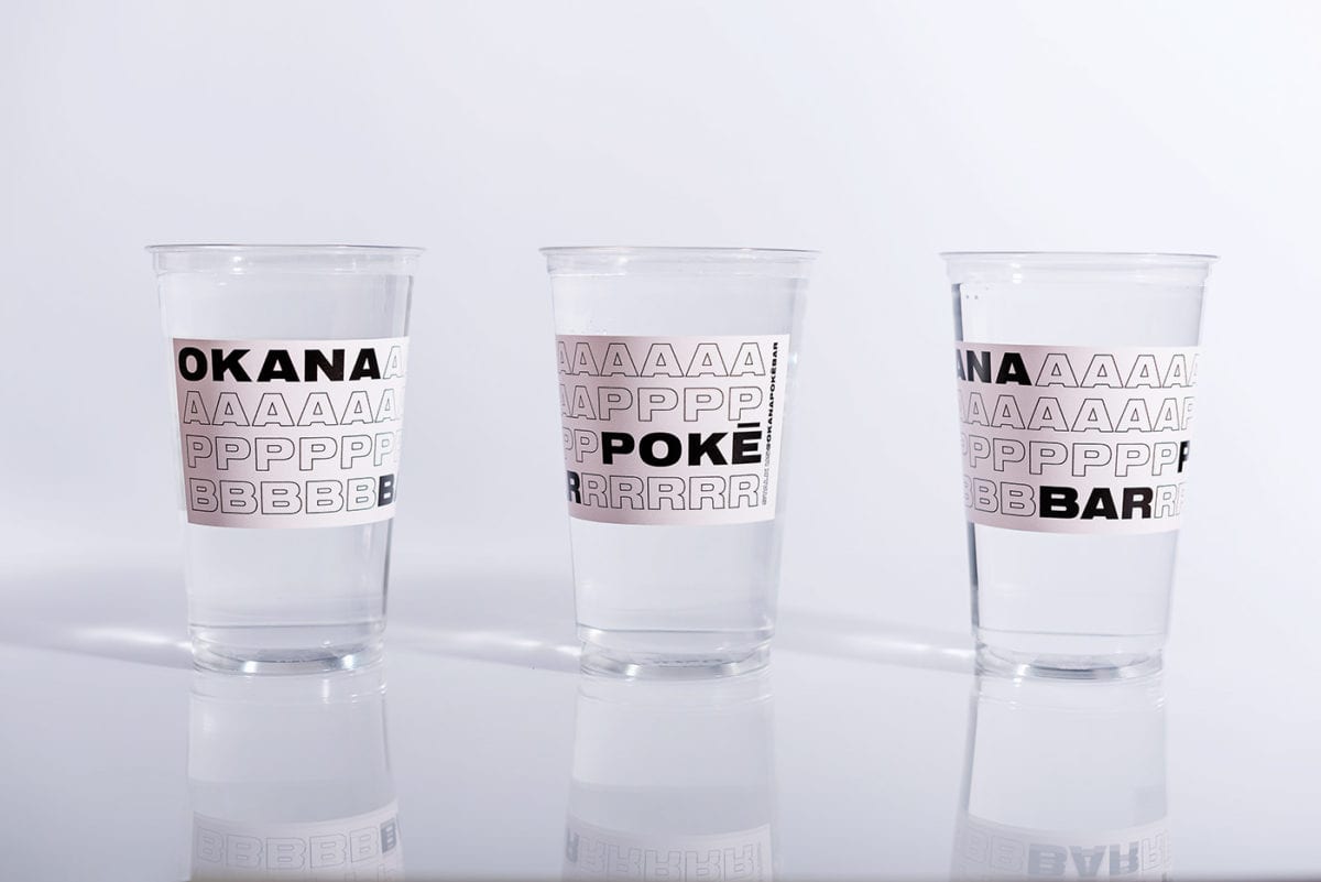
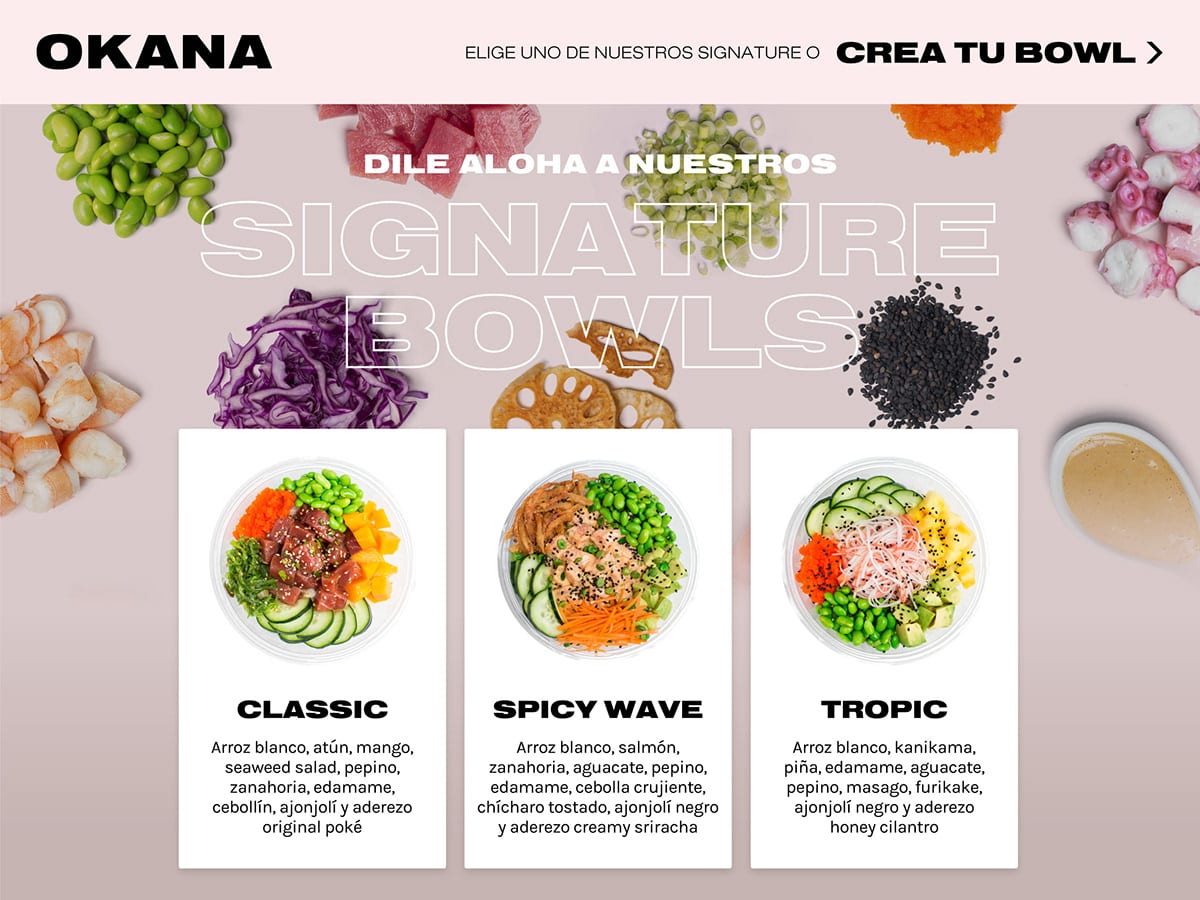
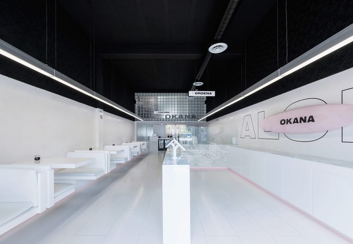
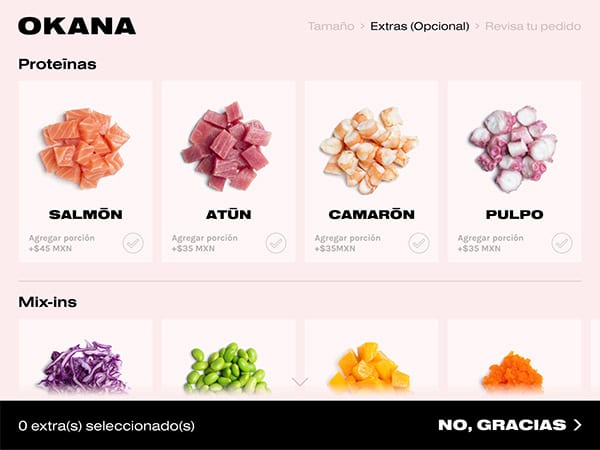
OKANA is a fresh, minimalistic and modern take on a quick service poké shop, with a visual identity built around energetic typographic exploration. It purposefully avoids all typical Hawaiian visual tropes; no leis, surfboards, or beaches to be found here. Ok, maybe there’s one surfboard but its used in an atypical way. Instead, a stark palette of black, white and millennial pink draws the ingredients and food into sharp focus; the colors in each bowl are more saturated and pronounced when photographed with brand touchpoints. A prime example of this in application is the small sampling of branded social media posts, found below.
Okana Poke Bar Branding, Packaging & Art Direction by Vegrande.

